https://www.kaggle.com/thykhuely/mercari-interactive-eda-topic-modelling
该题为的目的在于通过商家给予的商品的信息,建立一个商品的估价模型。
所给数据的大致分析:
列含义的分析:
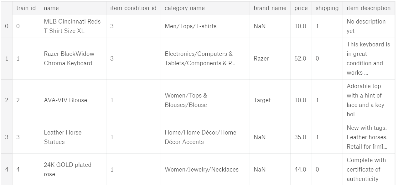
name:商品名
item_condition_id:卖方提供的物品的状况(不是很懂这个数据,可能是商品好坏状况)
category_name:每个商品有相应的三个标签
brand_name:品牌名
price:价格(即我们要预测的值)
shipping:1为运费为卖方支付,0为运费为买方支付
item_description:对物品的描述
1.首先对price我们的目标进行一个分析
train.price.describe()
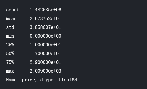
可以清楚的看出数据的一些特性
然后观察price的分布情况
plt.subplot(1, 2, 1)
(train['price']).plot.hist(bins=50, figsize=(20,10), edgecolor='white',range=[0,250])
plt.xlabel('price+', fontsize=17)
plt.ylabel('frequency', fontsize=17)
plt.tick_params(labelsize=15)
plt.title('Price Distribution - Training Set', fontsize=17)

plt.subplot(1, 2, 2)
np.log(train['price']+1).plot.hist(bins=50, figsize=(20,10), edgecolor='white')
plt.xlabel('log(price+1)', fontsize=17)
plt.ylabel('frequency', fontsize=17)
plt.tick_params(labelsize=15)
plt.title('Log(Price) Distribution - Training Set', fontsize=17)
plt.show()
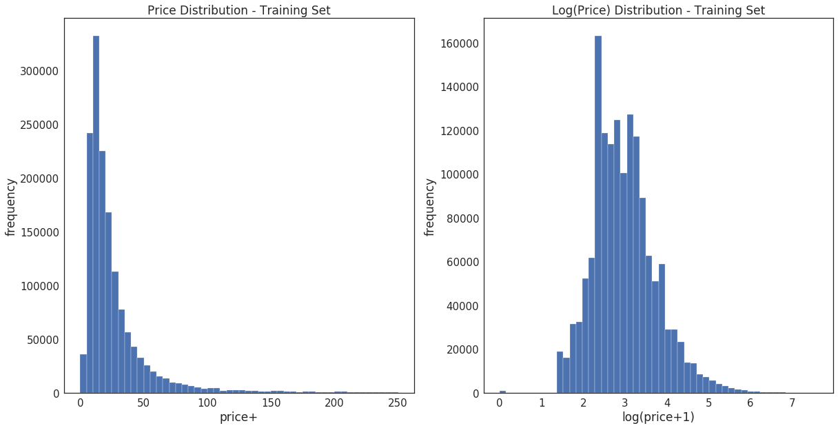
此处使用log(price+1)的方法使数据更加接近正态分布。也可以尝试Box-Cox.
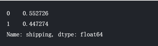
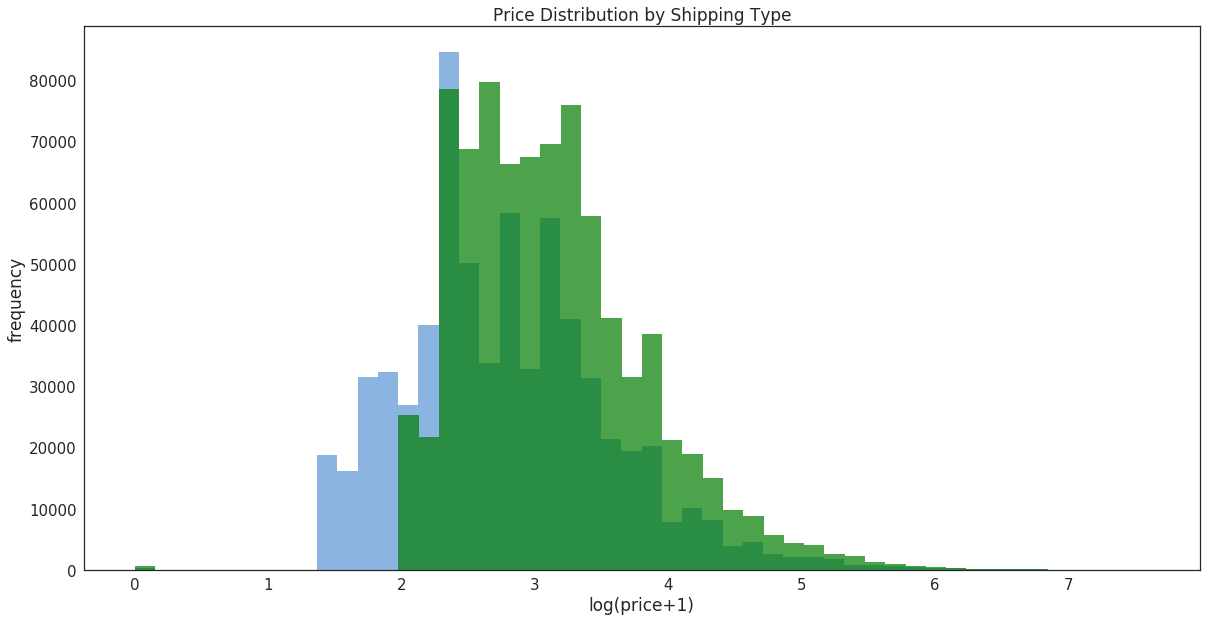
2.对shipping运费进行分析
统计两种运费方式的分布情况
train.shipping.value_counts()/len(train)
对于两种运费方式进行price的分析
prc_shipBySeller = train.loc[train.shipping==1, 'price']
prc_shipByBuyer = train.loc[train.shipping==0, 'price']

fig, ax = plt.subplots(figsize=(20,10))
ax.hist(np.log(prc_shipBySeller+1), color='#8CB4E1', alpha=1.0, bins=50,
       label='Price when Seller pays Shipping')
ax.hist(np.log(prc_shipByBuyer+1), color='#007D00', alpha=0.7, bins=50,
       label='Price when Buyer pays Shipping')
ax.set(title='Histogram Comparison', ylabel='% of Dataset in Bin')
plt.xlabel('log(price+1)', fontsize=17)
plt.ylabel('frequency', fontsize=17)
plt.title('Price Distribution by Shipping Type', fontsize=17)
plt.tick_params(labelsize=15)
plt.show()
3.对item_categroy(标签)的分析
对所有标签种类的分析
print("There are %d unique values in the category column." % train['category_name'].nunique())

显示总数量前5的标签,以及标签的数量
# TOP 5 RAW CATEGORIES
train['category_name'].value_counts()[:5]

查看空标签数量
1 # missing categories
2 print("There are %d items that do not have a label." % train['category_name'].isnull().sum())

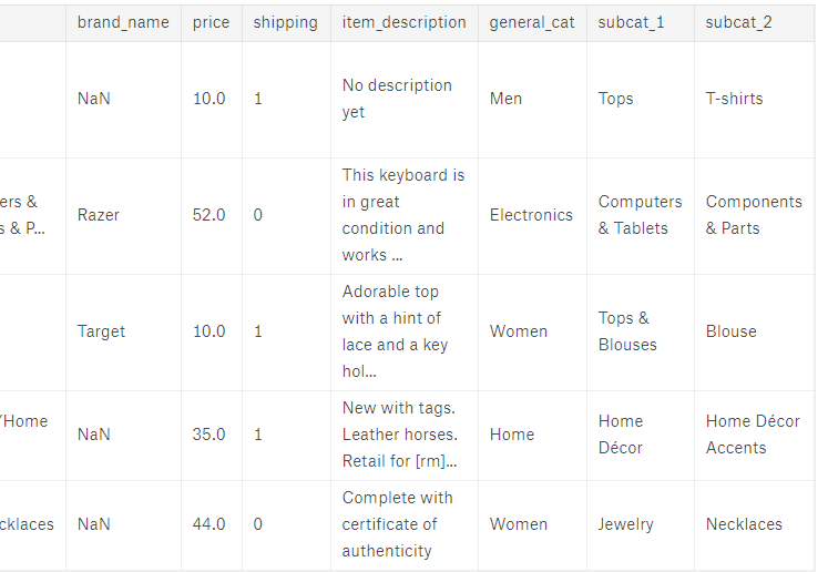
对标签的拆分
# reference: BuryBuryZymon at https://www.kaggle.com/maheshdadhich/i-will-sell-everything-for-free-0-55
def split_cat(text):
    try: return text.split("/")
    except: return ("No Label", "No Label", "No Label")

train['general_cat'], train['subcat_1'], train['subcat_2'] = \
zip(*train['category_name'].apply(lambda x: split_cat(x)))
train.head()
对每个小标签进行分析
print("There are %d unique first sub-categories." % train['subcat_1'].nunique())
![]()
print("There are %d unique second sub-categories." % train['subcat_2'].nunique())

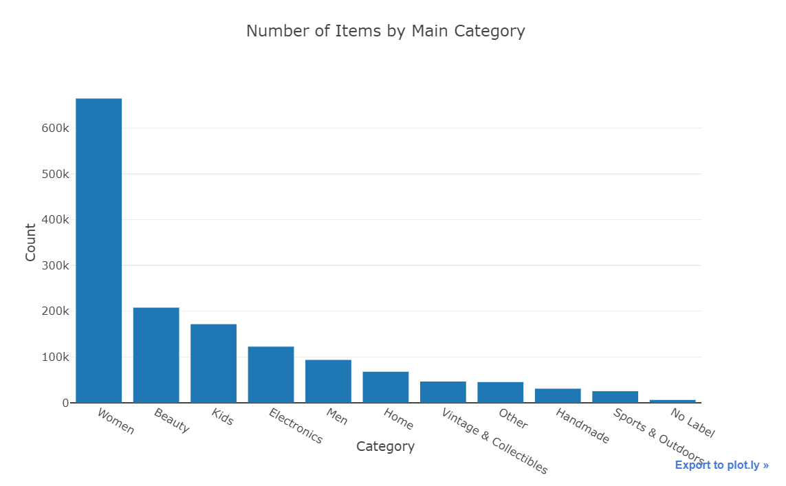
对general_cat进行分析
x = train['general_cat'].value_counts().index.values.astype('str')
y = train['general_cat'].value_counts().values
pct = [("%.2f"%(v*100))+"%"for v in (y/len(train))]
trace1 = go.Bar(x=x, y=y, text=pct)
layout = dict(title= 'Number of Items by Main Category',
              yaxis = dict(title='Count'),
              xaxis = dict(title='Category'))
fig=dict(data=[trace1], layout=layout)
py.iplot(fig)
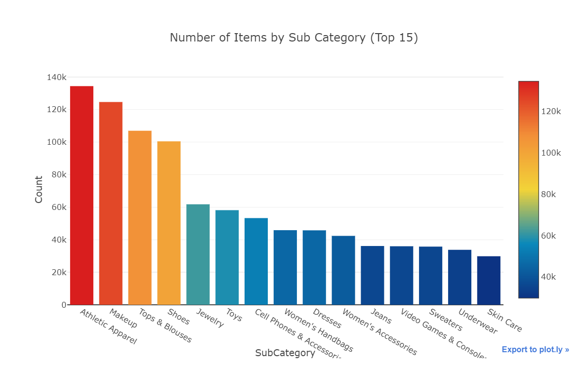
x = train['subcat_1'].value_counts().index.values.astype('str')[:15]
y = train['subcat_1'].value_counts().values[:15]
pct = [("%.2f"%(v*100))+"%"for v in (y/len(train))][:15]
trace1 = go.Bar(x=x, y=y, text=pct,
                marker=dict(
                color = y,colorscale='Portland',showscale=True,
                reversescale = False
                ))
layout = dict(title= 'Number of Items by Sub Category (Top 15)',
              yaxis = dict(title='Count'),
              xaxis = dict(title='SubCategory'))
fig=dict(data=[trace1], layout=layout)
py.iplot(fig)
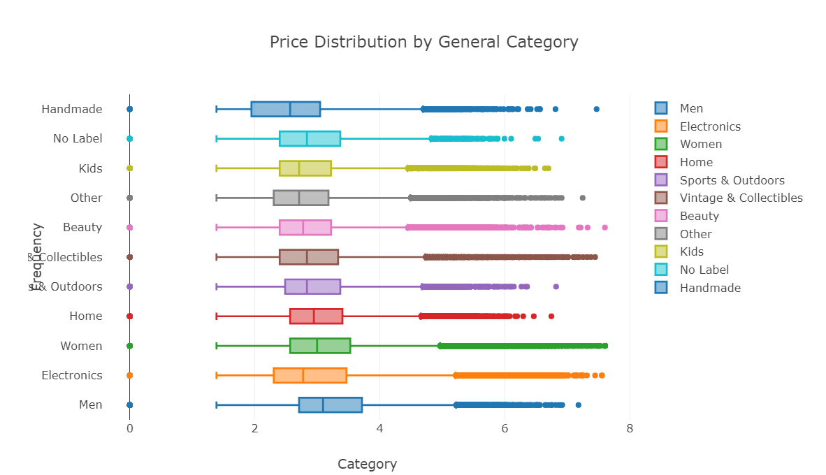
使用箱型图对标签数据进行分析
general_cats = train['general_cat'].unique()
x = [train.loc[train['general_cat']==cat, 'price'] for cat in general_cats]

data = [go.Box(x=np.log(x[i]+1), name=general_cats[i]) for i in range(len(general_cats))]

layout = dict(title="Price Distribution by General Category",
              yaxis = dict(title='Frequency'),
              xaxis = dict(title='Category'))
fig = dict(data=data, layout=layout)
py.iplot(fig)
对brand_name(品牌名)的分析
print("There are %d unique brand names in the training dataset." % train['brand_name'].nunique())
![]()
x = train['brand_name'].value_counts().index.values.astype('str')[:10]
y = train['brand_name'].value_counts().values[:10]

# trace1 = go.Bar(x=x, y=y,
#                 marker=dict(
#                 color = y,colorscale='Portland',showscale=True,
#                 reversescale = False
#                 ))
# layout = dict(title= 'Top 10 Brand by Number of Items',
#               yaxis = dict(title='Brand Name'),
#               xaxis = dict(title='Count'))
# fig=dict(data=[trace1], layout=layout)
# py.iplot(fig)