(一)——安装与配置
1、下载
去 Qt Plotting Widget QCustomPlot - Download下载需要版本的QCustomPlot的压缩包QCustomPlot.tar.gz,下载解压后会得到qcustomplot的.cpp与.h文件,这两个文件是我们需要的。
2、添加到项目
①把这两个文件复制粘贴到项目下;
②右键点击项目名 → 添加现有文件,选中之前项目文件下的两个文件;
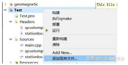
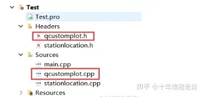
③配置完成,就可以在目录中看到这两个文件;
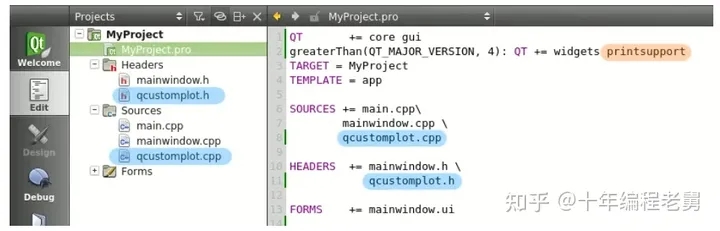
④添加变量。
如果你的QT版本是5.0及以上,那么.pro文件中的QT变量必须添加一个printsupport,就像下图所写的这样:
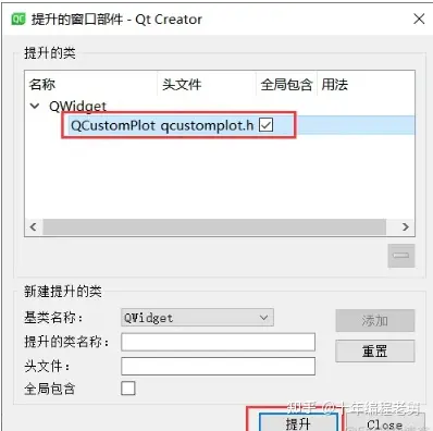
这样配置完成之后,我们就可以使用QCustomPlot了,QCustomPlot是继承自QWidget的。使用时,先生成一个QWidget,然后右键点击这个QWidget,选择提升为QCustomPlot,这样我们就得到了一个QCustomPlot。
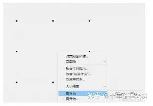
有时候,右键点击QWidget的时候,只有第二个提升为...,点进去之后,选中QCustomPlot,并点击提升就行。
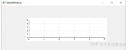
当然,这时候并不会有任何视图上的变化,但是当运行程序时,我们就能看到一个有着坐标轴和网格线的空画布。
3、例子
QCustomPlot.tar.gz中包含了许多案例项目,可以编译运行,这里就不再演示了。
4、使用QCustomPlot作为共享库.so或.dll
共享库的意思是,在我们的工程项目中不包含库.h和.cpp,而是连接到一个外部的qcustomplot.so(GNU/Linux系统下)或qcustomplot.cll(MSWindows)。
如果想在我们的应用中使用共享库,需要在包含QCustomPlot头文件之前使用宏定义QCUSTOMPLOT_USE_LIBRARY。
之前提到的下载网页中还有两个下载项sharedlib与source,其中sharedlib提供了演示这一点的两个项目:一个编译共享的QCustomPlot库,另一个使用共享库。这可以帮助我们使用作为共享库的QCustomPlot。
(二)——基本绘图
1、基本用法
1.1、创建新画布
customPlot -> addGraph();
每个Graph及其上的线构成一幅图。
1.2、给画布分配数据点
customPlot->graph(0)->setData(x,y)
x、y是大小相等的一组数据,其中x中存储的是横坐标,y中存储的是纵坐标。
1.3、轴
假设我们有两个QVector<double>,分别存放了一组点的x和y坐标(Key与Value)。不过QCustomPlot更倾向于使用Key与Value而非x与y,这样可以更灵活地区分哪个轴具有什么样的功能。所以当我们定义左边轴为Key轴而底部轴为Value轴时,我们就可以沿着左边的轴绘制一幅直立的图。
QCustomPlot有4个轴customPlot->xAxis, yAxis, xAxis2, 和 yAxis2,它们都是QCPAxis类型的,分别对应下、左、上、右。
如果要设置轴的范围为(-1,1),可以用:
customPlot->xAxis->setRange(-1,1);
1.4、重绘
如果对画布做了任何修改,可以用
customPlot->replot();
进行重绘。
不过每当Widget被拉伸或者触发了内置用户交互时,都会自动进行重绘;这里的交互是指通过鼠标拖动坐标轴的范围、用鼠标滚轮缩放等。
1.5、例子
绘制一个y=x2的曲线:
 1     QVector<double> x(101),y(101);
 2     for(int i=0;i<101;i++){
 3         x[i]=i/50.0-1;//设置x的范围为-1~1
 4         y[i]=x[i]*x[i];
 5     }
 6     //创建画布,设置画布上的点数据
 7     ui->customPlot->addGraph();
 8     ui->customPlot->graph(0)->setData(x,y);
 9     //设置坐标轴标签
10     ui->customPlot->xAxis->setLabel("x");
11     ui->customPlot->yAxis->setLabel("y");
12     //设置坐标轴范围,以便我们可以看到全部数据
13     ui->customPlot->xAxis->setRange(-1,1);
14     ui->customPlot->yAxis->setRange(0,1);
15     ui->customPlot->replot();
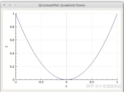
坐标轴刻度、间隔和显示的数字是由axis ticker决定的,它是QCPAxisTicker类型的变量,通过xAxis->ticker()访问。
可以通过xAxis->ticker()->setTickCount(6)来调整坐标轴上显示的刻度数值的个数。默认情况下,这个个数是自适应的最少的个数。不过,也有一些特殊的情况,比如坐标轴是时间、日期、分类、对数坐标系的情况。
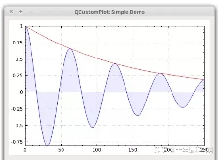
例1:两幅图叠加绘制
下边的代码是绘制一幅衰减的余弦曲线和它的指数包裹曲线,每条曲线即是一条Graph
 1     //添加两幅图并填充内容
 2     //第一幅图
 3     ui->customPlot->addGraph();
 4     //线的颜色
 5     ui->customPlot->graph(0)->setPen(QPen(Qt::blue));
 6     //用半透明的蓝色填充
 7     ui->customPlot->graph(0)->setBrush(QBrush(QColor(0,0,255,20)));
 8
 9     //第二幅图
10     ui->customPlot->addGraph();
11     ui->customPlot->graph(1)->setPen(QPen(Qt::red));
12
13     //生成数据点
14     QVector<double> x(251),y0(251),y1(251);
15     for(int i=0;i<251;i++){
16         x[i]=i;
17         y0[i]=qExp(-i/150.0)*qCos(i/10.0);//指数衰减的余弦曲线
18         y1[i]=qExp(-i/150.0);//指数包裹曲线
19     }
20     //配置上和右坐标轴来显式刻度,但是不显示数字
21     ui->customPlot->xAxis2->setVisible(true);
22     ui->customPlot->xAxis2->setTickLabels(false);
23     ui->customPlot->yAxis2->setVisible(true);
24     ui->customPlot->yAxis->setTickLabels(false);
25
26     //修改左和底坐标轴,使之与右和上坐标轴始终匹配
27     connect(ui->customPlot->xAxis, SIGNAL(rangeChanged(QCPRange)), ui->customPlot->xAxis2, SLOT(setRange(QCPRange)));
28     connect(ui->customPlot->yAxis, SIGNAL(rangeChanged(QCPRange)), ui->customPlot->yAxis2, SLOT(setRange(QCPRange)));
29
30     //为每幅图设置点
31     ui->customPlot->graph(0)->setData(x,y0);
32     ui->customPlot->graph(1)->setData(x,y1);
33
34     //使图0自适应范围
35     ui->customPlot->graph(0)->rescaleAxes();
36     //图1页一样,但是只允许放大,以免比图0小
37     ui->customPlot->graph(1)->rescaleAxes(true);
38     //注意,以上两步也可以用ui->customPlot->rescaleAxes();来代替
39
40     //允许用户用鼠标拖拉、缩放、选择任一幅图
41     ui->customPlot->setInteractions(QCP::iRangeDrag | QCP::iRangeZoom | QCP::iSelectPlottables);
结果:
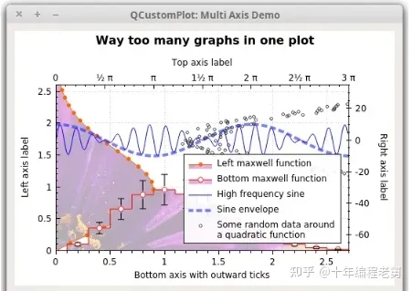
例2:多轴、多样式绘图
接下来,我们来看一个更复杂的例子,这个例子中包含了4个坐标轴上的4个Graph,纹理填充,垂直误差、图例、分割点等内容
  1     QCustomPlot * cp = ui->customPlot;
  2     QCustomPlot * customPlot = cp;
  3     //设置区域,点号作为小数分隔符、逗号作为千位分隔符
  4     cp->setLocale(QLocale(QLocale::English,QLocale::UnitedKingdom));
  5     cp->legend->setVisible(true);
  6     //用MainWindow字体,减小字体大小
  7     QFont legendFont=font();
  8     legendFont.setPointSize(9);
  9     cp->legend->setFont(legendFont);
 10     cp->legend->setBrush(QBrush(QColor(255,255,255,230)));
 11     //默认情况下,图例是嵌入主框架之中,接下来演示如何修改它的布局
 12     cp->axisRect()->insetLayout()->setInsetAlignment(0,Qt::AlignBottom | Qt::AlignRight);
 13
 14     //配置第一幅图,Key轴是左,Value轴是底
 15     cp->addGraph(cp->yAxis,cp->xAxis);
 16     cp->graph(0)->setPen(QPen(QColor(255,100,0)));
 17     cp->graph(0)->setBrush(QBrush(QPixmap("./balboa.jpg")));
 18     cp->graph(0)->setLineStyle(QCPGraph::lsLine);
 19     cp->graph(0)->setScatterStyle(QCPScatterStyle(QCPScatterStyle::ssDisc,5));
 20     cp->graph(0)->setName("Left maxwell function");
 21
 22     //配置第二幅图,Key是底,Value是左
 23     customPlot->addGraph();
 24     customPlot->graph(1)->setPen(QPen(Qt::red));
 25     customPlot->graph(1)->setBrush(QBrush(QPixmap("./balboa.jpg"))); // same fill as we used for graph 0
 26     customPlot->graph(1)->setLineStyle(QCPGraph::lsStepCenter);
 27     customPlot->graph(1)->setScatterStyle(QCPScatterStyle(QCPScatterStyle::ssCircle, Qt::red, Qt::white, 7));
 28     customPlot->graph(1)->setName("Bottom maxwell function");
 29     QCPErrorBars * errorBars = new QCPErrorBars(customPlot->xAxis,customPlot->yAxis);
 30     errorBars->removeFromLegend();
 31     errorBars->setDataPlottable(cp->graph(1));
 32
 33     //配置第三幅图,Key是顶,Value是右
 34     customPlot->addGraph(customPlot->xAxis2, customPlot->yAxis2);
 35     customPlot->graph(2)->setPen(QPen(Qt::blue));
 36     customPlot->graph(2)->setName("High frequency sine");
 37     //配置第四幅图,轴与第三幅图相同
 38     customPlot->addGraph(customPlot->xAxis2, customPlot->yAxis2);
 39     QPen blueDotPen;
 40     blueDotPen.setColor(QColor(30, 40, 255, 150));
 41     blueDotPen.setStyle(Qt::DotLine);
 42     blueDotPen.setWidthF(4);
 43     customPlot->graph(3)->setPen(blueDotPen);
 44     customPlot->graph(3)->setName("Sine envelope");
 45     //配置第五幅图,右为Key轴,顶为Value轴
 46     //第五幅图中包含一些随机扰动的点
 47     customPlot->addGraph(customPlot->yAxis2, customPlot->xAxis2);
 48     customPlot->graph(4)->setPen(QColor(50, 50, 50, 255));
 49     customPlot->graph(4)->setLineStyle(QCPGraph::lsNone);
 50     customPlot->graph(4)->setScatterStyle(QCPScatterStyle(QCPScatterStyle::ssCircle, 4));
 51     customPlot->graph(4)->setName("Some random data around\na quadratic function");
 52
 53     //生成数据
 54     QVector<double> x0(25), y0(25);
 55     QVector<double> x1(15), y1(15), y1err(15);
 56     QVector<double> x2(250), y2(250);
 57     QVector<double> x3(250), y3(250);
 58     QVector<double> x4(250), y4(250);
 59     for (int i=0; i<25; ++i) // data for graph 0
 60     {
 61       x0[i] = 3*i/25.0;
 62       y0[i] = qExp(-x0[i]*x0[i]*0.8)*(x0[i]*x0[i]+x0[i]);
 63     }
 64     for (int i=0; i<15; ++i) // data for graph 1
 65     {
 66       x1[i] = 3*i/15.0;;
 67       y1[i] = qExp(-x1[i]*x1[i])*(x1[i]*x1[i])*2.6;
 68       y1err[i] = y1[i]*0.25;
 69     }
 70     for (int i=0; i<250; ++i) // data for graphs 2, 3 and 4
 71     {
 72       x2[i] = i/250.0*3*M_PI;
 73       x3[i] = x2[i];
 74       x4[i] = i/250.0*100-50;
 75       y2[i] = qSin(x2[i]*12)*qCos(x2[i])*10;
 76       y3[i] = qCos(x3[i])*10;
 77       y4[i] = 0.01*x4[i]*x4[i] + 1.5*(rand()/(double)RAND_MAX-0.5) + 1.5*M_PI;
 78     }
 79
 80     //为每幅图设置数据
 81     customPlot->graph(0)->setData(x0, y0);
 82     customPlot->graph(1)->setData(x1, y1);
 83     errorBars->setData(y1err);
 84     customPlot->graph(2)->setData(x2, y2);
 85     customPlot->graph(3)->setData(x3, y3);
 86     customPlot->graph(4)->setData(x4, y4);
 87     //激活顶和右坐标轴
 88     customPlot->xAxis2->setVisible(true);
 89     customPlot->yAxis2->setVisible(true);
 90     //设置显示数据的合适的范围
 91     customPlot->xAxis->setRange(0, 2.7);
 92     customPlot->yAxis->setRange(0, 2.6);
 93     customPlot->xAxis2->setRange(0, 3.0*M_PI);
 94     customPlot->yAxis2->setRange(-70, 35);
 95     //为顶轴设置刻度为pi相关刻度
 96     customPlot->xAxis2->setTicker(QSharedPointer<QCPAxisTickerPi>(new QCPAxisTickerPi));
 97     //添加标题布局
 98     customPlot->plotLayout()->insertRow(0);
 99     customPlot->plotLayout()->addElement(0, 0, new QCPTextElement(customPlot, "Way too many graphs in one plot", QFont("sans", 12, QFont::Bold)));
100     //设置各个轴的标签
101     customPlot->xAxis->setLabel("Bottom axis with outward ticks");
102     customPlot->yAxis->setLabel("Left axis label");
103     customPlot->xAxis2->setLabel("Top axis label");
104     customPlot->yAxis2->setLabel("Right axis label");
105     //使底轴刻度向外延伸
106     customPlot->xAxis->setTickLength(0, 5);
107     customPlot->xAxis->setSubTickLength(0, 3);
108     //使右轴刻度向内和向外延伸
109     customPlot->yAxis2->setTickLength(3, 3);
110     customPlot->yAxis2->setSubTickLength(1, 1);
结果:
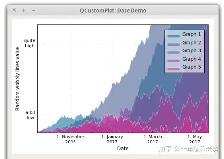
例3:绘制日期、时间数据
本例介绍如何绘制时间、日期相关的数。要实现这一目的,需要在每个轴上使用 QCPAxisTickerDateTime作为轴刻度。
 1     QCustomPlot * cp = ui->customPlot;
 2     QCustomPlot * customPlot = ui->customPlot;
 3
 4     cp->setLocale(QLocale(QLocale::English,QLocale::UnitedKingdom));
 5     //当前时间戳,用它作为起始点
 6     double now = QDateTime::currentDateTime().toSecsSinceEpoch();
 7     //设置随机数种子
 8     srand(8);
 9     //生成多幅graph
10     for(int gi=0;gi<5;gi++){
11         cp->addGraph();
12         QColor color(20+200/4.0*gi,70*(1.6-gi/4.0),150,150);
13         cp->graph()->setLineStyle(QCPGraph::lsLine);
14         cp->graph()->setPen(QPen(color.lighter(200)));
15         cp->graph()->setBrush(QBrush(color));
16         //产生随机数据
17         QVector<QCPGraphData> timeData(250);
18         for (int i=0;i<250;i++){
19             timeData[i].key=now+24*3600*i;
20             if(i==0)
21                 timeData[i].value =(i/50.0+1)*(rand()/(double)RAND_MAX-0.5);
22             else
23                 timeData[i].value=qFabs(timeData[i-1].value)*(1+0.02/4.0*(4-gi))+(i/50.0+1)*(rand()/(double)RAND_MAX-0.5);
24             cp->graph()->data()->set(timeData);
25
26         }
27         //配置底轴以显示日期而非数字
28         QSharedPointer<QCPAxisTickerDateTime>dateTicker(new QCPAxisTickerDateTime);
29         dateTicker->setDateTimeFormat("d._MMMM\nyyyy");
30         cp->xAxis->setTicker(dateTicker);
31         //配置左轴
32         QSharedPointer<QCPAxisTickerText> textTicker(new QCPAxisTickerText);
33         textTicker->addTick(10,"a bit\nlow");
34         textTicker->addTick(50,"quite/nhigh");
35         cp->yAxis->setTicker(textTicker);
36         //为左轴和底轴的刻度设置合适的字体
37         cp->xAxis->setTickLabelFont(QFont(QFont().family(),8));
38         cp->yAxis->setTickLabelFont(QFont(QFont().family(),8));
39         //设置轴标签
40         cp->xAxis->setLabel("Date");
41         cp->yAxis->setLabel("Random wobbly lines value");
42         //使顶轴和右轴可见,但是并不显示刻度值和标签
43         customPlot->xAxis2->setVisible(true);
44         customPlot->yAxis2->setVisible(true);
45         customPlot->xAxis2->setTicks(false);
46         customPlot->yAxis2->setTicks(false);
47         customPlot->xAxis2->setTickLabels(false);
48         customPlot->yAxis2->setTickLabels(false);
49         //设置轴范围以显示所有数据
50         cp->xAxis->setRange(now,now+24*3600*249);
51         cp->yAxis->setRange(0,60);
52         //显示图例,图例背景轻微透明
53         cp->legend->setVisible(true);
54         cp->legend->setBrush(QColor(255,255,255,150));
结果:
我们传入dateTicker ->setDateTimeFormat()中的字符串,需要符合ISO8601时间格式,除了时间格式之外的其他字符都会原封不动的保留,而时间格式的字符会被正确填充。
需要注意的是,QCustomPlot处理的时间/日期坐标系,都是以时间戳0起始坐标点的,,单位是s。所以当我们构造时,也要以时间戳为横坐标,只是在显示的时候通过时间/日期占位符转化为指定的时间/日期。
如果精度是比秒更小的单元,那么可以用浮点数。我们可以用 QCPAxisTickerDateTime ::dateTimeToKey和 keyToDateTime用于浮点Unix Time和QDateTime间的转换。
而对于QDateTime::toMSecsSinceEpoch,则是以毫秒为单位,也可以使用这种方式构建更微小的时间精度。
3、图形之外:曲线、图标、统计图
目前为止,我们只应用了Graph,因为Graph是我们使用QCustomPlot的主要内容,QCustomPlot为我们使用Graph提供了专门的接口,我们也一直在使用它们,比如 QCustomPlot ::addGraph、 QCustomPlot ::graph等等。但是这些并不是全部。
QCustomPlot也有许多更通用的绘图接口,称为Plottable,这个接口是围绕抽象类 QCPAbstractPlottable构建的。所有的Plottables都是从这个类继承而来,当然也包括了最熟悉的 QCPGraph类。现在介绍一些 QCustomPlot提供的Plottable类:
QCPGraph:这是我们本节经常用的一个Plottable类。用于点、线、填充的方式展示一系列的数据;
QCPCurve:与QCPgraph类似,不同之处在于它用于展示参数曲线。不同于函数Graph,使用这个类时可能有循环;
QCPBars:柱状图;
QCPStatisticalBox::箱型图;
QCPColorMap:通过使用颜色梯度将第三个维度可视化的2D图;
QCPFinancial: 用于可视化股价的Plottable;
QCPErrorBars: 一个特殊的Plottable,附加在另一个Plottable上用于显示数据点的误差情况。
不同于Graph,其他的Plottable需要用new进行构造,而不是用addCurve、addBars等函数创建。已经存在的Plottable可以通过 QCustomPlot ::plottable(int index)访问,plottable的数量可以用 QCustomPlot::plottableCount访问。
下文是构造柱状图的例子:
 1 QCPBars *myBars = new QCPBars(customPlot->xAxis, customPlot->yAxis);
 2 // now we can modify properties of myBars:
 3 myBars->setName("Bars Series 1");
 4 QVector<double> keyData;
 5 QVector<double> valueData;
 6 keyData << 1 << 2 << 3;
 7 valueData << 2 << 4 << 8;
 8 myBars->setData(keyData, valueData);
 9 customPlot->rescaleAxes();
10 customPlot->replot();
(三)——用户交互
1、范围调整
默认情况下,用户调整坐标轴范围的方法是在分别在对应的QCPAxisRect上进行拖拽。
为了实现在QCustomPlot上实现范围拖拽,需要在当前允许的交互上增加Flag QCP ::iRangeDrag。这一点可以通过customPlot -> setInteraction( QCP::iRangeDrag , true)做到。如果想要只允许在一个方向上拖拽,可以用QCPAxisRect::setRangeDrag并且制定参数为Qt::Vertical或Qt::Horizontal。如果想允许在所有方向上拖拽(当然这也是默认的),可以用 Qt::Vertical | Qt::Horizontal 作为参数。
在拖拽过程中,通过 QCPAxisRect ::setRangeDragAxes设置的轴将会实时更新其范围;这将会给用户通过抓取坐标平面来实现移动坐标系的感觉。默认的QCustomPlot的轴是 QCustomPlot ::xAxis和 QCustomPlot::yAxis。
以上只是改变了范围的区间,如果我们想改变范围的大小,例如缩放图像,用户可能会用鼠标滚轮。该行为是通过Flag QCP ::iRangeZoom控制的,当然它也需要用 QCustomPlot ::setInteraction来激活。和拖拽类似,对于缩放的轴和方向也是可以选择的,具体可以看函数 QCPAxisRect ::setRangeZoomAxes 和 QCPAxisRect ::setRangeZoom。除此之外,缩放因子(滚动一次滚轮时缩放倍数)由 QCPAxisRect::setRangeZoomFactor决定。
2、选择要素
2.1、某一类要素的选择
QCustomPlot提供了要素选择的机制,允许用户选择画布上的任意要素,例如坐标轴和图像。
某一类要素是否可以选中,是通过在setInteraction方法中设置Flag QCP::iSelect(...)来实现的。例如,通过设置customPlot -> setInteraction( QCP::iSelectPlottables , true )就允许用户通过点击的方法来选中Plottable(比如图像)。通过参考文档 QCP ::Interaction可以获取全部交互Flag。
如果想要同时选中多个要素,可以设置交互Flag QCP ::iMultiSelect。这样用户就可以拖过按CTRL键,依次选中多个要素。(这个键位可以通过 QCustomPlot ::setMultiSelectModifier修改)。
被选中的要素会用加粗的蓝色线条绘制。
2.2、控制单个要素的选择
对某个具体对象的可选属性,可以用 setSelectable方法进行调整。例如,如果我们不想某个图像被用户选择,可以用方法thatGraph ->setSelectable(false)。
要素的选择状态可以用 setSelected函数进行调整,这样的话,即使某个要素是无法选中的(通过上一段的方法),我们依然可以通过该方法来在程序中通过上述方法修改它的状态为选中的。
如果要取消对于画板上所有要素的选择,可以用 QCustomPlot ::deselectAll。
2.3、被选择要素的外观
一个被选中的要素通常会用和它原来绘制方式不同的画笔、刷子、字体来显示。这一点可以通过方法 QCPGraph ::setSelectedPen, QCPGraph ::setSelectedBrush, QCPAxis ::setSelectedLabelFont,QCPAxis::setSelectedBasePen, QCPItemText ::setSelectedColor来进行修改。至于这些方法的含义,可以很容易从它们的名字中看出来。
这些方法,和一开始绘制要素时的方法名十分相似,就是加了前缀"Selected"。
2.4、要素的多个组成部分
一些要素(比如坐标轴、图例)可能有多个组成部分,这时如果我们只用一个boolean参数来表示选择状态就不太合适了。这种情况下,不管是可选择性还是选中状态,都应当是SelectablePart的Flag的一组 or组合,也就是说,不同的组分要分别通过它们各自的QFlag的组合(通过or连接)来说明。
每个多组分的要素都需要定义一个它自己的SelectablePart。
例如,QCPAxis通常是由三部分组成的——刻度线、刻度数字、轴标签(如下)。
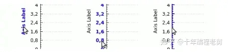
因此这三部分都需要各自指明它们的可选择性, QCPAxis ::SelectablePart定义了 QCPAxis ::spNone、 QCPAxis ::spAxis、 QCPAxis ::spTickLabels和 QCPAxis ::spAxisLabel。如果想要刻度线和刻度数字可选,但是轴标签不可选,可以用theAxis ->setSelectableParts( QCPAxis ::spAxis|QCP ::spTickLabels)。
如果想控制当前的多组分选择状态,可以用 QCPAxis ::setSelectedParts方法。
2.5、对要素选中状态的响应
每当选中要素改变时,每个要素都会发送一个信号selectionChanged。不管这个改变是由于用户自主选择引起的还是程序中通过调用方法 setSelected/ setSelectedParts引起的。
如果是由于用户交互引起的改变,会发送QCustomPlot::selectionChangedByUser信号。在该信号的槽函数中,我们可以检查特定要素的选中状态并对其做出反应。如果要检查某种特定类型的选中,可以用方法 QCustomPlot ::selectedPlottables、 selectedItems、 selectedAxes和 selectedLegends。
3、用户交互信号
用户交互信号与选择机制是相互独立的,QCustomPlot会基于用户的操作发送多重信号。最低级的信号是QCustomPlot::mouseDoubleClick、mousePress、mouseMove、mouseRelease和mouseWheel信号,这些信号的发送时机,可以从它们的名字中看出来。
也有一些高级的信号,它们表示在具体对象上发生的事件——QCustomPlot::plottableClick、plottableDoubleClick、itemClick、itemDoubleClick、axisClick、axisDoubleClick、legendClick、legendDoubleClicktitleClick和titleDoubleClick。
所有这些信号都表示了具体哪个要素被点击了,正如和QMouseEvent相关的事件那样。
案例Package中包含了一个使用多方面用户交互系统的例子(这里不再说明),它也告诉了我们如何改进交互系统以更好满足我们需求的方法。