
学习心得,思维导图:
掌握情况:还行
学习总结:
css三大特性:
1.层叠性
一个标签可以有多个css样式
浏览器处理冲突的能力,如果一个属性通过两个相同的选择器设置到元素上,样式的层叠规则按照样式的声明顺序来层叠,就近原则。
前提:选择器必须是同一种。样式不冲突,就不会层叠。
2.继承性
子标签会继承父标签的某些样式。比如说文本颜色和字号。
3.优先级
权重:
(1)继承 0 --- 最低
(2)行内样式 100
(3)权重相同,就近原则
(4)!important 命令 无限大
css权重公式:
- 继承 * 0,0,0,0
- 标签选择器 0,0,0,1
- 类,伪类选择器 0,0,1,0
- ID选择器 0,1,0,0
- 行内样式 1,0,0,0
- !important 无穷大
- width ,height 大于无穷大
max-width,max-height
min-width,min-height
div ul li --- 0,0,0,3
li --- 0,0,0,1
a:link----0,0,1,1
div a ---- 0,0,0,2
权重不能被继承
贡献值是没有进位
!important。如果同时有max-width,max-height,!important不管用
常用的单位
px(像素):最常用
em(绝对单位):比如说父级的字号16px,我可以设置成2em
rem:由整个html的字号决定,当我们改变了浏览器的字号设置,页面的字号也会发生变化,
百分比:相对父元素的比例
关于一些修饰
|
字体大小: |
font-size: 20px; |
|
字体样式: |
font-style: italic; |
|
字体粗细: |
font-weight: bold; |
|
字体: |
font-family: monospace; |
|
字体修饰: |
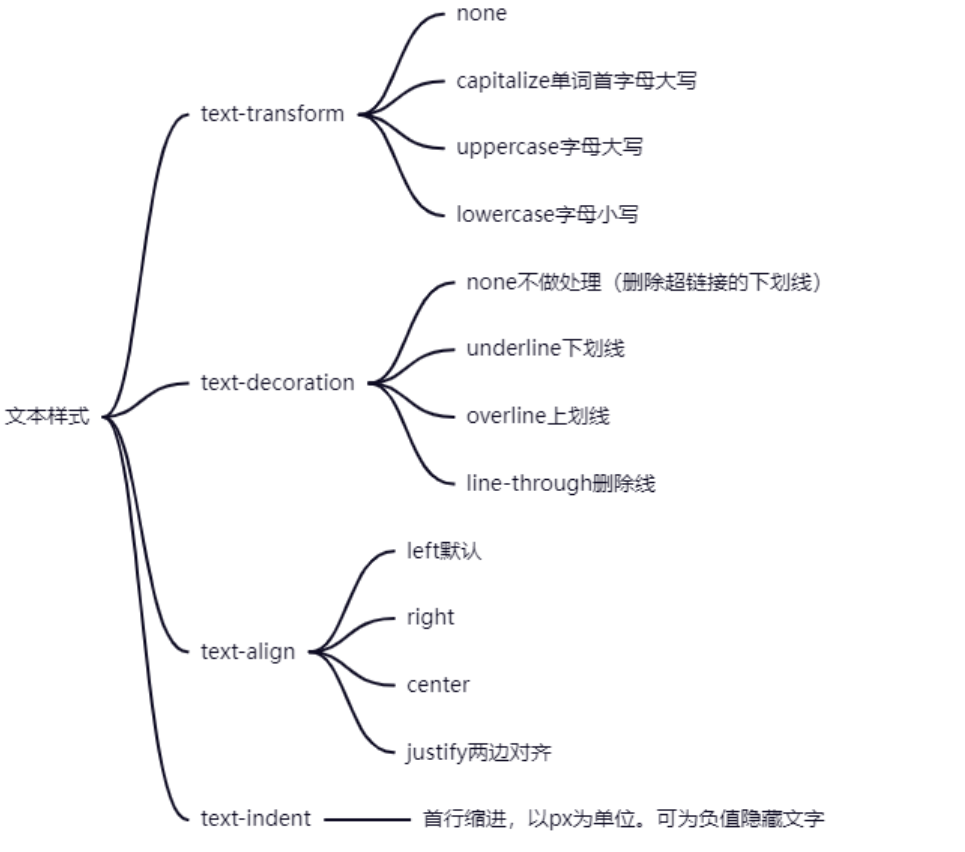
text-decoration:underline; |
|
背景颜色: |
background-color: rgba(25, 77, 135, 0.7); |
区块属性:定义一个元素的显示方式
          .div1{
                background-color: green;
            }
            .div2 {
                background-color: blue;
            }
            .div3 {
                background-color: yellow;
            }
            .div4 {
                background-color: red;
            }


            .div5 {
                background-color: orange;
                /* 隐藏元素 */
                display: none;
            }
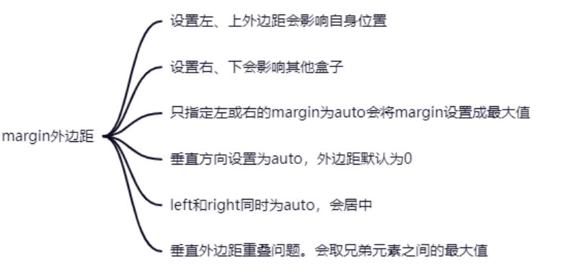
盒子模型
 1        div {
 2                 width: 300px;
 3                 height: 300px;
 4                 background-color: orange;
 5                 /* 外边距 */
 6                 margin:100px;
 7                 border: 10px solid red;
 8                 padding: 20px;
 9                 /* border-box:保证盒子的大小是300*300,外边距不包括 */
10                 /* box-sizing: border-box; */
11                 /* content-box:保证当前div的尺寸是300*300,不包含内边距和边框线 */
12                 box-sizing: content-box;
13                 /*
14                     会算盒子的各个尺寸
15                 */
16             }
定位的left和top
right和bottom
left是相对于父元素的位置
left是定位的属性
margin-left有啥区别?
相对于自己的初始位置,margin是盒子模型的属性
在开发中,尽量统一使用
文档流
在网页中将窗体自上而下分成好多行,并在每行从左到右的顺序排列元素,即为文档流。网页默认的布局方式。
定位position
1.static:文档流,默认的
2.absolute:绝对定位
相对于一个父元素的绝对定位
在设置了绝对定位之后,元素会脱离文档流,在页面浮起来
3.relative:相对定位
相对于上一个元素的位置
4.fixed:固定定位
子绝父相:子元素绝对定位,父元素相对定位
animate动画
transition和animate区别?
transition只能通过固定的属性来开始与结束值
 1 .div1 {
 2                 /* 引用自定义动画,延迟时间 */
 3                 animation: myAnim 5s;
 4             }
 5             /* 先声明动画,再使用 */
 6             @keyframes myAnim {
 7                 0% {
 8                     width: 100px;
 9                     height: 100px;
10                     background-color: orange;
11                 }
12                 25%{
13                     width: 200px;
14                     height: 200px;
15                     background-color: blue;
16                 }
17                 50% {
18                     width: 400px;
19                     height: 400px;
20                     background-color: red;transform: rotate(45deg);
21                 }
22                 75% {
23                     width: 200px;
24                     height: 200px;
25                     background-color: blue;transform: rotateZ(180deg);
26                 }
27                 100% {
28                     width: 100px;
29                     height: 100px;
30                     background-color: orange;transform: rotate3d(270deg);
31                 }
32             }
flex布局
块级元素和行内块级元素
1.父容器要加上display:flex


 浙公网安备 33010602011771号
 你点我就回上面去了ヾ(≧O≦)〃嗷~