
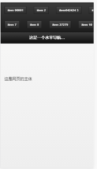
<!DOCTYPE html>
<html>
<head>
    <meta charset="utf-8">
    <meta name="viewport" content="width=device-width,initial-scale=1,maximum-scale=1.0 ,user-scalable=no">
    <link rel="stylesheet" href="http://code.jquery.com/mobile/1.3.2/jquery.mobile-1.3.2.min.css">
    <script src="http://code.jquery.com/jquery-1.8.3.min.js"></script>
    <script src="http://code.jquery.com/mobile/1.3.2/jquery.mobile-1.3.2.min.js"></script>

    <style>
        #overflow {
            border: 1px solid #000;
            overflow-x: scroll;
            overflow-y: hidden;
        }

        #overflow .container div {
            float: left;
            padding: 6px 10px
        }
    </style>
</head>
<body>
<div data-role="page" id="currentorders">
    <header data-role="header" data-position="fixed">
        <nav data-role="navbar">
            <div id="overflow">
                <div class="container">
                    <div><a href="" class="yellow">item 00001</a>
                    </div>
                    <div><a href="" class="orange">item 2</a>
                    </div>
                    <div><a href="" class="red">item042424 3</a>
                    </div>
                    <div><a href="" class="yellow">item 4</a>
                    </div>
                    <div><a href="" class="orange">item 5</a>
                    </div>
                    <div><a href="" class="red">item245242 6</a>
                    </div>
                    <div><a href="" class="red">item 7</a>
                    </div>
                    <div><a href="" class="red">item 8</a>
                    </div>
                    <div><a href="" class="red">item 27279</a>
                    </div>
                    <div><a href="" class="red">item 10</a>
                    </div>
                    <div><a href="" class="red">item 11</a>
                    </div>
                </div>
            </div>
        </nav>
        <div data-role="header">
            <h3>这是一个水平导航栏,并且支持水平滚动</h3>
        </div>
    </header>
    <div data-role="content">
        这是网页的主体
    </div>

</div>
</body>
<script>
    $('#currentorders').live("pageshow", function () {
        var width = 0;
        var afterDiv = 0;
        $('#overflow .container div').each(function () {
            width += $(this).outerWidth(true);
            afterDiv = $(this).outerWidth(true);
        });
        console.log(afterDiv);
        $('#overflow .container').css('width', width / 2 + afterDiv + "px");
    })

    $("#overflow .container div a").live('touchstart', function () {
        var width = 0;
        var afterDiv = 0;
        $('#overflow .container div').each(function () {
            width += $(this).outerWidth(true);
            afterDiv = $(this).outerWidth(true);
        });
        $('#overflow .container').css('width', width / 2 + afterDiv + "px")
        ;
    })

</script>
</html>
Me discréditer résister, peut supporter beaucoup de compliments!

 浙公网安备 33010602011771号