一、前言
布局的传统解决方案,基于盒状模型,依赖 display 属性 + position属性 + float属性。它对于那些特殊布局非常不方便,比如,垂直居中就不容易实现。
2009年,W3C 提出了一种新的方案----Flex 布局,可以简便、完整、响应式地实现各种页面布局。目前,它已经得到了所有浏览器的支持,这意味着,现在就能很安全地使用这项功能。Flex 布局将成为未来布局的首选方案。
二、Flex概念
2.1 简介
Flex 是 Flexible Box 的缩写,意为"弹性布局",用来为盒状模型提供最大的灵活性。
任何一个容器都可以指定为 Flex 布局。
Webkit 内核的浏览器,必须加上-webkit前缀。
.box{
  display: -webkit-flex; /* Safari */
  display: flex;
}
注意,设为 Flex 布局以后,子元素的float、clear和vertical-align属性将失效。
2.2 基本概念
采用 Flex 布局的元素,称为 Flex 容器(flex container),简称"容器"。
它的所有子元素自动成为容器成员,称为 Flex 项目(flex item),简称"项目"。
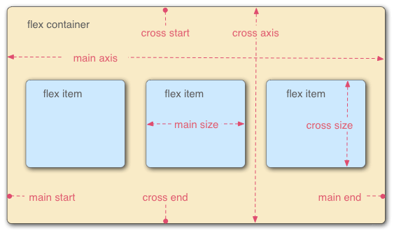
容器默认存在两根轴:水平的主轴(main axis)和垂直的交叉轴(cross axis)。主轴的开始位置(与边框的交叉点)叫做main start,结束位置叫做main end;交叉轴的开始位置叫做cross start,结束位置叫做cross end。
项目默认沿主轴排列。
单个项目占据的主轴空间叫做main size,占据的交叉轴空间叫做cross size。
三、父项常见属性
1)、flex-direction:设置主轴的方向
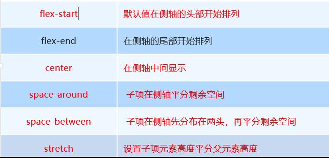
2)、justify-content:设置主轴上的子元素排列方式
3)、flex-wrap:设置子元素是否换行
4)、align-content:设置侧轴上的子元素的排列方式(多行)
5)、align-items:设置侧轴上的子元素排列方式(单行)
6)、flex-flow:复合属性,相当于同时设置了 flex-direction 和 flex-wrap
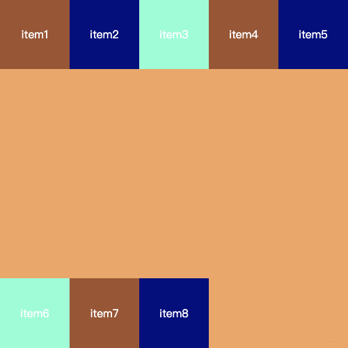
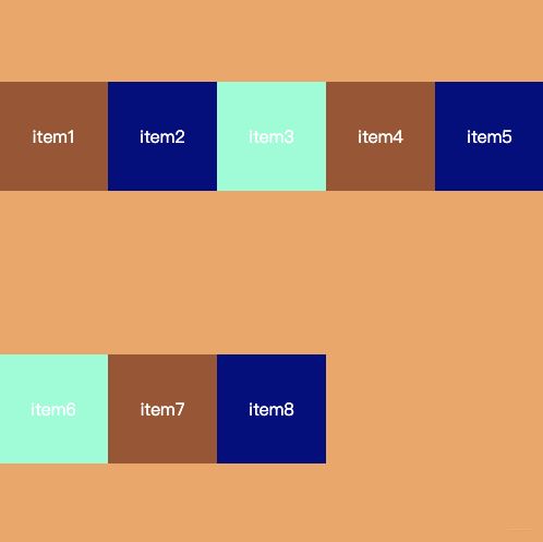
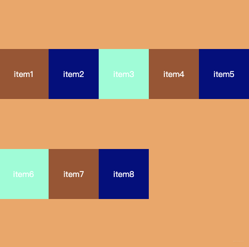
3.1 flex-direction 设置主轴的方向
flex items默认都是沿着main axis(主轴)从main start开始往main end方向排布
flex-direction决定了main axis的方向,有四个取值,分别为:
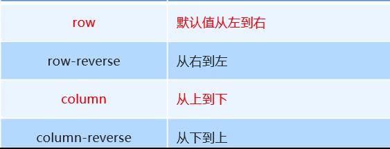
依次对应示例如图:

3.2 justify-content
justify-conten决定了flex item在主轴的对齐方式,取值有:
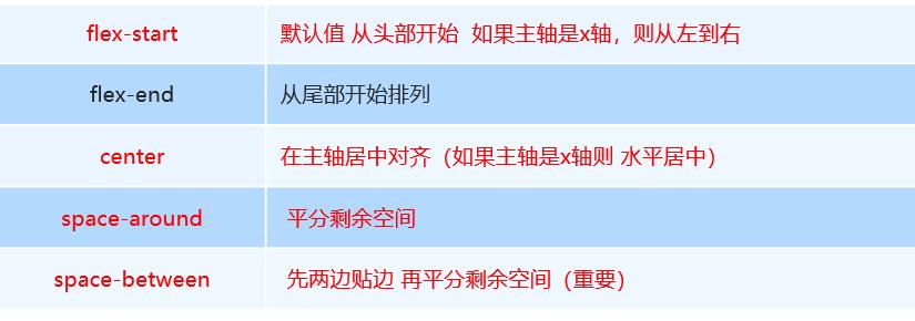
- flex-start(默认值):与main start对齐

- flex-end: 与main end对齐
- center: 居中对齐

- space-between: flex items之间距离相等,与main start、main end两端对齐
- space-evenly: flex items之间距离相等,与main start、main end之间的距离等于flex items之间的距离
- space-around: flex items之间的距离相等,flex items与main start、main end之间的距离是flex items之间距离的一半
3.3 align-items
align-items决定了flex items在cross axis上的对齐方式,其取值如下:

-
normal: 在弹性布局中,效果和stretch一样
-
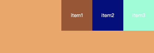
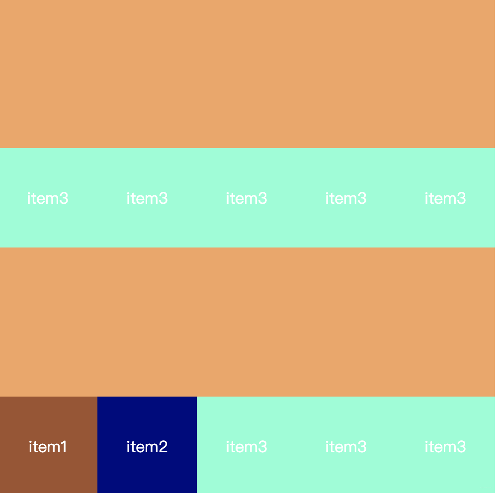
stretch: 当flex items在cross axis方向的size为auto时,会自动拉伸至填充flex container,当未设置item1 item2 item3高度时,会自动拉伸填满:

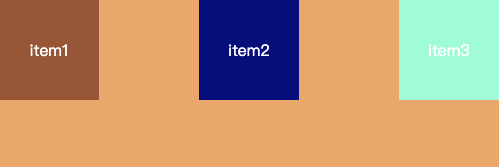
当设置item高度时,效果如下:
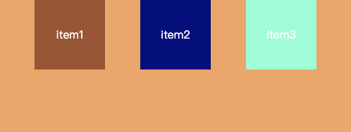
flex-start: 与cross start对齐
flex-end: 与corss end对齐

center: 居中对齐

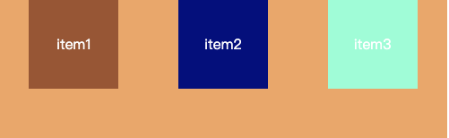
baseline: 与第一行文字的基准线对齐
3.4 flex-wrap
flex-wrap决定了flex container是单行还是多行显示,取值有如下三个:
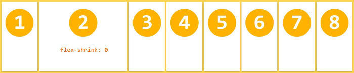
-nowrap:默认值,单行,所有flex-items都在一行显示,如果展示不开的话,会对宽度进行压缩
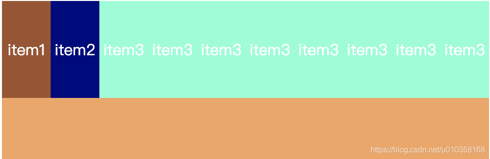
可以发现,这时的宽度已经不是我们设置的宽度值了,flex对各个item宽度进行了压缩
-wrap: 换行显示

-wrap-reverse: 换行,第一行在下方
3.5 flex-flow
flex-flow是flex-direction和flex-wrap的缩写属性,默认值为row nowrap.
.box {
  flex-flow: <flex-direction> || <flex-wrap>;
}
3.6 align-content
align-content决定了多行flex items在cross axis上的对齐方式,用法与justify-content类似,取值如下:
- stretch:默认值,轴线占满整个交叉轴
- flex-start:与cross start对齐

- flex-end:与cross end对齐

- center: 居中对齐
- space-between: flex items之间的距离相等,与cross start 、 cross end两端对齐
- space-around: flex items之间距离相等,flex item与cross start、cross end之间的距离是flex items之间距离的一半
- space-evenly: flex items之间的距离相等,flex items与cross start、cross end之间的距离等于flex items之间的距离
四、flex布局子项常见属性
1)、flex子项目占的份数
2)、align-self控制子项自己在侧轴的排列方式
3)、order属性定义子项的排列顺序(前后顺序)
4.1 order
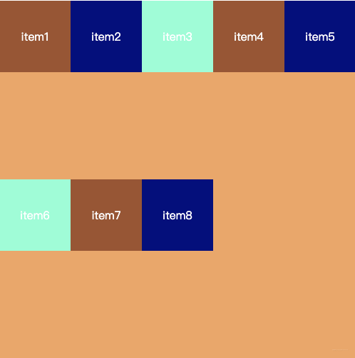
order决定了flex items的排布顺序。
- 可以设置任意整数(正整数 负整数 0) ,值越小,就越排在前面
- 默认值为0
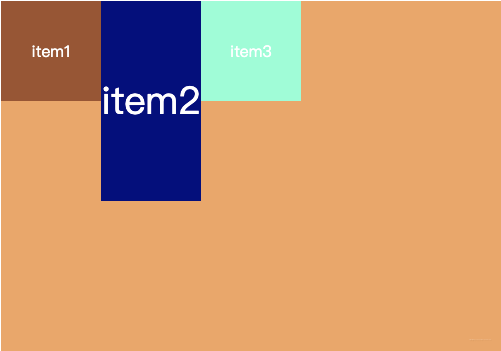
.item1 {
    background-color: sienna;
    order: 18;
}

.item2 {
    background-color: navy;
    order: 2;
}

.item3 {
    background-color: aquamarine;
    order: 99;
}

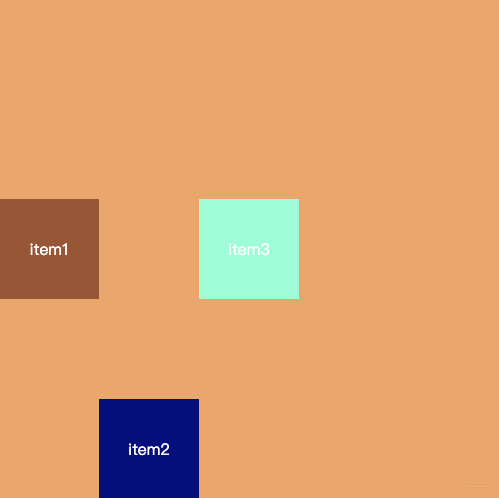
4.2 align-self
flex items可以通过align-self覆盖flex container中设置的align-items。
- 默认值为auto,遵从flex container的align-items设置
- stretch、flex-start、flex-end、center、baseline效果与align-items一致
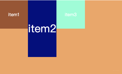
<!DOCTYPE html>
<html lang="en">

<head>
    <meta charset="UTF-8">
    <meta name="viewport" content="width=device-width, initial-scale=1.0">
    <title>Document</title>

    <style>
        .box {
            /*
                开启flex后,就不再区分块级元素和行内元素了
             */
            display: flex;
            width: 500px;
            height: 500px;
            background-color: sandybrown;
            margin: 0 auto;
            align-items: center;
        }

        .item {
            width: 100px;
            height: 100px;
            text-align: center;
            line-height: 100px;
            color: white;
        }

        .item1 {
            background-color: sienna;
            /* order: 18; */
        }

        .item2 {
            background-color: navy;
            align-self: flex-end;
            /* order: 2; */
        }

        .item3 {
            background-color: aquamarine;
            /* order: 99; */
        }
    </style>
</head>

<body>
    <div class="box">
        <div class="item item1">item1</div>
        <div class="item item2">item2</div>
        <div class="item item3">item3</div>

    </div>
</body>

</html>
效果:
4.3 flex-grow
flex-grow属性定义项目的放大比例
- 默认为0,可以设置任意非负数字
- 当flex container在main axis方向上有剩余size时,flex-grow属性才会有效
- 如果所有flex items的flex-grow总和sum超过1,每个flex item扩展的size=flex container的剩余size * flex-grow / sum
- 如果所有flex items的flex-grow总和sum小于1,每个flex items扩展的size=flex container的剩余size * flex-grow
- flex items扩展后的最终size不能超过max-width\max-height
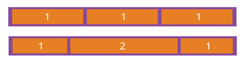
如果所有项目的flex-grow属性都为1,则它们将等分剩余空间(如果有的话)。如果一个项目的flex-grow属性为2,其他项目都为1,则前者占据的剩余空间将比其他项多一倍。
4.4 flex-shrink
flex-shrink决定了flex-items如何收缩。
-
默认值为1,可以设置任意非负数字,负值对该属性无效
-
当flex items在main axis方向上超过了flex container的size,flex-shrink属性才会有效
-
如果所有flex items的flex-shrink总和sum超过1,每个flex items收缩的size= flex items超出flex container的size * 收缩比例 /所有flex item的收缩比例之和
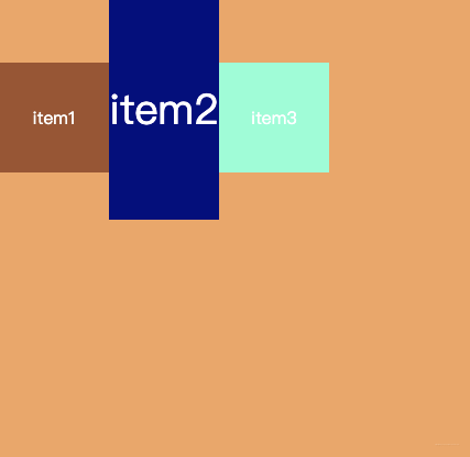
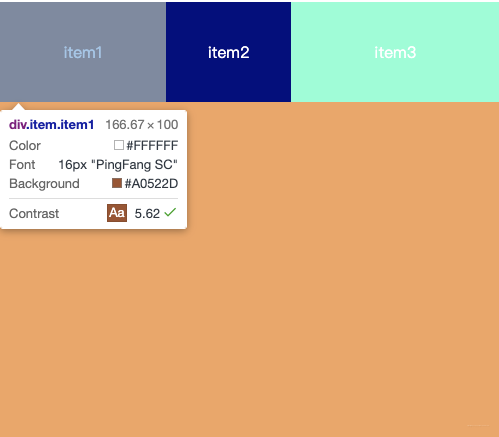
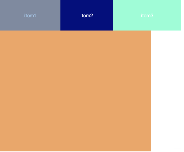
<style>
    .box {
        display: flex;
        width: 500px;
        height: 500px;
        background-color: sandybrown;
        margin: 0 auto;
    }

    .item {
        width: 250px;
        height: 100px;
        text-align: center;
        line-height: 100px;
        color: white;
    }

    .item1 {
        background-color: sienna;
        /* width = 250 -250/6*2 = 250 - 83.33 = 167.67 */
        flex-shrink: 2;
    }

    .item2 {
        background-color: navy;
        flex-shrink: 3;
    }

    .item3 {
        background-color: aquamarine;
        flex-shrink: 1;
    }
</style>
- 如果所有flex items的flex-shrink总和sum不超过1,每个flex item收缩的size= flex item的size - flex items超出flex container的size * flex-shrink
.item1 {
     background-color: sienna;
     /* width = 250 -250/6*2 = 250 - 83.33 = 167.67 */
     /* flex-shrink: 2; */
     /* width = 250 - 250*0.2 = 200 */
     flex-shrink: .2;
 }

 .item2 {
     background-color: navy;
      /* width = 250 - 250*0.3 = 175 */
     flex-shrink: .3;
 }

 .item3 {
     background-color: aquamarine;
      /* width = 250 - 250*0.2 = 225 */
     flex-shrink: .1;
 }
- flex items收缩后的最终size不能小于min-width/min-height
- 如果所有项目的flex-shrink属性都为1,当空间不足时,都将等比例缩小。如果一个项目的flex-shrink属性为0,其他项目都为1,则空间不足时,前者不缩小。
4.5 flex-basis
flex-basis用来设置flex items在main asis方向上的空间大小
- auto: 默认值,即项目本身大小
- 具体宽度数值: 100px , 200px
决定flex items最终base size的因素,优先级从高到低为:
- max-width\max-height\min-width\min-height
- flex-basis
- width/height
- 内容本身的size
4.6 flex
flex是flex-grow | flex-shrink | flex-basis三个属性的简写,flex属性可以指定1个,2个或三个值。
4.6.1 单值语法
值必须是其中之一:
- 一个无单位数(number):它会被当做flex-grow的值
- 一个有效的宽度(width)值:它会被当做flex-basis的值
- 关键字none auto 或initial
4.6.2 双值语法:
- 第一个值必须为一个无单位数,他会被当做flex-grow的值
- 第二个值必须为以下之一:
- 一个无单位数:它会被当做flex-shrink的值
- 一个有效的宽度值:它会被当做flex-basis的值
4.6.3 三值语法:
- 第一个值必须为无单位数,作为flex-grow的值
- 第二个值必须为无单位数,作为flex-shink的值
- 第三个值必须为有效的宽度值,作为flex-basis的值