
1、安装库
npm install typings echarts --global
npm install ngx-echarts --save
npm install @types/echarts --save
2、app.module引入
import { BrowserModule } from '@angular/platform-browser';
import { NgModule } from '@angular/core';
import { AppRoutingModule } from './app-routing.module';
import { AppComponent } from './app.component';
import { HomeComponent } from './home/home.component';
import {BrowserAnimationsModule} from "@angular/platform-browser/animations";
import {ButtonModule} from 'primeng/primeng';
import { HeaderComponent } from './components/header/header.component';  // header  components
import {NgxEchartsModule} from 'ngx-echarts';
@NgModule({
  declarations: [
    AppComponent,
    HomeComponent,
    HeaderComponent,
    // selfHttp
  ],
  imports: [
    BrowserModule,
    HttpClientModule,
    AppRoutingModule,
    BrowserAnimationsModule,
    ButtonModule,
    NgxEchartsModule
  ],
  providers: [httpInterceptorProviders, apiList,{provide: LocationStrategy, useClass: HashLocationStrategy}],
  bootstrap: [AppComponent]
})
export class AppModule { }
3、具体文件使用
html代码
<div #myCharts echarts [options]="chartOption" class="demo-chart charstDiv" ></div>
ts代码
import { Component, OnInit, Input } from '@angular/core';
import { MessageService } from 'primeng/api';
import * as ec from 'echarts';  // 没有安装ypes/echarts就会报错
@Component({
  selector: 'app-table',
  templateUrl: './table.component.html',
  styleUrls: ['./table.component.css'],
  providers: [MessageService]
})

export class TableComponent implements OnInit {


  chartOption: any;
  constructor(private messageService: MessageService) {

  }

  ngOnInit() {
    this.selectedColumns = this.tablelist.header;
    this.items = [
      {
        label: '查看', icon: 'pi pi-eye', command: (event) => this.showDialog()
      },
      { label: '删除', icon: 'pi pi-trash', command: (event) => this.del() }
    ];

  }
  onRowSelect(event) {
    this.data = {
      labels: [],
      datasets: []
    };
    this.displaySidebar = true;
    // 组装图表
    var data1 = [];
    var data2 = [];
    var data3 = [];
    this.selectedList.forEach((element, index) => {
      data1.push((element.month + '月'));
      // 销量
      data2.push(element.sale);
      // 店铺数
      data3.push(element.comNum);
    });
    this.chartOption = {
      // title: {
      //   text: '堆叠区域图'
      // },
      backgroundColor: '#2c343c',
      tooltip: {
        trigger: 'axis'
      },
      legend: {
        data: ['零售额', '店铺总数',],
        textStyle: {//图例文字的样式
          color: 'white',
          fontSize: 16
        }
      },
      toolbox: {
        orient: 'vertical',
        top: 'middle',
        feature: {
          // dataView: {//数据视图工具,可以展现当前图表所用的数据,编辑后可以动态更新。
          //   show: true,//是否显示组件。
          //   readOnly: false
          // },
          magicType: {//动态类型切换 示例:feature: { magicType: {type: ['line', 'bar', 'stack', 'tiled']}}
            show: true,
            type: ['line', 'bar']
          },
          restore: {//配置项还原。
            show: true
          },
          saveAsImage: {}
        }
      },
      dataZoom: {//dataZoom 组件 用于区域缩放,从而能自由关注细节的数据信息,或者概览数据整体,或者去除离群点的影响。
        type: 'slider',//滑动条型数据区域缩放组件
        start: 0,//起始位置0
        end: 100//结束位置100
      },
      grid: {
        left: '3%',
        right: '4%',
        bottom: '40px',
        containLabel: true
      },
      xAxis: [
        {
          type: 'category',
          boundaryGap: false,
          axisLabel: {
            interval: 0,
            textStyle: {
              color: '#c3dbff',  //更改坐标轴文字颜色
              fontSize: 14      //更改坐标轴文字大小
            }
          },
          data: data1,
          axisLine: {
            lineStyle: {
              color: 'white', //更改坐标轴颜色
            }
          }
        }
      ],
      yAxis: [
        {
          type: 'value',
          axisLabel: {
            interval: 0,
            textStyle: {
              color: '#c3dbff',  //更改坐标轴文字颜色
              fontSize: 14      //更改坐标轴文字大小
            }
          },
          axisLine: {
            lineStyle: {
              color: 'white', //更改坐标轴颜色
            }
          }
        }
      ],
      series: [
        {
          name: '零售额',
          type: 'line',
          stack: '总量',
          areaStyle: {normal: {
            color:new ec.graphic.LinearGradient(0, 0, 0, 1, [  //随机颜色
              { offset: 0, color: 'red' },
              { offset: 0.5, color: 'pink' },
              { offset: 1, color: '#ddd' }
            ])
          }},
          itemStyle: {
            normal: {
              color: function () {
                return '#' + Math.floor(Math.random() * 0xffffff).toString(16); // 随机颜色
              }
            }
          },
          data: data2
        },
        {
          name: '店铺总数',
          type: 'line',
          stack: '总量',
          areaStyle: {normal: {
            color:new ec.graphic.LinearGradient(0, 0, 0, 1, [
              { offset: 0, color: '#9cd4d8' },
              { offset: 0.5, color: '#aec9fe' },
              { offset: 1, color: 'pink' }
            ])
          }},
          itemStyle: {
            normal: {
              color: function () {
                return '#' + Math.floor(Math.random() * 0xffffff).toString(16);
              }
            }
          },
          data: data3
        },
      ]
    }
  }

}
注意:渲染数据的时机要选好,组装数据放在最后组装,如果把chartOption 定义在前面,再给series赋值图表是不会更新的,当然ec的方法里面可能会有,但是确挺麻烦的,优先考虑简单的。
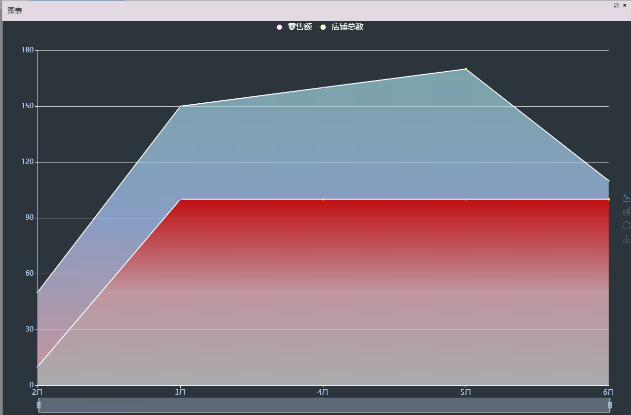
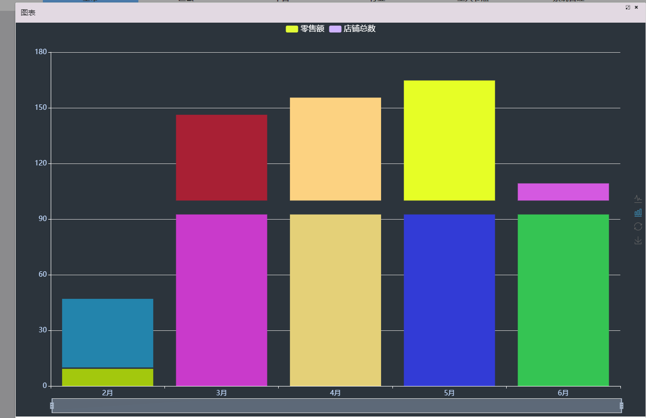
有点colorful了,自己调整下。
今ならできます。

 浙公网安备 33010602011771号