
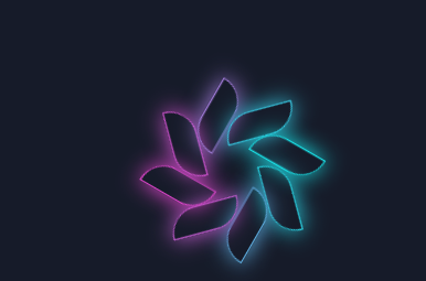
花瓣效果如下,当然是一直转动的
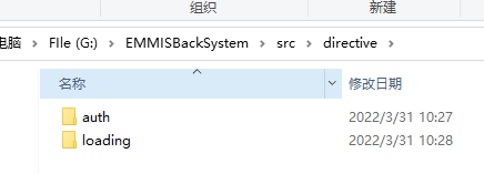
目录结构
src目录下新增directive目录,用来存放自定义指令
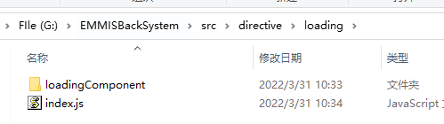
新建loading目录,里面存放如下文件index.js loadingComponent 文件夹
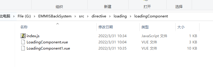
loadingComponent 里面存放如下文件 index.js loadingComponent .vue(加载组件)
loadingComponent .vue
<template>
    <div class="LoadingComponent" v-show="visible">
        <div class="modal"></div>
        <div class="out">
            <div class="fade-in">
                <div class="container">
                    <div class="one common"></div>
                    <div class="two common"></div>
                    <div class="three common"></div>
                    <div class="four common"></div>
                    <div class="five common"></div>
                    <div class="six common"></div>
                    <div class="seven common"></div>
                    <div class="eight common"></div>
                </div>
            </div>
        </div>
    </div>
</template>
<script>
export default {
    name: 'LoadingComponent',
    props: {},
    data() {
        return {
            visible: false, // 仅用于废水、废气台账
        };
    },
    mounted() {
    },
    methods: {},
};
</script>
<style scoped lang="less">
.LoadingComponent {
    width: 100%;
    height: 100%;
    z-index: 11111111111111111111;
    position: absolute;
    top: 0px;
    // .modal {
    //     width: 100%;
    //     height: 100%;
    //     position: absolute;
    //     top: 0px;
    //     background-color: white;
    //     opacity: 0.5;
    // }
    .container {
        width: 40vw;
        height: 40vw;
        position: absolute;
        left: 0;
        right: 0;
        top: 0;
        bottom: 0;
        margin: auto;
        overflow: hidden;
    }

    .common {
        height: 5vw;
        max-height: 100%;
        overflow: auto;
        width: 2vw;
        margin: auto;
        max-width: 100%;
        position: absolute;
        background-color: ;
        border-radius: 0vw 10vw 0vw 10vw;
        box-shadow: inset 0vw 0vw 0vw 0.1vw #ebc5e6, 0vw 0vw 1.5vw 0vw #e6cee2;
    }

    .one {
        transform: rotate(45deg);
        left: 0;
        right: 0;
        top: 0;
        bottom: 7.5vw;
    }

    .two {
        transform: rotate(90deg);
        left: 5.5vw;
        right: 0;
        top: 0;
        bottom: 5.5vw;
    }

    .three {
        transform: rotate(135deg);
        left: 7.5vw;
        right: 0;
        top: 0;
        bottom: 0;
    }

    .four {
        transform: rotate(180deg);
        left: 5.5vw;
        right: 0;
        top: 5.5vw;
        bottom: 0;
    }

    .five {
        transform: rotate(225deg);
        left: 0;
        right: 0;
        top: 7.5vw;
        bottom: 0;
    }

    .six {
        transform: rotate(270deg);
        left: 0;
        right: 5.5vw;
        top: 5.5vw;
        bottom: 0;
    }

    .seven {
        transform: rotate(315deg);
        left: 0;
        right: 7.5vw;
        top: 0;
        bottom: 0;
    }

    .eight {
        transform: rotate(360deg);
        left: 0;
        right: 5.5vw;
        top: 0;
        bottom: 5.5vw;
    }

    .bar {
        width: 12vw;
        height: 0.25vw;
        position: absolute;
        left: 0;
        right: 0;
        top: 16vw;
        bottom: 0;
        margin: auto;
        overflow: hidden;
        background: #e645d0;
    }

    .progress {
        width: 12vw;
        height: 0.5vw;
        position: absolute;
        left: 0;
        right: 0;
        top: 0;
        bottom: 0;
        margin: auto;
        overflow: hidden;
        background: #17e1e6;
    }

    .one {
        animation: one 1s ease infinite;
        -moz-animation: one 1s ease infinite;
        /* Firefox */
        -webkit-animation: one 1s ease infinite;
        /* Safari and Chrome */
        -o-animation: one 1s ease infinite;
        /* Opera */
    }

    @keyframes one {
        0%,
        100% {
        }
        50% {
            background: ;
            box-shadow: inset 0vw 0vw 0vw 0.1vw #17e1e6,
                0vw 0vw 1.5vw 0vw #17e1e6;
        }
    }

    .two {
        animation: two 1s 0.125s ease infinite;
        -moz-animation: two 1s 0.125s ease infinite;
        /* Firefox */
        -webkit-animation: two 1s 0.125s ease infinite;
        /* Safari and Chrome */
        -o-animation: two 1s 0.125s ease infinite;
        /* Opera */
    }

    @keyframes two {
        0%,
        100% {
        }
        50% {
            background: ;
            box-shadow: inset 0vw 0vw 0vw 0.1vw #17e1e6,
                0vw 0vw 1.5vw 0vw #17e1e6;
        }
    }

    .three {
        animation: three 1s 0.25s ease infinite;
        -moz-animation: three 1s 0.25s ease infinite;
        /* Firefox */
        -webkit-animation: three 1s 0.25s ease infinite;
        /* Safari and Chrome */
        -o-animation: three 1s 0.25s ease infinite;
        /* Opera */
    }

    @keyframes three {
        0%,
        100% {
        }
        50% {
            background: ;
            box-shadow: inset 0vw 0vw 0vw 0.1vw #17e1e6,
                0vw 0vw 1.5vw 0vw #17e1e6;
        }
    }

    .four {
        animation: four 1s 0.375s ease infinite;
        -moz-animation: four 1s 0.375s ease infinite;
        /* Firefox */
        -webkit-animation: four 1s 0.375s ease infinite;
        /* Safari and Chrome */
        -o-animation: four 1s 0.375s ease infinite;
        /* Opera */
    }

    @keyframes four {
        0%,
        100% {
        }
        50% {
            background: ;
            box-shadow: inset 0vw 0vw 0vw 0.1vw #17e1e6,
                0vw 0vw 1.5vw 0vw #17e1e6;
        }
    }

    .five {
        animation: five 1s 0.5s ease infinite;
        -moz-animation: five 1s 0.5s ease infinite;
        /* Firefox */
        -webkit-animation: five 1s 0.5s ease infinite;
        /* Safari and Chrome */
        -o-animation: five 1s 0.5s ease infinite;
        /* Opera */
    }

    @keyframes five {
        0%,
        100% {
        }
        50% {
            background: ;
            box-shadow: inset 0vw 0vw 0vw 0.1vw #17e1e6,
                0vw 0vw 1.5vw 0vw #17e1e6;
        }
    }

    .six {
        animation: six 1s 0.625s ease infinite;
        -moz-animation: six 1s 0.625s ease infinite;
        /* Firefox */
        -webkit-animation: six 1s 0.625s ease infinite;
        /* Safari and Chrome */
        -o-animation: six 1s 0.625s ease infinite;
        /* Opera */
    }

    @keyframes six {
        0%,
        100% {
        }
        50% {
            background: ;
            box-shadow: inset 0vw 0vw 0vw 0.1vw #17e1e6,
                0vw 0vw 1.5vw 0vw #17e1e6;
        }
    }

    .seven {
        animation: seven 1s 0.75s ease infinite;
        -moz-animation: seven 1s 0.75s ease infinite;
        /* Firefox */
        -webkit-animation: seven 1s 0.75s ease infinite;
        /* Safari and Chrome */
        -o-animation: seven 1s 0.75s ease infinite;
        /* Opera */
    }

    @keyframes seven {
        0%,
        100% {
        }
        50% {
            background: ;
            box-shadow: inset 0vw 0vw 0vw 0.1vw #17e1e6,
                0vw 0vw 1.5vw 0vw #17e1e6;
        }
    }

    .eight {
        animation: eight 1s 0.875s ease infinite;
        -moz-animation: eight 1s 0.875s ease infinite;
        /* Firefox */
        -webkit-animation: eight 1s 0.875s ease infinite;
        /* Safari and Chrome */
        -o-animation: eight 1s 0.875s ease infinite;
        /* Opera */
    }

    @keyframes eight {
        0%,
        100% {
        }
        50% {
            background: ;
            box-shadow: inset 0vw 0vw 0vw 0.1vw #17e1e6,
                0vw 0vw 1.5vw 0vw #17e1e6;
        }
    }

    .container {
        animation: container 5s linear infinite;
        -moz-animation: container 5s linear infinite;
        /* Firefox */
        -webkit-animation: container 5s linear infinite;
        /* Safari and Chrome */
        -o-animation: container 5s linear infinite;
        /* Opera */
    }

    @keyframes container {
        from {
            transform: rotate(0deg);
        }
        to {
            transform: rotate(-360deg);
        }
    }

    .progress {
        animation: progress 15s ease;
        -moz-animation: progress 15s ease;
        /* Firefox */
        -webkit-animation: progress 15s ease;
        /* Safari and Chrome */
        -o-animation: progress 15s ease;
        /* Opera */
    }

    @keyframes progress {
        0% {
            left: -24vw;
        }
        10% {
            left: -20vw;
        }
        30% {
            left: -16vw;
        }
        50% {
            left: -12vw;
        }
        65% {
            left: -10vw;
        }
        80% {
            left: -4vw;
        }
        100% {
            left: 0;
        }
    }

    .fade-in {
        animation: fade-in 2s ease;
        -moz-animation: fade-in 2s ease;
        /* Firefox */
        -webkit-animation: fade-in 2s ease;
        /* Safari and Chrome */
        -o-animation: fade-in 2s ease;
        /* Opera */
    }

    @keyframes fade-in {
        from {
            opacity: 0;
        }
        to {
            opacity: 1;
        }
    }

    .out {
        animation: out 2s 15s ease;
        -moz-animation: out 2s 15s ease;
        /* Firefox */
        -webkit-animation: out 2s 15s ease;
        /* Safari and Chrome */
        -o-animation: out 2s 15s ease;
        /* Opera */
    }

    @keyframes out {
        from {
            opacity: 1;
        }
        to {
            opacity: 0;
        }
    }
}
</style>
loadingComponent/index.js
import Vue from 'vue'
import Loading from './LoadingComponent.vue'

const Mask = Vue.extend(Loading)

const toggleLoading = (el, binding) => {
  if (binding.value) {
    Vue.nextTick(() => {
      // 控制loading组件显示
      el.instance.visible = true
      // 插入到目标元素
      insertDom(el, el,)
    })
  } else {
    el.instance.visible = false
  }
}

const insertDom = (parent, el) => {
  parent.appendChild(el.mask)
}

export default {
  bind: function (el, binding, vnode) {
    const mask = new Mask({
      el: document.createElement('div'),
      data () {}
    })
    el.instance = mask
    el.mask = mask.$el
    el.maskStyle = {}
    binding.value && toggleLoading(el, binding)
  },
  update: function (el, binding) {
    if (binding.oldValue !== binding.value) {
      toggleLoading(el, binding)
    }
  },
  unbind: function (el, binding) {
    el.instance && el.instance.$destroy()
  }
}
import Vue from 'vue';
import Loading from './loadingComponent'
export default {
  install(Vue) {
    Vue.directive('myLoading', Loading)
  }
}
以上操作完成后再main.js里面引入
main.js
import DirectiveLoading from '@/directive/loading' //权限控制指令
Vue.use( DirectiveLoading )
页面上的使用v-myLoading

效果如下:

具体的模板自己修改为喜欢的样式即可。
今ならできます。
