

电子游戏销售之回归模型与数据可视化

0、写在前面
该篇文章的任务包括以下3个方面
检测与处理缺失值建立回归模型数据可视化
实验环境
- Python版本:
Python3.9 - Numpy版本:
Python1.22.3 - Pandas版本:
Pandas1.5.0 - scikit-learn版本:
scikit-learn1.1.2 - Matplotlib版本:
Matplotlib3.5.2
原始数据
- 数据来源:
https://www.kaggle.com/datasets/gregorut/videogamesales?resource=download
https://tianchi.aliyun.com/dataset/92584
数据字段
- Name - 游戏名称
- Platform - 游戏的开发平台
- Year_of_Release - 游戏发行年份
- Genre - 游戏类别
- Publisher - 游戏的发布者
- NA_Sales - 北美销售量
- EU_Sales - 欧洲销售量
- JP_Sales - 日本销售量
- Other_Sales - 其他地区的销售量
- Global_Sales - 全球销售量
- Criticscore - 评判游戏的得分
- Critic_Count - 评判游戏的人数
- User_Score - 用户对于游戏的得分
- Usercount - 给予游戏User_Score的用户人数
- Developer - 游戏开发者
- Rating - 评级
前置准备
提前将csv数据导入到MySQL中,以便数据预处理
1、回归模型
该实验建立的是线性回归模型
1.1 模型建立准备
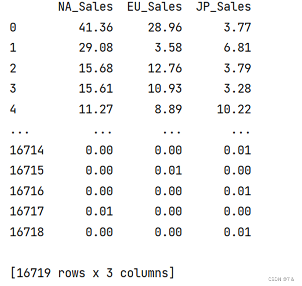
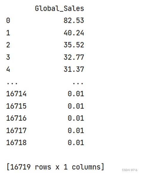
NA_Sales,EU_Sales,JP_Sales作为数据集,每条数据的Global_Sales作为target建立回归模型
video_games_data = video_games.iloc[:, 5:8]
video_games_target = video_games.iloc[:, 9:10]
print(video_games_data)
print(video_games_target)
数据集展示:
target数据展示:
1.2 建立模型
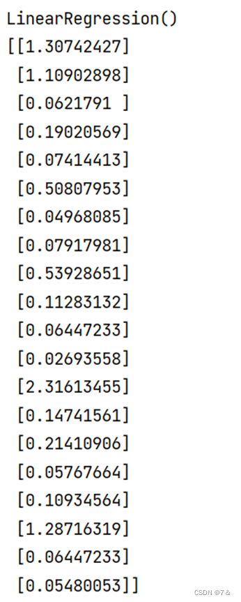
使用sklearn建立线性回归模型,并提前将数据划分为训练集和测试集
video_games_train, video_games_test, video_games_target, video_games_target_test = train_test_split(
    video_games_data, video_games_target)
clf = LinearRegression().fit(video_games_train, video_games_target) # 线性回归模型
print(clf)
1.3 模型分析
- 回归模型结果可视化:
video_games_target_test_pred=clf.predict(video_games_test)
print(video_games_target_test_pred[:20])
rcParams['font.sans-serif'] = 'SimHei'
fig = plt.figure(figsize=(10,6)) ##设定空白画布,并制定大小
##用不同的颜色表示不同数据
plt.plot(range(video_games_test.shape[0]),video_games_target_test,color="blue", linewidth=1.5, linestyle="-")
plt.plot(range(video_games_test.shape[0]),video_games_target_test_pred,color="red", linewidth=1.5, linestyle="-.")
plt.legend(['真实值','预测值'])
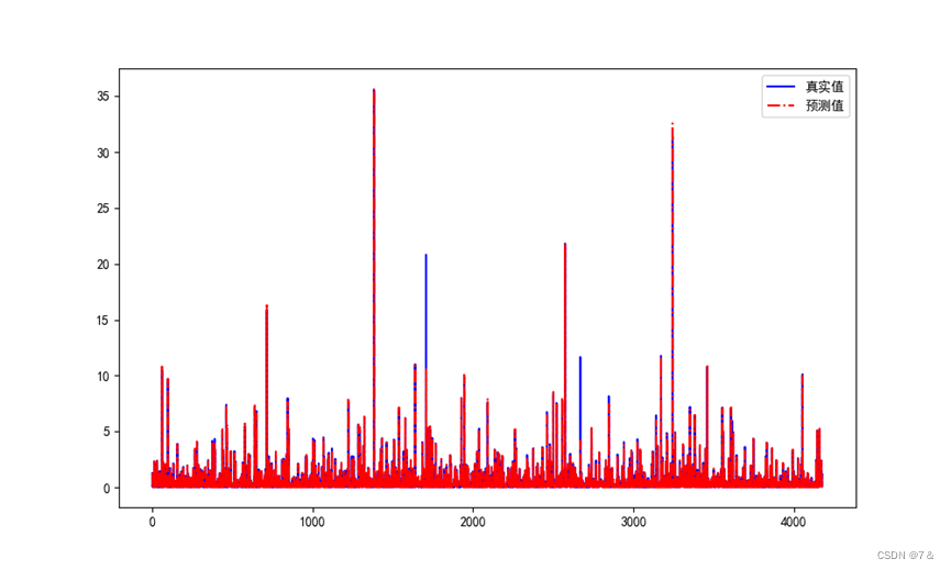
可以看到,真实值和预测值除个别外,其他的基本上比较接近
- 回归模型评价
根据
平均绝对误差、均方误差、中值绝对误差、可解释方差值、R²值等评价指标来评估建立的线性回归模型是否合适。
print('video_games数据线性回归模型1的平均误差为', mean_absolute_error(video_games_target_test1,video_games_target_test_pred1))
print('video_games数据线性回归模型1的均方误差', mean_squared_error(video_games_target_test1,video_games_target_test_pred1))
print('video_games数据线性回归模型1的中值绝对误差为', median_absolute_error(video_games_target_test1,video_games_target_test_pred1))
print('video_games数据线性回归模型1的可解释方差值为 ', explained_variance_score(video_games_target_test1,video_games_target_test_pred1))
print('video_games数据线性回归模型1的R²值', r2_score(video_games_target_test1,video_games_target_test_pred1))
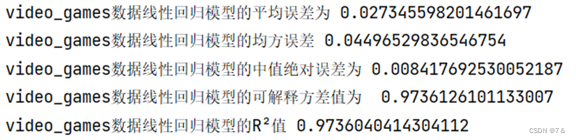
平均方差、均方误差、中值绝对误差均接近于0,而可解释方差值、R2可以看出建立的线性回归模型拟合效果良好,但可以继续优化。
Note:评价构建的线性回归模型还可以使用
梯度提升的方法
2、数据可视化
可视化代码在参考链接里面有
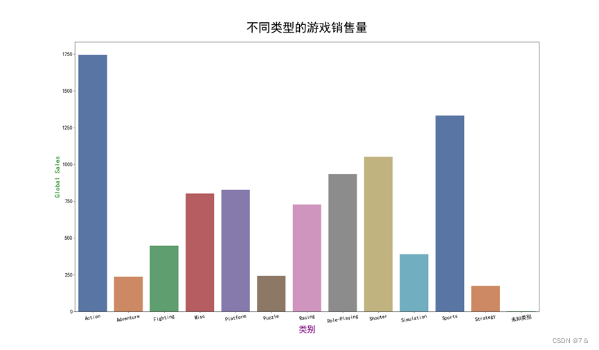
不同类型游戏的数量直方图
highest_number_of_sales = df.groupby('Genre').sum(numeric_only=True).astype('int')
plt.figure(figsize=(24, 14)) # figuring the size
# makes bar plot
sns.barplot( # barplot
    x=highest_number_of_sales.index, # x-axis
    y=highest_number_of_sales["Global_Sales"], # y-axis
    data=highest_number_of_sales, # data
    palette="deep" # palette
)
plt.title( # title
    "不同类型的游戏销售量",
    weight="bold", # weight
    fontsize=35, # font-size
    pad=30 # padding
)
plt.xlabel( # x-label
    "类别",
    weight="bold", # weight
    color="purple", # color
    fontsize=25, # font-size
)
plt.xticks( # x-ticks
    weight="bold", # weight
    fontsize=15, # font-size
    rotation=10
)
plt.ylabel( # y-label
    "Global Sales",
    weight="bold", # weight
    color="green", # color
    fontsize=20 # font-size
)
plt.yticks( # y-ticks
    weight="bold", # weight
    fontsize=15 # font-size
)
plt.show()
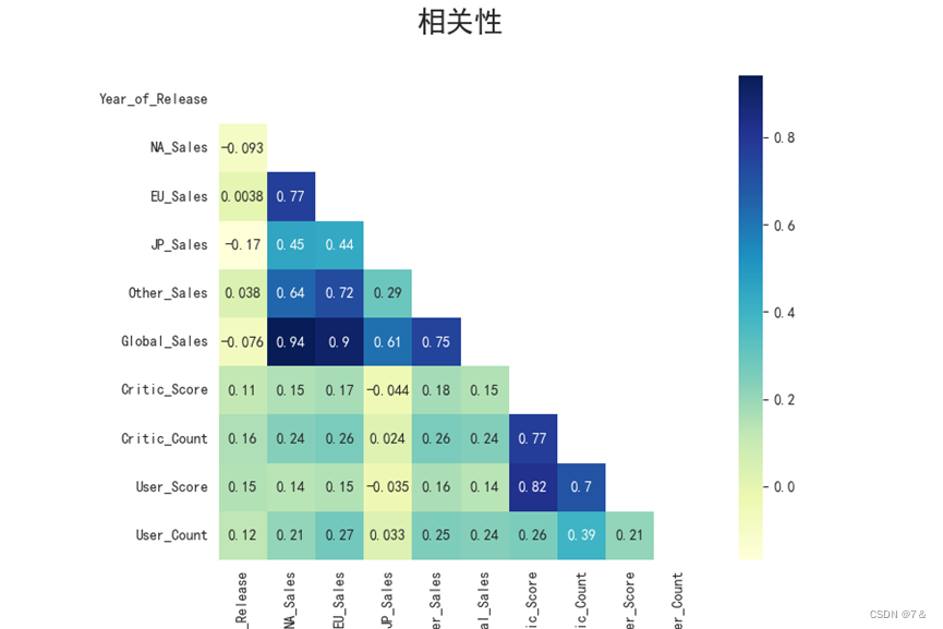
各地区销售量和游戏发行年份的相关性
corrmat= df.corr(numeric_only=True)
mask = np.zeros_like(corrmat)
mask[np.triu_indices_from(mask)] = True
with sns.axes_style("white"):
    f, ax = plt.subplots(figsize=(9,6))
    plt.title("相关性Correlation", weight="bold", fontsize=20, pad=30) # title
    plt.xticks(weight="bold", fontsize=10, rotation=45) # x-ticks
    plt.yticks(weight="bold", fontsize=10) # y-ticks
    plt.xlabel('各地区销售')
    plt.ylabel('发行年份')
    sns.heatmap(corrmat, cmap="YlGnBu", annot=True, mask=mask, square=True)
    plt.show()
按发行的游戏总数划分的类型
rel = df.groupby(['Genre']).count().iloc[:,0]
rel = pd.DataFrame(rel.sort_values(ascending=False))
genres = rel.index
rel.columns = ['Releases']
colors = sns.color_palette("summer", len(rel))
plt.figure(figsize=(12,8))
ax = sns.barplot(y = genres , x = 'Releases', data=rel,orient='h', palette=colors)
ax.set_xlabel(xlabel='发行数量', fontsize=16)
ax.set_ylabel(ylabel='Genre', fontsize=16)
ax.set_title(label='按发行的游戏总数划分的类型', fontsize=20)
ax.set_yticklabels(labels = genres, fontsize=14)
plt.show()
tp
3、参考资料
结束!
本文来自博客园,作者:{WHYBIGDATA},转载请注明原文链接:https://www.cnblogs.com/shadowlim/p/17051706.html

 浙公网安备 33010602011771号