

http://www.codeproject.com/KB/user-controls/DatePickerUserControl.aspx
Introduction
This is a simple date-picker control. The user can either enter a date into a text box or click on an icon that opens a pop-up calendar. JavaScript is used to display the pop-up calendar. The control can easily be integrated into your own ASP.NET websites.
Background
This control is based on another CodeProject article. I overworked the control so it compiles with Visual Studio 2005 and works with the latest versions of Firefox and Internet Explorer. I fixed some JavaScript errors and added better design-time support and data-binding.
Using the Code
The control consists of the main user control with the files Date.ascx and Date.ascx.cs and a directory cal that contains the JavaScript file, CSS definition and some images. To use the control in your own project, simply add the files Date.ascx and Date.ascx.cs, as well as the folder cal to your ASP.NET web project.

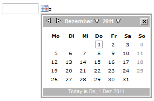
Once these resources are added to your project, just drag Date.ascx onto a web form in design mode. In design mode, the date-picker control will look as follows:

Programmatically, the currently selected date can be accessed as either a string or as a DateTime object:
// setting the currently selected date as a string

Date1.CalendarDateString = "05.12.2007";

// setting the currently selected date as a DateTime object

Date1.CalendarDate = DateTime.Now;
Both of these properties can also be used for data-binding.
Validation of Selected Date
Of course, it is possible to enter any text into the textbox (or set via the CalendarDateString property) that cannot be converted into a valid date. In this case, the CalendarDate property returns the value DateTime.MaxValue, which indicates an invalid date. The CalendarDateString property, however, still returns the text in the textbox.
You can also use client-side validation by using a RangeValidator object. In this case, set the Type property of RangeValidator to Date. The MinimumValue and MaximumValue
properties must be set to strings representing the minimum and maximum
date in the same format as is used by the date-picker control.
Customize Appearance
The visual appearance of the pop-up calendar is defined in CSS file popcalendar.css, which resides in the cal folder. Most styles have comments, so just try out and modify colors and font styles. To customize the style of the text box within the control, it is possible to set the CSS class of the text box with the following property:
// set CSS class of textbox

Date1.TextCssClass = "dateTextBox";
Per default the date format is dd.mm.yyyy, e.g. 31.12.2007. If you
want to change this, e.g. to 12/31/2007, you have to change the value
of the constant DateFormat, which is defined in the file Date.ascx.cs:
// date format used by the calendar control

private const string DateFormat = "dd.MM.yyyy";
History
- December, 2007 -- Original version posted

 浙公网安备 33010602011771号