
针对background的属性进行一下总结分析:
一、单一样式
1、background-size 背景大小
参数:
普通数据:30px 40px
百分比:30% 50%
cover:将背景图片等比例缩放到完全覆盖容器大小
contain:将背景图片等比例缩放到宽度或者是高度与容器相等的一边(有可能出现空白区域)
2、background-clip 从某一个位置截掉图片
参数:
border-box
padding-box
content-box
3、background-origin 从某个地方显示背景图片
参数:
border-box
padding-box
content-box
4、background-color
参数:english/rgba/rgb/#ff0/hsl/hsla/(transparent)
5、background-image 设置图片
参数:url(图片的地址);
可设置一张或者是多张图片,url间用逗号隔开(平时可放2张以上这样可以针对网络不好的情况),none为其默认值。
背景图会默认铺满整个容器(它撑不开容器,只有内容能撑开)。
6、background-attachment 背景图片是否滚动
参数:
scroll(默认)/local/fixed
7、background-repeat 背景平铺
参数:
no-repeat、rpeat-x、rpeat-y、rpeat 这是一个值的情况
round:当背景图像不能以整数次平铺时,会根据情况来进行缩放(图片会变形)
space:不会拉伸,但有空白的区域
8、background-position 背景坐标
参数:
传值:可以用像素,也可以用百分比来表示;
第一个值用于x轴,第二个值用于y轴,默认值为0% 0%,即背景图像的左上角与对象背景区域的左上角对齐。
传关键字:x轴:left/center/right y轴:top/center/bottom
如果只传一个值那另一个值则默认为center;如果两个值都不写那就默认为0,0在左上角。
二、复合样式
background:green url(images/1.jpg) no-repeat center top scroll ;
实例:css sprite(雪碧图)
将很多小图标按照一定的距离隔开,放在一张图片上就称之为雪碧图。
优点:减少网页的http请求,加快网页的加载速度,提高用户体验;减少了图片的体积,解决了图片命名问题;网页更换风格更加方面
不足:在宽屏,高分辨率的屏幕下自适应页面,如果图片不够宽,容易出现背景断裂;在维护时比较的麻烦,如果页面背景有改动,这个大图也需要进行改动;大图里的小图标不能随意的改变大小颜色
解决:一般用字体图标代替雪碧图。
用到的知识:background-image,background-repeat,background-position
示例:
1、pc端雪碧图处理过程
大图如下:

要求:显示悲伤和生气的脸
代码:
<!DOCTYPE html>
<html lang="en">
<head>
    <meta charset="UTF-8">
    <title>pc端雪碧图简单示例</title>
    <style>
    .sad_face{
        width:75px;
        height: 75px;
        background-image: url(images/2.png);
        background-repeat: no-repeat;
        background-position:-185px -328px ;
    }
    .angry_face{
        width: 75px;
        height: 75px;
        background:url(images/2.png);
        background-repeat:  no-repeat;
        background-position:   -631px -181px;
    }
    </style>
</head>
<body>
    <div class="sad_face"></div>
    <br>
    <div class="angry_face"></div>
</body>
</html>
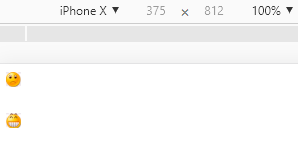
效果:

2、手机端雪碧图处理过程
强调:因为容器的宽度和高度是自适应或者是响应式的,如果不设置background-size图片会出现溢出的情况。可以用rem设置background-size的高度,宽度可以自适应就好。
<!DOCTYPE html>
<html lang="en">

<head>
    <meta charset="UTF-8">
    <meta name="viewport" content="width=device-width, initial-scale=1.0">
    <meta http-equiv="X-UA-Compatible" content="ie=edge">
    <title>移动端雪碧图</title>
    <style>
        .sad_face {
            width: 0.75rem;
            height: 0.75rem;
            background: url(images/2.png) no-repeat;
            background-size: 10.35rem auto;
            background-position: -1.85rem -3.28rem;
        }

        .happy_face {
            width: 0.75rem;
            height: 0.75rem;
            background: url(images/2.png) no-repeat;
            background-size: 10.35rem auto;
            background-position: -9.26rem -1.76rem;
        }
    </style>
</head>

<body>
    <div class="sad_face"></div>
    <br>
    <div class="happy_face"></div>
</body>
</html>

 浙公网安备 33010602011771号