1.什么是BFC
直译为块级格式化上下文
理解一: 把BFC理解成一块独立的渲染区域,元素触发BFC后,变成隔离的独立容器,容器内的元素不会影响到容器外的元素
理解二:一种布局方式,相比box-sizing,flex布局而言,叫做传统布局
2.实现BFC属性的方法
1. 浮动元素,float 除 none 以外的值
2. 定位元素,position的值不是static或者relative。
3. display 为 inline-block 、table-cell、table-caption、table、table-row、table-row-group、
table-header-group、table-footer-group、inline-table、flow-root、flex或 inline-flex、grid或 inline-grid
4. overflow 除了 visible 以外的值(hidden,auto,scroll)
5. 根元素<html> 就是一个 BFC
3.BFC作用
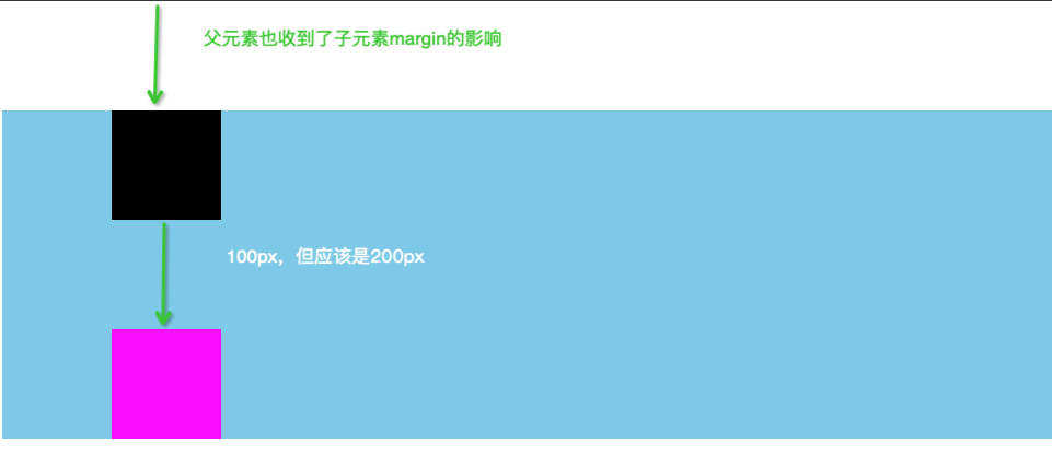
3-1:避免外边距重叠
- 原来的,错误效果
<!DOCTYPE html>
<html lang="en">
<head>
    <meta charset="UTF-8">
    <meta http-equiv="X-UA-Compatible" content="IE=edge">
    <meta name="viewport" content="width=device-width, initial-scale=1.0">
    <title>Document</title>
    <style>
        .box{
            background: skyblue;
            overflow: hidden;
        }
        .child1{
            width: 100px;
            height: 100px;
            background-color: black;
            margin: 100px;
        }
        .child2{
            width: 100px;
            height: 100px;
            background-color: fuchsia;
            margin: 100px;
        }
    </style>
</head>
<body>
    <div class="box">
        <div class="child1"></div>
        <div class="child2"></div>
    </div>
</body>
</html>
效果图:
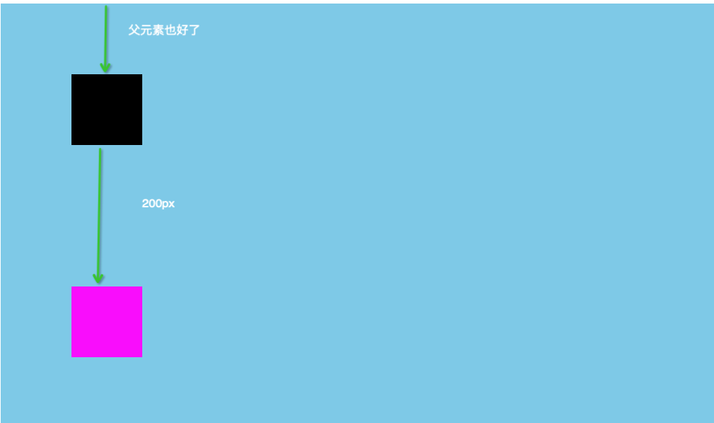
- 触发BFC后,想要的效果
<!DOCTYPE html>
<html lang="en">
<head>
    <meta charset="UTF-8">
    <meta http-equiv="X-UA-Compatible" content="IE=edge">
    <meta name="viewport" content="width=device-width, initial-scale=1.0">
    <title>Document</title>
    <style>
        .box{
            background: skyblue;
            overflow: hidden;      /* 3-2 解决父元素受影响   */
        }
        .child1{
            width: 100px;
            height: 100px;
            background-color: black;
            margin: 100px;
        }
        .child2{
            width: 100px;
            height: 100px;
            background-color: fuchsia;
            margin: 100px;
        }
        .wrap{
            overflow: hidden;  /* 解决边距问题 */
            /* display: table;
            display: inline-block;
            display: flex; */
        }
    </style>
</head>
<body>
    <div class="box">
       <div class="wrap">
            <div class="child1"></div>
       </div>
        <div class="child2"></div>
    </div>
</body>
</html>
效果图:
3-2:避免子元素设置margin-top,父元素受影响
3-1中解决
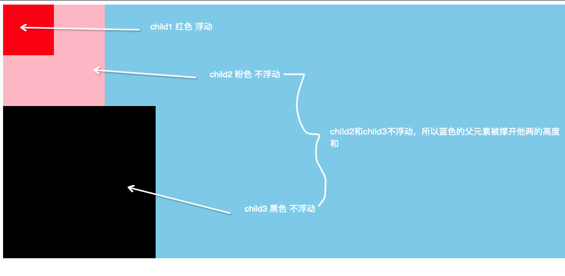
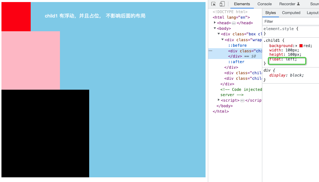
3-3:清除浮动(普通元素和浮动元素重叠)
- 让某个子元素float,且占位
原来代码,错误效果:
      <!DOCTYPE html>
<html lang="en">
<head>
    <meta charset="UTF-8">
    <meta http-equiv="X-UA-Compatible" content="IE=edge">
    <meta name="viewport" content="width=device-width, initial-scale=1.0">
    <title>Document</title>
    <style>
        .box{
            background: skyblue;
        }
        .child1{
            background: red;
            width: 100px;
            height: 100px;
            float: left;
        }
        .child2{
            background: pink;
            width: 200px;
            height: 200px;
        }
        .child3{
            background: black;
            width: 300px;
            height: 300px;
        }
    </style>
</head>
<body>
    <div class="box clearfix">
        <div class="child1"></div>
        <div class="child2"></div>
        <div class="child3"></div>
    </div>
</body>
</html>
效果图:
- 想要的效果,触发BFC
方案1:在浮动元素的后面兄弟元素添加clear: both , 这个兄弟元素可以是自己后添加的,可以是原来的
<!DOCTYPE html>
<html lang="en">
<head>
    <meta charset="UTF-8">
    <meta http-equiv="X-UA-Compatible" content="IE=edge">
    <meta name="viewport" content="width=device-width, initial-scale=1.0">
    <title>Document</title>
    <style>
        .box{
            background: skyblue;
        }
        .child1{
            background: red;
            width: 100px;
            height: 100px;
            float: left;
        }
        .child2{
            background: pink;
            width: 200px;
            height: 200px;
            clear: both;       /* 原来的兄弟元素 */
        }
        .child3{
            background: black;
            width: 300px;
            height: 300px;
        }
        .gap{       /* 后面自己添加的兄弟元素 */
            clear: both;
        }
    </style>
</head>
<body>
    <div class="box clearfix">
        <div class="child1"></div>
        <div class="gap"></div>
        <div class="child2"></div>
        <div class="child3"></div>
    </div>
</body>
</html>
方案二: 给浮动元素添加父元素,让这个父元素用overflow: hidden触发BFC,形成隔离的独立区域,就不会影响下面的布局
<!DOCTYPE html>
<html lang="en">
<head>
    <meta charset="UTF-8">
    <meta http-equiv="X-UA-Compatible" content="IE=edge">
    <meta name="viewport" content="width=device-width, initial-scale=1.0">
    <title>Document</title>
    <style>
        .box{
            background: skyblue;
        }
        .child1{
            background: red;
            width: 100px;
            height: 100px;
            float: left;
        }
        .child2{
            background: pink;
            width: 200px;
            height: 200px;
        }
        .child3{
            background: black;
            width: 300px;
            height: 300px;
        }

        .wrap{
            overflow: hidden;       /* 父元素触发BFC */
        }

    </style>
</head>
<body>
    <div class="box clearfix">
        <div class="wrap">
            <div class="child1"></div>
        </div>
        <div class="child2"></div>
        <div class="child3"></div>
    </div>
</body>
</html>
方案三:给浮动元素添加父元素,让这个父元素用伪元素after,形成类似第一种方案的形式,只不过新加的这个元素是父元素的兄弟元素
<!DOCTYPE html>
<html lang="en">
<head>
    <meta charset="UTF-8">
    <meta http-equiv="X-UA-Compatible" content="IE=edge">
    <meta name="viewport" content="width=device-width, initial-scale=1.0">
    <title>Document</title>
    <style>
        .box{
            background: skyblue;
        }
        .child1{
            background: red;
            width: 100px;
            height: 100px;
            float: left;
        }
        .child2{
            background: pink;
            width: 200px;
            height: 200px;
        }
        .child3{
            background: black;
            width: 300px;
            height: 300px;
        }

        .wrap:after{
            content: '';
            display: block;
            clear: both;
            height: 0;      /* ie */
            overflow: hidden; /* ie */
            visibility: hidden;  /* 兼容 */
        }

    </style>
</head>
<body>
    <div class="box clearfix">
        <div class="wrap">
            <div class="child1"></div>
        </div>
        <div class="child2"></div>
        <div class="child3"></div>
    </div>
</body>
</html>
方案四:给浮动元素添加父元素,让这个父元素用伪元素after, brofore,形成类似第一种方案的形式,只不过新加的这个元素是父元素的兄弟元素
<!DOCTYPE html>
<html lang="en">
<head>
    <meta charset="UTF-8">
    <meta http-equiv="X-UA-Compatible" content="IE=edge">
    <meta name="viewport" content="width=device-width, initial-scale=1.0">
    <title>Document</title>
    <style>
        .box{
            background: skyblue;
        }
        .child1{
            background: red;
            width: 100px;
            height: 100px;
            float: left;
        }
        .child2{
            background: pink;
            width: 200px;
            height: 200px;
        }
        .child3{
            background: black;
            width: 300px;
            height: 300px;
        }

        .wrap:after, .wrap:before{
            content: '';
            display: block;
        }
        .wrap:after{
            clear: both;
        }

    </style>
</head>
<body>
    <div class="box clearfix">
        <div class="wrap">
            <div class="child1"></div>
        </div>
        <div class="child2"></div>
        <div class="child3"></div>
    </div>
</body>
</html>
以上4种方案的效果图:
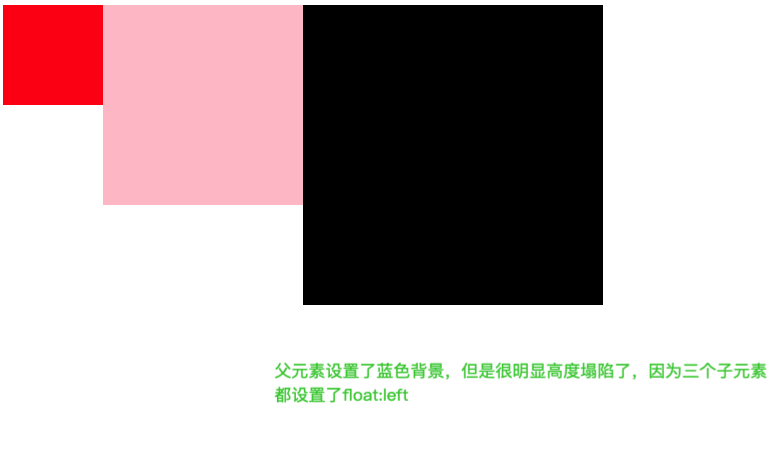
3-5:父元素高度塌陷,想要让父元素被撑开
原来的错误效果:
<!DOCTYPE html>
<html lang="en">
<head>
    <meta charset="UTF-8">
    <meta http-equiv="X-UA-Compatible" content="IE=edge">
    <meta name="viewport" content="width=device-width, initial-scale=1.0">
    <title>Document</title>
    <style>
        .box{
            background: skyblue;
        }
        .child1{
            background: red;
            width: 100px;
            height: 100px;
            float: left;
        }
        .child2{
            background: pink;
            width: 200px;
            height: 200px;
            float: left;
        }
        .child3{
            background: black;
            width: 300px;
            height: 300px;
            float: left;
        }

    </style>
</head>
<body>
    <div class="box clearfix">
        <div class="child1"></div>
        <div class="child2"></div>
        <div class="child3"></div>
    </div>
</body>
</html>
效果图:
解决方案1: 添加兄弟元素,只是得在最后面添加,兄弟元素设置clear:both
<!DOCTYPE html>
<html lang="en">
<head>
    <meta charset="UTF-8">
    <meta http-equiv="X-UA-Compatible" content="IE=edge">
    <meta name="viewport" content="width=device-width, initial-scale=1.0">
    <title>Document</title>
    <style>
        .box{
            background: skyblue;
        }
        .child1{
            background: red;
            width: 100px;
            height: 100px;
            float: left;
        }
        .child2{
            background: pink;
            width: 200px;
            height: 200px;
            float: left;
        }
        .child3{
            background: black;
            width: 300px;
            height: 300px;
            float: left;
        }
        .gap{   /* 最后没有兄弟元素,所以只能添加 */
            clear: both;
        }

    </style>
</head>
<body>
    <div class="box clearfix">
        <div class="child1"></div>
        <div class="child2"></div>
        <div class="child3"></div>
        <div class="gap"></div>
    </div>
</body>
</html>
方案二, 方案三,方案四都和上面的方案二,三,四一样,只是对应属性得设置到他们共同的父元素上
<!DOCTYPE html>
<html lang="en">
<head>
    <meta charset="UTF-8">
    <meta http-equiv="X-UA-Compatible" content="IE=edge">
    <meta name="viewport" content="width=device-width, initial-scale=1.0">
    <title>Document</title>
    <style>
        .box{
            background: skyblue;
            /* overflow: hidden; */       /* 方案二 */
        }
        .child1{
            background: red;
            width: 100px;
            height: 100px;
            float: left;
        }
        .child2{
            background: pink;
            width: 200px;
            height: 200px;
            float: left;
        }
        .child3{
            background: black;
            width: 300px;
            height: 300px;
            float: left;
        }

        /*   方案三
        .clearfix:after{
            content: '';
            display: block;
            clear: both;
            height: 0;
            overflow: hidden;
            visibility: hidden;
        } */

        /* 方案四 */
        .clearfix:after, .clearfix:before{
            content: '';
            display: block;
        }

        .clearfix:after{
            clear: both;
        }


    </style>
</head>
<body>
    <div class="box clearfix">
        <div class="child1"></div>
        <div class="child2"></div>
        <div class="child3"></div>
    </div>
</body>
</html>
效果图: