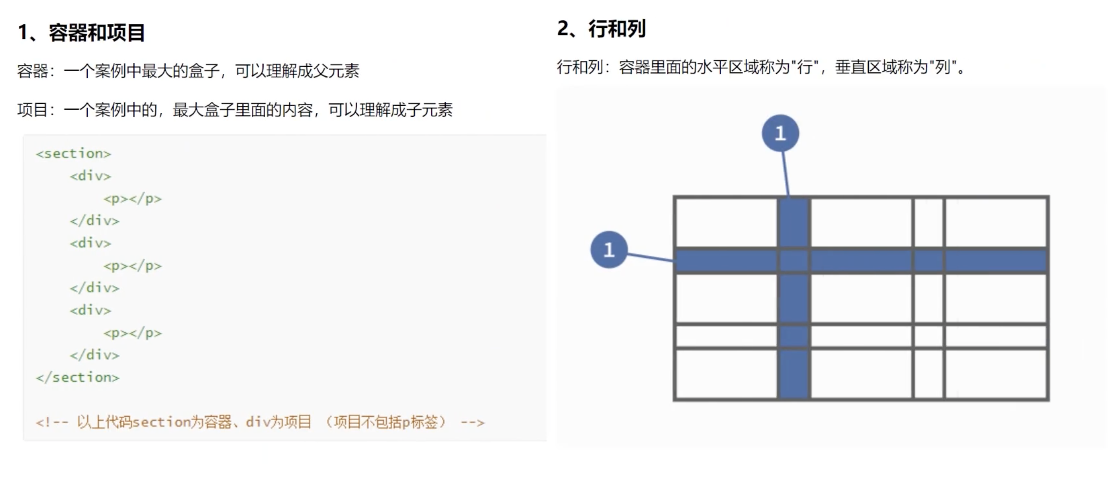
007:CSS3新特性:层次选择器、属性选择器、伪类选择器、文本阴影和盒子阴影、圆角、怪异盒模型、弹性盒、多列布局、响应式布局、rem布局、vw 布局、网格布局
目录
1:层次选择器 #box+p #box~p
(#second+p: 会选中id为second元素且和#box 同一个级别的第一个兄弟元素p,
#second~p: 会选中id为second元素且和#box 同一个级别的后面的所有兄弟元素,前面的兄弟元素不管)
2:属性选择器 div[class] div[class="box"] div[class~="box"] div[class^="box"] div[class*="box"] div[class$="box"]
3:伪类选择器
3.1: 结构性伪类选择器 li:first-child li:last-child li:nth-child(2) :root
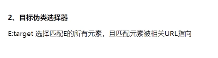
3.2:目标伪类选择器 div:target(选中的 div)
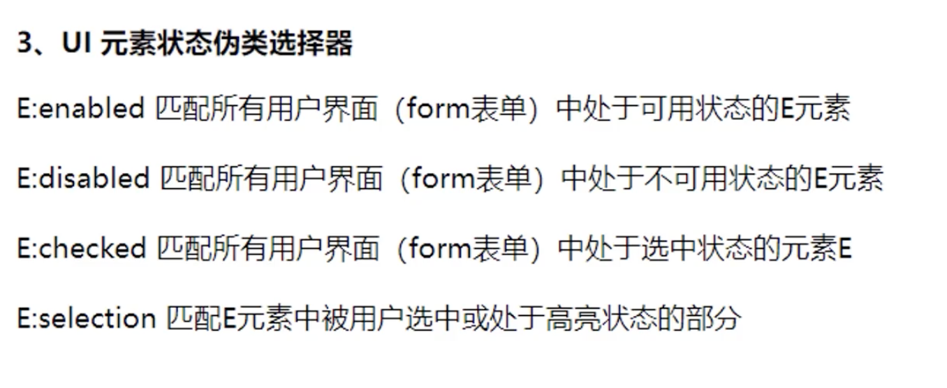
3.3:UI 状态伪类选择器 input:enabled input:disabled input:checked p::selection
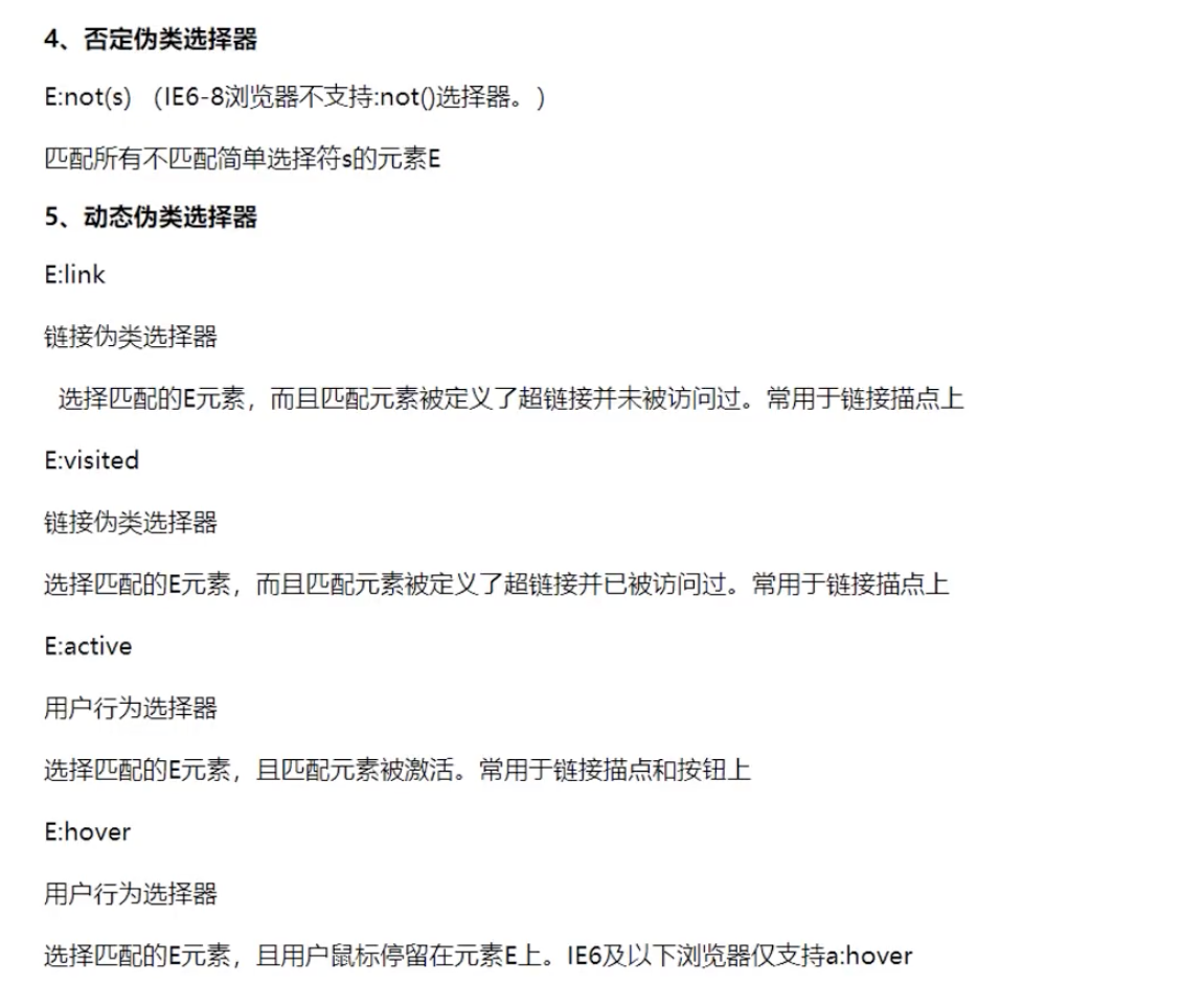
3.4:否认和动态伪类选择器 input:not(:enabled) a:link a:visited a:hover a:active [lvha]
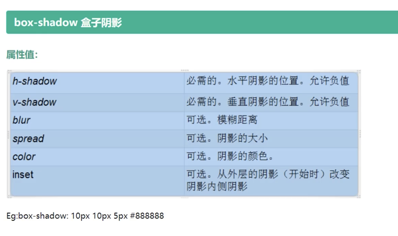
4:阴影 text-shadow: h-shadow v-shadow blur color; box-shadow: h-shadow v-shadow blur spread color position;
5:圆角 border-radius: 10px 20px 30px 40px;
6:字体 @font-face
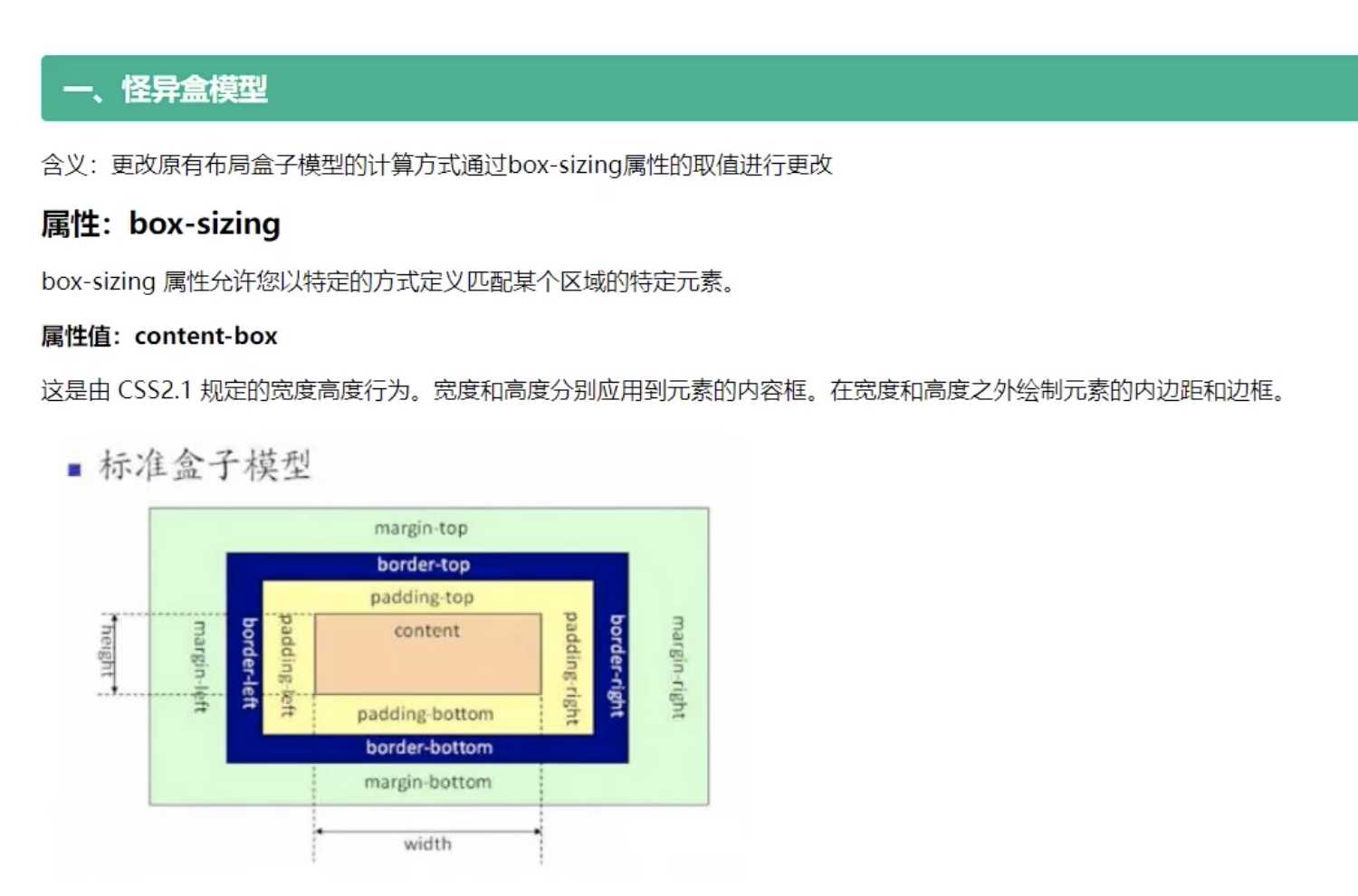
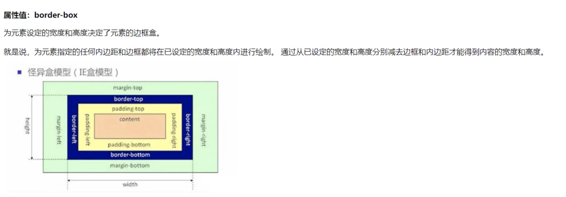
7:怪异盒模型 box-sizing: content-box; box-sizing: border-box;
8:弹性盒
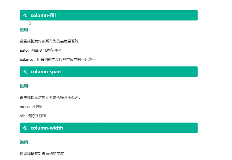
9:多列布局
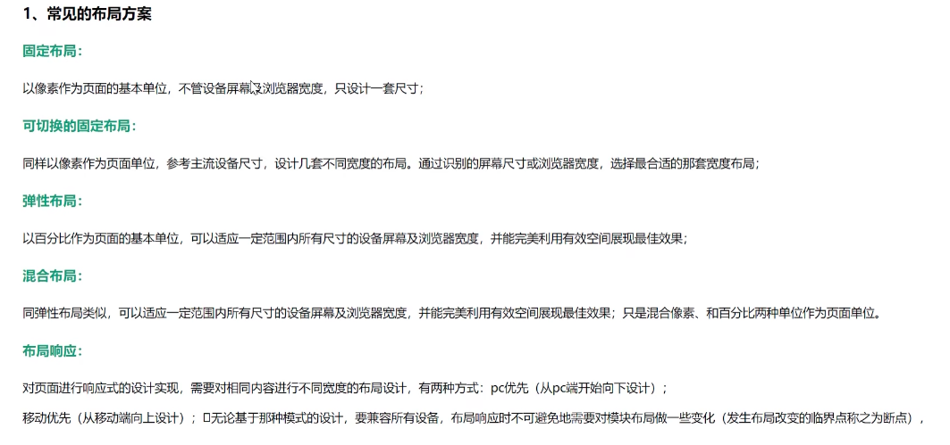
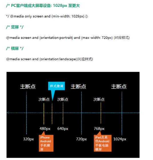
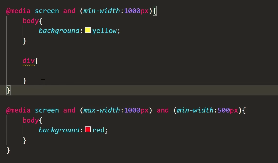
10:响应式布局(横屏检测)
11: px em rem 区别
12:rem 布局
13:vw、vh 布局
14:网格布局
正文
前言
一:层次选择器
代码
<!DOCTYPE html>
<html lang="en">
<head>
    <meta charset="UTF-8">
    <meta name="viewport" content="width=device-width, initial-scale=1.0">
    <title>层次选择器</title>
    <style>
       .box {
        background-color: aqua;
       }

       /* 群组选择器 */
       .box, .box1 {
          background-color: red;
       }

       /* 后代选择器 后辈儿子、孙子之后等级别*/
       .box li {
        background-color: blue;
       }

       /* 子代选择器 儿子级别 */
       .box>ul>li{
        background-color: purple;
       }

       /* 兄弟节点 层次选择器
       +代表.li2后面的第一个兄弟节点 */
       .box .li2+li {
        background-color: greenyellow;
       }

       /* 兄弟节点 层次选择器
       ~代表.li2后面的第一个兄弟节点 */
       .box .li2~li {
        background-color: green;
       }
    </style>
</head>
<body>
    <div class="box">
        <ul>
            <li>box-1111</li>
            <li class="li2">box-2222</li>
            <li>box-3333</li>
            <li>box-4444</li>
            <li>box-5555</li>
            <li>box-6666</li>
        </ul>
    </div>

    <div class="box1">
        <ul>
            <li>box1-1111</li>
            <li class="li12">box1-2222</li>
            <li>box1-3333</li>
            <li>box1-4444</li>
            <li>box1-5555</li>
            <li>box1-6666</li>
        </ul>
    </div>

</body>
</html>
详解
1:群组选择器
.box1, .box2
2:后代选择器
.box1 .box2
3:子代选择器
.box1>.box2
4:层次选择器
.box1+li
.box1~li
二:属性选择器
代码
<!DOCTYPE html>
<html lang="en">

<head>
    <meta charset="UTF-8">
    <meta name="viewport" content="width=device-width, initial-scale=1.0">
    <title>属性选择器</title>
    <style>
        div {
            width: 150px;
            height: 150px;
            background-color: aqua;
        }

        .box1 {
            background-color: red;
        }

        .box2 {
            background-color: blue;
        }

        .box3 {
            background-color: greenyellow;
        }

        .box4 {
            background-color: purple;
        }

        .box5 {
            background-color: fuchsia;
        }

        .box6 {
            background-color: gray;
        }

        .BoldSize {
            font-size: 20px;
            font-weight: bold;
        }

        /* 属性选择器 包含class属性 */
        div[class] {
            background-color: cornflowerblue;
        }

        /* 属性选择器 包含class属性 完全匹配:当 class 属性值等于box1*/
        div[class="box1"] {
            background-color: turquoise;
        }

        /* 属性选择器 包含class属性 包含匹配:当 class 属性值包含box1*/
        div[class~="box1"] {
            background-color: teal;
        }

        /* 匹配正则表达式 以 box 开头*/
        div[class^="box"] {
            background-color: chocolate;
        }

        /* 匹配正则表达式 模糊搜索box*/
        div[class*="box"] {
            background-color: darkorchid;
        }

        /* 匹配正则表达式 以x1结尾*/
        div[class$="x1"] {
            background-color: gold;
        }
    </style>
</head>

<body>
    <div class="box1" width="100px" height="200px">box1</div>
    <div class="box2">box2</div>
    <div class="box3">box3</div>
    <div class="box4">box4</div>
    <div class="box5">box5</div>
    <div class="box6">box6</div>
    <div class="BoldSize box1">box1 boldSize</div>
    <div class="BoldSize box2">box2 boldSize</div>
</body>

</html>
详解
3:伪类选择器
3.1: 结构性伪类选择器
代码
<!DOCTYPE html>
<html lang="en">

<head>
    <meta charset="UTF-8">
    <meta name="viewport" content="width=device-width, initial-scale=1.0">
    <title>伪类选择器-1:结构伪类选择器</title>
    <style>
        /* box 中的 li 标签集合中的第一个标签 */
        .box1 li:first-child {
            background-color: aqua;
        }

        /* box 中的 li 标签集合中的最后一个标签 */
        .box1 li:last-child {
            background-color: aqua;
        }

        /* box 中的 li 标签集合中的第二个 */
        .box1 li:nth-child(2) {
            background-color: red;
        }

        /* box 中的 li 标签集合中偶数集合 */
        .box1 li:nth-child(2n) {
            background-color: red;
        }

        /* box 中的 li 标签集合中偶数集合 */
        .box1 li:nth-child(even) {
            background-color: blue;
        }

        /* box 中的 li 标签集合中奇数集合 */
        .box1 li:nth-child(2n+1) {
            background-color: lawngreen;
        }

        /* box 中的 li 标签集合中奇数集合 */
        .box1 li:nth-child(odd) {
            background-color: hotpink;
        }

        /* .box2 后代中有 p 的标签集合中  只有一个 p标签的 的元素 */
        .box2 p:only-child {
            background-color: purple;
        }

        /* 根元素 */
        :root, body {
            height: 100%;
            background-color: coral;
        }

        .box3:empty {
            background-color: aquamarine;
            width: 100px;
            height: 100px;
        }
    </style>
</head>

<body>
    <div class="box1">
        <ul>
            <li>111111</li>
            <li>222222</li>
            <li>333333</li>
            <li>444444</li>
            <li>555555</li>
            <li>666666</li>
        </ul>
    </div>
    <div class="box2">
        <p>box2</p>
    </div>
    <div class="box3"></div>

</body>

</html>
详解
3.2:目标伪类选择器
代码
<!DOCTYPE html>
<html lang="en">

<head>
    <meta charset="UTF-8">
    <meta name="viewport" content="width=device-width, initial-scale=1.0">
    <title>目标伪类选择器</title>
    <style>
        ul {
            position: fixed;
            right: 10px;
            top: 50px;
        }
        div {
            width: 200px;
            height: 300px;
        }

        div:target {
            background-color: red !important;
        }

        #a {
            background-color: aqua;
        }

        #b {
            background-color: hotpink;
        }

        #c {
            background-color: chocolate;
        }

        #d {
            background-color: blueviolet;
        }
    </style>
</head>

<body>
    <ul>
        <li><a href="#a">aaa</a></li>
        <li><a href="#b">bbb</a></li>
        <li><a href="#c">ccc</a></li>
        <li><a href="#d">ddd</a></li>
    </ul>
    <div id="a"></div>
    <div id="b"></div>
    <div id="c"></div>
    <div id="d"></div>

</body>

</html>
详解
3.3:UI 状态伪类选择器
代码
<!DOCTYPE html>
<html lang="en">

<head>
    <meta charset="UTF-8">
    <meta name="viewport" content="width=device-width, initial-scale=1.0">
    <title>UI元素伪类选择器</title>
    <style>
        /* 可用状态 */
        input:enabled {
            background-color: blue;
        }

        /* 禁用状态 */
        input:disabled {
            background-color: gray;
        }

        /* ** checkbox
            需要去到原先的样式
            appearance: none;
        ** */
        input[type=checkbox] {
            /* 去掉默认样式 */
            appearance: none;
            background-color: green;
            width: 20px;
            height: 20px;
            border: 1px solid  red;
        }
        input:checked {
            background-color: indigo;
        }

        /*选中状态 */
        p::selection {
            color: red;
            background-color: aqua;
        }
    </style>
</head>

<body>
    <form action="">
        <input type="text"> <br>
        <input type="password" disabled> <br>
        <input type="checkbox" checked> <br>

        <p>Lorem ipsum dolor sit amet consectetur, adipisicing elit. Quis, debitis doloribus. Perferendis assumenda
            possimus, maxime unde alias praesentium illo repudiandae et deserunt deleniti! Animi magni alias quia
            tempora labore itaque!</p>

    </form>
</body>

</html>
详解
3.4:否认和动态伪类选择器
代码
<!DOCTYPE html>
<html lang="en">

<head>
    <meta charset="UTF-8">
    <meta name="viewport" content="width=device-width, initial-scale=1.0">
    <title>UI元素伪类选择器</title>
    <style>
        /* 可用状态
        不是可用的,禁用状态 */
        input:not(:enabled) {
            background-color: blue;
        }

    </style>
</head>

<body>
    <form action="">
        <input type="text"> <br>
        <input type="password" disabled> <br>
        <input type="checkbox" checked> <br>

        <p>Lorem ipsum dolor sit amet consectetur, adipisicing elit. Quis, debitis doloribus. Perferendis assumenda
            possimus, maxime unde alias praesentium illo repudiandae et deserunt deleniti! Animi magni alias quia
            tempora labore itaque!</p>

    </form>
</body>

</html>
详解
四:文本阴影和盒子阴影
代码
<!DOCTYPE html>
<html lang="en">

<head>
    <meta charset="UTF-8">
    <meta name="viewport" content="width=device-width, initial-scale=1.0">
    <title>盒子阴影</title>
    <style>
         /* 文本阴影 */
         .box1 {
            text-shadow: 1px 2px 3px red;
        }
        /*
            1px: 水平方向位移
            2px: 垂直方向位移
            3px: 模糊程度,数值越大,越模糊
            red: 颜色
        */

        .box2 {
            margin-top: 50px;
            width: 100px;
            height: 100px;
            background-color: aqua;
            /* 可以单独写 */
            box-shadow: 10px 10px 10px #888888;

            /* 可以合些,用逗号拼接 */
            box-shadow: 10px 10px 10px #888888, -10px -10px 10px red;
            /*
            1px: 水平方向位移
            2px: 垂直方向位移
            3px: 模糊程度,数值越大,越模糊
            red: 颜色
            */
        }
    </style>
</head>

<body>
    <div class="box1">文本阴影</div>

    <div class="box2">盒子阴影</div>
</body>

</html>
详解
五:圆角
1:圆角
代码
<!DOCTYPE html>
<html lang="en">

<head>
    <meta charset="UTF-8">
    <meta name="viewport" content="width=device-width, initial-scale=1.0">
    <title>圆角</title>
    <style>
        .box1 {
            width: 100px;
            height: 100px;
            background-color: blue;

            /* 四个角 */
            /* border-radius: 10px; */

            /* 左上右下10px  左下右上20px */
            /* border-radius: 10px 20px; */

            /* 左上、左下右上、右下 */
            /* border-radius: 10px 20px 30px; */

            /* 左上、右上、右下、左下 */
            border-radius: 10px 20px 30px 40px;
        }

        .box2 {
            width: 100px;
            height: 100px;
            background-color: red;
            border-top-left-radius: 10px;
            border-top-right-radius: 10px;
            border-bottom-right-radius: 10px;
            border-bottom-left-radius: 10px;
        }
    </style>
</head>

<body>
    <div class="box1"></div>
    <div class="box2"></div>
</body>

</html>
代码2:圆角、半圆、扇形
<!DOCTYPE html>
<html lang="en">

<head>
    <meta charset="UTF-8">
    <meta name="viewport" content="width=device-width, initial-scale=1.0">
    <title>圆角的使用</title>
    <style>
        /* 圆形 */
        .box1 {
            width: 100px;
            height: 100px;
            margin-bottom: 10px;
            background-color: aqua;
            text-align: center;
            line-height: 100px;

            /* 边框半径 大于50%都是圆 */
            border-radius: 50px;
            border-radius: 50%;
            border-radius: 100%;
        }

        /* 椭圆 */
        .box2 {
            width: 100px;
            height: 100px;
            margin-bottom: 10px;
            background-color: aqua;
            text-align: center;
            line-height: 100px;

            /* 边框半径 水平方向 垂直方向 */
            border-radius: 10px/20px;
            border-radius: 10px 10px 10px 10px/20px 30px 40px 50px;
        }

        /* 半圆 */
        .box3 {
            width: 200px;
            height: 100px;
            margin-bottom: 10px;
            background-color: aqua;
            text-align: center;
            line-height: 100px;

            /* 边框半径  宽度是高度的一倍。 左上 右上的偏移量是高度 */
            border-radius: 100px 100px 0px 0px;
        }

        /* 扇形 */
        .box4 {
            width: 100px;
            height: 100px;
            margin-bottom: 10px;
            background-color: aqua;
            text-align: center;
            line-height: 100px;

            /* 边框半径  宽度是高度的一倍。 左上 右上的偏移量是高度 */
            border-radius: 100px 0px 0px 0px;
        }
    </style>
</head>

<body>
    <div class="box1">圆角</div>
    <div class="box2">椭圆</div>
    <div class="box3">半圆</div>
    <div class="box4">扇形</div>
</body>

</html>
六:字体引入
代码
<!DOCTYPE html>
<html lang="en">
<head>
    <meta charset="UTF-8">
    <meta name="viewport" content="width=device-width, initial-scale=1.0">
    <title>字体</title>
    <style>
        /* 使用 font-face 引入字体 */
        @font-face {
            /* 自定义字体名字 */
            font-family: zk;
            src: url(font/YeZiGongChangChuanQiuShaXingKai-2.ttf);
        }
        div {
            font-size: 30px;
            font-family: zk;
            text-shadow: 3px 1px 0px green;
        }
    </style>
</head>
<body>
    <div>字体使用</div>
</body>
</html>
详解
字体:见文件
七:怪异盒模型
代码
<!DOCTYPE html>
<html lang="en">
<head>
    <meta charset="UTF-8">
    <meta name="viewport" content="width=device-width, initial-scale=1.0">
    <title>怪异盒模型</title>
    <style>
        .box1 {
            width: 200px;
            height: 200px;
            background-color: aqua;
            border: 10px solid red;
            margin-bottom: 20px;

            /* 正常的盒子模型 */
            box-sizing: content-box;
        }

        .box2 {
            width: 200px;
            height: 200px;
            background-color: teal;
            border: 10px solid red;

            /* 怪异盒模型 */
            box-sizing: border-box;
        }

    </style>
</head>
<body>
    <div class="box1"></div>
    <div class="box2"></div>
</body>
</html>
详解
八:弹性盒
代码
<!DOCTYPE html>
<html lang="en">

<head>
    <meta charset="UTF-8">
    <meta name="viewport" content="width=device-width, initial-scale=1.0">
    <title>弹性盒</title>

    <style>
        .box {
            width: 500px;
            height: 500px;
            background-color: lightgray;
            margin: 0 auto;

            /* 1:弹性盒 */
            display: flex;

            /* 2:弹性盒主轴
            row 水平排列
            column 垂直排列
            row-reverse 横向取反
            column-reverse 纵向取反
             */
            flex-direction: row ;

            /* 3:调整主轴对齐方向
                flex-start 开始
                flex-end 末端
                center  中间
                space-between 两端对齐
                space-around    距离环绕
            */
            /* justify-content: flex-start; */
            /* justify-content: center; */
            /* justify-content: flex-end; */
            /* justify-content: space-between; */
            /* justify-content: space-around; */

            /* 4:调整侧轴的对齐方式 */
            align-items: flex-start;
            /* align-items: center; */
            /* align-items: flex-end; */

            /* 5:折行 */
            /* flex-wrap: wrap; */

            /* 6:调整折行后的行间距
                flex-start 开始
                flex-end 末端
                center  中间
                space-between 两端对齐
                space-around    距离环绕
            */
            /* align-content: flex-start; */


        }

        .box div {
            border: 1px solid red;
            margin: 3px;
            /* text-align: center; */
            /* line-height: 100px; */
        }

        .box1, .box3 {
            width: 100px;
            height: 100px;
        }
        .box2 {
            /* 7:项目对齐 Align-self
                flex-start
                center
                flex-end
                baseline
                stretch(不设置高度,撑开高度 )

                把折行去掉
            */
            align-self: stretch;

            /* 8: 宽高剩余 主轴 */
            flex: 1;

            /* 9:调整顺序 */
            order: 1;
        }
    </style>

</head>

<body>
    <!-- 弹性盒是一种新的布局方式,特别适合移动端布局
        影响:
        1。子元素默认横向排列
        2.行内元素,变成了块级元素
        3.只有一个元素的时候, margin:auto 自动居中
    -->
    <div class="box">
        <div class="box1">111</div>
        <div class="box2">222</div>
        <div class="box3">333</div>
        <!-- <div>444</div>
        <div>555</div>
        <div>666</div>
        <div>777</div>
        <div>888</div>
        <div>111</div>
        <div>222</div>
        <div>333</div>
        <div>444</div>
        <div>555</div>
        <div>666</div>
        <div>777</div>
        <div>888</div> -->
    </div>

</body>

</html>
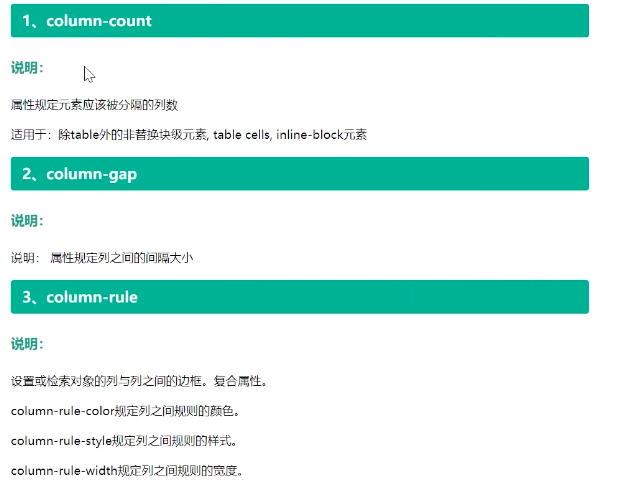
九:多列布局
代码
<!DOCTYPE html>
<html lang="en">

<head>
    <meta charset="UTF-8">
    <meta name="viewport" content="width=device-width, initial-scale=1.0">
    <title>多列布局</title>
    <style>
        * {
            margin: 0;
            padding: 0;
        }

        html,
        body {
            height: 100%;
        }

        .box {
            /* 1:显示分几列 */
            /* 共三列 */
            column-count: 3;

            /* 2:分隔间隔 */
            column-gap: 10px;

            /* 3:分割边框 */
            column-rule: 2px solid red;

            /*  列尺寸为自适应宽度 */
            /* column-fill: auto; */

            /* 设置列宽 */
            /* column-width: 100px; */
        }

        .box div {
            height: 200px;
            background-color: aqua;

            /* 333这个div 分区折行 */
            /* 禁止 div 这个盒子折行 */
            break-inside: avoid;
        }

        .box h1 {
            /* 横框所有列 */
            column-span: all;

        }
    </style>
</head>

<body>
    <div class="box">
        <h1>多列布局</h1>
        <div>111</div>
        <div>222</div>
        <div>333</div>
        <div>444</div>
        <div>555</div>
        <div>666</div>
        <div>777</div>
    </div>
</body>

</html>
详解
十:响应式布局
代码
<!DOCTYPE html>
<html lang="en">

<head>
    <meta charset="UTF-8">
    <meta name="viewport" content="width=device-width, initial-scale=1.0">
    <title>响应式布局</title>
    <style>
        html,
        body {
            height: 100%;
        }

        * {
            margin: 0;
            padding: 0;
        }

        .box {
            display: flex;
            flex-wrap: wrap;
            justify-content: space-between;
            align-items: flex-start;
            align-self: flex-start;

        }

        .box div {
            width: 24%;
            height: 100px;
            box-sizing: border-box;
            background-color: blue;
            margin-bottom: 2px;
        }

        @media screen and (max-width: 400px) {
            .box div {
                width: 90%;
            }
        }

        @media screen and (min-width: 400px) and (max-width: 600px) {
            .box div {
                width: 48%;
            }
        }

        @media screen and (min-width: 600px) and (max-width: 800px) {
            .box div {
                width: 33%;
            }
        }

        @media screen and (min-width: 800px) and (max-width: 1000px) {
            .box div {
                width: 24%;
            }
        }
    </style>
</head>

<body>
    <div class="box">
        <div>111</div>
        <div>222</div>
        <div>333</div>
        <div>444</div>
        <div>555</div>
        <div>666</div>
        <div>777</div>
        <div>888</div>
        <div>999</div>
        <div>111</div>
        <div>222</div>
        <div>333</div>
        <div>444</div>
        <div>555</div>
        <div>666</div>
        <div>777</div>
        <div>888</div>
        <div>999</div>
        <div>111</div>
        <div>222</div>
        <div>333</div>
        <div>444</div>
        <div>555</div>
        <div>666</div>
        <div>777</div>
        <div>888</div>
        <div>999</div>

    </div>
</body>

</html>
详解
十一: px em rem 区别
代码
<!DOCTYPE html>
<html lang="en">
<head>
    <meta charset="UTF-8">
    <meta name="viewport" content="width=device-width, initial-scale=1.0">
    <title>rem布局开发-等比例缩放布局</title>
    <style>
        html {
            font-size: 18px;
        }

        body {
            font-size: 16px;
        }

        .box1 {
            font-size: 16px;
        }

        .box2 {
            font-size: 32px;
        }

        .box3 {
            font-size: 2em;
        }

        .box4 {
            font-size: 2rem;
        }

        .box5 {
            font-size: 32px;
        }

    </style>
</head>
<body>

    <!-- px em rem 才去rem 布局
    em:相对单位, 相对于父元素的字体大小,
    rem 相对单位,是相对于根元素的字体大小,
    div width:10em, 相对于根元素字体大小的10倍
    -->

    <div class="box1">春风明媚</div>
    <div class="box2">春风明媚</div>
    <div class="box2">春风明媚</div>
    <div class="box3">春风明媚</div>
    <div class="box4">春风明媚</div>
    <div></div>

</body>
</html>
十二:rem 布局
代码
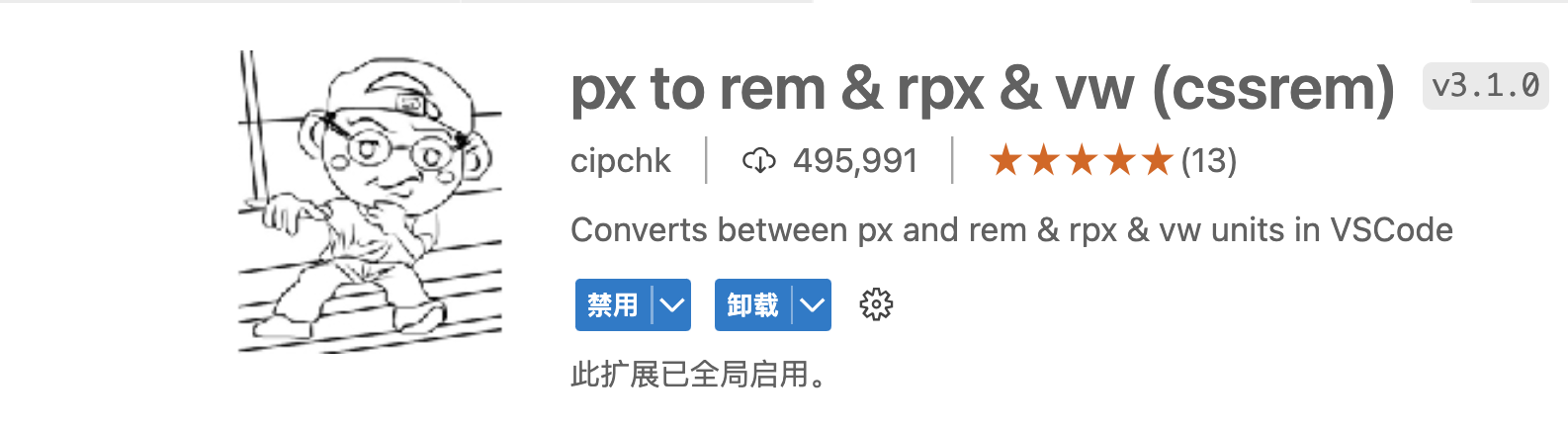
<!DOCTYPE html>
<html lang="en">

<head>
    <meta charset="UTF-8">
    <meta name="viewport" content="width=device-width, initial-scale=1.0">
    <title>rem 布局</title>
    <style>
        /* 1:先让 div 和 html 的 fontsize 成为固定的 比例
        2:让 html 的 fantsize成为动态的

        插件名字:px to rem & rpx(cssrem)插件
            插件是基于16px 来计算的
            其他的 px 需要修改配置。
        */
        * {
            margin: 0;
            padding: 0;
        }
        html {
            font-size: 16px;
        }

        body {
            font-size: 16px;
        }

        div {
            width: 46.875rem;
            height: 12.5rem;
            background-color: red;
        }
    </style>
    <script>
        // fontsize动态计算
        // fontsize = 当前设别的 css 布局宽度/物理分辨率 * 基准fontsize
        document.documentElement.style.fontSize = document.documentElement.clientWidth/750 * 16 +"px";
    </script>
</head>

<body>
    <div></div>
</body>

</html>
详解
十三:vw、vh 布局
代码
<!DOCTYPE html>
<html lang="en">

<head>
    <meta charset="UTF-8">
    <meta name="viewport" content="width=device-width, initial-scale=1.0">
    <title>等比例缩放-VM、VH</title>
    <style>
        /* px 等价于 多少vm vh */
        * {
            margin: 0;
            padding: 0;
        }

        div {
            width: 100vw;
            height: 100vh;
            background: red;
        }
    </style>
</head>

<body>
    <!-- vh 与 vw -->
    <!--
        vh view-height
            100vh === 视口的高度
        vw view-width
        100 vw === 视口高度
    -->
</body>
<div></div>

</html>
<!DOCTYPE html>
<html lang="en">

<head>
    <meta charset="UTF-8">
    <meta name="viewport" content="width=device-width, initial-scale=1.0">
    <title>等比例缩放-VM、VH</title>
    <style>
        /* px 等价于 多少vm vh */
        * {
            margin: 0;
            padding: 0;
        }

        /* vw 布局 */
        html {
            /* 16px */
            font-size: 5vw;
        }

        div {
            /* 100vw 包含滚动条 100%不包含滚动条 */
            width: 100vw;
            height: 6.25rem;
            background: red;
        }
    </style>
</head>

<body>
    <!-- vh 与 vw -->
    <!--
        vh view-height
            100vh === 视口的高度
        vw view-width
        100 vw === 视口高度
    -->
</body>
<div></div>

</html>
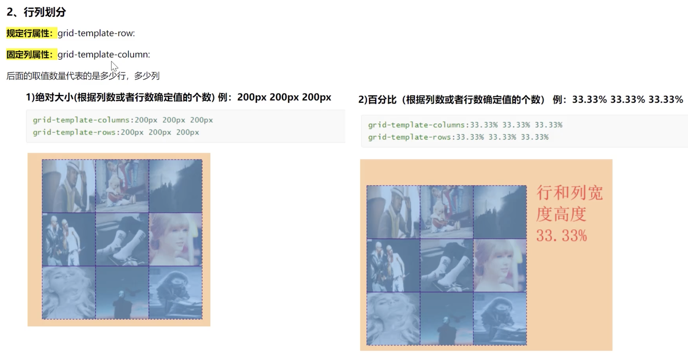
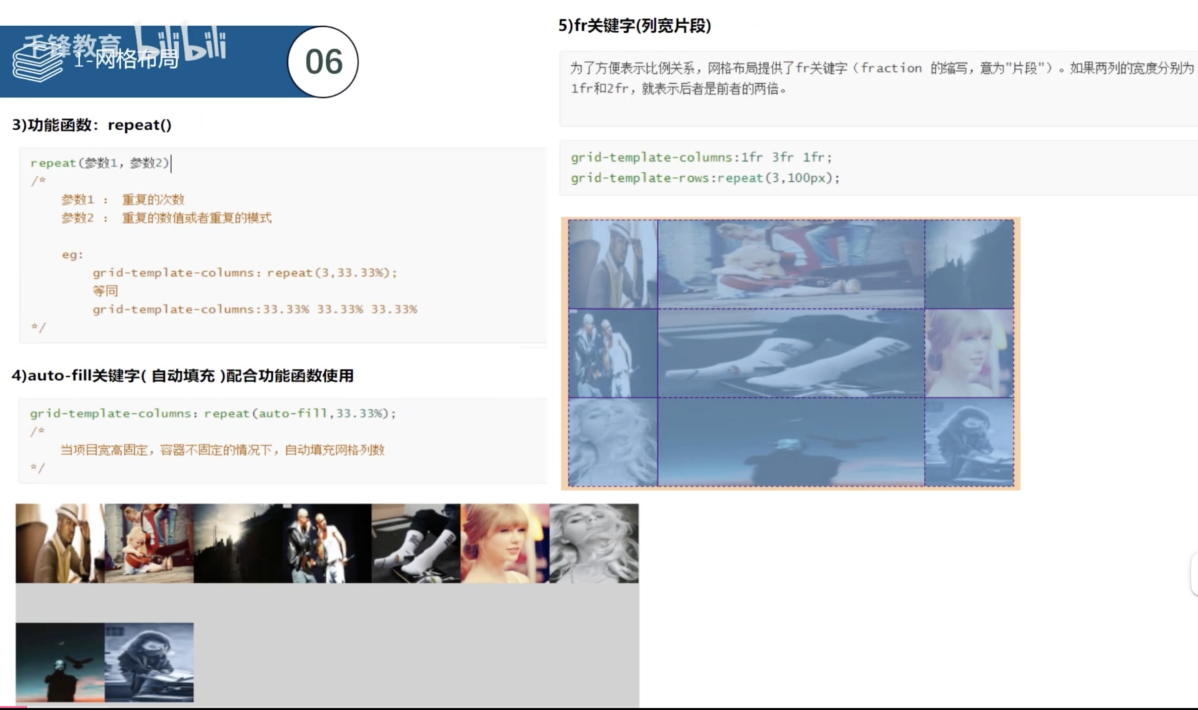
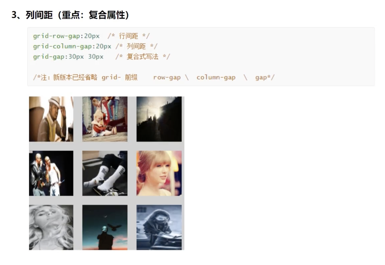
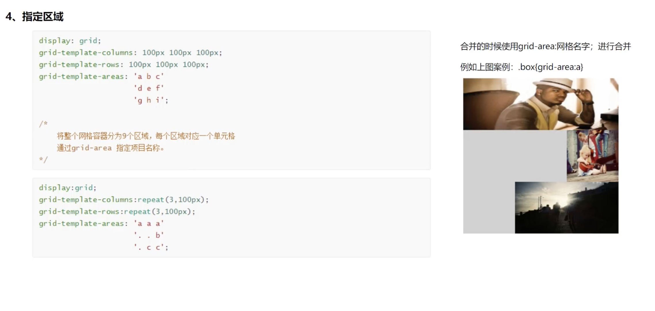
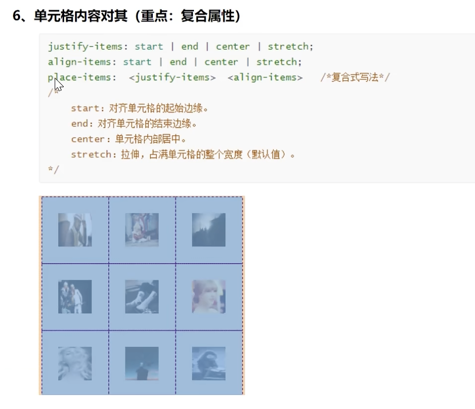
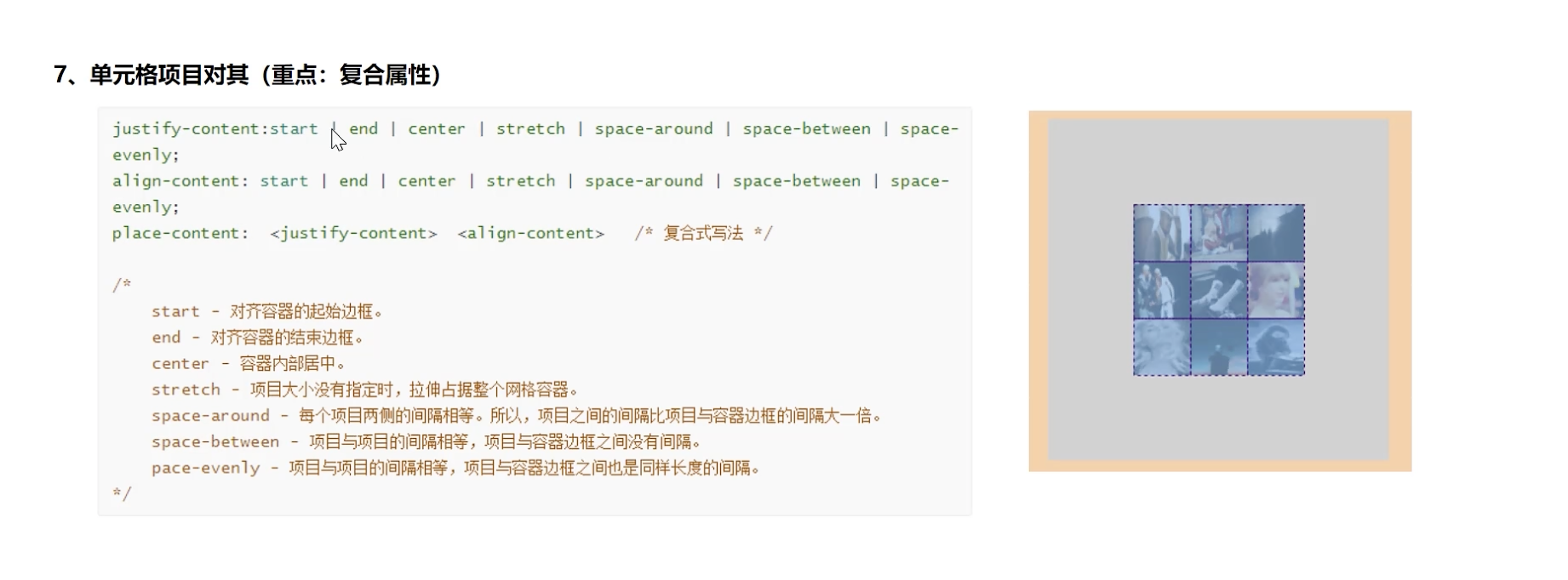
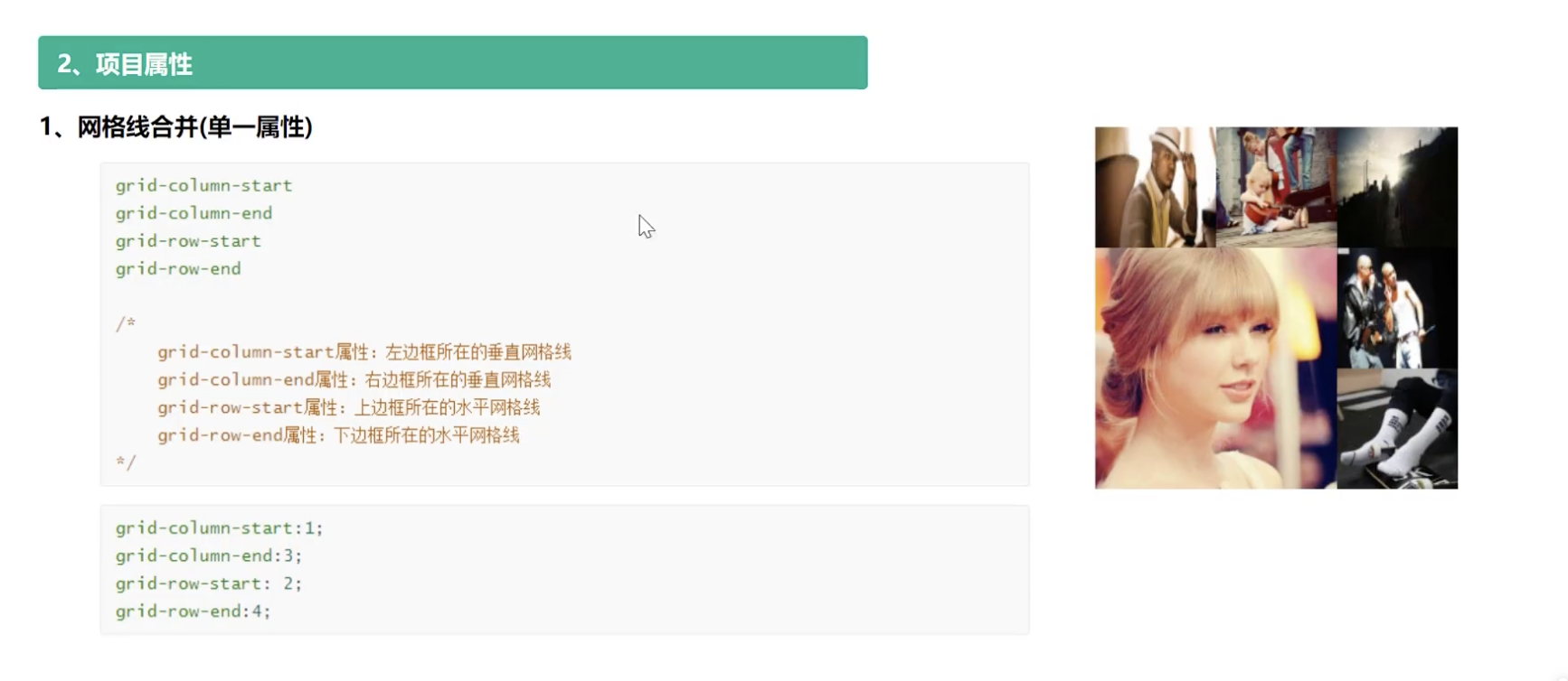
十四:网格布局
代码
<!DOCTYPE html>
<html lang="en">

<head>
    <meta charset="UTF-8">
    <meta name="viewport" content="width=device-width, initial-scale=1.0">
    <title>网格布局</title>
    <style>
        .box {
            width: 600px;
            height: 600px;
            margin: 10px auto;
            border: 1px solid gray;

            /* 一:网格布局 */
            display: grid;

            /* 二:几行几列 */
            /* 1:固定值的方式 */
            /* 3行,每行200px 高度 */
            /* grid-template-rows: 200px 200px 200px; */
            /* 3列,每列200px 高度 */
            /* grid-template-columns: 200px 200px 200px; */

            /* 2:百分比的方式 */
            /* grid-template-rows: 33.3% 33.3% 33.4%; */
            /* grid-template-columns: 33.3% 33.3% 33.4%; */

            /* 3:repeat函数 */
            /* grid-template-rows: repeat(3, 33.3%); */
            /* grid-template-columns: repeat(3, 33.3%); */
            grid-template-rows: repeat(3, 100px);
            grid-template-columns: repeat(3, 100px);

            /* 4:repeat auto-fill  自动填充 */
            /* grid-template-rows: repeat(auto-fill, 33.3%); */
            /* grid-template-columns: repeat(auto -fill, 33.3%); */

            /* 5:fr 片段 */
            /* grid-template-rows: 100px 1fr 200px; */
            /* grid-template-columns: 100px 1fr 200px; */

            /* 6: minmax 最小最大函数,设置最小最大 用的比较少  */
            /* grid-template-rows: minmax(100px, 200px) 200px 300px; */
            /* grid-template-columns: 200px 200px 200px; */

            /* 7:auto */
            /* grid-template-rows: 200px auto 200px; */
            /* grid-template-columns: 200px auto 200px; */

            /* 三:行列间距 */
            /* 行间距 */
            /* row-gap: 10px; */
            /* 列间距 */
            /* column-gap: 20px; */
            /* 行列间距 */
            gap: 10px 20px;

            /* 四:区域合并
            只能够正方向或者矩形
            */
            grid-template-areas: 'a a c'
                                 'd h f'
                                 'g h i';

            /* 五:网格布局-对齐方式
            column:垂直方向布局
            row:水平方向布局
            */
            grid-auto-flow: row;

            /* 水平对齐 */
            justify-content: start;
            justify-content: center;
            /* justify-content: end; */
            /* justify-content: space-around; */
            /* justify-content: space-between; */
            /* justify-content: stretch; */

            /* 垂直对齐 */
            align-content: start;
            align-content: center;
            /* align-content: end; */
            /* align-content: space-around; */
            /* align-content: space-between; */

            /* 六:控制每个单元格里面元素的对齐方式 */
            /* 水平对齐 */
            /* justify-items: start; */
            /* justify-items: center; */
            /* justify-items: end; */
            /* justify-items: space-around; */
            /* justify-items: space-between; */

            /* 垂直对齐 */
            /* align-items: start; */
            /* align-items: center; */
            /* align-items: end; */
            /* align-items: space-around; */
            /* align-items: space-between; */

            /* 复合写法 */
            /* place-content: center center; */
            /* place-items: center center; */


        }

        .box div {
            border: 1px solid red;
            width: 50px;
            height: 50px;
        }

         /* 七:网格线合并
         m行 n 列有 行有m+1根线,列有n+1条线
         */
        .box div:nth-child(1) {
            /* grid-area: a; */

            /* start end 左开右闭 */
            /* grid-column-start: 1; */
            /* grid-column-end: 3; */

            /* 复合写法 */
            grid-column: 1/3;
        }
        .box div:nth-child(5) {
            /* grid-area: h; */

            /* start end 左开右闭 */
            /* grid-row-start: 2; */
            /* grid-row-end: 4; */

            /* 复合写法 */
            grid-row: 2/4;
        }
    </style>
</head>

<body>
    <div class="box">
        <div>1</div>
        <div>2</div>
        <div>3</div>
        <div>4</div>
        <div>5</div>
        <div>6</div>
        <div>7</div>
    </div>
</body>

</html>
详解

引用


 浙公网安备 33010602011771号