006:CSS高级技巧:精灵图、宽高自适应、浮动元素宽高自适应、窗口自适应、两栏布局、三栏布局
目录
1:精灵图
2:宽高自适应
3:浮动元素高度自适应
4:窗口自适应
5: 两栏布局
6:三栏布局
正文
一:精灵图
总述
精灵图
代码
<!DOCTYPE html>
<html lang="en">

<head>
    <meta charset="UTF-8">
    <meta name="viewport" content="width=device-width, initial-scale=1.0">
    <title>精灵图</title>

    <style>
        /* 左侧精灵图 */
        .header, .body, .footer {
            position: relative;
            height: 32px;
            margin-bottom: 10px;
        }

        .conf {
            float: left;
            width: 103px;
            height: 32px;
            margin-left: 10px;
            background: url(image/jingling.png);
        }

        .conf1 {
            float: left;
            width: 103px;
            height: 32px;
            margin-left: 10px;
            background: url(image/jingling.png);
        }

        .conf2 {
            float: left;
            width: 103px;
            height: 32px;
            margin-left: 10px;
            background: url(image/jingling.png);
        }

        .box1 {
            background-position: -0px -0px;
        }

        .box2 {
            background-position: -0px -32px;
        }

        .box3 {
            background-position: -0px -65px;
        }

        .box4 {
            background-position: -0px -98px;
        }

        /* 中间精灵图 */
        .box5 {
            background-position: -104px -0px;
        }

        .box6 {
            background-position: -104px -32px;
        }

        .box7 {
            background-position: -104px -65px;
        }

        .box8 {
            background-position: -104px -98px;
        }

        /* 最下面精灵图 */
        .box9 {
            background-position: -104px -131px;
        }
    </style>

</head>

<body>
    <div class="header">
        <div class="box1 conf"></div>
        <div class="box2 conf"></div>
        <div class="box3 conf"></div>
        <div class="box4 conf"></div>
    </div>

    <div class="body">
        <div class="box5 conf"></div>
        <div class="box6 conf"></div>
        <div class="box7 conf"></div>
        <div class="box8 conf"></div>
    </div>

    <div class="footer">
        <div class="box9 conf"></div>
    </div>

</body>

</html>
详解
1:精灵技术产生的背景
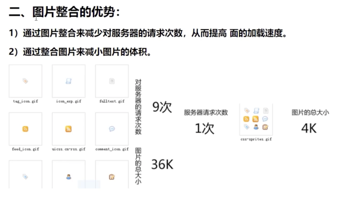
当用户访问一个网站时,需要向服务器发送请求,网页上的每张图像都要经过一次请求才能展现给用户。
然而,一个网页中往往会应用很多小的背景图像作为修饰,当网页中的图像过多时,服务器就会频繁地接受和发送请求,这将大大降低页面的加载速度。为了有效地减少服务器接受和发送请求的次数,提高页面的加载速度,出现了CSS精灵技术(也称CSS Sprites、CSS雪碧)。
2:精灵技术本质
简单地说,CSS精灵是一种处理网页背景图像的方式。它将一个页面涉及到的所有零星背景图像都集中到一张大图中去,然后将大图应用于网页,这样,当用户访问该页面时,只需向服务发送一次请求,网页中的背景图像即可全部展示出来。通常情况下,这个由很多小的背景图像合成的大图被称为精灵图(雪碧图)
3: 精灵技术的使用CSS 精灵其实是将网页中的一些背景图像整合到一张大图中(精灵图),然而,各个网页元素通常只需要精灵图中不同位置的某个小图,要想精确定位到精灵图中的某个小图,就需要使用CSS的background-image、background-repeat和background-position属性进行背景定位,其中最关键的是使用background-position属性精确地定位。
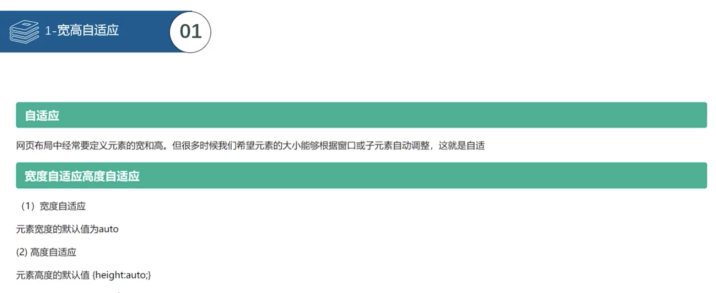
二:宽高自适应
代码
<!DOCTYPE html>
<html lang="en">
<head>
    <meta charset="UTF-8">
    <meta name="viewport" content="width=device-width, initial-scale=1.0">
    <title>宽高自适应</title>
    <style>
        div {
            /* 宽度自适应 */
            width: auto;
            /* 高度自适应 */
            height: auto;

            /* 最小宽度 */
            min-width: 500px;
            /* 最大宽度 */
            max-width: 1000px;

            /* 最小高度 */
            min-height: 500px;
            /* 最大高度 */
            max-height: 1000px;
        }

    </style>
</head>
<body>
     <div></div>
</body>
</html>
详解
三:浮动元素宽高自适应
代码
伪元素
<!DOCTYPE html>
<html lang="en">

<head>
    <meta charset="UTF-8">
    <meta name="viewport" content="width=device-width, initial-scale=1.0">
    <title>伪元素</title>
    <style>
        /*  第一个字符 */
        div::first-letter {
            font-size: 20px;
            color: red;
        }

        /* 第一行 */
        div::first-line {
            background-color: aqua;
        }

        /* div 标签最前面 */
        div::before {
            content: "div 标签最前面插入内容";
        }

        /* div 标签最后面 */
        div::after {
            content: "div 标签最后面插入内容";
        }
    </style>
</head>

<body>
    <div>Lorem ipsum dolor sit amet consectetur adipisicing elit. Eligendi minus molestiae soluta libero quaerat vero,
        nemo consequatur sint a, dignissimos expedita eum ad maxime nobis debitis aut dolores tenetur aliquam!</div>
</body>

</html>
万能清除浮动
<!DOCTYPE html>
<html lang="en">

<head>
    <meta charset="UTF-8">
    <meta name="viewport" content="width=device-width, initial-scale=1.0">
    <title>清除浮动元素</title>
    <style>
        .box1 {
            width: 100px;
            height: 100px;
            float: left;
            background-color: blue;
        }

        /* 万能清除浮动 父元素*/
        .box::after {
            content: "";
            clear: both;
            display: block;

            /* 有内容的时候不显示 */
            width: 0;
            height: 0;
             visibility: hidden;
        }

        .box2 {
            width: 200px;
            height: 200px;
            background-color: red;
        }


    </style>
</head>

<body>
    <div class="box">
        <div class="box1"></div>
        <!-- <div style="clear: both;"></div> -->
     </div>
    <div class="box2"> </div>
</body>

</html>
详解
伪类元素
四:窗口自适应
代码
<!DOCTYPE html>
<html lang="en">

<head>
    <meta charset="UTF-8">
    <meta name="viewport" content="width=device-width, initial-scale=1.0">
    <title>窗口自适应</title>
    <style>
        .box {
            width: 100%;
            height: 100%;
            background-color: blue;
        }

        /* 窗口自适应 */
        html, body {
            height: 100%;
        }

    </style>
</head>

<body>
    <div class="box">
     </div>
</body>

</html>
五:两栏布局
代码
<!DOCTYPE html>
<html lang="en">

<head>
    <meta charset="UTF-8">
    <meta name="viewport" content="width=device-width, initial-scale=1.0">
    <title>两栏布局</title>
    <style>
        /* 窗口自适应 */
        html, body {
            height: 100%;
        }

        /* 两栏布局方法1: */
        .box1 {
            width: 200px;
            height: 50%;
            background-color: blue;
            float: left;
        }

        .box2 {
            margin-left: 200px;
            height: 50%;
            background-color: red;
        }

         /* 两栏布局方法2:
         使用 calc 来计算宽度
         */
         .box3 {
            float: left;
            width: 200px;
            height: 50%;
            background-color: olive;
            float: left;
        }

        .box4 {
            float: left;
            width: calc(100% - 200px);
            height: 50%;
            background-color: orchid;
        }


    </style>
</head>

<body>
    <div class="box1"></div>
    <div class="box2"></div>
    <div class="box3"></div>
    <div class="box4"></div>
</body>

</html>
详解

六:三栏布局
代码
左中右三栏
<!DOCTYPE html>
<html lang="en">

<head>
    <meta charset="UTF-8">
    <meta name="viewport" content="width=device-width, initial-scale=1.0">
    <title>三栏布局-calc</title>
    <style>
        /* 窗口自适应 */
        html, body {
            height: 100%;
        }

        /* 三栏布局方法1: */
        .left {
            width: 200px;
            height: 100%;
            background-color: blue;
            float: left;
        }

        .center {
            width: calc(100% - 400px);
            min-width: 200px;
            height: 100%;
            background-color: red;
            float: left;
        }

        .right {
            width: 200px;
            height: 100%;
            background-color: olivedrab;
            float: left;
        }


    </style>
</head>

<body>
    <div class="left"></div>
    <div class="center"></div>
    <div class="right"></div>
</body>

</html>
上中(左中右)下
<!DOCTYPE html>
<html lang="en">

<head>
    <meta charset="UTF-8">
    <meta name="viewport" content="width=device-width, initial-scale=1.0">
    <title>三栏布局-calc</title>
    <style>
        /* 窗口自适应 */
        html,
        body {
            height: 100%;
        }

        /* 三栏布局方法 */
        .top {
            width: 100%;
            height: 200px;
            background-color: blue;
        }

        .middle {
            width: 100%;
            height: calc(100% - 400px);
            background-color: red;
        }

        /* 父盒子设置了高度,可以不用清除浮动 */
        /* .middle::after {
            content: "";
            clear: both;
            display: block;
            width: 0;
            height: 0;
            visibility: hidden;
        } */

        .left {
            width: 200px;
            height: 100%;
            background-color: aquamarine;
            float: left;
        }

        .center {
            width: calc(100% - 400px);
            height: 100%;
            background-color: blueviolet;
            float: left;
        }

        .rigth {
            width: 200px;
            height: 100%;
            background-color: chocolate;
            float: left;
        }

        .bottom {
            width: 100%;
            height: 200px;
            background-color: olivedrab;
        }
    </style>
</head>

<body>
    <div class="top"></div>
    <div class="middle">
        <div class="left"></div>
        <div class="center"></div>
        <div class="right"></div>
    </div>
    <div class="bottom"></div>

</body>

</html>
详解
1:鼠标样式cursor
设置或检索在对象上移动的鼠标指针采用何种系统预定义的光标形状。
cursor : default 小白 | pointer 小手 | move 移动 | text 文本
鼠标放我身上查看效果哦:
<ul>
<li style="cursor:default">我是小白</li>
<li style="cursor:pointer">我是小手</li>
<li style="cursor:move">我是移动</li>
<li style="cursor:text">我是文本</li>
</ul>
尽量不要用hand 因为 火狐不支持 pointer ie6以上都支持的尽量用
2: 轮廓 outline
是绘制于元素周围的一条线,位于边框边缘的外围,可起到突出元素的作用。
outline : outline-color ||outline-style || outline-width
但是我们都不关心可以设置多少,我们平时都是去掉的。
最直接的写法是 : outline: 0; 或者 outline: none;
<input type="text" style="outline: 0;"/>
3: 防止拖拽文本域resize
resize:none 这个单词可以防止 火狐 谷歌等浏览器随意的拖动 文本域。
右下角可以拖拽:
<textarea></textarea>
右下角不可以拖拽:
<textarea style="resize: none;"></textarea>
4:vertical-align 垂直对齐
以前我们讲过让带有宽度的块级元素居中对齐,是margin: 0 auto;
以前我们还讲过让文字居中对齐,是 text-align: center;
但是我们从来没有讲过有垂直居中的属性, 我们的妈妈一直很担心我们的垂直居中怎么做。
vertical-align 垂直对齐, 这个看上去很美好的一个属性, 实际有着不可捉摸的脾气,否则我们也不会这么晚来讲解。
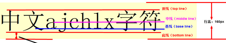
vertical-align : baseline |top |middle |bottom
设置或检索对象内容的垂直对其方式。
vertical-align 不影响块级元素中的内容对齐,它只针对于 行内元素或者行内块元素,特别是行内块元素, **通常用来控制图片/表单与文字的对齐**。
4.1:图片、表单和文字对齐
所以我们知道,我们可以通过vertical-align 控制图片和文字的垂直关系了。 默认的图片会和文字基线对齐。
去除图片底侧空白缝隙
有个很重要特性你要记住: 图片或者表单等行内块元素,他的底线会和父级盒子的基线对齐。这样会造成一个问题,就是图片底侧会有一个空白缝隙。
解决的方法就是:
4.1.1: 给img vertical-align:middle | top等等。 让图片不要和基线对齐。<img src="media/1633.png" width="500" style="border: 1px dashed #ccc;" />
4.1.2: 给img 添加 display:block; 转换为块级元素就不会存在问题了。<img src="media/sina1.png" width="500" style="border: 1px dashed #ccc;"/>
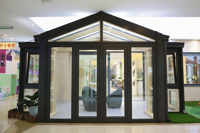
七:滑动门
先来体会下现实中的滑动门,或者你可以叫做推拉门:
7.1: 滑动门出现的背景
制作网页时,为了美观,常常需要为网页元素设置特殊形状的背景,比如微信导航栏,有凸起和凹下去的感觉,最大的问题是里面的字数不一样多,咋办?
为了使各种特殊形状的背景能够自适应元素中文本内容的多少,出现了CSS滑动门技术。它从新的角度构建页面,使各种特殊形状的背景能够自由拉伸滑动,以适应元素内部的文本内容,可用性更强。 最常见于各种导航栏的滑动门。
7.2: 核心技术
核心技术就是利用CSS精灵(主要是背景位置)和盒子padding撑开宽度, 以便能适应不同字数的导航栏。
一般的经典布局都是这样的:
<li>
<a href="#">
<span>导航栏内容</span>
</a>
</li>
总结:
1. a 设置 背景左侧,padding撑开合适宽度。
2. span 设置背景右侧, padding撑开合适宽度 剩下由文字继续撑开宽度。
3. 之所以a包含span就是因为 整个导航都是可以点击的。


 浙公网安备 33010602011771号