004*(CSS) CSS三大重点之二:浮动(脱标、高度塌陷、转行内块)、溢出属性、元素种类和转换
目录
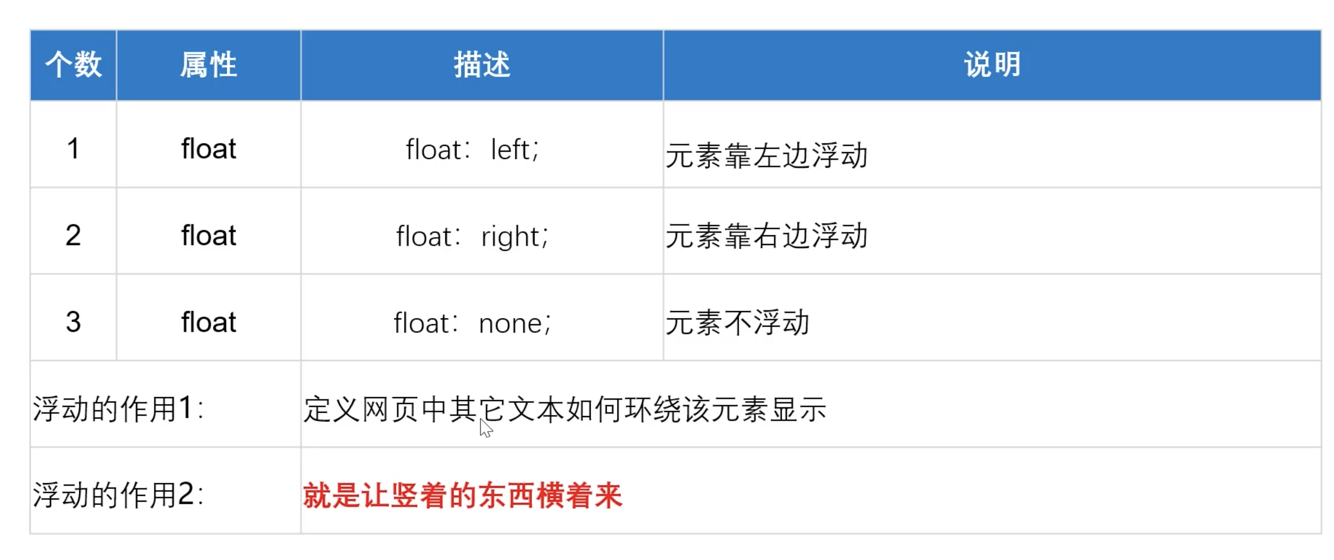
1:浮动 float 浮 漏 特
2: 清除浮动6种方法
3:溢出属性、溢出省约号
4:元素转换
正文
一:浮动
1:CSS的定位机制有3种:
普通流(标准流)
浮动
定位
2:(float) 脱标、高度塌陷、转行内块
代码:
<!DOCTYPE html>
<html lang="en">

<head>
    <meta charset="UTF-8">
    <meta name="viewport" content="width=device-width, initial-scale=1.0">
    <title> 浮动、清除浮动的几种方法</title>
    <style>
        /* 浮动的主要作用
        1:让竖着的元素横着
        2:定义网页中其他的元素围绕该元素显示

        会导致父元素高度塌陷,高度为0。
         */
        .box1,
        .box2,
        .box3 {
            float: left;
        }

        .box1 {
            width: 300px;
            height: 300px;
            background-color: red;
        }

        .box2 {
            width: 200px;
            height: 150px;
            background-color: #0f0;
        }

        .box3 {
            width: 200px;
            height: 200px;
            background-color: #00f;
        }

        .box4 {
            width: 10000px;
            height: 500px;
            background-color: olivedrab;

            /* 清除浮动方法2: 给浮动之后的其他元素清除浮动*/
            /* clear: both; */
        }

        /* 清除浮动方法1: 给父元素写固定高度*/
        .box {
            /* height: 350px; */

            /* 清除浮动方法4: overflow: hidden;    让浮动元素计算高度*/
            /* overflow: hidden; */
        }

        /* 清除浮动方法5:after伪元素清除浮动 */
        /* .clearfix:after { */
            /*正常浏览器 清除浮动*/
            /* content: "";
            display: block;
            height: 0;
            clear: both;
            visibility: hidden;
        } */

        /* 清除浮动方法6:使用before和after双伪元素清除浮动 */
        .clearfix:before,
        .clearfix:after {
            content: "";
            display: table;
        }

        .clearfix:after {
            clear: both;
        }
    </style>
</head>

<body>
    <div class="box clearfix">
        <div class="box1">浮动box1</div>
        <div class="box2">浮动box2</div>
        <div class="box3">浮动box3</div>
        <!-- 清除浮动3: 额外标签法  当前浮动的元素后面追加一个盒子,设置属性:clear: both -->
        <!-- <div style="clear: both;"></div> -->
    </div>


    <!-- 清除浮动 -->
    <div class="box4"> 底部盒子</div>
</body>

</html>
详解
1:什么是浮动?浮动是为了div在一行展示!!!!!!
2: 浮动
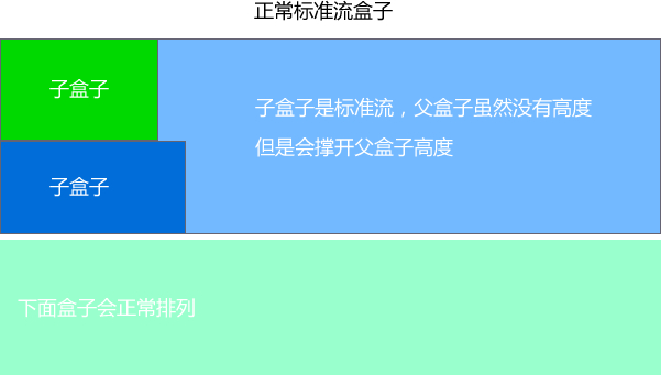
浮动的目的就是为了让多个块级元素同一行上显示。 最核心的关键点就是 怎么排列的, 是否占有位置
float 浮 漏 特
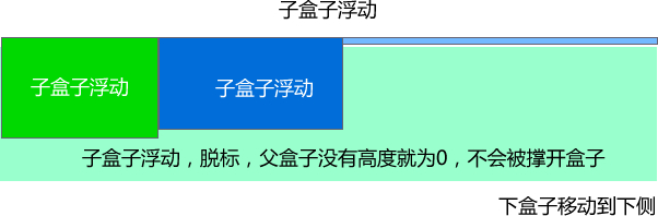
浮: 加了浮动的元素盒子是浮起来的,漂浮在其他的标准流盒子上面。
漏: 加了浮动的盒子,不占位置的,它浮起来了,它原来的位置漏 给了标准流的盒子。 高度塌陷。
特: 特别注意,首先浮动的盒子需要和标准流的父级搭配使用, 其次 特别的注意浮动可以使元素显示模式体现为行内块特性。
3:清除浮动
为什么要清除浮动
浮动本质是用来做一些文字混排效果的,但是被我们拿来做布局用,则会有很多的问题出现, 但是,你不能说浮动不好。
由于浮动元素不再占用原文档流的位置,所以它会对后面的元素排版产生影响,为了解决这些问题,此时就需要在该元素中清除浮动。
准确地说,并不是清除浮动,而是**清除浮动后造成的影响**
如果浮动一开始就是一个美丽的错误,那么请用正确的方法挽救它。
清除浮动本质
清除浮动主要为了解决父级元素因为子级浮动引起内部高度为0 的问题。高度塌陷
父盒子自动检测子盒子的高度。
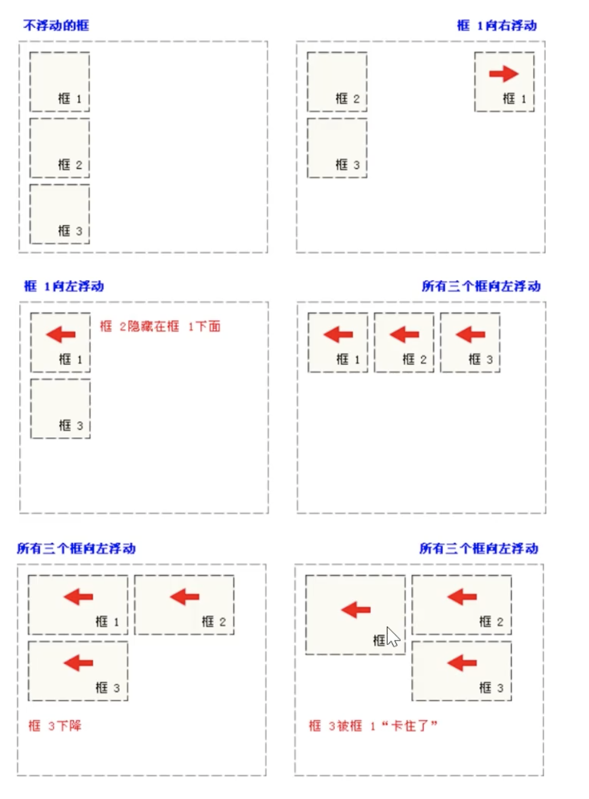
4:常见的浮动表现
二:清除浮动的方法
其实本质叫做闭合浮动更好一些, 记住,清除浮动就是把浮动的盒子圈到里面,让父盒子闭合出口和入口不让他们出来影响其他元素。
1: 给父元素固定高度
2:给浮动标签的下个标签清除浮动
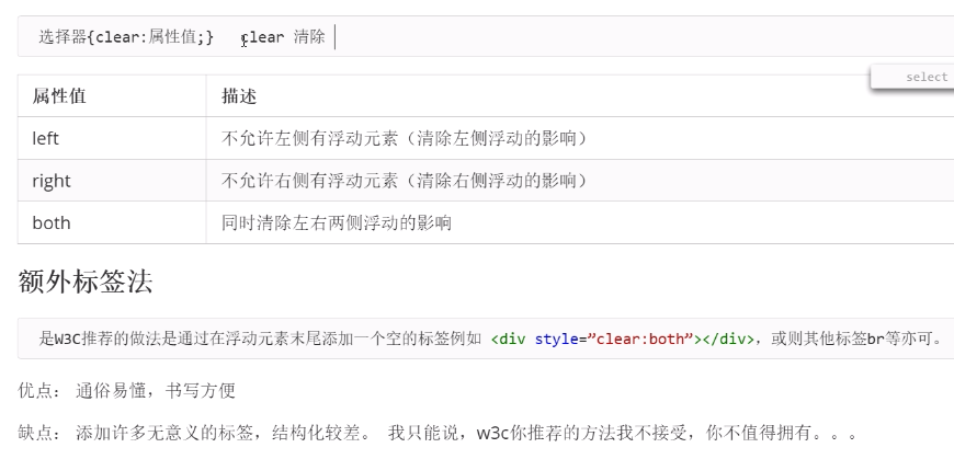
3:额外标签法
4:给父元素 overflow:hidden,让父元素计算高度
5:after伪元素清除浮动
**:after 方式为空元素的升级版,好处是不用单独加标签了**
使用方法:
.clearfix:after { content: ""; display: block; height: 0; clear: both; visibility: hidden; }
.clearfix {*zoom: 1;} /* IE6、7 专有 */
优点: 符合闭合浮动思想 结构语义化正确
缺点: 由于IE6-7不支持:after,使用 zoom:1触发 hasLayout。
代表网站: 百度、淘宝网、网易等
<!DOCTYPE html>
<html lang="en">
<head>
    <meta charset="UTF-8">
    <title>Document</title>
    <style>
    .clearfix:after {  /*正常浏览器 清除浮动*/
        content:"";
        display: block;
        height: 0;
        clear: both;
        visibility: hidden;
    }
    .clearfix {
        *zoom: 1;  /*zoom 1 就是ie6 清除浮动方式  *  ie7一下的版本所识别*/
    }

    .father {
        border: 1px solid red;
        width: 300px;

    }
    .big {
        width: 100px;
        height: 100px;
        background-color: purple;
        float: left;
    }
    .small {
        width: 80px;
        height: 80px;
        background-color: blue;
        float: left;
    }
    .footer {
        width: 400px;
        height: 100px;
        background-color: pink;
    }
    </style>
</head>
<body>
    <div class="father clearfix">
        <div class="big"></div>
        <div class="small"></div>
    </div>
    <div class="footer"></div>
</body>
</html>
6:使用before和after双伪元素清除浮动

代表网站:小米 腾讯
<!DOCTYPE html>
<html lang="en">
<head>
    <meta charset="UTF-8">
    <title>Document</title>
    <style>
    .clearfix:before, .clearfix:after {
        content: "";
        display: table;
    }
    .clearfix:after {
        clear: both;
    }
    .father {
        border: 1px solid red;
        width: 300px;

    }
    .big {
        width: 100px;
        height: 100px;
        background-color: purple;
        float: left;
    }
    .small {
        width: 80px;
        height: 80px;
        background-color: blue;
        float: left;
    }
    .footer {
        width: 400px;
        height: 100px;
        background-color: pink;
    }
    </style>
</head>
<body>
    <div class="father clearfix">
        <div class="big"></div>
        <div class="small"></div>
    </div>
    <div class="footer"></div>
</body>
</html>
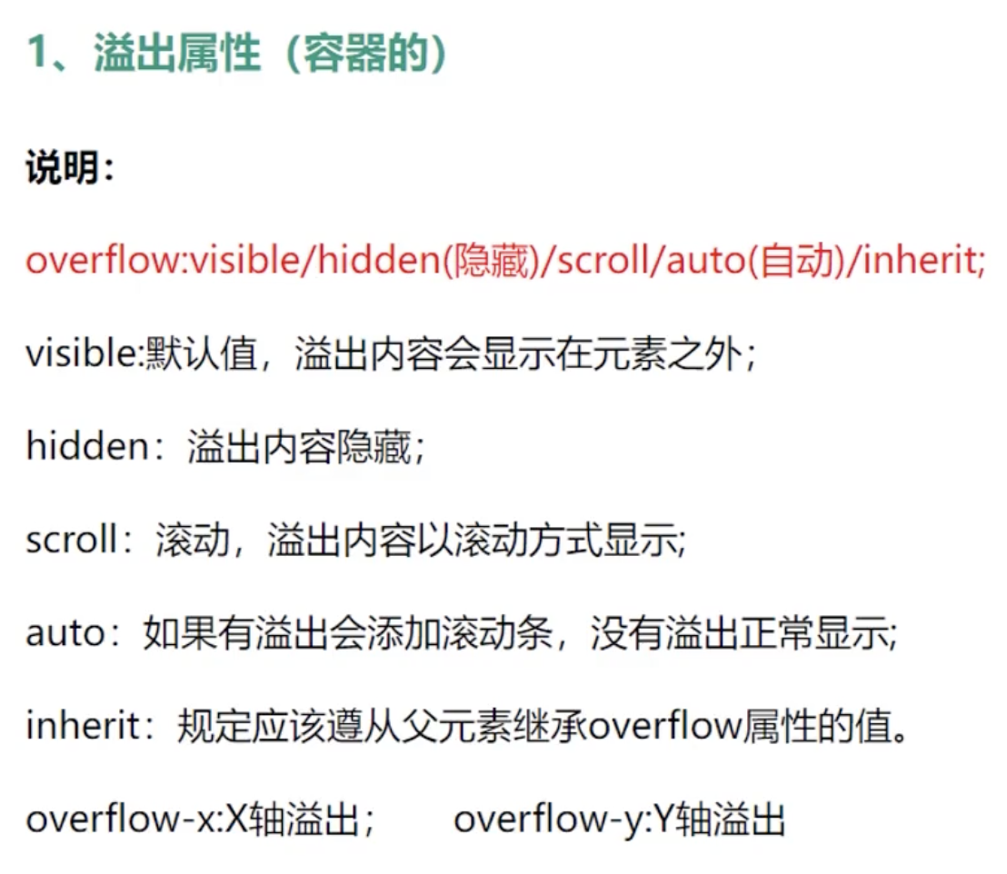
三:溢出属性
综述
2个重要的功能:清除浮动、文案显示在一行
代码
<!DOCTYPE html>
<html lang="en">

<head>
    <meta charset="UTF-8">
    <meta name="viewport" content="width=device-width, initial-scale=1.0">
    <title>溢出属性</title>

    <style>
        .box {
            width: 150px;
            height: 200px;
            background: red;

            /* 隐藏 */
            overflow: hidden;

            /* 显示 */
            overflow: visible;

            /* 滚动 */
            overflow: scroll;

            /* 高度够了的时候不现实滚动条,高度不够的时候显示滚动条 */
            overflow: auto;
            overflow: inherit;

            /* x轴显示滚动条 */
            overflow-x: auto;
            /* y轴显示滚动条 */
            overflow-y: auto;
        }
    </style>
</head>

<body>
    <div class="box">Lorem ipsum dolor sit amet consectetur adipisicing elit. Molestias, quaerat. Ipsam dolore nulla
        ipsa
        voluptatibus molestiae inventore, nam eos, ex optio, quibusdam ea odit molestias dicta debitis distinctio
        beatae. Esse.</div>

</body>

</html>
详解
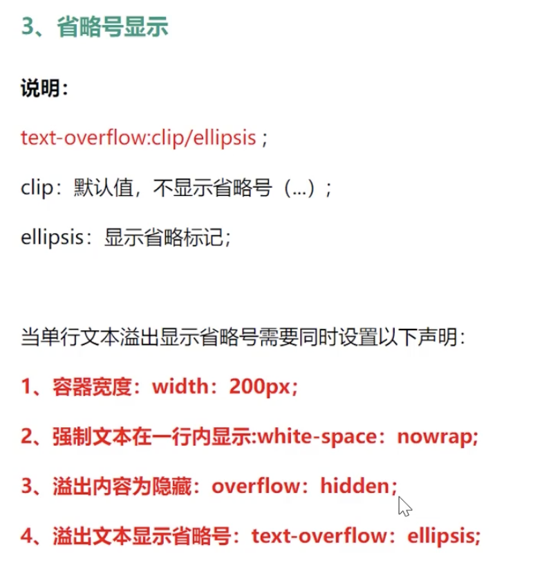
2:溢出省约号
<!DOCTYPE html>
<html lang="en">

<head>
    <meta charset="UTF-8">
    <meta name="viewport" content="width=device-width, initial-scale=1.0">
    <title>Document</title>

    <style>
        div {

            background: yellow;
            width: 200px;
            height: 200px;

            /* white-space
                nowrap :不换行
                pre: 显示空格,回车,不换行
                pre-wrap: 显示空格,回车,换行
                pre-line: 显示回车,不显示空格,换行 */

            /* 溢出省约号 */
            white-space: nowrap;
            overflow: hidden;
            text-overflow: ellipsis;
        }
    </style>
</head>

<body>
    <div>
        Lorem ipsum dolor, sit amet consectetur adipisicing elit. Molestias itaque saepe est in animi, reprehenderit aut
        magni, omnis hic, adipisci ipsum odio ipsa excepturi! Doloremque qui veritatis voluptatum nesciunt eveniet!
    </div>
</body>

</html>
详解
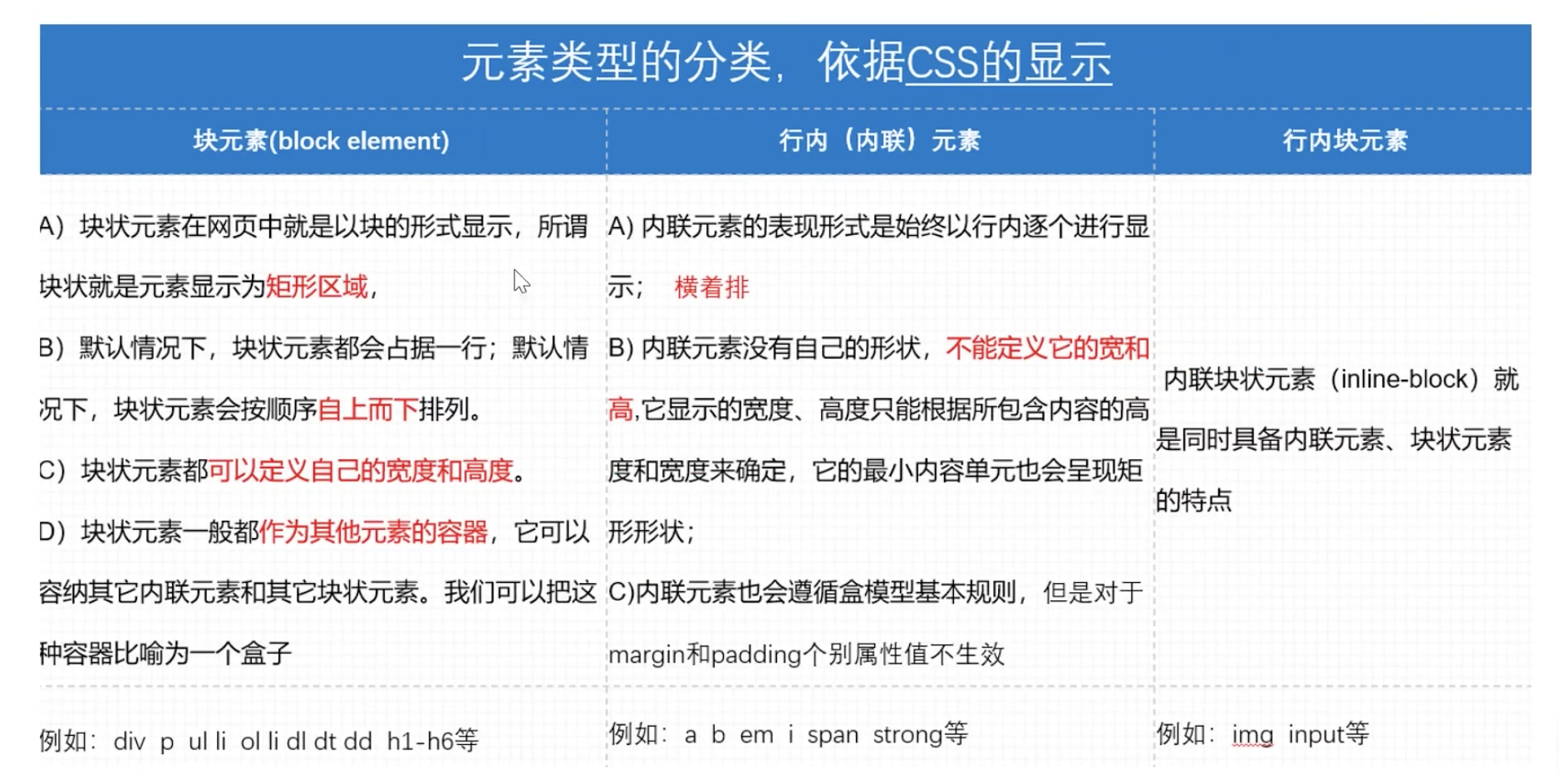
四:元素类型转换
<!DOCTYPE html>
<html lang="en">
<head>
    <meta charset="UTF-8">
    <meta name="viewport" content="width=device-width, initial-scale=1.0">
    <title>元素类型</title>
    <style>
        div {
            width: 100px;
            height: 100px;
            background-color: red;
        }

        span {
            /* 展示在一行  行内元素不支持上下边距,支持左右边距*/
            margin: 10px;
            padding: 10px;
        }

        input {
            /* 行内块:有宽高,展示在一行 */
            width: 100px;
            height: 100px;
            background-color: red;
        }

        div {
            /* inline:  行内
            block       块
            inline-block 行内块
            */
            display: inline-block;
            display: inline;
            display: block;
        }
    </style>
</head>
<body>
     <div>1:块级元素</div>
     <span>2:行内元素</span>
     <!-- 3: 行内块元素 -->
     <input type="text">
</body>
</html>
详解:


 浙公网安备 33010602011771号