008*:线性渐变、径向渐变、过渡、变换(平移、缩放、旋转、多属性复写、倾斜、太极)动画(关键帧)、3D变换( 平移、 缩放、旋转、立方体)
目录
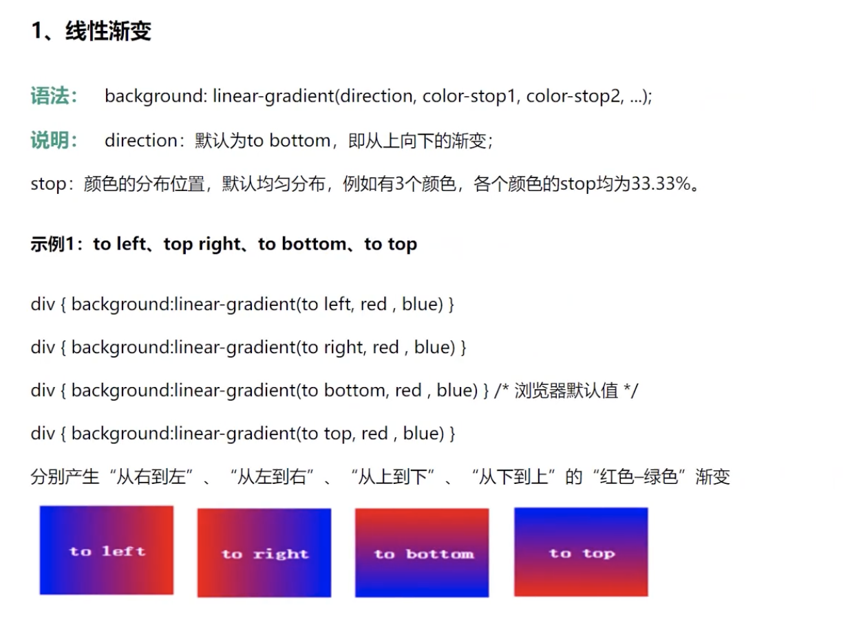
1:线性渐变 linear-gradient background: linear-gradient(direction, color-stop1, color-stop2, ...);
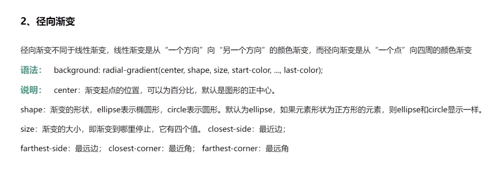
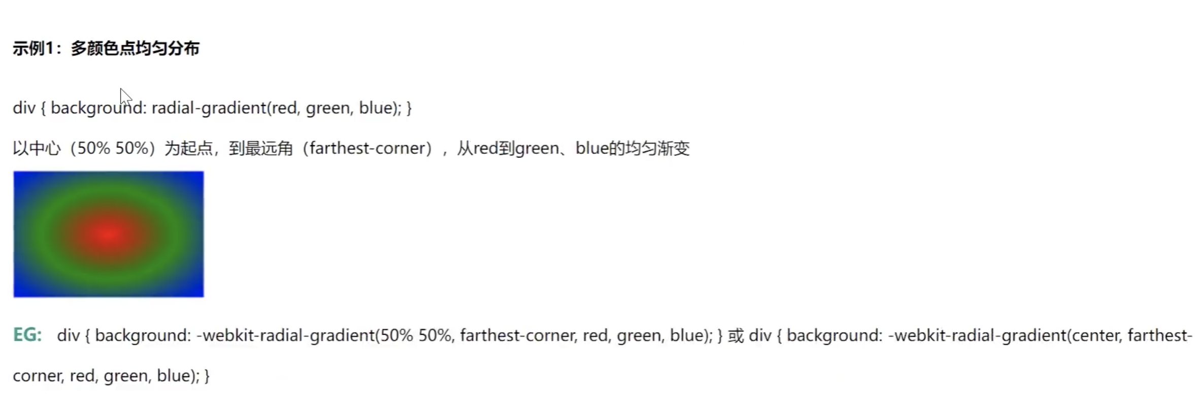
2:径向渐变 radial-gradient: ellipse background: radial-gradient(center, shape, size, start-color, ..., last-color);
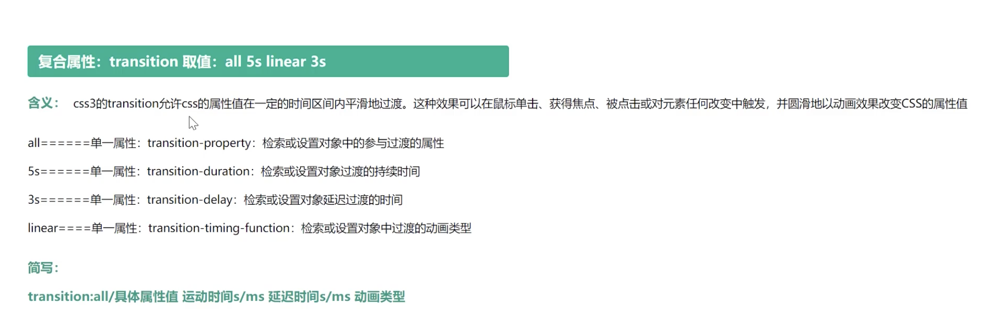
3:过渡 transition transition: all_change_properties duration timing_function delay
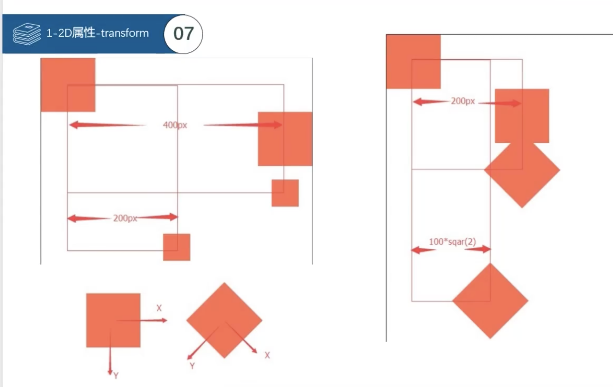
4:变换 transform
平移 translate
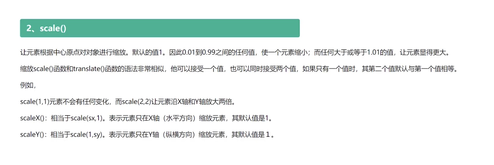
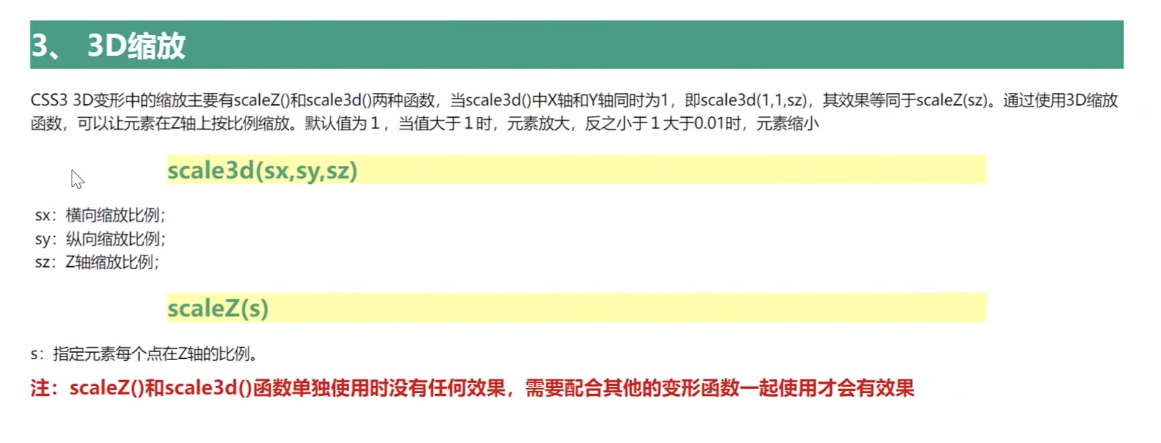
缩放 scale
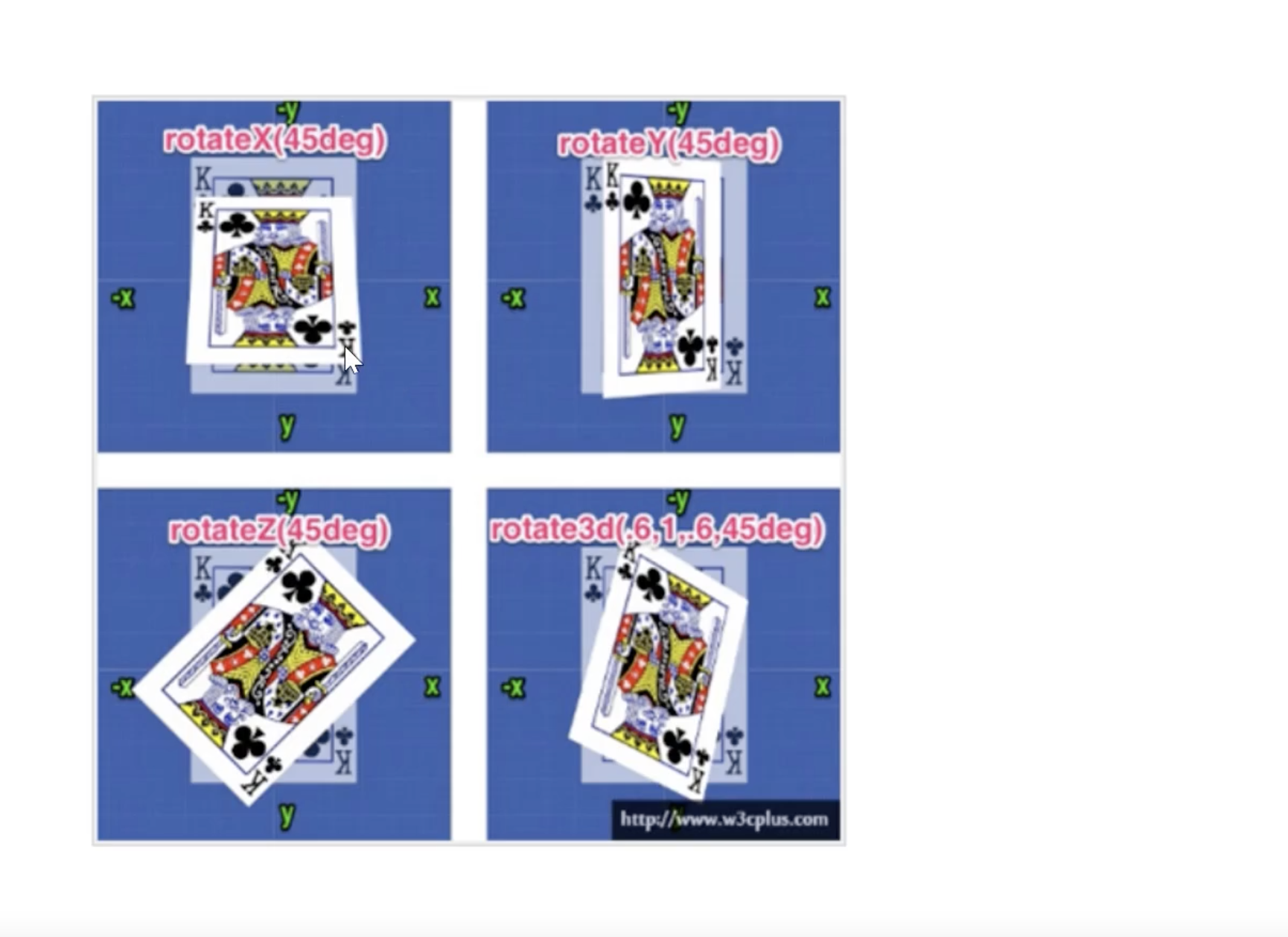
旋转 rotate
多属性复写
倾斜 skew
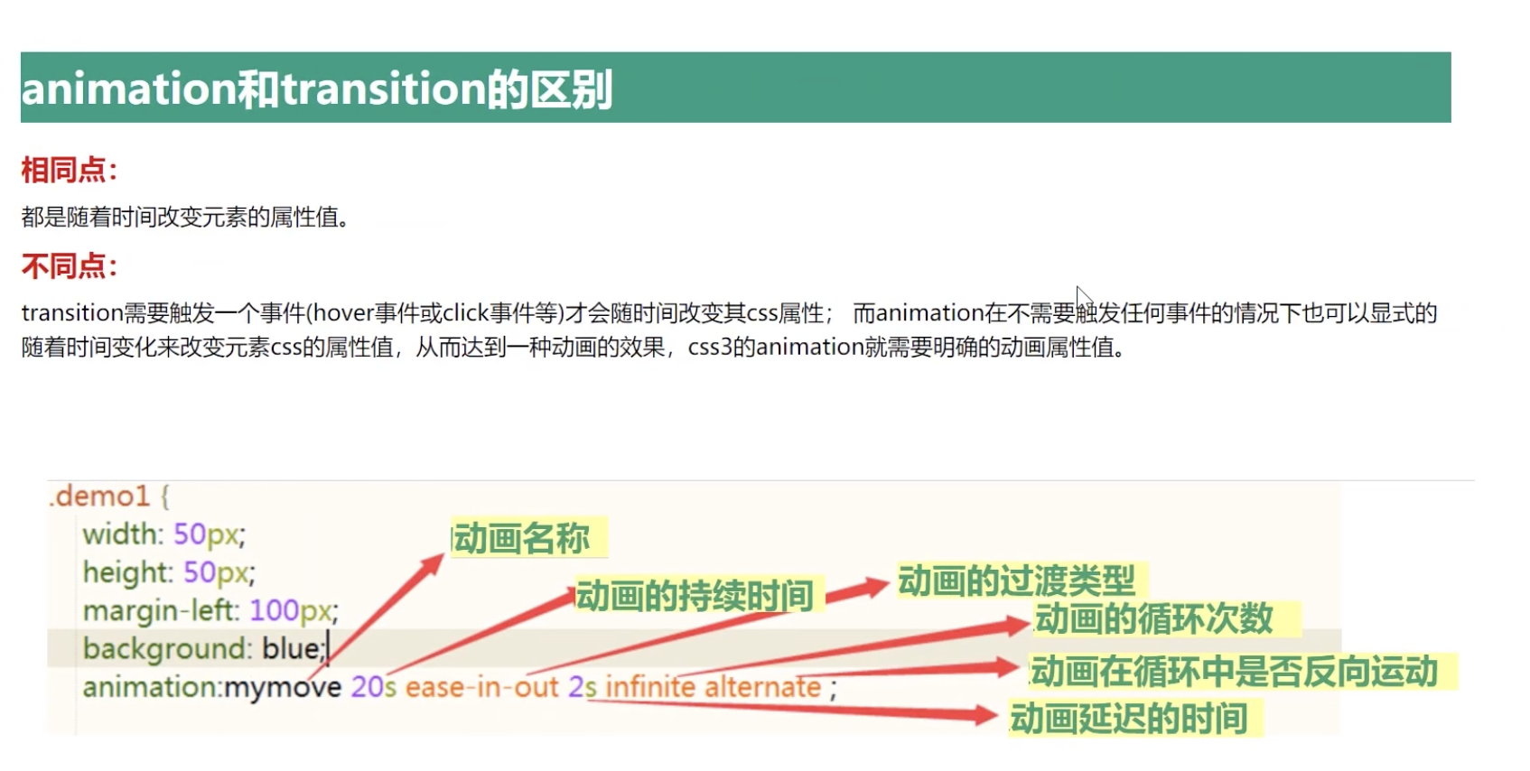
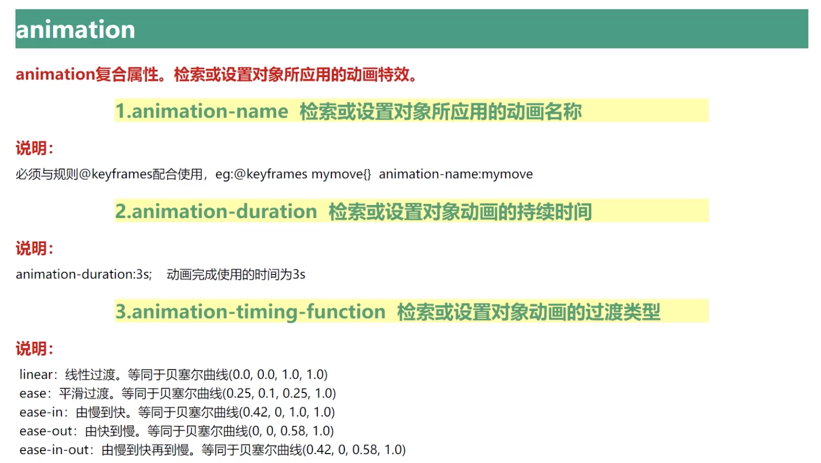
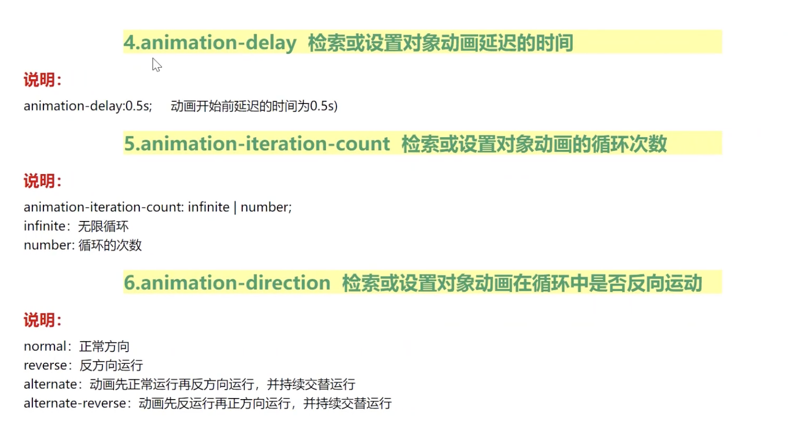
5:动画 animation animation: name duration timing-function delay iteration-count direction fill-mode;
关键帧动画
6:3D动画
平移
缩放
旋转
7:实例
太极
立方体
正文
一:线性渐变
代码
<!DOCTYPE html>
<html lang="en">

<head>
    <meta charset="UTF-8">
    <meta name="viewport" content="width=device-width, initial-scale=1.0">
    <title>线性渐变</title>
    <style>
        * {
            margin: 0;
            padding: 0;
        }

        div {
            width: 200px;
            height: 200px;
            margin: 10px auto;
        }

        /* 从上到下 */
        .bottom {

            /* 线性渐变 */
            /* background: linear-gradient(red, green, blue); */
            background: linear-gradient( to bottom, red, green, blue);
        }

        /* 从下到上 */
        .top {
            /* 线性渐变 */
            background: linear-gradient(to top, green, blue, red);
        }

        /* 从下到上 */
        .left {
            /* 线性渐变 */
            background: linear-gradient(to left, green, blue, red);
        }

        /* 从下到上 */
        .right {
            /* 线性渐变 */
            background: linear-gradient(to right, green, blue, red);
        }
    </style>
</head>

<body>
    <div class="bottom"></div>
    <div class="top"></div>
    <div class="left"></div>
    <div class="right"></div>
</body>

</html>
详解
二:径向渐变
代码
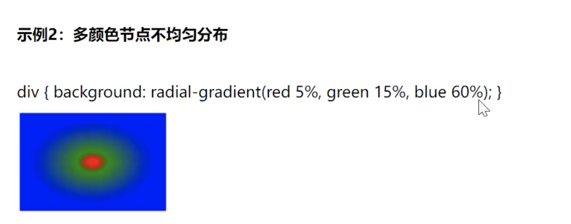
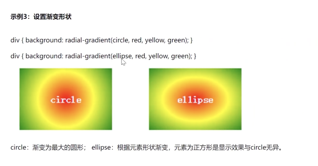
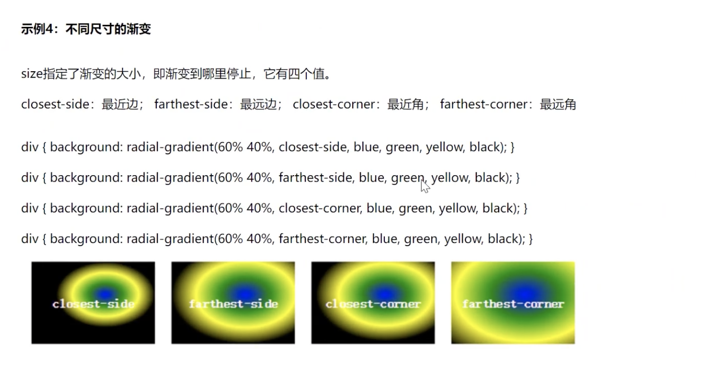
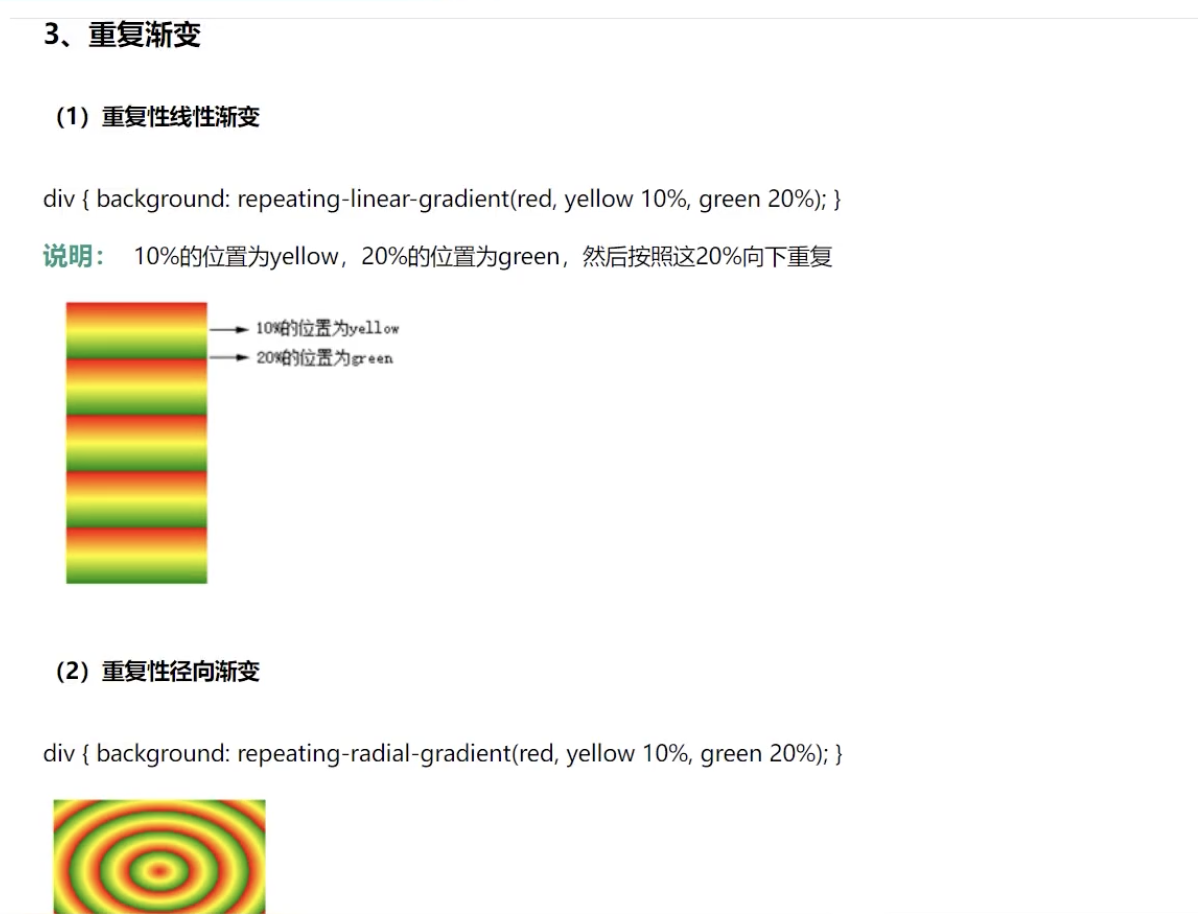
<!DOCTYPE html>
<html lang="en">

<head>
    <meta charset="UTF-8">
    <meta name="viewport" content="width=device-width, initial-scale=1.0">
    <title>径向渐变</title>
    <style>
        * {
            margin: 0;
            padding: 0;
        }

        div {
            width: 200px;
            height: 200px;
            margin: 10px auto;
        }

        /* 多颜色均匀分布 */
        .bottom {
            background: radial-gradient(red, green, blue);

            /* 50% 50% 中心 */
            /* background: radial-gradient(50% 50%, red, green, blue); */

            /* ellipse 椭圆 circle 圆 */
            /* background: -webkit-radial-gradient(70% 30%, ellipse, red, green, blue); */
            /* background: -webkit-radial-gradient(70% 30%,  circle, red, green, blue); */

            /* closest-side 最近边   farthest-side 最远边 closest-corner 最近角 farthest-corner 最远角 */
            /* background: -webkit-radial-gradient(70% 30%, closest-side, red, green, blue); */
            /* background: -webkit-radial-gradient(70% 30%, farthest-side, red, green, blue); */
            /* background: -webkit-radial-gradient(70% 30%, closest-corner, red, green, blue); */
            /* background: -webkit-radial-gradient(70% 30%, farthest-corner, red, green, blue); */
        }

        /* 多颜色 节点不均匀分布 */
        .top {
            /* 10%-30%中间渐变  30%-80%渐变 */
            background: radial-gradient(red 10%, green 30%, blue 80%);
        }

        /* 椭圆 */
        .left {
            width: 300px;
            background: -webkit-radial-gradient( ellipse, red, green, blue);
        }

        /* 重复渐变 */
        .right {
            background: repeating-linear-gradient(green, blue 10%, red 20%);

        }

        /* 重复渐变 */
        .center {
            background: repeating-radial-gradient(green, blue 10%, red 20%);

        }
    </style>
</head>

<body>
    <div class="bottom"></div>
    <div class="top">circle</div>
    <div class="left">ellipse</div>
    <div class="right"></div>
    <div class="center"></div>
</body>

</html>
详解
三:过渡
1:平移
代码
<!DOCTYPE html>
<html lang="en">

<head>
    <meta charset="UTF-8">
    <meta name="viewport" content="width=device-width, initial-scale=1.0">
    <title>2D动画-平移</title>
    <style>
        /* 1:复合动画写法 */
        .box1 {
            width: 200px;
            height: 200px;
            margin: 10px auto;
            background-color: red;
            /* 监听所有的属性变化 复合属性写法 */
            /* transition: all 2s linear; */

            /* 3:贝塞尔曲线
            网站:https://cubic-bezier.com/#.17,.67,.83,.67
            */
            transition: all 2s cubic-bezier(.13,1.15,.91,.18);
        }

        .box1:hover {
            width: 400px;
            height: 400px;
            background-color: blue;
        }

        /* 2:单一动画写法 */
        .box2 {
            margin-top: 300px;
            width: 200px;
            height: 200px;
            margin: 10px auto;
            background-color: green;
            /* 单一动画 */
            /* 监听的属性集合 */
            transition-property: width height background-color;
            transition-duration: 5s;
            transition-delay: 1s;

            transition-timing-function: linear;
            transition-timing-function: ease;
            transition-timing-function: ease-in;
            transition-timing-function: ease-out;
            transition-timing-function: ease-in-out;
            transition-timing-function: linear;
        }

        .box2:hover {
            width: 400px;
            height: 400px;
            background-color: palevioletred;
        }
    </style>
</head>

<body>
    <div class="box1"></div>
    <div class="box2"></div>

</body>

</html>
详解
四:变换:
1:位移
translate
2:缩放
代码
<!DOCTYPE html>
<html lang="en">
<head>
    <meta charset="UTF-8">
    <meta name="viewport" content="width=device-width, initial-scale=1.0">
    <title>2D动画-缩放</title>
    <style>
        div {
            width: 300px;
            height: 300px;
            margin: 200px auto 0;
            border: 1px solid red;
        }

        div>img {
            width: 100%;
            transition: all 2s linear;
        }


        div:hover img{
            /* 1:放大 */
            /* transform: scale(1.5); */
            /* transform: scale(-1.5); */

            /* 2:缩小 */
            transform: scale(0.5);
            /* 倒置 */
            /* transform: scale(-0.5); */


            /* 3:单一方向 */
            /* transform:scaleX(0.5); */
            /* transform:scaleY(0.5); */

            /* 4:改变缩放中心点:位置 */
            transform-origin: left top;
            /* transform-origin: left center; */
            /* transform-origin: left bottom; */
            /* transform-origin: right top; */
            /* transform-origin: right center; */
            /* transform-origin: right bottom; */
            /* transform-origin: center; */
        }

    </style>
</head>
<body>
     <div>
        <img src="image/hehua.jpg" alt="">
     </div>
</body>
</html>
详解
3:旋转
代码
<!DOCTYPE html>
<html lang="en">

<head>
    <meta charset="UTF-8">
    <meta name="viewport" content="width=device-width, initial-scale=1.0">
    <title>2D动画-旋转</title>
    <style>
        div {
            width: 200px;
            height: 200px;
            margin: 10 auto;
            border: 1px solid red;
        }


        div img {
            width: 100%;
            /* 想让谁旋转,加在谁上面,之后坚挺属性变化 */
            /* 动画过渡 */
            transition: all 2s linear;

        }

        div:hover img {
            /* 1:旋转:正值顺时针,负值逆时针 */
            transform: rotate(30deg);

            /* 2: 围绕 X 轴旋转 */
            /* transform: rotateX(30deg); */
            /* 围绕 Y 轴旋转 */
            /* transform: rotateY(30deg); */
            /* 围绕 Z 轴旋转 */
            /* transform: rotateZ(30deg); */

            /* 3:旋转的中心
            left top
            left center
            left bottom
            right top
            right center
            right bottom
            center
            */
            /* transform-origin: left bottom; */
        }
    </style>
</head>

<body>
    <div>
        <img src="image/hehua.jpg" alt="">
    </div>
</body>

</html>
详解
4:多属性复写
代码
<!DOCTYPE html>
<html lang="en">

<head>
    <meta charset="UTF-8">
    <meta name="viewport" content="width=device-width, initial-scale=1.0">
    <title>2D动画-复合动画</title>
    <style>
        .box {
            width: 600px;
            height: 632px;
            margin: 10px auto;
            border: 1px solid red;
        }

        .box div {
            width: 200px;
            height: 200px;
            margin-bottom: 10px;
            border: 1px solid blueviolet;
            box-sizing: border-box;
        }

        /* 1: 动画过渡、位移变换 */
        .box div:nth-child(1) {
            /* 动画过渡 */
            transition: all 2s linear;
        }

        .box div:nth-child(1):hover {
            /* 位移 变换 */
            transform: translate(400px, 0);
        }

        /* 2: 动画过渡、位移变换、缩放 */
        .box div:nth-child(2) {
            /* 动画过渡 */
            transition: all 2s linear;
        }

        .box div:nth-child(2):hover {
            /* 位移 变换、缩放
            两个动画之间不加逗号
            先写位移、在写缩放
            */
            transform: translate(400px, 0) scale(0.5);
        }

        /* 3: 动画过渡、位移变换、旋转 */
        .box div:nth-child(3) {
            /* 动画过渡 */
            transition: all 2s linear;
        }

        .box div:nth-child(3):hover {
            /* 位移 变换、缩放
            两个动画之间不加逗号
            先写位移、在写缩放
            */
            transform: translate(400px, 0)  rotate(120deg);
        }


    </style>
</head>

<body>
    <div class="box">
        <div> 位移 </div>
        <div> 位移缩放 </div>
        <div> 位移旋转 </div>
    </div>

</body>

</html>
详解
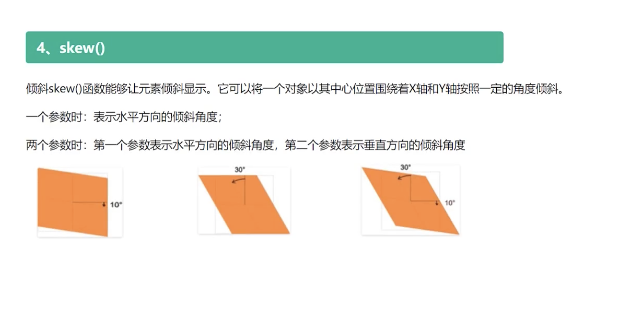
5:倾斜
代码
<!DOCTYPE html>
<html lang="en">

<head>
    <meta charset="UTF-8">
    <meta name="viewport" content="width=device-width, initial-scale=1.0">
    <title>2D动画-倾斜</title>
    <style>
        div {
            width: 200px;
            height: 200px;
            background: red;
            Line-height: 200px;
            text-align: center;
            border: 1px solid black;
            font-size: 50px;
            margin: 200px auto;

            /* skewX 正值, 拽右下角, 往右边拉动, 与 Y轴形成3odeg */
            transform: skewX(30deg);

            /*  skewY 正值, 拽右下角, 往下边拉动,与X轴形成3odeg */
            /* transform: skewY(30deg); */

            /*  skew(x,y) 往右下边拉动,正值, 拽右下角,形成3odeg */
            /* transform: skew(30deg, 30deg); */
        }
    </style>
</head>

<body>
    <div> 倾斜 </div>
</body>

</html>
详解
四:关键帧
代码
<!DOCTYPE html>
<html lang="en">

<head>
    <meta charset="UTF-8">
    <meta name="viewport" content="width=device-width, initial-scale=1.0">
    <title>关键帧动画</title>

    <link rel="stylesheet" href="https://cdnjs.cloudflare.com/ajax/libs/animate.css/3.5.1/animate.min.css" />
    <style>
        .box {
            width: 200px;
            height: 200px;
            Line-height: 200px;
            background: red;
            text-align: center;
            border: 1px solid black;
            font-size: 50px;
            margin: 200px auto;

            /* 1:关键帧动画 复合写法
            animation:
            name: 关键帧动画的名字,变量名字,可以自定义
            duration: 动画的持续时间
            timing-function:动画过渡类型
                linear:线性过渡
                ease:平滑过渡
                ease-in:由慢到快
                ease-out:由快到慢
                ease-in-out:由慢到快到慢
            delay:动画延迟时间
            iteration-count:动画循环次数
                infinite:无限循环
                number:循环次数
            direction:
                normal:正常方向
                reverse:反向方向
                alternate:先正常方向,再反向方向运行
                alternate-reverse:先反向方向,再正常方向运行
            fill-mode:动画填充方式
                none:无填充
                forward:最后的画面
                backward:初始画面
            */
            animation: zk 3s linear 1s infinite normal forwards;

            /* 2:动画单一属性 */
            animation-name: zk;
            animation-duration: 3s;
            animation-timing-function: linear;
            animation-delay: 1s;
            animation-iteration-count: infinite;
            animation-direction: normal;
            animation-fill-mode: forwards;

            /* 3:Animate.css 动画库
            网站:https://animate.style
            https://github.com/animate-css/animate.css
            https://www.dowebok.com/demo/2014/98/
            */
        }

        /* 定义动画 */
        @keyframes zk {
            from {
                width: 200px;
                height: 200px;
                background: red;
            }

            to {
                width: 400px;
                height: 400px;
                background: blue;
            }
        }

        #dowebok {
            width: 200px;
            height: 200px;
            margin: 10px auto;
            background-color: blue;
        }
    </style>
</head>

<body>
    <div class="box"> 关键帧动画 </div>
    <div class="animated bounce" id="dowebok"></div>
</body>

</html>
详解
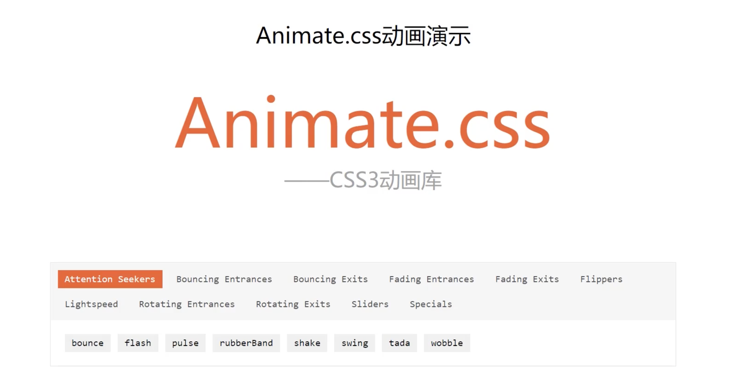
3:Animate.css 动画库
网站:https://animate.style
https://github.com/animate-css/animate.css
https://www.dowebok.com/demo/2014/98/
五:3D 变换
1:平移
代码
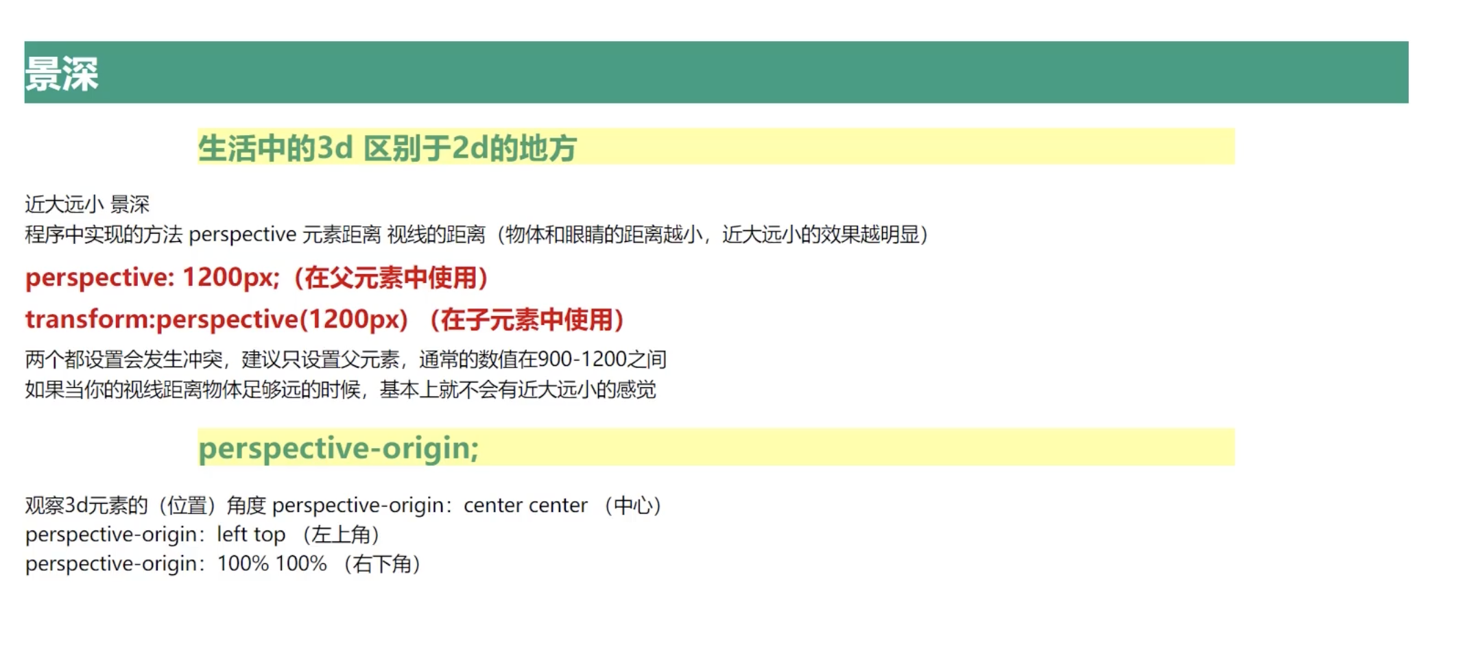
<!DOCTYPE html>
<html lang="en">

<head>
    <meta charset="UTF-8">
    <meta name="viewport" content="width=device-width, initial-scale=1.0">
    <title>3D动画-位移</title>

    <link rel="stylesheet" href="https://cdnjs.cloudflare.com/ajax/libs/animate.css/3.5.1/animate.min.css" />
    <style>
        .box {
            width: 500px;
            height: 500px;
            border: 5px solid red;
            margin: 0 auto;
             /* 相对定位 */
             position: relative;

            /* 1:设置平台
                flat: 平面 2D
                preserve-3d  :3D舞台
            */
            transform-style: flat;
            transform-style: preserve-3d;

            /* 让 Z 轴位移显示出来的方法1:旋转让 z 轴显示出来。  2:设置景深,用3D眼睛看
                Y轴旋转80度
                让 Z 轴显示出来,这样子就可以看出来 Z 轴偏移的距离
            */
            /* transform: rotateY(80deg); */

            /* 2:设置景深 */
            perspective: 900px;

            /* 3:景深眼睛的位置 */
            /* perspective-origin: center center; */
            /* perspective-origin: left top; */
        }

        /* 定位盒子居中 */
        .center {
            /* 绝对定位 */
            position: absolute;
            width: 200px;
            height: 200px;
            background: blue;
            left: 50%;
            top: 50%;
            margin-left: -100px;
            margin-top: -100px;

            /* 位移 */
            /* transform: translateX(100px); */
            /* transform: translateY(100px); */
            /* Z轴看不出来 */
            /* transform: translateZ(100px); */
            /* 复合写法
                x 轴便宜10px
                y 轴便宜50px
                z 轴便宜100px
            */
            /* transform: translate3d(10px, 50px, 100px); */

            /* 设置过渡都是为了让 Y 轴的位移显示出来 */
            transition: all 3s linear;
        }

        div:hover .center {
            transform: translateZ(300px);
        }
    </style>
</head>

<body>
    <div class="box">
        <div class="center"></div>
    </div>
</body>

</html>
详解
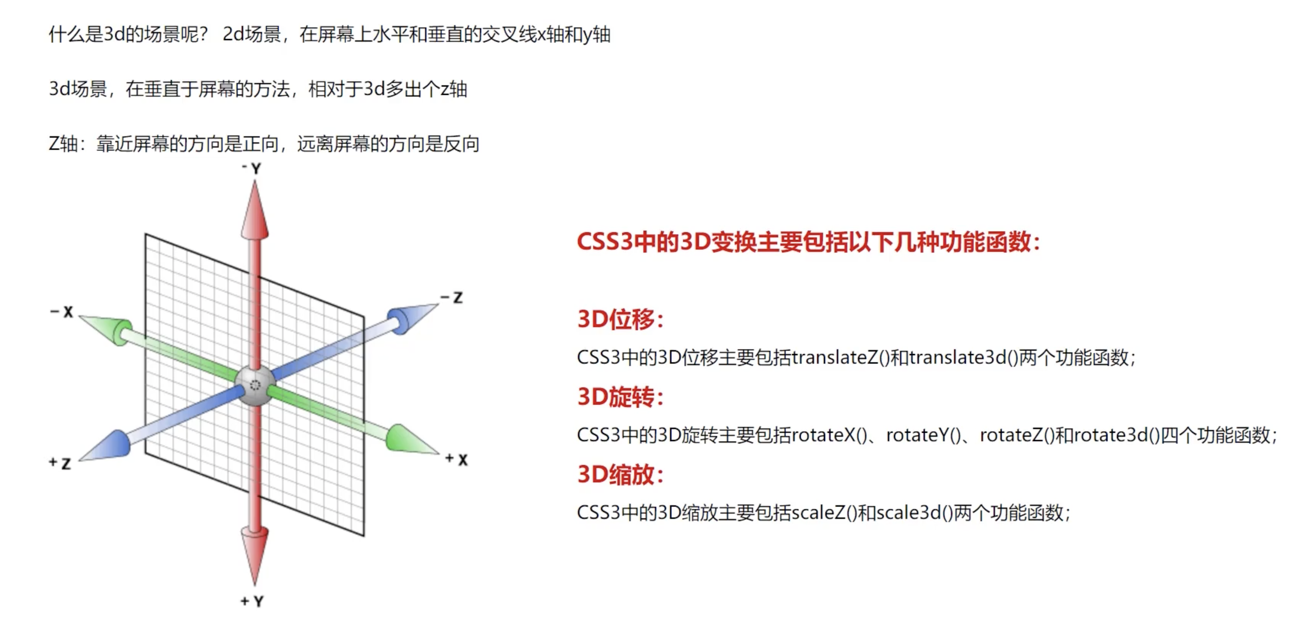
2:缩放
代码
<!DOCTYPE html>
<html lang="en">

<head>
    <meta charset="UTF-8">
    <meta name="viewport" content="width=device-width, initial-scale=1.0">
    <title>3D动画-缩放</title>

    <link rel="stylesheet" href="https://cdnjs.cloudflare.com/ajax/libs/animate.css/3.5.1/animate.min.css" />
    <style>
        .box {
            width: 500px;
            height: 500px;
            border: 5px solid red;
            margin: 0 auto;
            /* flex 布局 居中 */
            display: flex;


            /* 1:设置平台
                flat: 平面 2D
                preserve-3d  :3D舞台
            */
            /* transform-style: flat; */
            transform-style: preserve-3d;

            /* 2:设置景深 */
            perspective: 900px;

            /* 3:景深眼睛的位置 */
            /* perspective-origin: center center; */
            /* perspective-origin: left top; */
        }

        /* 定位盒子居中 */
        .center {
            width: 200px;
            height: 200px;
            background: blue;
            /* flex 布局 居中 */
            margin: auto;

            /* X轴放大2倍 */
            /* transform: scaleX(2);
            transform: scaleY(2); */

            /* 添加缩放,旋转 */
            /* transform: scaleZ(8) rotateX(45deg); */

            /* x 轴放大2倍 Y轴放大3倍,z轴放大10倍 */
            transform: scale3d(2, 3, 10) rotateX(4 5deg);
        }
    </style>
</head>

<body>
    <div class="box">
        <div class="center"></div>
    </div>
</body>

</html>
详解
3:旋转
代码
<!DOCTYPE html>
<html lang="en">

<head>
    <meta charset="UTF-8">
    <meta name="viewport" content="width=device-width, initial-scale=1.0">
    <title>3D动画-旋转</title>

    <link rel="stylesheet" href="https://cdnjs.cloudflare.com/ajax/libs/animate.css/3.5.1/animate.min.css" />
    <style>
        .box {
            width: 500px;
            height: 500px;
            border: 5px solid red;
            margin: 0 auto;
            /* flex 布局 居中 */
            display: flex;


            /* 1:设置平台
                flat: 平面 2D
                preserve-3d  :3D舞台
            */
            /* transform-style: flat; */
            transform-style: preserve-3d;

            /* 让 Z 轴 旋转 显示出来的方法1:旋转让 z 轴显示出来。  2:设置景深,用3D眼睛看
                Y轴旋转80度
                让 Z 轴显示出来,这样子就可以看出来 Z 轴偏移的距离
            */
            /* transform: rotateY(80deg); */

            /* 2:设置景深 */
            perspective: 900px;

            /* 3:景深眼睛的位置 */
            perspective-origin: center center;
            /* perspective-origin: left top; */
        }

        /* 定位盒子居中 */
        .center {
            width: 200px;
            height: 200px;
            background: blue;
            /* flex 布局 居中 */
            margin: auto;

            /* 旋转 */
            /* transform: rotateX(30deg); */
            /* transform: rotateY(30deg); */
            /* Z轴看不出来 */
            /* transform: rotateZ(30deg); */
            /*
                前面三个值在0-1之间
                x轴:旋转1*30度
                Y轴:旋转1*30度
                Z轴:旋转1*30度
            */
            transform: rotate3D(30deg, 30deg, 30deg);

            /* 设置过渡都是为了让 旋转动画 显示出来 */
            transition: all 3s linear;
        }

        div:hover .center {
            /* transform: rotateX(30deg); */
            /* transform: rotateY(30deg); */
            /* transform: rotateZ(30deg); */

            /*
                前面三个值在0-1之间
                x轴:旋转1*30度
                Y轴:旋转1*30度
                Z轴:旋转1*30度
            */
            transform: rotate3D(1, 1, 1, 30deg);
        }
    </style>
</head>

<body>
    <div class="box">
        <div class="center"></div>
    </div>
</body>

</html>
详解
七:实例
1:立方体
代码
<!DOCTYPE html>
<html lang="en">

<head>
    <meta charset="UTF-8">
    <meta name="viewport" content="width=device-width, initial-scale=1.0">
    <title>立方体</title>

    <link rel="stylesheet" href="https://cdnjs.cloudflare.com/ajax/libs/animate.css/3.5.1/animate.min.css" />
    <style>
        * {
            margin: 0;
            padding: 0;
        }

        .box {
            width: 600px;
            height: 600px;
            border: 5px solid black;
            border-radius: 20px;
            margin: 10px auto;

            /* 3D舞台 */
            transform-style: preserve-3d;

            /* 相对布局 */
            position: relative;

            animation: run 5s linear infinite;
        }

        @keyframes run {
            0% {
                transform: rotateY(30deg) rotateX(30deg);
            }

            50% {
                transform: rotateY(300deg) rotateX(300deg);

            }

            100% {
                transform: rotateY(30deg) rotateX(30deg);
            }
        }

        .box div {
            /* 绝对布局 */
            position: absolute;

            width: 200px;
            height: 200px;

            /* 盒子居中 */
            left: 50%;
            top: 50%;
            margin-top: -100px;
            margin-left: -100px;

            /* 水平居中 */
            line-height: 200px;
            /* 垂直居中 */
            text-align: center;

            font-size: 50px;

            color: white;

            /* 透明度 */
            opacity: 0.7;
        }

        .box div:nth-child(1) {
            background-color: gray;
            transform: translateZ(100px);
        }

        .box div:nth-child(2) {
            background-color: cadetblue;
            transform: translateX(-100px) rotateY(-90deg);
        }

        .box div:nth-child(3) {
            background-color: purple;
            transform: translateY(-100px) rotateX(90deg);
        }

        .box div:nth-child(4) {
            background-color: green;
            transform: translateY(100px) rotateX(-90deg);
        }

        .box div:nth-child(5) {
            background-color: red;
            transform: translateX(100px) rotateY(90deg);
        }

        .box div:nth-child(6) {
            background-color: darkblue;
            transform: translateZ(-100px) rotateY(180deg);
        }
    </style>
</head>

<body>
    <div class="box">
        <div>1</div>
        <div>2</div>
        <div>3</div>
        <div>4</div>
        <div>5</div>
        <div>6 </div>
    </div>
</body>

</html>
2:太极
代码
<!DOCTYPE html>
<html lang="en">

<head>
    <meta charset="UTF-8">
    <meta name="viewport" content="width=device-width, initial-scale=1.0">
    <title>太极</title>

    <style>
        body {
            background: lightblue;
        }

        .box {
            width: 200px;
            height: 200px;
            background: linear-gradient(white 50%, black 50%);
            border: 1px solid gray;
            margin: 0 auto;
            display: flex;
            align-items: center;
            border-radius: 50%;

            animation: run 1s linear infinite;
        }

        @keyframes run {
            0% {
                transform: rotate(0deg);
            }

            100% {
                transform: rotate(360deg);
            }
        }
        .box::before {
            content: '';
            display: block;
            width: 100px;
            height: 100px;
            background: red;
            border-radius: 50%;
            background: radial-gradient(white 25%, black 25%);
        }
        .box::after {
            content: '';
            display: block;
            width: 100px;
            height: 100px;
            background: blue;
            border-radius: 50%;
            background: radial-gradient(black 25%, white 25%);
        }


    </style>
</head>

<body>
    <div class="box">
    </div>
</body>

</html>
引用


 浙公网安备 33010602011771号