一、无监督学习Unsupervised Learning
1、无监督学习
任务:下边六个实例,根据自己喜欢的方式分成两组
让计算机将下面的六张图片分成两类

方式一:站着(1、2)或坐着(3、4、5、6)
方式二:全身(1、2、3)或半身(4、5、6)
方式三:蓝眼球(1、2、3、5)或不是蓝眼球(4、6)
三种划分方式没有对错之分,都能完成我们的任务,
无监督学习的两个特点:(1)、没有对与错。(2)、寻找数据的共同点。
无监督学习的定义:它是机器学习的一种方法,没有给定事先标记过的训练示例,自动对输入的数据进行分类或分群。
优点:
(1)、算法不受监督信息(偏见)的约束,可能考虑到新的信息。
(2)、不需要标签数据,极大程度扩大数据样本(可以放成千上万的数据,让计算机自动去归类,可以节省很多人力成本)
无监督学习的主要应用:聚类分析、关联规则、维度缩减
应用最广:聚类分析(clustering)
监督学习:
监督学习的训练数据:{(x(1) ,y(1) ),(x(2) ,y(2) ),....,(x(m) ,y(m) )}
由于监督学习的训练数据有y值,即已经打好了标签,即有输入的数据x还有对应的标签y。
无监督学习:
无监督学习的训练数据:{(x(1) ),(x(2) ),....,(x(m) )}
无监督学习的训练数据只有输入数据x,没有y值,让计算机自动分成两类。
2、聚类分析
聚类分析又称为群分析,根据对象某些属性的相似度,将其自动化分为不同的类别。
应用场景
(1)、客户划分(商业)

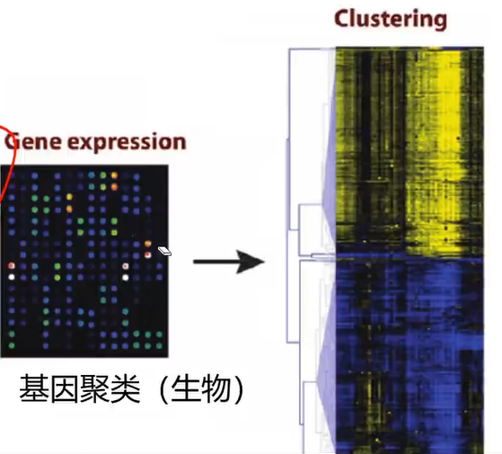
(2)、基因聚类(生物)
(3)、新闻关联

常用的聚类算法:
1、KMeans聚类
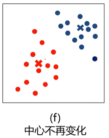
根据数据与中心点距离划分类别
基于类别数据更新中心点
重复过程直到收敛
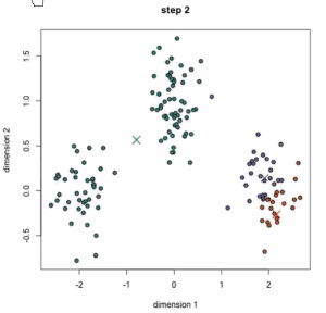
从动态图中可以看到:一开始有三个中心点,三个中心点其实是在移动的,最后分成3类。
特点:
1、实现简单,收敛快
2、需要指定类别数量
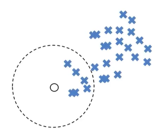
2、Mean-shift均值漂移聚类
(1)、在中心点一定区域检索数据点
(2)、更新中心
(3)、重复流程到中心点稳定
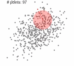
动态图中,红点一直在往中间区域走,中心点会向数据密集的区域转移
特点:
1、自动发现类别数量(不需要告诉有多少类),不需要人工选择、
2、需要选择区域半径(需要告诉它区域半径)
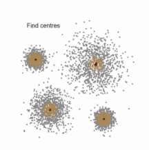
mean-shift算法实现的效果如下:一开始有很多的点,慢慢的这些点会集中到中间区域,最后分成4个类。
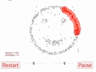
3、DBSCAN算法(基于密度的空间聚类算法)
一开始有一个点,然后会往四周扩张,如果周边点密度太少,就会被过滤掉
基于区域点密度筛选有效数据(可以过滤掉噪声,如果密度太低,直接会被过滤掉)
基于有效数据向周边扩张,直到没有新点加入
特点:
1、过滤噪音数据
2、不需要人为选择类别数量
3、数据密度不同时影响结果
二、 KMeans、KNN、Mean-shift
KNN(K-Nearest Neighbors)属于监督式学习,这里讲KNN因为KNN算法和KMeans算法很容易混淆。
1、KMeans(类别数量)
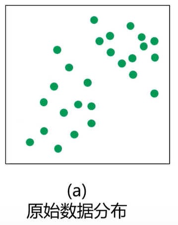
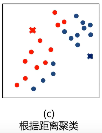
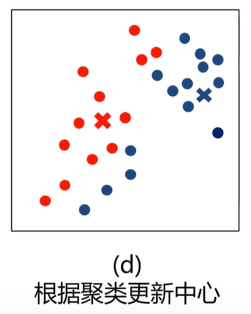
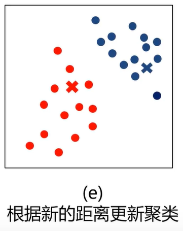
什么是K均值聚类?(KMeans Analysis)
K-均值算法:以空间中k个点为中心进行聚类,对最靠近他们的对象归类,是聚类算法中最为基础但也最为重要的算法。

根据距离归类:即距离最短。
中心更新:取区域中所有点的平均值
上图中,开始时有两个中心点(圆圈),然后计算每个点与中心点的距离,第一次计算完之后就进行分类,再进行区域中心的更新。更新完之后再计算每个点与中心点的距离,再进行分类,。。。
算法流程
1、选择聚类的个数k
2、确定聚类中心(随机选取)
3、根据点到聚类中心距离确定各个点所属类别
4、根据各个类别数据更新聚类中心
5、重复以上步骤直到收敛(中心点不再变化)
优点:
1、原理简单,实现容易,收敛速度快
2、参数少,方便使用
缺点:
1、必须设置簇的数量(类数不一样,结果也不一样,有时候给计算机的数据你也不知道要分成几类)
2、随机选择初始聚类中心,结果可能缺乏一致性(初始聚类中心比较重要,初始聚类中心不一样,结果可能不一样)

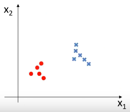
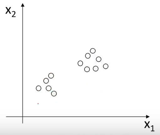
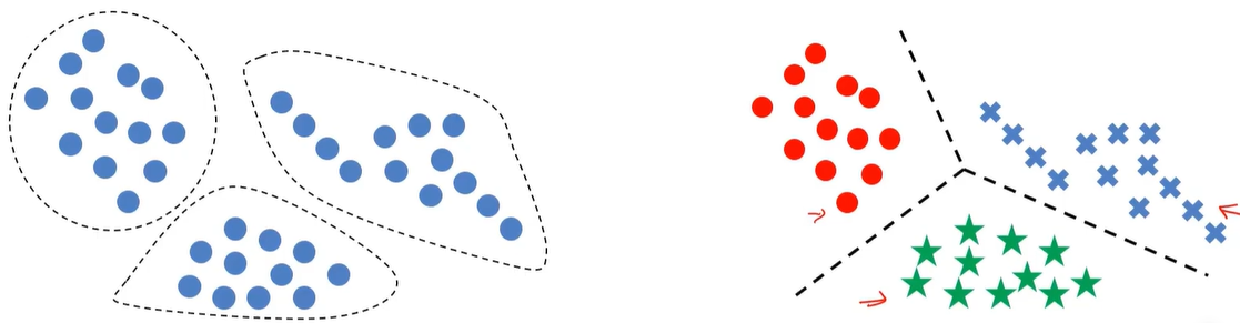
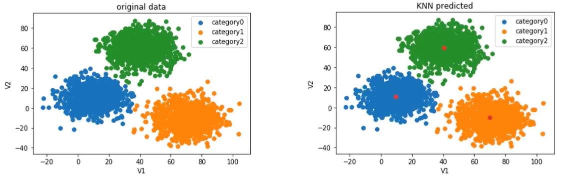
KMeans与KNN的比较
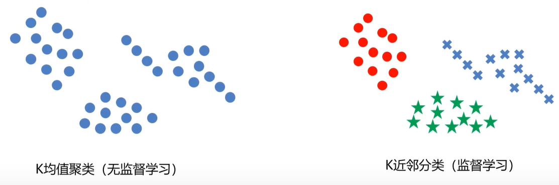
左边的图没有标签,右边的图有标签
KMeans基于没有标签的值自动划分类别。而KNN则是找到边界
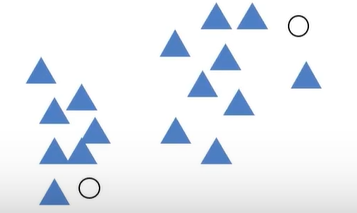
2、K近邻分类模型(KNN)(邻居数量)
给定一个训练数据集,对新的输入实例,在训练数据集中找到与该输入实例最邻近的K个实例(也就是上面所说的K个邻居),这K个实例的多数属于某个类,就把该输入实例分类到这个类中
最简单的机器学习算法之一。
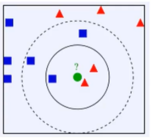
举例
• K=3,绿色圆点的最近的3个邻居是2个红色小三角形和1个蓝色小正方形,判定绿色的待分类点属于红色的三角形一类。
• 如果K=5,绿色圆点的最近的5个邻居是2个红色三角形和3个蓝色的正方形,判定绿色的待分类点属于蓝色的正方形一类。
下面的图已经打好了标签
3、Mean-shift均值漂移聚类(区域半径)
均值漂移算法:一种基于密度梯度上升的聚类算法(沿着密度上升方向寻找聚类中心点)
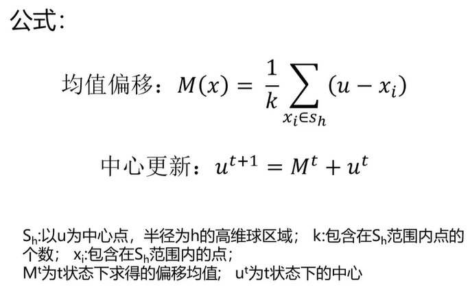
如下图所示:开始时中心点在圆圈位置,球区域有6个点,计算每个点与中心的距离得到平均距离M,中心点移动M距离后,再以相同的半径画一个圆,重复以上的步骤。
算法流程:
1、随机选择未分类点作为中心点
2、找出离中心点距离在带宽之内的点,记做集合S
3、计算从中心点到集合S中每个元素的偏移向量M
4、中心点以向量M移动
5、重复步骤2-4,直到收敛
6、重复1-5直到所有的点都被归类
7、分类:根据每个类,对每个点的访问频率,取问频率最大的那个类,作为当前点集的所属类。
三、实战准备
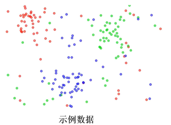
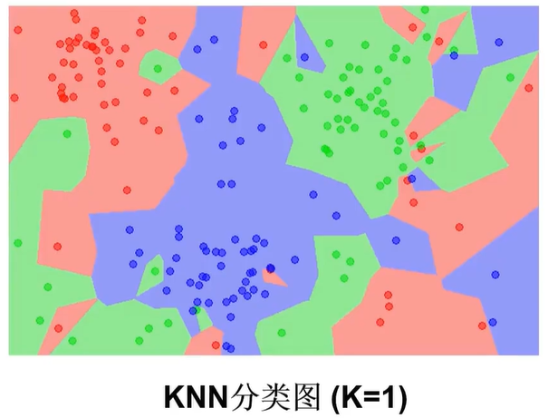
1、KMeans实现聚类(类别数量)
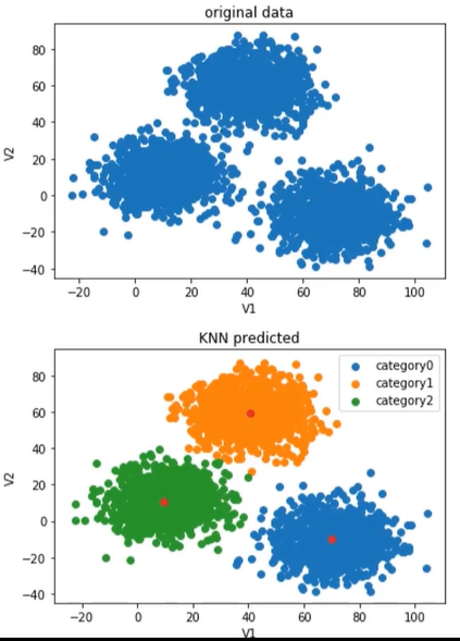
上面的图时原始数据,下面的图是KNN算法完成的预测。我们要做的是将原始数据进行分类,得到和KNN算法的结果相似。
(1)、模型训练
from sklearn.cluster import KMeans
KM=KMeans(n_clusters=3,random_state = 0)
KM.fit(x)
n_clusters表示聚类的个数,random_state初始状态,使结果具有重复性,初始化后,会有固定的3个点,就可以重复你的模型。
(2)、获取模型确定的中心点:
centers=KM.cluster_centers_
(3)、准确率计算:
from sklearn.metrics import accuracy_score
accuracy= accuracy_score(y,y_predict)
(4)、预测结果校正
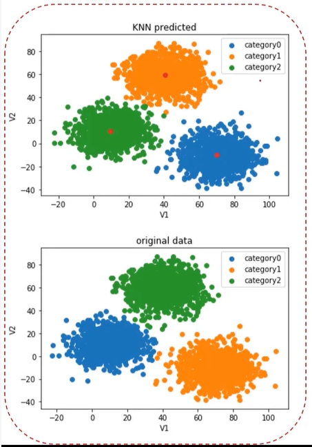
下图显示上图中KMeans(标题中的KNN应该为KMeans)算法预测的类别和下面的原始数据(这里原始数据表示正确结果)类别对应不上,如上图中的1类在下图为2类。
y cal = []
for i in y_predict:
    if i == 0:
        y_cal.append(1)
    elif i== 1:
        y_cal.append(2)
    else:
        y_cal.append(0)
print(y_predict,y_cal)
校正(calibrated)完之后的效果:
标题中的KNN应该为KMeans
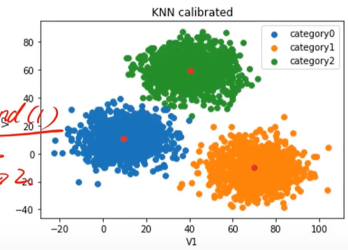
矫正之后发现与原始数据(这里原始数据表示正确结果)几乎一样。
2、MeanShift实现聚类(区域半径)
原始数据:
(1)、自动计算带宽(区域半径)
from sklearn.cluster import MeanShift,estimate_bandwidth
#detect bandwidth
bandwidth =estimate_bandwidth(X,n_samples=500)
bandWidth就是半径。
(2)、模型建立与训练
ms= MeanShift(bandwidth=bandwidth)
ms.fit(X)

3、KNN实现分类(邻居数量)
(1)、模型训练
from sklearn.neighbors import KNeighborsClassifier
KNN=KNeighborsClassifier(n_neighbors=3)
KNN.fit(x,y)
四、实战
KMeans算法(类别数量)
题目:2D数据类别划分
1、采用Kmeans算法实现2D数据自动聚类,预测V1=80,V2=60数据类别
2、计算预测准确率,完成结果矫正
3、采用KNN、Meanshift算法,重复步骤1-2
1、加载数据
import torch
import pandas as pd
import numpy as np
from matplotlib import pyplot as plt
from sklearn.cluster import KMeans

data=pd.read_csv('./data/data.csv')
print(data)
结果:
             V1         V2  labels
0      2.072345  -3.241693       0
1     17.936710  15.784810       0
2      1.083576   7.319176       0
3     11.120670  14.406780       0
4     23.711550   2.557729       0
         ...        ...     ...
2995  85.652800  -6.461061       1
2996  82.770880  -2.373299       1
2997  64.465320 -10.501360       1
2998  90.722820 -12.255840       1
2999  64.879760 -24.877310       1
[3000 rows x 3 columns]
注意:无监督学习只需要前面两列V1和V2就够了,第三列加载进来的目的是对比无监督学习得到的结果和实际结果会有什么差异性,并且还可以和监督式学习的结果进行对比,从而对监督学习和无监督学习的不同点有更深入的理解。
data.csv的下载地址
通过网盘分享的文件:data.csv
链接: https://pan.baidu.com/s/1mvGSXEaHcdi__s4g4JjdYw 提取码: 7sji
--来自百度网盘超级会员v6的分享
2、定义X,y
X=data.drop(['labels'],axis=1)
y=data.loc[:,'labels']
print(pd.value_counts(y)) # 查看类别数量
注意:无监督学习只需要X就行了,这里的y只是用来对比的。
结果:
labels
2    1156
1     954
0     890
Name: count, dtype: int64
发现有三个类别:0、1、2
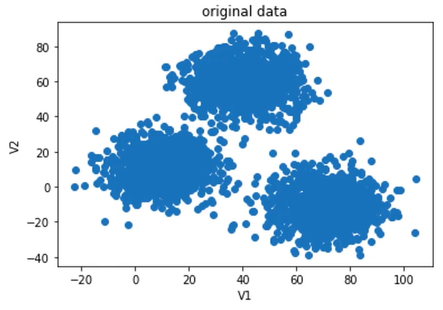
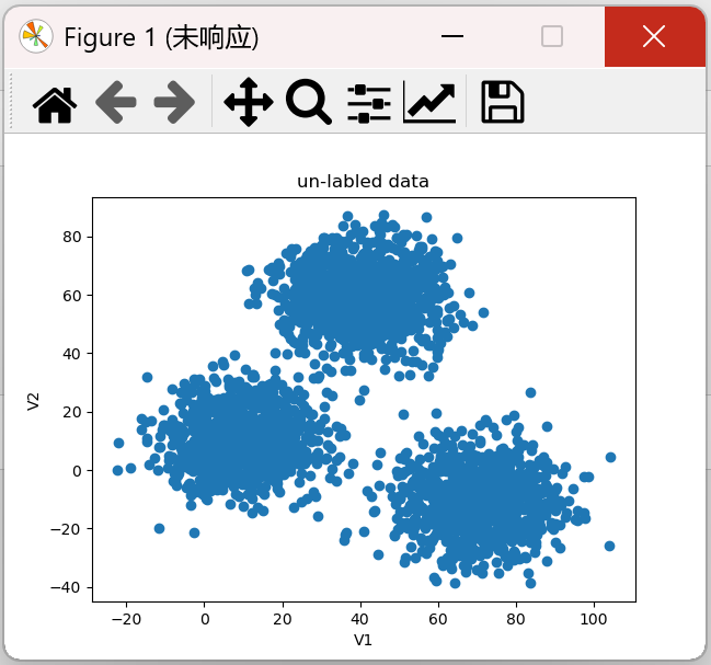
3、数据可视化
from matplotlib import pyplot as plt
fig1=plt.figure()
plt.scatter(X.loc[:,'V1'],X.loc[:,'V2'])
plt.title("un-labled data") # 未打标签的数据
plt.xlabel('V1')
plt.ylabel('V2')
plt.show()
结果:
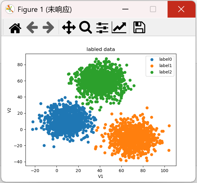
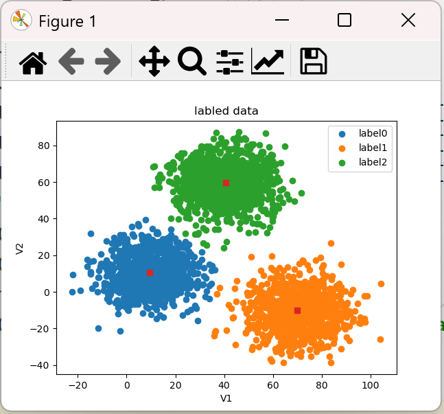
原始数据进行监督学习分类结果可视化
fig1 = plt.figure()
label0 = plt.scatter(X.loc[:, 'V1'][y == 0], X.loc[:, 'V2'][y == 0])
label1 = plt.scatter(X.loc[:, 'V1'][y == 1], X.loc[:, 'V2'][y == 1])
label2 = plt.scatter(X.loc[:, 'V1'][y == 2], X.loc[:, 'V2'][y == 2])
plt.title("labled data") # 打过标签的数据
plt.xlabel('V1')
plt.ylabel('V2')
plt.legend((label0, label1, label2), ('label0', 'label1', 'label2')) # 有图例才能知道分类
plt.show()
注意:这里y=0、y=2、y=2通过上面的pd.value_counts(y)得到
结果:
4、模型训练(这里的n_clusters的值是根据监督学习的结果得到的,相当于直接告诉我们有3类)
from matplotlib import pyplot as plt
KM = KMeans(n_clusters=3,random_state=0) # 归为3类
KM.fit(X)
print(KM.cluster_centers_) # 查看聚类的中心点
结果:
[[ 40.68362784  59.71589274]
 [ 69.92418447 -10.11964119]
 [  9.4780459   10.686052  ]]
发现有3个点
5、可视化中心点
centers = KM.cluster_centers_
fig3=plt.figure()
plt.scatter(centers[:,0],centers[:,1])
plt.show()
结果:
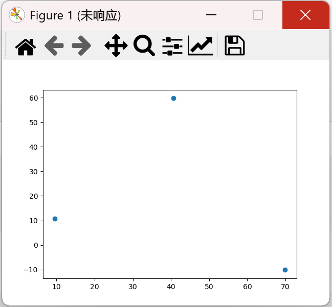
将中心点与原始数据显示在同一张图中:
centers = KM.cluster_centers_
fig1 = plt.figure()
label0 = plt.scatter(X.loc[:, 'V1'][y == 0], X.loc[:, 'V2'][y == 0])
label1 = plt.scatter(X.loc[:, 'V1'][y == 1], X.loc[:, 'V2'][y == 1])
label2 = plt.scatter(X.loc[:, 'V1'][y == 2], X.loc[:, 'V2'][y == 2])
plt.title("labled data")
plt.xlabel('V1')
plt.ylabel('V2')
plt.scatter(centers[:,0],centers[:,1], marker='s') #如 o(圆圈),s(正方形),^(三角形),*(星形),D(钻石)
plt.legend((label0, label1, label2), ('label0', 'label1', 'label2'))
plt.show()
结果:
结果发现这3个点(正方形的点)确实是中心点。
6、模型评估
# 预测结果
y_predict_test = KM.predict([[80, 60]])
print(y_predict_test)
# 准确率
y_predict = KM.predict(X)
print(pd.value_counts(y_predict), pd.value_counts(y))
from sklearn.metrics import accuracy_score
accuracy = accuracy_score(y, y_predict)
print(accuracy)
结果:
[0]
0    1149
1     952
2     899
Name: count, dtype: int64 labels
2    1156
1     954
0     890
Name: count, dtype: int64
0.31966666666666665
分数很低,因为完全对不上。
7、比较预测的结果(无监督学习)和标签的结果(监督学习)
centers = KM.cluster_centers_
fig4 = plt.subplot(121)
label0 = plt.scatter(X.loc[:, 'V1'][y_predict == 0], X.loc[:, 'V2'][y_predict == 0])
label1 = plt.scatter(X.loc[:, 'V1'][y_predict == 1], X.loc[:, 'V2'][y_predict == 1])
label2 = plt.scatter(X.loc[:, 'V1'][y_predict == 2], X.loc[:, 'V2'][y_predict == 2])
plt.title("predicted data")
plt.xlabel('V1')
plt.ylabel('V2')
plt.scatter(centers[:, 0], centers[:, 1])
plt.legend((label0, label1, label2), ('label0', 'label1', 'label2'))

fig4 = plt.subplot(122)
label0 = plt.scatter(X.loc[:, 'V1'][y == 0], X.loc[:, 'V2'][y == 0])
label1 = plt.scatter(X.loc[:, 'V1'][y == 1], X.loc[:, 'V2'][y == 1])
label2 = plt.scatter(X.loc[:, 'V1'][y == 2], X.loc[:, 'V2'][y == 2])
plt.title("labled data")
plt.xlabel('V1')
plt.ylabel('V2')
plt.scatter(centers[:, 0], centers[:, 1])
plt.legend((label0, label1, label2), ('label0', 'label1', 'label2'))
plt.show()
结果:
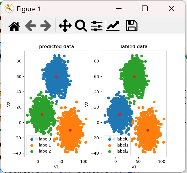
左图是预测的,右图是标签过的,发现预测的分类与标签的没对上,现在是类别划分出来了,只是名称不对,所以我们要修改预测的分类。这也导致上面预测V1=80,V2=60也不对。
8、模型矫正
预测模型如果是label0,实际是label2,如果是label1,实际是label1,如果是label2,实际是label0
y_corrected = []
for i in y_predict:
    if i == 0:
        y_corrected.append(2)
    elif i == 1:
        y_corrected.append(1)
    else:
        y_corrected.append(0)
print(pd.value_counts(y_corrected))
print(pd.value_counts(y))
y_corrected1 = np.array(y_corrected) # list转为ndarray,否则报错
print(accuracy_score(y,y_corrected))
前面的预测结果为0,即实际应该是第2类,即lable2
结果:
2    1149
1     952
0     899
Name: count, dtype: int64
labels
2    1156
1     954
0     890
Name: count, dtype: int64
0.997
y_predict的值为: [2 2 2 ... 1 1 1]
y_corrected1的值为: [0 0 0 ... 1 1 1]
发现预测的分类和标签过的分类几乎一致。而且校正完之后,准确率也很高,达到0.997。
画图时,用y_corrected1替换y_predict
print("y_predict的值为:",y_predict)
print("y_corrected1的值为:",y_corrected1)
centers = KM.cluster_centers_
fig4 = plt.subplot(121)
label0 = plt.scatter(X.loc[:, 'V1'][y_corrected1 == 0], X.loc[:, 'V2'][y_corrected1 == 0])
label1 = plt.scatter(X.loc[:, 'V1'][y_corrected1 == 1], X.loc[:, 'V2'][y_corrected1 == 1])
label2 = plt.scatter(X.loc[:, 'V1'][y_corrected1 == 2], X.loc[:, 'V2'][y_corrected1 == 2])
plt.title("predicted data")
plt.xlabel('V1')
plt.ylabel('V2')
plt.scatter(centers[:, 0], centers[:, 1])
plt.legend((label0, label1, label2), ('label0', 'label1', 'label2'))
结果如下:
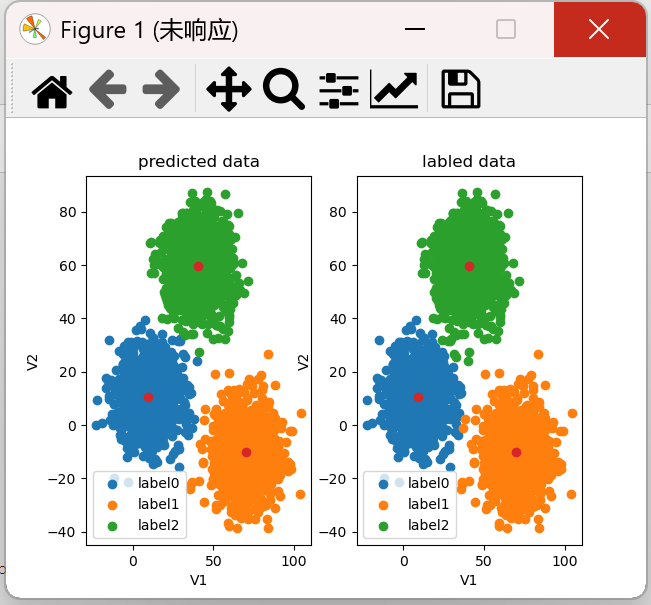
前面V1=80,V2=60的预测结果为0,实际是label2,也就是绿色的部分。
完整代码:
import torch
import pandas as pd
import numpy as np
from matplotlib import pyplot as plt
from sklearn.cluster import KMeans

data=pd.read_csv('./data/data.csv')
# print(data)

X=data.drop(['labels'],axis=1)
y=data.loc[:,'labels']
# print(pd.value_counts(y)) # 查看类别数量


KM = KMeans(n_clusters=3,random_state=0)
KM.fit(X)
print(KM.cluster_centers_) # 查看聚类的中心点

# 预测结果
y_predict_test = KM.predict([[80, 60]])
print(y_predict_test)
# 准确率
y_predict = KM.predict(X)
# print(pd.value_counts(y_predict), pd.value_counts(y))
from sklearn.metrics import accuracy_score
accuracy = accuracy_score(y, y_predict)
print(accuracy)

y_corrected = []
for i in y_predict:
    if i == 0:
        y_corrected.append(2)
    elif i == 1:
        y_corrected.append(1)
    else:
        y_corrected.append(0)
print(pd.value_counts(y_corrected))
print(pd.value_counts(y))
y_corrected1 = np.array(y_corrected) # list转为ndarray,否则报错
print(accuracy_score(y,y_corrected))

print("y_predict的值为:",y_predict)
print("y_corrected1的值为:",y_corrected1)
centers = KM.cluster_centers_
fig4 = plt.subplot(121)
label0 = plt.scatter(X.loc[:, 'V1'][y_corrected1 == 0], X.loc[:, 'V2'][y_corrected1 == 0])
label1 = plt.scatter(X.loc[:, 'V1'][y_corrected1 == 1], X.loc[:, 'V2'][y_corrected1 == 1])
label2 = plt.scatter(X.loc[:, 'V1'][y_corrected1 == 2], X.loc[:, 'V2'][y_corrected1 == 2])
plt.title("predicted data")
plt.xlabel('V1')
plt.ylabel('V2')
plt.scatter(centers[:, 0], centers[:, 1])
plt.legend((label0, label1, label2), ('label0', 'label1', 'label2'))

fig4 = plt.subplot(122)
label0 = plt.scatter(X.loc[:, 'V1'][y == 0], X.loc[:, 'V2'][y == 0])
label1 = plt.scatter(X.loc[:, 'V1'][y == 1], X.loc[:, 'V2'][y == 1])
label2 = plt.scatter(X.loc[:, 'V1'][y == 2], X.loc[:, 'V2'][y == 2])
plt.title("labled data")
plt.xlabel('V1')
plt.ylabel('V2')
plt.scatter(centers[:, 0], centers[:, 1])
plt.legend((label0, label1, label2), ('label0', 'label1', 'label2'))
plt.show()
KNN算法(邻居数量)
1、获取数据和定义X,y
import torch
import pandas as pd
import numpy as np
from matplotlib import pyplot as plt
from sklearn.cluster import KMeans
from sklearn.neighbors import KNeighborsClassifier
from sklearn.metrics import accuracy_score

data=pd.read_csv('./data/data.csv')
print(data)

X=data.drop(['labels'],axis=1)
y=data.loc[:,'labels']
# print(pd.value_counts(y)) # 查看类别数量
KNN模型属于监督式算法,必须得告诉它一个正确的答案是什么,所以输入数据包括了x和y,而无监督学习的KMeans算法只需要X,不需要y.
2、建立一个KNN模型
from sklearn.neighbors import KNeighborsClassifier
KNN = KNeighborsClassifier(n_neighbors=3)
KNN.fit(X,y)
3、预测结果和准确率
# 对测试集进行预测 V1=80 V2=60
y_predict_knn_test = KNN.predict([[80, 60]])
print(y_predict_knn_test)
y_predict_knn = KNN.predict(X)

# 准确率
from sklearn.metrics import accuracy_score
print("knn accuracy:", accuracy_score(y, y_predict_knn))
结果:
[2]
knn accuracy: 1.0
监督式学习的预测结果比无监督学习的预测结果更好,而且不需要进行校正,一次性就可以知道结果。而无监督学习的预测结果需要经过校正才行。
4、可视化
fig6 = plt.subplot(121)
label0 = plt.scatter(X.loc[:, 'V1'][y_predict_knn == 0], X.loc[:, 'V2'][y_predict_knn == 0])
label1 = plt.scatter(X.loc[:, 'V1'][y_predict_knn == 1], X.loc[:, 'V2'][y_predict_knn == 1])
label2 = plt.scatter(X.loc[:, 'V1'][y_predict_knn == 2], X.loc[:, 'V2'][y_predict_knn == 2])
plt.title('knn result')
plt.xlabel('V1')
plt.ylabel('V2')
plt.legend((label0, label1, label2), ('label0', 'label1', 'label2'))

fig6 = plt.subplot(122)
label0 = plt.scatter(X.loc[:, 'V1'][y == 0], X.loc[:, 'V2'][y == 0])
label1 = plt.scatter(X.loc[:, 'V1'][y == 1], X.loc[:, 'V2'][y == 1])
label2 = plt.scatter(X.loc[:, 'V1'][y == 2], X.loc[:, 'V2'][y == 2])
plt.title('labeled data')
plt.xlabel('V1')
plt.ylabel('V2')
plt.legend((label0, label1, label2), ('label0', 'label1', 'label2'))
plt.show()
结果:
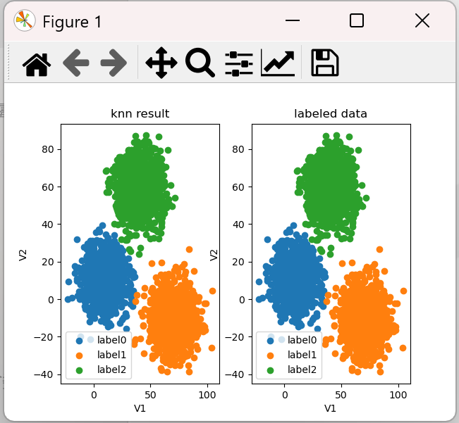
注意:KNN has no cluster_centers_ attribute,故不能用下面代码获取中心点
centers = KNN.cluster_centers_
完整代码:
import torch
import pandas as pd
import numpy as np
from matplotlib import pyplot as plt
from sklearn.cluster import KMeans
from sklearn.neighbors import KNeighborsClassifier
from sklearn.metrics import accuracy_score

data=pd.read_csv('./data/data.csv')
print(data)

X=data.drop(['labels'],axis=1)
y=data.loc[:,'labels']
# print(pd.value_counts(y)) # 查看类别数量

#建立一个KNN模型
KNN = KNeighborsClassifier(n_neighbors=3)
KNN.fit(X,y)

# 对测试集进行预测 V1=80 V2=60
y_predict_knn_test = KNN.predict([[80, 60]])
print(y_predict_knn_test)
y_predict_knn = KNN.predict(X)
print(pd.value_counts(y_predict_knn),pd.value_counts(y))
# 准确率
print("knn accuracy:", accuracy_score(y, y_predict_knn))


fig6 = plt.subplot(121)
label0 = plt.scatter(X.loc[:, 'V1'][y_predict_knn == 0], X.loc[:, 'V2'][y_predict_knn == 0])
label1 = plt.scatter(X.loc[:, 'V1'][y_predict_knn == 1], X.loc[:, 'V2'][y_predict_knn == 1])
label2 = plt.scatter(X.loc[:, 'V1'][y_predict_knn == 2], X.loc[:, 'V2'][y_predict_knn == 2])
plt.title('knn result')
plt.xlabel('V1')
plt.ylabel('V2')
plt.legend((label0, label1, label2), ('label0', 'label1', 'label2'))

fig6 = plt.subplot(122)
label0 = plt.scatter(X.loc[:, 'V1'][y == 0], X.loc[:, 'V2'][y == 0])
label1 = plt.scatter(X.loc[:, 'V1'][y == 1], X.loc[:, 'V2'][y == 1])
label2 = plt.scatter(X.loc[:, 'V1'][y == 2], X.loc[:, 'V2'][y == 2])
plt.title('labeled data')
plt.xlabel('V1')
plt.ylabel('V2')
plt.legend((label0, label1, label2), ('label0', 'label1', 'label2'))
plt.show()
MeanShift算法(区域半径)
1、获取数据和定义X,y
import torch
import pandas as pd
import numpy as np
from matplotlib import pyplot as plt
from sklearn.cluster import KMeans
from sklearn.neighbors import KNeighborsClassifier
from sklearn.metrics import accuracy_score

data=pd.read_csv('./data/data.csv')
print(data)

X=data.drop(['labels'],axis=1)
y=data.loc[:,'labels']
# print(pd.value_counts(y)) # 查看类别数量
结果:
             V1         V2  labels
0      2.072345  -3.241693       0
1     17.936710  15.784810       0
2      1.083576   7.319176       0
3     11.120670  14.406780       0
4     23.711550   2.557729       0
         ...        ...     ...
2995  85.652800  -6.461061       1
2996  82.770880  -2.373299       1
2997  64.465320 -10.501360       1
2998  90.722820 -12.255840       1
2999  64.879760 -24.877310       1
[3000 rows x 3 columns]
2、建立模型,计算半径,训练模型
#建立meanshift模型
from sklearn.cluster import MeanShift,estimate_bandwidth
#估计带宽
bw = estimate_bandwidth(X,n_samples=500)
print(bw)
# 训练模型
ms = MeanShift(bandwidth=bw)
ms.fit(X) # 无监督学习只需要X,不需要y
结果:30.84663454820215
即圆的半径为30.8
3、预测结果
# 对测试集进行预测 V1=80 V2=60
y_predict_test = ms.predict([[80,60]])
print(y_predict_test)
y_predict_ms = ms.predict(X)
print(pd.value_counts(y_predict_ms),pd.value_counts(y))
结果:
[0]
0    1149
1     952
2     899
Name: count, dtype: int64 labels
2    1156
1     954
0     890
Name: count, dtype: int64
发现也归了三个类,只是名称没对上,后面需要校正。
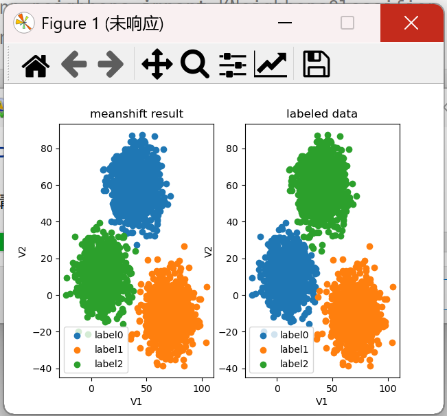
4、可视化
fig7 = plt.subplot(121)
label0 = plt.scatter(X.loc[:, 'V1'][y_predict_ms == 0], X.loc[:, 'V2'][y_predict_ms == 0])
label1 = plt.scatter(X.loc[:, 'V1'][y_predict_ms == 1], X.loc[:, 'V2'][y_predict_ms == 1])
label2 = plt.scatter(X.loc[:, 'V1'][y_predict_ms == 2], X.loc[:, 'V2'][y_predict_ms == 2])
plt.title('meanshift result')
plt.xlabel('V1')
plt.ylabel('V2')
plt.legend((label0, label1, label2), ('label0', 'label1', 'label2'))

fig7 = plt.subplot(122)
label0 = plt.scatter(X.loc[:, 'V1'][y == 0], X.loc[:, 'V2'][y == 0])
label1 = plt.scatter(X.loc[:, 'V1'][y == 1], X.loc[:, 'V2'][y == 1])
label2 = plt.scatter(X.loc[:, 'V1'][y == 2], X.loc[:, 'V2'][y == 2])
plt.title('labeled data')
plt.xlabel('V1')
plt.ylabel('V2')
plt.legend((label0, label1, label2), ('label0', 'label1', 'label2'))
plt.show()
结果:
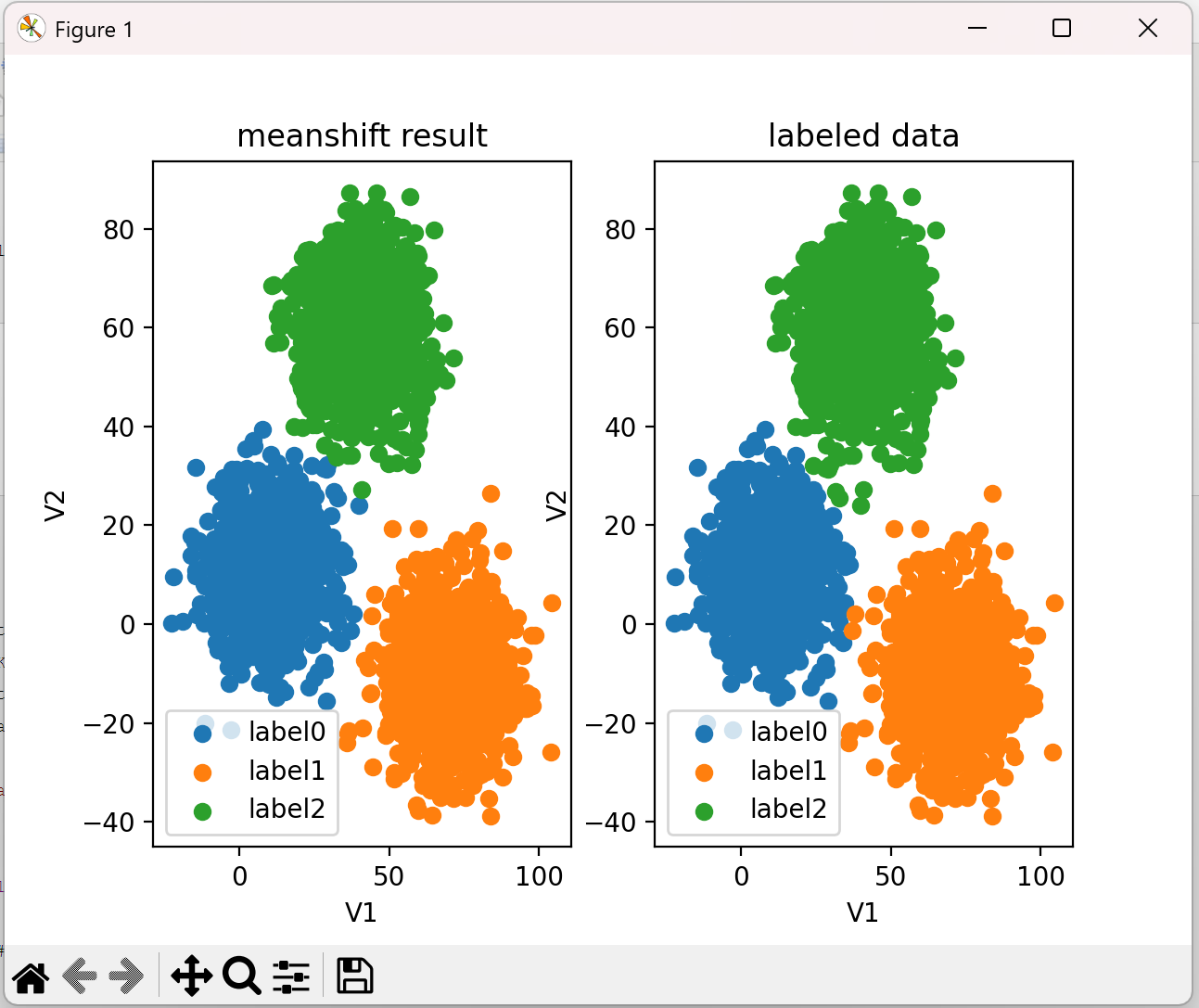
5、校正
# 进行数据矫正
y_corrected_ms = []
for i in y_predict_ms:
    if i == 0:
        y_corrected_ms.append(2)
    elif i == 1:
        y_corrected_ms.append(1)
    else:
        y_corrected_ms.append(0)
print(pd.value_counts(y_corrected_ms), pd.value_counts(y))
#更改数据格式
y_corrected_ms1 = np.array(y_corrected_ms)
print(type(y_corrected_ms))
6、使用校正后的数据进行可视化
fig7 = plt.subplot(121)
label0 = plt.scatter(X.loc[:, 'V1'][y_corrected_ms1 == 0], X.loc[:, 'V2'][y_corrected_ms1 == 0])
label1 = plt.scatter(X.loc[:, 'V1'][y_corrected_ms1 == 1], X.loc[:, 'V2'][y_corrected_ms1 == 1])
label2 = plt.scatter(X.loc[:, 'V1'][y_corrected_ms1 == 2], X.loc[:, 'V2'][y_corrected_ms1 == 2])
plt.title('meanshift result')
plt.xlabel('V1')
plt.ylabel('V2')
plt.legend((label0, label1, label2), ('label0', 'label1', 'label2'))

fig7 = plt.subplot(122)
label0 = plt.scatter(X.loc[:, 'V1'][y == 0], X.loc[:, 'V2'][y == 0])
label1 = plt.scatter(X.loc[:, 'V1'][y == 1], X.loc[:, 'V2'][y == 1])
label2 = plt.scatter(X.loc[:, 'V1'][y == 2], X.loc[:, 'V2'][y == 2])
plt.title('labeled data')
plt.xlabel('V1')
plt.ylabel('V2')
plt.legend((label0, label1, label2), ('label0', 'label1', 'label2'))
plt.show()
结果:
完整代码:
import torch
import pandas as pd
import numpy as np
from matplotlib import pyplot as plt
from sklearn.cluster import KMeans
from sklearn.neighbors import KNeighborsClassifier
from sklearn.metrics import accuracy_score

data=pd.read_csv('./data/data.csv')
print(data)

X=data.drop(['labels'],axis=1)
y=data.loc[:,'labels']
# print(pd.value_counts(y)) # 查看类别数量

#建立meanshift模型
from sklearn.cluster import MeanShift,estimate_bandwidth
#估计带宽
bw = estimate_bandwidth(X,n_samples=500)
print(bw)
# 训练模型
ms = MeanShift(bandwidth=bw)
ms.fit(X)

# 对测试集进行预测 V1=80 V2=60
y_predict_test = ms.predict([[80,60]])
print(y_predict_test)
y_predict_ms = ms.predict(X)
print(pd.value_counts(y_predict_ms),pd.value_counts(y))

# 进行数据矫正
y_corrected_ms = []
for i in y_predict_ms:
    if i == 0:
        y_corrected_ms.append(2)
    elif i == 1:
        y_corrected_ms.append(1)
    else:
        y_corrected_ms.append(0)
print(pd.value_counts(y_corrected_ms), pd.value_counts(y))
#更改数据格式
y_corrected_ms1 = np.array(y_corrected_ms)
print(type(y_corrected_ms))

fig7 = plt.subplot(121)
label0 = plt.scatter(X.loc[:, 'V1'][y_corrected_ms1 == 0], X.loc[:, 'V2'][y_corrected_ms1 == 0])
label1 = plt.scatter(X.loc[:, 'V1'][y_corrected_ms1 == 1], X.loc[:, 'V2'][y_corrected_ms1 == 1])
label2 = plt.scatter(X.loc[:, 'V1'][y_corrected_ms1 == 2], X.loc[:, 'V2'][y_corrected_ms1 == 2])
plt.title('meanshift result')
plt.xlabel('V1')
plt.ylabel('V2')
plt.legend((label0, label1, label2), ('label0', 'label1', 'label2'))

fig7 = plt.subplot(122)
label0 = plt.scatter(X.loc[:, 'V1'][y == 0], X.loc[:, 'V2'][y == 0])
label1 = plt.scatter(X.loc[:, 'V1'][y == 1], X.loc[:, 'V2'][y == 1])
label2 = plt.scatter(X.loc[:, 'V1'][y == 2], X.loc[:, 'V2'][y == 2])
plt.title('labeled data')
plt.xlabel('V1')
plt.ylabel('V2')
plt.legend((label0, label1, label2), ('label0', 'label1', 'label2'))
plt.show()

 浙公网安备 33010602011771号