利用纯粹的CSS3替代小图标---向右箭头
1、向右的箭头> .
看到很多网站里面向右的箭头都是图片代替的,但是为了网站的性能,我们一般的原则是能够避免使用图片的尽量不用图片
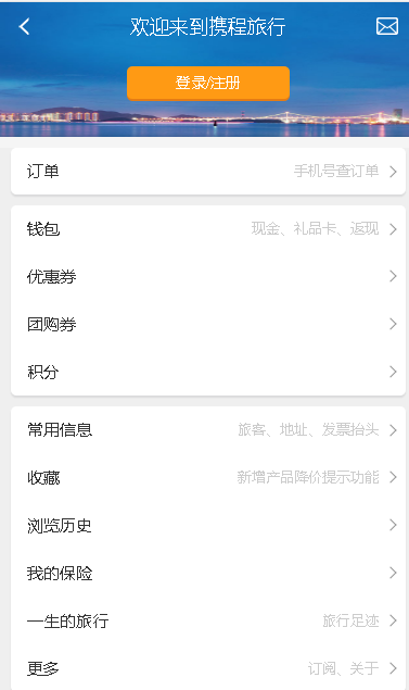
比如看下携程个人中心首页面,向右的箭头
其实现思路是这样的:定义一个正方形盒子,盒子边框定义1px的上边框和右边框,然后对盒子旋转45度即可。
代码如下:
<i class="arrow"></i>
.arrow{
     display: inline-block;
     width: 7px;
     height: 7px;
     border: solid #999;
     border-width: 1px 1px 0 0;
     -webkit-transform:rotate(-45deg);
     transform:rotate(-45deg);
}
嘘...
我们能不能直接使用符号“ > “这个呢。
来来来,看淘宝网
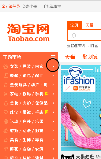
审查元素之后发现它是这样实现的。
<i class="tb-icon service-arrow">➤</i>
.tb-icon{
    font-family: iconfont!important;
    font-size: 14px;
    font-style: normal;
    display: inline-block;
    text-decoration: none;
    -webkit-font-smoothing: antialiased;
    -moz-osx-font-smoothing: grayscale;
}
看到没,淘宝都这样做,我们何不借鉴下呢。
不过它在添加字符的时候额外修饰了一番。使用字体抗锯齿属性:-webkit-font-smoothing
对字体进行抗锯齿渲染可以使字体看起来会更清晰舒服。在图标字体成为一种趋势的今天,抗锯齿渲染使用也越来越多。
font-smoothing是非标准的CSS定义。它被列入标准规范的草案中,后由于某些原因从web标准中被移除了。
但是,我们可以用以下两种定义进行抗锯齿渲染
-webkit-font-smoothing: antialiased; /*chrome、safari*/

-moz-osx-font-smoothing: grayscale;/*firefox*/
(1)Webkit在自己的引擎中支持了这一效果。
-webkit-font-smoothing
它有三个属性值:
none ------ 对低像素的文本比较好
subpixel-antialiased------默认值
antialiased ------抗锯齿很好
例子:
body{
  -webkit-font-smoothing: antialiased;
}
这个属性可以使页面上的字体抗锯齿,使用后字体看起来会更清晰。加上之后就顿时感觉页面小清晰了。
(2)Gecko也推出了自己的抗锯齿效果的非标定义。
-moz-osx-font-smoothing: inherit | grayscale;
这个属性也是更清晰的作用。
例子:
.icon {
  -webkit-font-smoothing: antialiased;
  -moz-osx-font-smoothing: grayscale;
}
(3)Ionic框架在样式中多加了一条font-smoothing: antialiased;
这是坐等font-smoothing标准化,有备无患么。
当然了还有一种方法了,使用Art-Reactor | 字体图标集 这里面有很多很多图标方便我们使用,使用方法也比较简单,详细看看这个就知道了
http://chinakids.github.io/Art-Reactor/ 当然这个教程也不错 http://www.zcool.com.cn/article/ZMTc3NDg4.html
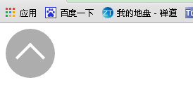
小应用:回到网站头部小图标
<div class="arr">
    <i class="arrow"></i>
</div>
.arr{
    width:70px;
    height:70px;
    line-height:100px;
    background:rgba(153,153,153,0.8);
    border-radius:50%;
    text-align:center;
}
.arr .arrow{
    display: inline-block;
    width:26px;
    height:26px;
    border: solid #fff;
    border-width: 4px 4px 0 0;
    -webkit-transform:rotate(-45deg);
     transform:rotate(-45deg);
}
效果图为