android 的Switch控件的android:thumb 和android:track属性的理解
有些人对Switch控件的 android:thumb和 android:track两个属性理解不清楚和明白,现在跟大家讲清楚这两个属性的作用。
Switch主要有两个属性构成:上面圆形的滑块,下面的滑道。
android:thumb对应的滑块
android:track 对应的滑道。
1、先来看Switch默认样式,如下:
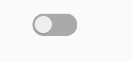
 checked=false,滑块和滑道都是灰色。
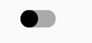
 checked=true,滑块是深粉红色,滑道是浅粉红色
对应的xml:
<Switch
        android:checked="true"
        android:layout_width="wrap_content"
        android:layout_height="wrap_content"></Switch>
2、设置滑道样式,如图:
 checked=false,滑块还是系统默认颜色白色,滑道变成深灰色。
 checked=true,滑块还是系统默认颜色深粉红色,滑道变成浅绿色。
样式和xml代码:
在资源的drawable目录下创建switch_track_off.xml 文件,如下:
switch_track_off.xml 文件:
<?xml version="1.0" encoding="utf-8"?>
<shape xmlns:android="http://schemas.android.com/apk/res/android"
    android:shape="rectangle">
    <solid
        android:color="@android:color/darker_gray">
    </solid>
    <corners
        android:radius="30dp">
    </corners>
</shape>
switch_track_on.xml 文件
<?xml version="1.0" encoding="utf-8"?>
<shape xmlns:android="http://schemas.android.com/apk/res/android"
    android:shape="rectangle">

    <solid
        android:color="@android:color/holo_green_light">
    </solid>

    <corners
        android:radius="32dp">
    </corners>

</shape>
switch_track.xml 文件
<?xml version="1.0" encoding="utf-8"?>
<selector xmlns:android="http://schemas.android.com/apk/res/android">
    <item
        android:state_checked="true"
        android:drawable="@drawable/switch_track_on"></item>
    <item
        android:state_checked="false"
        android:drawable="@drawable/switch_track_off"></item>

</selector>
布局文件:
    <Switch
        android:checked="true"
        android:layout_width="wrap_content"
        android:layout_height="wrap_content"
        android:layout_marginTop="30dp"
        android:track="@drawable/switch_track"></Switch>
3、设置滑块样式:
 在第二步上,设置滑块样式,checked=false,滑块由系统默认的白色改为黑色,滑道还是第二步的灰色。
 checked=true,滑块由系统默认的深粉红色改为蓝色,滑道还是第二步的绿色。
在资源的drawable目录下创建switch_thumb_off.xml 文件,如下:
<?xml version="1.0" encoding="utf-8"?>
<shape xmlns:android="http://schemas.android.com/apk/res/android"
    android:shape="oval">
    <size
        android:width="30dp"
        android:height="30dp">
    </size>
    <solid
        android:color="#000000">
    </solid>

</shape>
switch_thumb_on.xml :
<?xml version="1.0" encoding="utf-8"?>
<shape xmlns:android="http://schemas.android.com/apk/res/android"
    android:shape="oval">
    <size
        android:width="30dp"
        android:height="30dp">
    </size>
    <solid
        android:color="#0000ff">
    </solid>

</shape>
switch_thumb.xml :
<?xml version="1.0" encoding="utf-8"?>
<selector xmlns:android="http://schemas.android.com/apk/res/android">

    <item
        android:state_checked="true"
        android:drawable="@drawable/switch_thumb_on"></item>
    <item
        android:state_checked="false"
        android:drawable="@drawable/switch_thumb_off"></item>
</selector>
布局文件:
    <Switch
        android:checked="true"
        android:layout_width="wrap_content"
        android:layout_height="wrap_content"
        android:layout_marginTop="30dp"
        android:track="@drawable/switch_track"
        android:thumb="@drawable/switch_thumb"></Switch>
上面已经把Switch 的android:thumb和 android:track属性讲清楚了。

 浙公网安备 33010602011771号