【Python高级应用课程设计 】大数据分析——银行客户认购产品预测
一、选题背景
随着大数据时代的到来,银行客户认购产品的预测分析变得越来越重要。在竞争激烈的市场环境中,银行需要更好地了解客户需求,提供更精准的产品推荐和服务,以提高客户满意度和忠诚度。同时,通过预测客户认购产品,银行可以更好地规划产品线和营销策略,提高业务效益和盈利能力。本选题旨在通过对银行客户的大数据分析,挖掘客户认购产品的潜在规律和趋势,预测客户未来的认购行为,为银行提供更加精准的营销和服务支持。
二、大数据分析设计方案
1.本数据集的数据内容与数据特征分析

数据收集与处理:首先,需要从银行系统中获取客户的相关数据,包括基本信息、交易记录、产品持有情况等。然后,对这些数据进行清洗和整合,去除异常值和缺失值,并对数据进行适当的预处理,如数据规范化、特征选择等,以便后续分析。
模型选择与训练:选择适合银行客户认购产品预测的机器学习算法,如逻辑回归、支持向量机、决策树、随机森林等。根据数据特点和业务需求,选择合适的算法进行模型训练。在训练过程中,可以通过交叉验证等技术来评估模型的性能,并对模型进行优化和调整。
数据处理:银行客户数据量大且复杂,需要进行高效的数据清洗和整合,处理异常值和缺失值。同时,需要对数据进行适当的预处理和特征选择,以便更好地训练模型。
模型选择与训练:在选择合适的机器学习算法时,需要考虑数据的特点和业务需求。同时,在训练模型时,需要处理大量的数据并进行高效的计算,以获得更好的模型性能。
本次实验数据字段说明,
id: 数据记录的唯一标识符。
age: 个体的年龄。
job: 个体的工作职位(例如,“admin.”表示行政人员,“blue-collar”表示蓝领工人,“technician”表示技术员等)。
marital: 个体的婚姻状况(例如,“divorced”表示离婚,“married”表示已婚,“single”表示单身)。
education: 个体的教育程度(例如,“basic.9y”可能表示9年基础教育,“high.school”表示高中教育,“university.degree”表示大学学位)。
default: 是否有违约记录(“no”表示无,“yes”表示有,"unknown"表示未知)。
housing: 是否拥有住房贷款(“no”表示无,“yes”表示有,"unknown"表示未知)。
loan: 是否有个人贷款(“no”表示无,“yes”表示有,"unknown"表示未知)。
contact: 联系方式(“cellular”表示手机,“telephone”表示固定电话)。
month: 最后一次联系的月份(例如,“may”表示5月,“jun”表示6月)。
day_of_week: 最后一次联系的星期几(例如,“mon”表示星期一,“tue”表示星期二)。
duration: 最后一次联系的持续时间,单位为秒。
campaign: 在这次营销活动中和这个客户联系的次数。
pdays: 上次营销活动后,再次联系客户经过的天数(999表示客户之前没有被联系过)。
previous: 在这次营销活动之前,和客户联系过的次数。
poutcome: 上一次营销活动的结果(“failure”表示失败,“nonexistent”表示不存在之前的营销活动,“success”表示成功)。
emp_var_rate: 就业变化率(与就业趋势相关的经济指标)。
cons_price_index: 消费者价格指数(衡量物价水平变化的指标)。
cons_conf_index: 消费者信心指数(衡量消费者经济信心水平的指标)。
lending_rate3m: 三个月贷款利率。
nr_employed: 就业人数指数(与就业水平相关的经济指标)。
subscribe: 是否订阅了定期存款(“no”表示没有订阅,“yes”表示已订阅)。import warnings
warnings.filterwarnings('ignore')
import pandas as pd
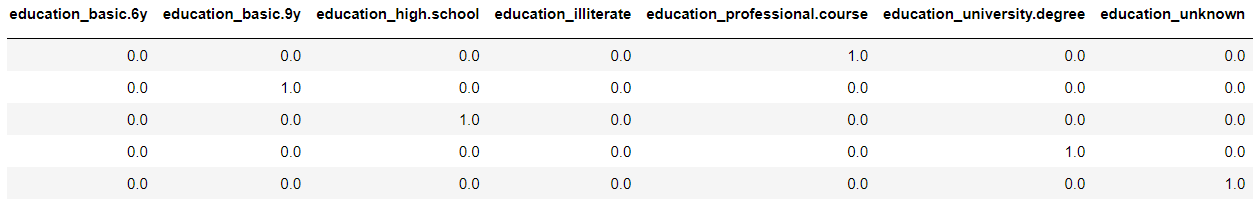
df_train=pd.read_csv('.\\train.csv')[['id',"age","job","marital","education","default","housing","loan","subscribe"]]
df_train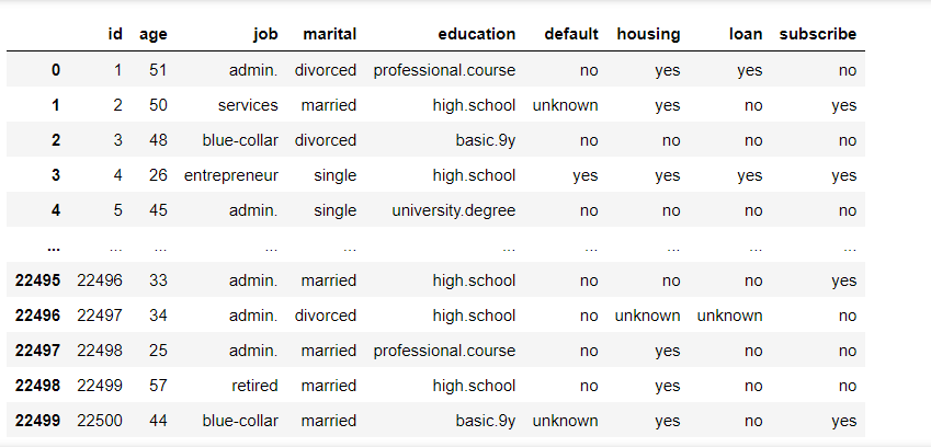
检测空值情况
df_train.info()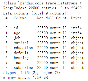
检查是否存在重复行
df_train[df_train.duplicated()]
使用箱型图检测数据是否存在异常值
import matplotlib.pyplot as plt
plt.rcParams['font.sans-serif']=['SimHei']#解决中文乱码问题
plt.rcParams["font.size"]=10#设置字体大小
plt.boxplot(df_train['age'])
plt.title('数据分析箱型图')
plt.show()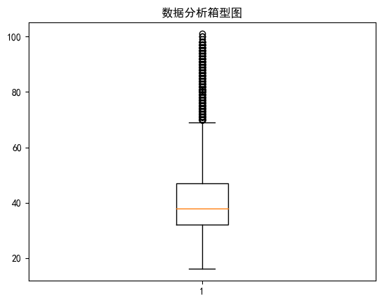
统计性分析
plt.figure(figsize=(10, 4))
job_counts = df_train['job'].value_counts().head(10)
job_counts.plot(kind='bar', color='skyblue')
plt.title('银行客户前10职业统计')
plt.xlabel('职业')
plt.ylabel('频率')
plt.xticks(rotation=45)
plt.show()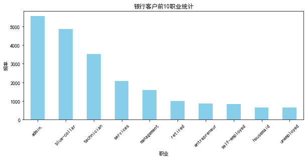
婚姻分布图
marital_status_counts = df_train['marital'].value_counts()
labels = marital_status_counts.index.tolist()
plt.figure(figsize=(8, 8))
plt.pie(marital_status_counts, labels=labels, autopct='%1.1f%%', startangle=140)
plt.title('银行客户婚姻状况分布')
plt.show()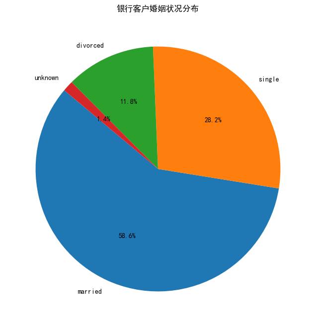
客户教育水平
import seaborn as sns
plt.figure(figsize=(20, 15))
# 教育水平的条形图
plt.subplot(5, 2, 4)
sns.countplot(x='education', data=df_train)
plt.title('客户教育水平分布')
plt.xlabel('教育水平')
plt.ylabel('数量')
plt.xticks(rotation=45)
# 显示图表
plt.tight_layout()
plt.show() 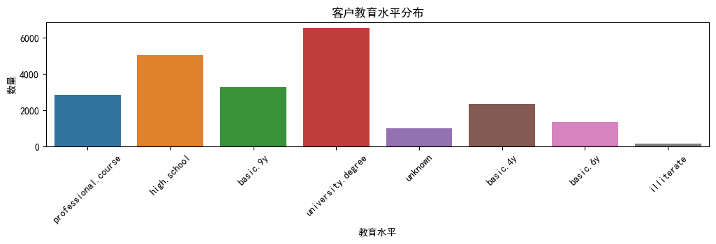
plt.figure(figsize=(20, 15))
# 职业与是否为银行客户的关系(堆叠条形图)
plt.subplot(2, 3, 5)
job_subscribe = pd.crosstab(df_train['job'], df_train['subscribe'])
job_subscribe.plot(kind='bar', stacked=True, color=['skyblue', 'orange'], ax=plt.gca())
plt.title('职业与是否为银行客户的关系')
plt.xlabel('职业')
plt.ylabel('人数')
plt.xticks(rotation=45)
plt.show()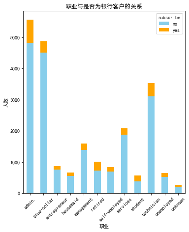
# 默认信用情况的计数图
plt.figure(figsize=(20, 15))
plt.subplot(5, 2, 5)
sns.countplot(x='default', data=df)
plt.title('客户默认信用情况')
plt.xlabel('默认信用')
plt.ylabel('数量')
plt.show()
plt.figure(figsize=(20, 15))
# 是否有住房贷款(饼图)
plt.subplot(2, 3, 1)
df_train['housing'].value_counts().plot(kind='pie', autopct='%1.1f%%')
plt.title('是否有住房贷款')
plt.ylabel('')
plt.show()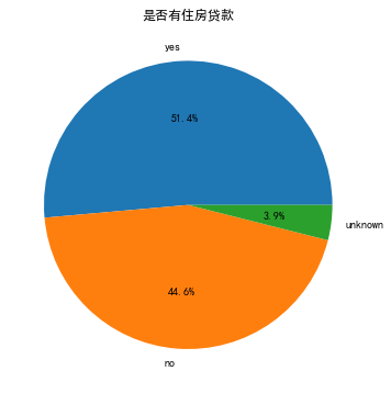
# 是否有个人贷款(饼图)
plt.figure(figsize=(20, 15))
plt.subplot(2, 3, 2)
df_train['loan'].value_counts().plot(kind='pie', autopct='%1.1f%%')
plt.title('是否有个人贷款')
plt.ylabel('')
plt.show()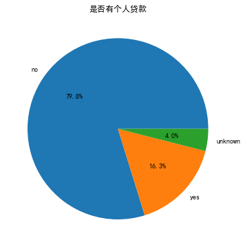
# 是否为银行客户(饼图)
plt.figure(figsize=(20, 15))
plt.subplot(2, 3, 3)
df_train['subscribe'].value_counts().plot(kind='pie', autopct='%1.1f%%')
plt.title('是否为银行客户')
plt.ylabel('')
plt.show()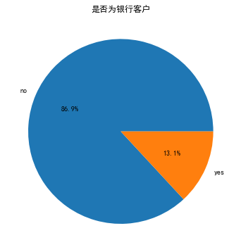
# 年龄与是否为银行客户的关系(箱形图)
plt.figure(figsize=(20, 15))
df_train.boxplot(column='age', by='subscribe')
plt.title('年龄与是否为银行客户的关系')
plt.suptitle('') # 去除默认的副标题
plt.xlabel('是否为银行客户')
plt.ylabel('年龄')
plt.show()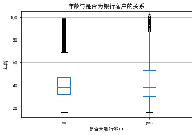
机器学习预测分析
import copy
def convert_yes_no(value):
if value == 'yes':
return 1
elif value == 'no':
return 0
else:
return None
df=copy.deepcopy(df_train)
for column in ['default', 'housing', 'loan', 'subscribe']:
df[column] = df[column].apply(convert_yes_no)
df = df.dropna(subset=['default', 'housing', 'loan', 'subscribe']).reset_index(drop=True)
df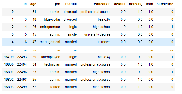
x=df.iloc[:,:-1].drop(['id'], axis = 1)
y=df.iloc[:,-1:]
from sklearn.preprocessing import OneHotEncoder
non_numeric_columns = x.select_dtypes(include=['object']).columns
encoder = OneHotEncoder(sparse=False)
encoded_data = encoder.fit_transform(x[non_numeric_columns])
encoded_df = pd.DataFrame(encoded_data, columns=encoder.get_feature_names_out(non_numeric_columns))
x = pd.concat([x.drop(non_numeric_columns, axis=1), encoded_df], axis=1)
x.head()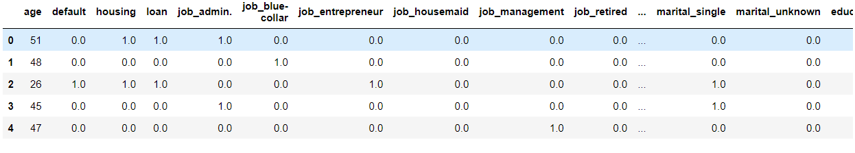
from sklearn.preprocessing import StandardScaler
scaler = StandardScaler()#标准差标准化
x= scaler.fit_transform(x)
from sklearn.model_selection import train_test_split
x_train,x_test,y_train,y_test=train_test_split(x,y,test_size=0.365,random_state=42)
from sklearn.linear_model import LogisticRegression
cgr=LogisticRegression()
cgr.fit(x_train,y_train)
cgr.score(x_test,y_test)
其他模型
from sklearn.metrics import roc_curve,auc
y_score=cgr.predict_proba(x_test)[:,1]
fpr, tpr, thersholds = roc_curve(y_test,y_score)
roc_auc=auc(fpr,tpr)
plt.plot(fpr, tpr, 'k--', label='ROC (area = {0:.2f})'.format(roc_auc), lw=2)
plt.xlim([-0.05, 1.05]) # 设置x、y轴的上下限,
plt.ylim([-0.05, 1.05])
plt.xlabel('False Positive Rate')
plt.ylabel('True Positive Rate') # 可以使用中文,但需要导入一些库即字体
plt.title('ROC Curve')
plt.legend(loc="lower right")
plt.show()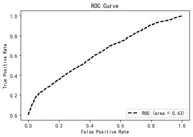
随机森林
from sklearn.ensemble import RandomForestClassifier
rf_model = RandomForestClassifier()
rf_model.fit(x_train, y_train)
accuracy = rf_model.score(x_test, y_test)
accuracy
# 设置matplotlib中文显示
plt.rcParams['font.sans-serif'] = ['SimHei']
plt.rcParams['axes.unicode_minus'] = False
# 绘制第一个图表:年龄与婚姻状况
plt.figure(figsize=(12, 6))
sns.boxplot(x='marital', y='age', data=df_train)
plt.title('年龄与婚姻状况分布')
plt.xlabel('婚姻状况')
plt.ylabel('年龄')
plt.show()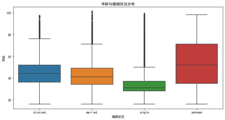
plt.figure(figsize=(12, 6))
sns.countplot(x='job', hue='education', data=df_train)
plt.title('工作类型与教育水平分布')
plt.xlabel('工作类型')
plt.ylabel('数量')
plt.xticks(rotation=45)
plt.show()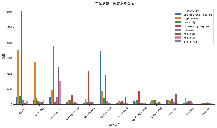
df_train['loan_status'] = df_train['housing'] + ',' + df_train['loan']
plt.figure(figsize=(12, 6))
sns.countplot(x='loan_status', hue='subscribe', data=df_train)
plt.title('信贷情况与订阅关系')
plt.xlabel('信贷情况')
plt.ylabel('数量')
plt.show()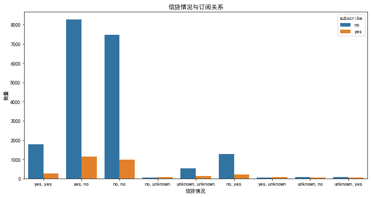
# 对比银行客户和非银行客户的教育水平
subscribed_df = df_train[df_train['subscribe'] == 'yes']
# 统计各学历层次的频率
education_counts = subscribed_df['education'].value_counts()
# 筛选出非订阅银行服务的客户(subscribe为'no')
non_subscribed_df = df_train[df_train['subscribe'] == 'no']
# 统计非银行客户的教育水平频率
non_education_counts = non_subscribed_df['education'].value_counts()
# 绘制银行客户和非银行客户的教育水平对比图
plt.figure(figsize=(12, 6))
# 银行客户
plt.subplot(1, 2, 1)
education_counts.plot(kind='bar', color='skyblue')
plt.title('银行客户的教育水平')
plt.xlabel('教育水平')
plt.ylabel('客户数量')
plt.xticks(rotation=45)
# 非银行客户
plt.subplot(1, 2, 2)
non_education_counts.plot(kind='bar', color='orange')
plt.title('非银行客户的教育水平')
plt.xlabel('教育水平')
plt.ylabel('客户数量')
plt.xticks(rotation=45)
plt.tight_layout()
plt.show()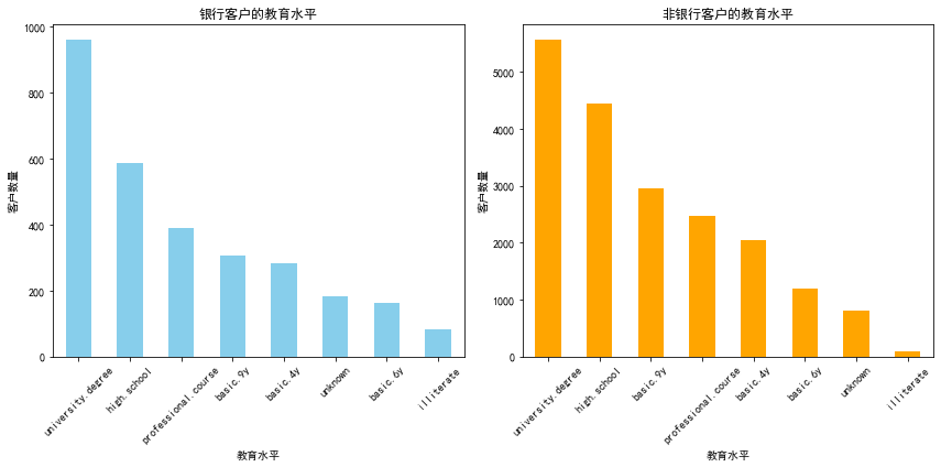
heatmap_data = pd.crosstab(df_train['job'], df_train['education'])
plt.figure(figsize=(10, 8))
sns.heatmap(heatmap_data, annot=True, cmap='coolwarm')
plt.title('工作类型与教育水平的相关性热力图')
plt.xlabel('教育水平')
plt.ylabel('工作类型')
plt.show()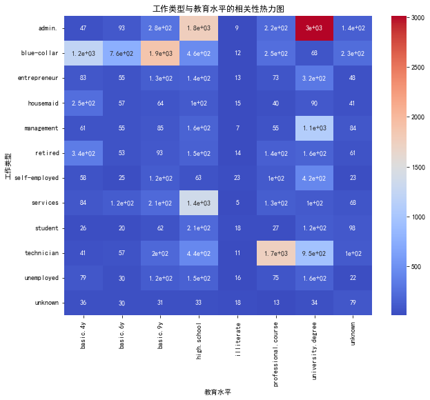
# 创建一个新的数据框,用于绘制复合条形图
loan_marital_job = pd.crosstab(index=[df_train['job'], df_train['marital']], columns=df_train['loan_status'])
# 绘制复合条形图
loan_marital_job.plot(kind='bar', stacked=True, figsize=(14, 8))
plt.title('各职业婚姻状况下的贷款状态分布')
plt.xlabel('职业和婚姻状况')
plt.ylabel('数量')
plt.xticks(rotation=45)
plt.show()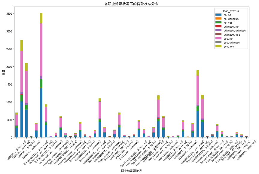
bins = [20, 30, 40, 50, 60]
# 为DataFrame添加一个新列,用于表示年龄组
df_train['age_group'] = pd.cut(df_train['age'], bins, right=False, labels=["20-29", "30-39", "40-49", "50-59"])
# 计算每个年龄组中不同工作的数量
age_job_counts = df_train.groupby(['age_group', 'job']).size().unstack(fill_value=0)
# 绘制条形图
plt.figure(figsize=(15, 8))
age_job_counts.plot(kind='bar', stacked=True, colormap='viridis')
plt.title('不同年龄组的工作类型分布', fontsize=14)
plt.xlabel('年龄组', fontsize=12)
plt.ylabel('工作数量', fontsize=12)
plt.xticks(rotation=45, fontsize=10)
plt.yticks(fontsize=10)
plt.legend(title='工作类型', bbox_to_anchor=(1.05, 1), loc='upper left', fontsize=10)
plt.tight_layout()
plt.show()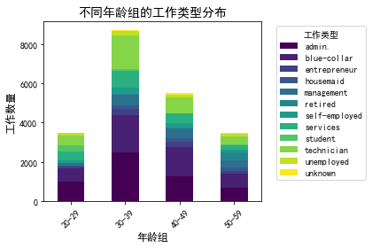
# 创建已婚和未婚的DataFrame
married_df = df_train[df_train['marital'] == 'married']
unmarried_df = df_train[df_train['marital'] != 'married']
# 计算已婚和未婚的年龄中位数
median_age_married = married_df['age'].median()
median_age_unmarried = unmarried_df['age'].median()
# 绘制年龄分布直方图
plt.figure(figsize=(14, 7))
# 已婚人群的年龄分布
plt.hist(married_df['age'], bins=range(min(df_train['age']), max(df_train['age']) + 5, 5), alpha=0.5, label='已婚')
# 未婚人群的年龄分布
plt.hist(unmarried_df['age'], bins=range(min(df_train['age']), max(df_train['age']) + 5, 5), alpha=0.5, label='未婚')
plt.axvline(median_age_married, color='blue', linestyle='dashed', linewidth=1, label='已婚中位年龄')
plt.axvline(median_age_unmarried, color='orange', linestyle='dashed', linewidth=1, label='未婚中位年龄')
plt.title('已婚与未婚人群的年龄分布', fontsize=16)
plt.xlabel('年龄', fontsize=14)
plt.ylabel('人数', fontsize=14)
plt.legend(fontsize=12)
plt.grid(True)
plt.tight_layout()
plt.show()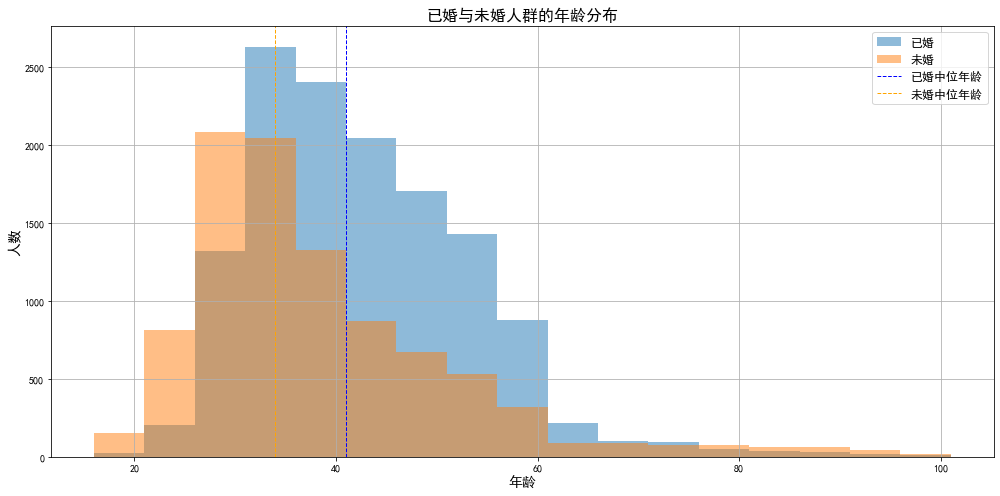
完整代码:
import warnings
warnings.filterwarnings('ignore')
import pandas as pd
df_train=pd.read_csv('.\\train.csv')[['id',"age","job","marital","education","default","housing","loan","subscribe"]]
df_train
df_train.info()
df_train[df_train.duplicated()]
import matplotlib.pyplot as plt
plt.rcParams['font.sans-serif']=['SimHei']#解决中文乱码问题
plt.rcParams["font.size"]=10#设置字体大小
plt.boxplot(df_train['age'])
plt.title('数据分析箱型图')
plt.show()
plt.figure(figsize=(10, 4))
job_counts = df_train['job'].value_counts().head(10)
job_counts.plot(kind='bar', color='skyblue')
plt.title('银行客户前10职业统计')
plt.xlabel('职业')
plt.ylabel('频率')
plt.xticks(rotation=45)
plt.show()
marital_status_counts = df_train['marital'].value_counts()
labels = marital_status_counts.index.tolist()
plt.figure(figsize=(8, 8))
plt.pie(marital_status_counts, labels=labels, autopct='%1.1f%%', startangle=140)
plt.title('银行客户婚姻状况分布')
plt.show()
import seaborn as sns
plt.figure(figsize=(20, 15))

# 教育水平的条形图
plt.subplot(5, 2, 4)
sns.countplot(x='education', data=df_train)
plt.title('客户教育水平分布')
plt.xlabel('教育水平')
plt.ylabel('数量')
plt.xticks(rotation=45)

# 显示图表
plt.tight_layout()
plt.show()
plt.figure(figsize=(20, 15))
# 职业与是否为银行客户的关系(堆叠条形图)
plt.subplot(2, 3, 5)
job_subscribe = pd.crosstab(df_train['job'], df_train['subscribe'])
job_subscribe.plot(kind='bar', stacked=True, color=['skyblue', 'orange'], ax=plt.gca())
plt.title('职业与是否为银行客户的关系')
plt.xlabel('职业')
plt.ylabel('人数')
plt.xticks(rotation=45)
plt.show()
# 默认信用情况的计数图
plt.figure(figsize=(20, 15))
plt.subplot(5, 2, 5)
sns.countplot(x='default', data=df)
plt.title('客户默认信用情况')
plt.xlabel('默认信用')
plt.ylabel('数量')
plt.show()
plt.figure(figsize=(20, 15))
# 是否有住房贷款(饼图)
plt.subplot(2, 3, 1)
df_train['housing'].value_counts().plot(kind='pie', autopct='%1.1f%%')
plt.title('是否有住房贷款')
plt.ylabel('')
plt.show()
# 是否有个人贷款(饼图)
plt.figure(figsize=(20, 15))
plt.subplot(2, 3, 2)
df_train['loan'].value_counts().plot(kind='pie', autopct='%1.1f%%')
plt.title('是否有个人贷款')
plt.ylabel('')
plt.show()
# 是否为银行客户(饼图)
plt.figure(figsize=(20, 15))
plt.subplot(2, 3, 3)
df_train['subscribe'].value_counts().plot(kind='pie', autopct='%1.1f%%')
plt.title('是否为银行客户')
plt.ylabel('')
plt.show()
# 年龄与是否为银行客户的关系(箱形图)
plt.figure(figsize=(20, 15))
df_train.boxplot(column='age', by='subscribe')
plt.title('年龄与是否为银行客户的关系')
plt.suptitle('')  # 去除默认的副标题
plt.xlabel('是否为银行客户')
plt.ylabel('年龄')
plt.show()
import copy
def convert_yes_no(value):
    if value == 'yes':
        return 1
    elif value == 'no':
        return 0
    else:
        return None

df=copy.deepcopy(df_train)
for column in ['default', 'housing', 'loan', 'subscribe']:
    df[column] = df[column].apply(convert_yes_no)

df = df.dropna(subset=['default', 'housing', 'loan', 'subscribe']).reset_index(drop=True)

df
x=df.iloc[:,:-1].drop(['id'], axis = 1)
y=df.iloc[:,-1:]

from sklearn.preprocessing import OneHotEncoder
non_numeric_columns = x.select_dtypes(include=['object']).columns
encoder = OneHotEncoder(sparse=False)
encoded_data = encoder.fit_transform(x[non_numeric_columns])
encoded_df = pd.DataFrame(encoded_data, columns=encoder.get_feature_names_out(non_numeric_columns))
x = pd.concat([x.drop(non_numeric_columns, axis=1), encoded_df], axis=1)
x.head()
from sklearn.preprocessing import StandardScaler
scaler = StandardScaler()#标准差标准化
x= scaler.fit_transform(x)

from sklearn.model_selection import train_test_split
x_train,x_test,y_train,y_test=train_test_split(x,y,test_size=0.365,random_state=42)

from sklearn.linear_model import LogisticRegression
cgr=LogisticRegression()
cgr.fit(x_train,y_train)
cgr.score(x_test,y_test)
from sklearn.metrics import roc_curve,auc
y_score=cgr.predict_proba(x_test)[:,1]
fpr, tpr, thersholds = roc_curve(y_test,y_score)
roc_auc=auc(fpr,tpr)
plt.plot(fpr, tpr, 'k--', label='ROC (area = {0:.2f})'.format(roc_auc), lw=2)
plt.xlim([-0.05, 1.05])  # 设置x、y轴的上下限,
plt.ylim([-0.05, 1.05])
plt.xlabel('False Positive Rate')
plt.ylabel('True Positive Rate')  # 可以使用中文,但需要导入一些库即字体
plt.title('ROC Curve')
plt.legend(loc="lower right")
plt.show()
from sklearn.tree import DecisionTreeClassifier
from sklearn.metrics import accuracy_score
# 创建决策树分类器实例
dtc = DecisionTreeClassifier()
# 训练模型
dtc.fit(x_train, y_train)
# 在测试集上进行预测
y_pred = dtc.predict(x_test)
# 计算准确率
accuracy = accuracy_score(y_test, y_pred)
accuracy
from sklearn.svm import SVC
svm_model = SVC()
svm_model.fit(x_train, y_train)
accuracy = svm_model.score(x_test, y_test)
accuracy
from sklearn.ensemble import RandomForestClassifier
rf_model = RandomForestClassifier()
rf_model.fit(x_train, y_train)
accuracy = rf_model.score(x_test, y_test)
accuracy
from sklearn.ensemble import GradientBoostingClassifier
gb_model = GradientBoostingClassifier()
gb_model.fit(x_train, y_train)
accuracy = gb_model.score(x_test, y_test)
accuracy
from sklearn.neighbors import KNeighborsClassifier
knn_model = KNeighborsClassifier()
knn_model.fit(x_train, y_train)
accuracy = knn_model.score(x_test, y_test)
accuracy
from sklearn.naive_bayes import GaussianNB
nb_model = GaussianNB()
nb_model.fit(x_train, y_train)
accuracy = nb_model.score(x_test, y_test)
accuracy
# 设置matplotlib中文显示
plt.rcParams['font.sans-serif'] = ['SimHei']
plt.rcParams['axes.unicode_minus'] = False

# 绘制第一个图表:年龄与婚姻状况
plt.figure(figsize=(12, 6))
sns.boxplot(x='marital', y='age', data=df_train)
plt.title('年龄与婚姻状况分布')
plt.xlabel('婚姻状况')
plt.ylabel('年龄')

plt.show()
plt.figure(figsize=(12, 6))
sns.countplot(x='job', hue='education', data=df_train)
plt.title('工作类型与教育水平分布')
plt.xlabel('工作类型')
plt.ylabel('数量')
plt.xticks(rotation=45)

plt.show()
    df_train['loan_status'] = df_train['housing'] + ',' + df_train['loan']

    plt.figure(figsize=(12, 6))
    sns.countplot(x='loan_status', hue='subscribe', data=df_train)
    plt.title('信贷情况与订阅关系')
    plt.xlabel('信贷情况')
    plt.ylabel('数量')

    plt.show()
# 对比银行客户和非银行客户的教育水平
subscribed_df = df_train[df_train['subscribe'] == 'yes']

# 统计各学历层次的频率
education_counts = subscribed_df['education'].value_counts()
# 筛选出非订阅银行服务的客户(subscribe为'no')
non_subscribed_df = df_train[df_train['subscribe'] == 'no']

# 统计非银行客户的教育水平频率
non_education_counts = non_subscribed_df['education'].value_counts()

# 绘制银行客户和非银行客户的教育水平对比图
plt.figure(figsize=(12, 6))

# 银行客户
plt.subplot(1, 2, 1)
education_counts.plot(kind='bar', color='skyblue')
plt.title('银行客户的教育水平')
plt.xlabel('教育水平')
plt.ylabel('客户数量')
plt.xticks(rotation=45)

# 非银行客户
plt.subplot(1, 2, 2)
non_education_counts.plot(kind='bar', color='orange')
plt.title('非银行客户的教育水平')
plt.xlabel('教育水平')
plt.ylabel('客户数量')
plt.xticks(rotation=45)

plt.tight_layout()
plt.show()
heatmap_data = pd.crosstab(df_train['job'], df_train['education'])

plt.figure(figsize=(10, 8))
sns.heatmap(heatmap_data, annot=True, cmap='coolwarm')
plt.title('工作类型与教育水平的相关性热力图')
plt.xlabel('教育水平')
plt.ylabel('工作类型')

plt.show()
# 创建一个新的数据框,用于绘制复合条形图
loan_marital_job = pd.crosstab(index=[df_train['job'], df_train['marital']], columns=df_train['loan_status'])

# 绘制复合条形图
loan_marital_job.plot(kind='bar', stacked=True, figsize=(14, 8))
plt.title('各职业婚姻状况下的贷款状态分布')
plt.xlabel('职业和婚姻状况')
plt.ylabel('数量')
plt.xticks(rotation=45)
plt.show()
bins = [20, 30, 40, 50, 60]

# 为DataFrame添加一个新列,用于表示年龄组
df_train['age_group'] = pd.cut(df_train['age'], bins, right=False, labels=["20-29", "30-39", "40-49", "50-59"])

# 计算每个年龄组中不同工作的数量
age_job_counts = df_train.groupby(['age_group', 'job']).size().unstack(fill_value=0)

# 绘制条形图
plt.figure(figsize=(15, 8))
age_job_counts.plot(kind='bar', stacked=True, colormap='viridis')
plt.title('不同年龄组的工作类型分布', fontsize=14)
plt.xlabel('年龄组', fontsize=12)
plt.ylabel('工作数量', fontsize=12)
plt.xticks(rotation=45, fontsize=10)
plt.yticks(fontsize=10)
plt.legend(title='工作类型', bbox_to_anchor=(1.05, 1), loc='upper left', fontsize=10)
plt.tight_layout()

plt.show()
# 创建已婚和未婚的DataFrame
married_df = df_train[df_train['marital'] == 'married']
unmarried_df = df_train[df_train['marital'] != 'married']

# 计算已婚和未婚的年龄中位数
median_age_married = married_df['age'].median()
median_age_unmarried = unmarried_df['age'].median()

# 绘制年龄分布直方图
plt.figure(figsize=(14, 7))

# 已婚人群的年龄分布
plt.hist(married_df['age'], bins=range(min(df_train['age']), max(df_train['age']) + 5, 5), alpha=0.5, label='已婚')

# 未婚人群的年龄分布
plt.hist(unmarried_df['age'], bins=range(min(df_train['age']), max(df_train['age']) + 5, 5), alpha=0.5, label='未婚')

plt.axvline(median_age_married, color='blue', linestyle='dashed', linewidth=1, label='已婚中位年龄')
plt.axvline(median_age_unmarried, color='orange', linestyle='dashed', linewidth=1, label='未婚中位年龄')

plt.title('已婚与未婚人群的年龄分布', fontsize=16)
plt.xlabel('年龄', fontsize=14)
plt.ylabel('人数', fontsize=14)
plt.legend(fontsize=12)
plt.grid(True)
plt.tight_layout()

plt.show()四、总结
通过对银行客户的大数据分析和挖掘,我得到了以下有益的结论:
客户画像:通过数据分析,可以得出客户的基本信息、交易记录、产品持有情况等特征,从而构建出客户画像。这有助于银行更好地了解客户需求和行为,为精准营销和服务提供支持。
认购产品预测:通过训练预测模型,可以预测客户未来认购产品的可能性。这有助于银行提前了解客户需求,提供更加精准的产品推荐和服务,提高客户满意度和忠诚度。
自己在完成此设计过程中,得到了的收获如下:
深入了解银行客户数据的特点和结构,掌握了数据清洗、整合和特征提取等数据处理技术,熟悉了多种机器学习算法,并能够根据数据特点选择合适的算法进行模型训练和优化,了解了大数据在金融行业中的应用场景和价值,加深了对大数据分析的认识和理解。


 浙公网安备 33010602011771号