

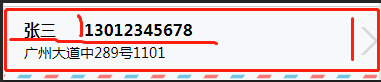
比如我们要在app上显示这样的布局
我们先进行拆分,
第一层: 底部彩色条纹线和上面其他部分A. 采用column布局;
第二层: A再拆分为文字部分B和右边箭头部分C, 采用Row布局; (B的宽度不用指定,用 flex-grow: 1; 自动适配; 而C垂直居中,则用 align-self: center; 指定)
第三层: B再拆分为姓名,电话部分D和地址部分E, 采用Column布局;
第四层: D再拆分为姓名和电话, 采用Column布局
html部分:
<div class="pro_list">
  <div class="pro_list_addressBox">
    <div class="pro_list_column pro_list_address" >
      <div class="pro_list_row">
        <span class="addr_name"> 张三 </span>
        <span class="addr_tel"> 13012345678 </span>
      </div>
      <p>
        广州大道中289号1101 </p>
    </div>

    <image src='/images/arrow_right.png' class="pro_list_arrow_right"></image>
  </div>
  <image src='/images/addressBar.png' class="addressBar"></image>
</div>
css 部分:
.pro_list_info {
  position: relative;
  z-index: 1;
  min-height: 100px;
  display: flex;
  flex-direction: column;
}
.pro_list_addressBox {
  display: flex;
  flex-direction: row;

  min-height: 80rpx;
  vertical-align: middle;
  border-top-style: solid;
  border-top-width: 1px;
  border-top-color: #ccc;
}
.pro_list_address {
  padding-left: 20px;
  padding-top:10px;
  flex-grow: 1;
  min-height: 80rpx;
  vertical-align: middle;
}
.pro_list_arrow_right {
  align-self: center;
  margin-top:10px;
  width:19px;
  height:28px;
}
.addr_name{
  width:60px;
  font-weight: bold;
  font-size: 16px;
}
.addr_tel{
  width:60px;
font-weight: bold;
  font-size: 16px;
}
.addressBar{
  width:747rpx;
  height:14rpx;
  }

.pro_list_row {

  display: flex;
  flex-direction: row;
  flex-wrap: wrap;
}

.pro_list_column {
  display: flex;
  flex-direction: column;
}

 浙公网安备 33010602011771号