


方案1:position 元素已知宽度
父元素设置为:position: relative;
子元素设置为:position: absolute;
距上50%,据左50%,然后减去元素自身宽度的距离就可以实现
事例1:
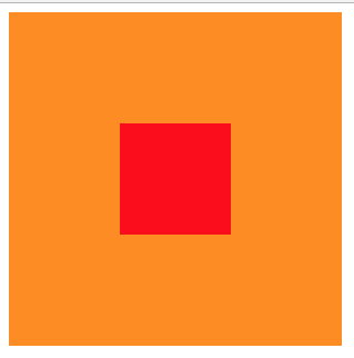
<div class="box">
<div class="content">
</div>
</div>
.box {
background-color: #FF8C00;
width: 300px;
height: 300px;
position: relative;
}
.content {
background-color: #F00;
width: 100px;
height: 100px;
position: absolute;
left: 50%;
top: 50%;
margin: -50px 0 0 -50px;
}
方案2:
position transform 元素未知宽度
如果元素未知宽度,只需将上面例子中的margin: -50px 0 0 -50px;替换为:transform: translate(-50%,-50%);
效果如上!
示例2:
<div class="box">
<div class="content">
</div>
</div>
.box {
background-color: #FF8C00;
width: 300px;
height: 300px;
position: relative;
}
.content {
background-color: #F00;
width: 100px;
height: 100px;
position: absolute;
left: 50%;
top: 50%;
transform: translate(-50%,-50%);
}

方案3:flex布局
示例3:
<div class="box">
<div class="content">
</div>
</div>
.box {
background-color: #FF8C00;
width: 300px;
height: 300px;
display: flex;//flex布局
justify-content: center;//使子项目水平居中
align-items: center;//使子项目垂直居中
}
.content {
background-color: #F00;
width: 100px;
height: 100px;
}
