CSS 实现图片对比(二)
上一篇文章中,实现了图片的对比功能。按照设想是可以实现任意图片的对比(主要是指图片大小)。
后面找了几张 NSAS 历史影像图对比,发现有问题,图片太多的话,图片超出父容器。
下面是对代码进行了调整。
1、通过图片的宽高,和容器的最大宽高比较,设置图片在当前容器显示的最佳范围
2、因为是左右拉动对比,所以图片css设置 max-height
HTML和JS

<template>
    <div class="contrast">
      <div :style="{width:imgWidth+'px'}" class="container">
        <div :style="{width:beforWidth+'%'}" class="img-box img-before">
          <img :src="img[0]" alt="">
        </div>
        <div class="img-box img-after">
          <img :src="img[1]" alt="">
        </div>

        <input v-model="beforWidth" type="range" min="0" max="100" class="slider">
        <div :style="{left:beforWidth+'%'}" class="btn" />
      </div>
    </div>
</template>

<script>
export default {
  data() {
    return {
      img:['img0','img1'],
      imgWidth: 2154,
      imgHeight: 2154,
      beforWidth: 50
    }
  },
  created() {
    // 容器最大宽高:1400*800,图片宽高和这个做对比
    // 如果超出,做等比缩放(以比例大的缩放)
    if (this.imgWidth > 1400 || this.imgHeight > 800) {
      if ((this.imgWidth / 1400) > (this.imgHeight / 800)) {
        this.imgWidth = 1400
      } else {
        this.imgWidth = this.imgWidth * 800 / this.imgHeight
      }
    }
  }
}
</script>
CSS
CSS 主要是改变了 container和 img 元素
.contrast {
    position: fixed;
    left: 0;
    top: 0;
    width: 100vw;
    height: 100vh;
    display: flex;
    justify-content: center;
    align-items: center;
    background: rgba(0, 0, 0, 0.5);
    z-index: 10;

    .container {
      position: relative;
      height: 100%;
      // 容器最大宽高
      max-width: 1400px;
      max-height: 800px;
    }

    .img-box {
      position: absolute;
      left: 0;
      top: 0;
      width: 100%;
      height: 100%;
      display: flex;
      align-items: center;
      overflow: hidden;

      img {
        // 图片的高最大是容器的 100%,这样保证从左侧平铺
        max-height: 100%;
      }
    }

    .img-before {
      z-index: 1;
    }

    .slider {
      position: absolute;
      appearance: none;
      width: 100%;
      height: 100%;
      display: flex;
      justify-content: center;
      align-items: center;
      background-color: transparent;
      outline: none;
      margin: 0;
      transition: all 0.2s;
      z-index: 3;

      &::-webkit-slider-thumb {
        width: 4px;
        height: 800px;
        -webkit-appearance: none;
        appearance: none;
        background: #ffffff;
        border-radius: 4px; /*外观设置为圆角*/
        box-shadow: 0 0.125em 0.125em #3b4547; /*添加底部阴影*/

        cursor: pointer;
        z-index: 5;
      }
    }

    .slider-d {
      position: absolute;
      top: 0;
      width: 3px;
      height: 100%;
      background-color: #fff;
      border-radius: 3px;
    }

    .btn {
      position: absolute;
      top: 50%;
      z-index: 2;

      &::before {
        content: '';
        position: absolute;
        left: -15px;
        padding: 5px;
        display: inline-block;
        border: solid #fff;
        border-width: 0 2px 2px 0;
        transform: rotate(135deg);
      }

      &::after {
        content: '';
        position: absolute;
        left: 3px;
        padding: 5px;
        display: inline-block;
        border: solid #fff;
        border-width: 0 2px 2px 0;
        transform: rotate(-45deg);
      }
    }
  }
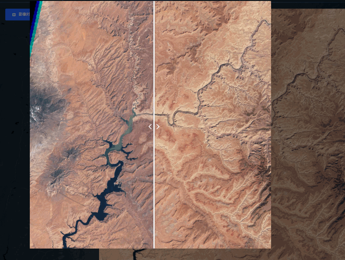
效果
实现的具体效果:


【推荐】国内首个AI IDE,深度理解中文开发场景,立即下载体验Trae
【推荐】编程新体验,更懂你的AI,立即体验豆包MarsCode编程助手
【推荐】抖音旗下AI助手豆包,你的智能百科全书,全免费不限次数
【推荐】轻量又高性能的 SSH 工具 IShell:AI 加持,快人一步
· 周边上新:园子的第一款马克杯温暖上架
· 分享 3 个 .NET 开源的文件压缩处理库,助力快速实现文件压缩解压功能!
· Ollama——大语言模型本地部署的极速利器
· DeepSeek如何颠覆传统软件测试?测试工程师会被淘汰吗?
· 使用C#创建一个MCP客户端