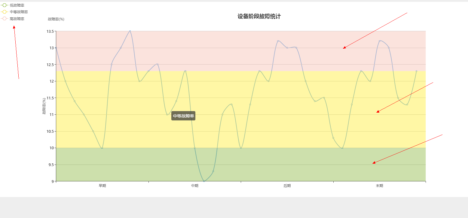
echarts 不同区域背景色不同 废了我一天的时间
var result = echarts.init(document.getElementById('result'));
var option1 = {
title: {
text: '设备阶段故障统计',
left:'50%',
top:'5%'
},
tooltip : {
trigger: 'axis',
axisPointer : { // 坐标轴指示器,坐标轴触发有效
type : 'shadow' // 默认为直线,可选为:'line' | 'shadow'
}
},
legend: {
orient: 'vertical',
left: 'left',
data:['低故障率','中等故障率','高故障率'],
selected: {
'低故障率' :true,
'中等故障率' :true,
'高故障率' :true,
//不想显示的都设置成false
}
},
color:['#81b22f','#f3d71c','#f4b9a9'],
xAxis: {
nameLocation:'center',
type: 'category',
boundaryGap:true,
data:['早期','中期','后期','末期'],
show:true,
axisTick: {
show: true
},
},
grid: {
top: '15%',
bottom: '5%',
containLabel: true
},
yAxis :{
nameGap:35,
name:'故障率(%)',
min:9,
max:13.5,
splitNumber:10,
type : 'value',
axisLabel : {
formatter : '{value}',
},
},
series: [ //就是从这个地方开始的 主要用的是markArea 和legend
{
name:'低故障率',
type:'line',
animation: false,
areaStyle: {
normal: {}
},
lineStyle: {
normal: {
width: 1
}
},
markArea: {
data: [[{
yAxis: '9'
}, {
yAxis: '10'
}]]
},
},{
name:'中等故障率',
type:'line',
animation: false,
areaStyle: {
normal: {}
},
lineStyle: {
normal: {
width: 1
}
},
markArea: {
data: [[{
yAxis: '10'
}, {
yAxis: '12.3'
}]]
}
},{
name:'高故障率',
type:'line',
animation: false,
areaStyle: {
normal: {}
},
lineStyle: {
normal: {
width: 1
}
},
markArea: {
data: [[{
yAxis: '12.3'
}, {
yAxis: '13.5'
}]]
}
},
],
};
result.setOption(option1);
});
效果图