
前端_冰墩墩
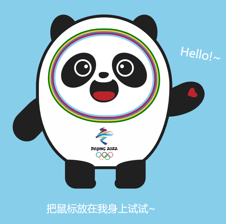
我想要一只冰墩墩,随着冬奥会如火如荼的进行,冰墩墩火了起来。让 我们自己做一只冰墩墩
<!DOCTYPE html>
<html lang="en">
<head>
    <meta charset="UTF-8">
    <meta http-equiv="X-UA-Compatible" content="IE=edge">
    <meta name="viewport" content="width=device-width, initial-scale=1.0">
    <title>html写冰墩墩</title>
    <style>
        *{
            margin: 0;
            padding: 0;
        }
        body{
            background-color: skyblue;
        }

        .bdd{
            height: 450px;
            width: 400px;
            margin: 65px auto;
            position: relative;

        }
        .bdd-body{
            background-color: #fefefe;
            width: 360px;
            height: 410px;

            border:#202020 8px solid;
            border-radius: 88% 88% 62% 68% / 82% 82% 95% 84%;

            position:absolute;
            top: 0px;
            left: 20px;
            z-index: 2;
        }

        .ear1,.ear2{
            background-color: #202020;
            width: 80px;
            height: 110px;
            border-radius: 50%;
            position: absolute;
        }
        .ear1{
            left: 60px;
            transform: rotate(-10deg);
        }
        .ear2{
            left: 275px;
            transform: rotate(10deg);

        }
        .ear2::after{
            content: "Hello!~";
            color: #fff;
            font-size: 32px;
            position: absolute;
            top: 60px;
            left: -25px;
            transition: all 0.8s ease-in 0s;
        }
        .bdd:hover .ear2::after{
            left:150px;
        }


        .arm1,.arm2{
            width: 80px;
            background-color: #202020;
            position: absolute;
        }
        .arm1{
            height: 130px;
            border-radius: 24% 69% 68% 76%/ 53% 95% 40% 52%;
            top: 225px;
            left: -28px;
            transform: rotate(45deg);
        }
        .arm2{
            height: 160px;
            border-radius: 56% 62% 98% 6%/ 40% 46% 80% 58%;
            top: 160px;
            left: 370px;
            transform: rotate(37deg);
            transition: all 0.5s ease-in 0s;
        }
        .arm2::before{
            content: "";
            width: 16px;
            height: 24px;
            background: #bc242c;
            position: absolute;
            border-top-left-radius: 50%;
            border-top-right-radius: 50%;
            transform: rotate(45deg);
            left: 32px;
            top: 20px;
        }
        .arm2::after{
            content: "";
            width: 16px;
            height: 24px;
            background: #bc242c;
            position: absolute;
            border-top-left-radius: 50%;
            border-top-right-radius: 50%;
            transform: rotate(-45deg);
            left: 25px;
            top: 21px;
        }
        .bdd:hover .arm2{
            transform: rotate(65deg);
        }

        .leg1,.leg2{
            width: 83px;
            height: 80px;
            background-color: #202020;

            position: absolute;
            z-index: 2;
        }
        .leg1{
            top: 400px;
            left: 100px;
            border-radius: 0 80px 30px 30px / 0 22px 30px 30px;
        }
        .leg2{
            top: 400px;
            left: 240px;
            border-radius: 80px 0 30px 30px / 22px 0 30px 30px;
        }
        .leg1::after,.leg2::after{
            content: "";
            width: 43px;
            height: 30px;
            position: absolute;
            background: #202020;
            border-radius: 30px;
        }
        .leg1::after{
            bottom: 0;
            right: -3px;
        }
        .leg2::after{
            bottom: 0;
            left: -3px;
        }

        .circle{
            position: absolute;
            border-radius: 48% 48% 44% 49%/ 53% 54% 45% 47%;
        }
        .c-green{
            border:green 5px solid;
            width: 300px;
            height: 250px;
            top: 30px;
            left: 25px;
        }
        .c-yellow{
            border: #ffc346 5px solid;
            width: 292px;
            height: 242px;
            top: 34px;
            left: 29px;
        }
        .c-purple{
            border: #5d75b3 5px solid;
            width: 284px;
            height: 234px;
            top: 38px;
            left: 33px;
        }
        .c-red{
            border: #af2350 5px solid;
            width: 276px;
            height: 226px;
            top: 42px;
            left:37px;
        }
        .c-blue{
            border: skyblue 5px solid;
            background-color: #fff;
            width: 268px;
            height: 218px;
            top: 46px;
            left: 41px;
        }

        .eye1,.eye2{
            background: #202020;
            width: 80px;
            height: 110px;
            border-radius: 50%;
            position: absolute;
        }
        .eye1{
            left: 70px;
            top: 90px;
            transform: rotate(45deg);
        }
        .eye2{
            left: 210px;
            top: 90px;
            transform: rotate(-45deg);
        }
        .eye1::before,.eye2::before{
            content: "";
            width: 38px;
            height: 38px;
            border: #fff 5px solid;
            border-radius: 100%;
            position: absolute;
        }
        .eye1::before{
            top: 18px;
            right: 12px;
        }
        .eye2::before{
            top: 18px;
            left: 12px;
        }
        .eye1::after,.eye2::after{
            content: "";
            width: 10px;
            height: 10px;
            background: #fff;
            border-radius: 100%;
            position: absolute;
        }
        .eye1::after{
            top: 28px;
            left: 42px;
        }
        .eye2::after{
            top: 28px;
            right: 42px;
        }

        .nose{
            width: 28px;
            height: 18px;
            background: #202020;
            position: absolute;
            top: 150px;
            left: 165px;
            border-radius: 80px 110px 130px 90px/ 60px 45px 90px 80px;
            z-index: 2;
        }

        .mouth{
            background: #202020;
            width: 80px;
            height: 64px;
            position:absolute;
            top: 170px;
            left: 140px;
            border-radius: 58px 52px 112px 100px / 82px 80px 96px 92px;
        }
        .mouth::before{
            content: "";
            width: 48px;
            height: 18px;
            background: #fff;
            border-radius: 50%;
            position: absolute;
            top: -9px;
            left: 15px;
        }
        .mouth::after{
            content: "";
            width: 60px;
            height: 25px;
            background: #bc242c;
            border-radius: 0 0 90px 95px  / 0 0 51px 50px;
            border-top-left-radius: 100%;
            border-top-right-radius: 100%;
            position:absolute;
            bottom: 5px;
            left: 10px;
        }
        .logo{
            width: 80px;
            height: 100px;
            /* background: red; */
            position: absolute;
            top: 297px;
            left: 140px;
            background: url(https://gimg2.baidu.com/image_search/src=http%3A%2F%2Fp2.itc.cn%2Fq_70%2Fimages03%2F20210907%2Fe92141920b744c5ab6a5cbcd96e53036.png&refer=http%3A%2F%2Fp2.itc.cn&app=2002&size=f9999,10000&q=a80&n=0&g=0n&fmt=jpeg?sec=1647165378&t=6229d4e1cf14f236c1cfd77196277dd4);
            background-size: 198px 238px;
            background-position: 192px 118px;
        }

        .tips p{
            color: #fff;
            text-align: center;
            font-size: 28px;
            /* -webkit-text-stroke: 1px #202020; */
        }
        .tihuan{
            display: none;
        }
        .bdd:hover .tihuan{
            display: block;
        }
        .bdd:hover .tip{
            display: none;
        }

    </style>
</head>
<body>
    <div class="bdd">
        <div class="bdd-body">
            <div class="face">
                <div class="circle c-green"></div>
                <div class="circle c-yellow"></div>
                <div class="circle c-purple"></div>
                <div class="circle c-red"></div>
                <div class="circle c-blue"></div>
            </div>
            <div class="eye1"></div>
            <div class="eye2"></div>
            <div class="nose"></div>
            <div class="mouth"></div>
            <div class="logo"></div>
        </div>
        <div class="ear1"></div>
        <div class="ear2"></div>
        <div class="arm1"></div>
        <div class="arm2"></div>
        <div class="leg1"></div>
        <div class="leg2"></div>
    </div>
    <div class="tips">
        <p>把鼠标放在我身上试试~</p>
    </div>
</body>
</html>
把最实用的经验,分享给最需要的读者,希望每一位来访的朋友都能有所收获!
分类:
前端 合集 / 前端项目


【推荐】国内首个AI IDE,深度理解中文开发场景,立即下载体验Trae
【推荐】编程新体验,更懂你的AI,立即体验豆包MarsCode编程助手
【推荐】抖音旗下AI助手豆包,你的智能百科全书,全免费不限次数
【推荐】轻量又高性能的 SSH 工具 IShell:AI 加持,快人一步
· 周边上新:园子的第一款马克杯温暖上架
· Open-Sora 2.0 重磅开源!
· 分享 3 个 .NET 开源的文件压缩处理库,助力快速实现文件压缩解压功能!
· Ollama——大语言模型本地部署的极速利器
· DeepSeek如何颠覆传统软件测试?测试工程师会被淘汰吗?