Qt - QSS样式表

1. QSS简介

Qt样式表(style sheet)是用于定制用户界面的强有力的机制,其概念、术语是收到HTML中的级联样式表(Cascading Style Sheets,CCS)启发而来,只是Qt样式表是用用于窗体界面的

与HTML的CSS类似,Qt的样式表是纯文本的格式定义,在应用程序运行时可以载入和解析这些样式定义。使用样式表可以定义各种界面组件(QWidget类及其子类)的样式,从而使应用程序的界面呈现不同的效果。很多软件具有换肤功能,使用Qt的样式表就可以很容易的实现这样的功能

多多翻看Qt官方文档,所有控件都有案例:在索引栏输入Qt style

CSS样式表学习:http://www.w3school.com.cn/css/css_syntax.asp

1.1 盒子模型

CSS盒模型本质上是一个盒子,封装周围的HTML元素,它包括:边距,边框,填充,和实际内容。

盒模型允许我们在其它元素和周围元素边框之间的空间放置元素。

下面的图片说明了盒子模型(Box Model):
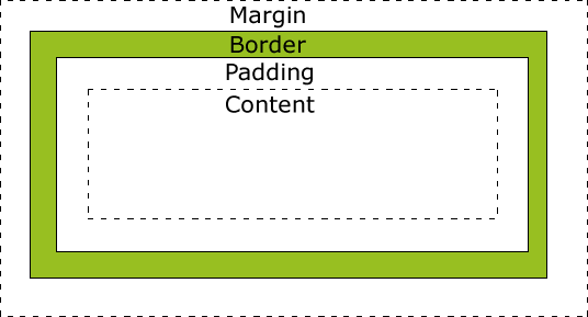
 

不同部分的说明:

  • Margin(外边距) - 清除边框外的区域,外边距是透明的。

  • Border(边框) - 围绕在内边距和内容外的边框。

  • Padding(内边距) - 清除内容周围的区域,内边距是透明的。

  • Content(内容) - 盒子的内容,显示文本和图像。

为了正确设置元素在所有浏览器中的宽度和高度,你需要知道的盒模型是如何工作的。


2. QSS加载方式

方式一:在代码中加载

myDialog->setStyleSheet("QLineEdit { background-color: yellow }");
nameEdit->setStyleSheet("background-color: yellow");


方式二:读文件的方式加载

QFile file("://qss/styles.css");
if(!file.open(QIODevice::ReadOnly | QIODevice::Text))
{
    qWarning("styles.css open falied");
}
this->setStyleSheet(file.readAll());


方式三:对整个软件的所有控件样式进行设置

#include "mainwindow.h"

#include <QApplication>
#include <QDebug>
#include <QFile>

int main(int argc, char *argv[])
{
    QApplication app(argc, argv);
    MainWindow w;
    w.show();
    
    QFile qss("StyleSheet.qss");
    if(!qss.open(QFile::ReadOnly))
    {
        qWarning("StyleSheet.css open falied");
    }
    app.setStyleSheet(qss.readAll());
    qss.close();
    
    return app.exec();
}

或者,本质都是一样的

#include "mainwindow.h"

#include <QApplication>
#include <QFile>
#include "global_function.h"

int main(int argc, char *argv[])
{
    QApplication a(argc, argv);
    
    MainWindow w;
    w.show();
    qApp->setStyleSheet(g_GetStrStyle());

    return a.exec();
}

 通过加载StyleSheet.css文件,对整个软件的所有控件样式进行设置。这种方式“一劳永逸”,可以设计自己的风格,所有软件重复使用。


3. QSS样式表用法

1.全局使用

qApp->setStyleSheet(“QLineEdit { background-color: yellow }”);

2.子类及子类以下使用

myDialog->setStyleSheet(“QLineEdit { background-color: yellow }”);

3.某一个特定的控件

使用QObject::setObjectName()设定一个ID

通过id选择器

myDialog->setStyleSheet(“QLineEdit#nameEdit { background-color: yellow }”);

4.直接在控件上使用

nameEdit->setStyleSheet(“background-color: yellow”);


4. QSS选择器类型

4.1 通配选择器

 *  

  匹配所有的控件

4.2 类型选择器

QPushButton 

  匹配所有QPushButton和其子类的实例

QPushButton {background: gray;}

4.3 属性选择器

QPushButton[flat="false"]

   匹配所有flat属性是false的QPushButton实例,注意该属性可以是自定义的属性,不一定非要是类本身具有的属性

QPushButton[STYLE_KEY='dangerous'] { background: magenta; }
/*openButton->setProperty("STYLE_KEY",  "dangerous");*/

4.4 类选择器

.QPushButton 

 匹配所有QPushButton的实例,但是并不匹配其子类。这是与CSS中的类选择器不一样的地方,注意前面有一个点号

.RedButton { background: magenta; }
 
/*
openButton->setProperty("class",  "RedButton");
closeButton->setProperty("class", "RedButton");
*/

4.5 ID选择器

#myButton

 匹配所有id为myButton的控件实例,这里的id实际上就是objectName指定的值

#openButton, #closeButton { background: magenta; }

4.6 后代选择器

QDialog QPushButton

   所有QDialog容器中包含的QPushButton,不管是直接的还是间接的

QDialog {background: gray;}
/* 设置 QDialog中的 QPushButton 的 QSS */
QDialog QPushButton 
{
    border: 2px solid magenta;
    border-radius: 10px;
    background: white;
    padding: 2px 15px;
}

4.7 子选择器

QFrame> QPushButton

   所有QFrame容器下面的QPushButton,其中要求QPushButton的直接父容器是QFrame,注意和后代选择器的区别

QFrame {background: gray;}
QFrame > QPushButton 
{
    border: 2px solid magenta;
    border-radius: 10px;
    background: white;
    padding: 2px 15px;
}

4.8 伪类选择器

选择器:状态 作为选择器,支持 ! 操作符,表示 非。

QPushButton:hover { color: white }
QCheckBox:checked { color: white }
QCheckBox:!checked { color: red }


所有的这些选择器可以联合使用,并且支持一次设置多个选择器类型,用逗号隔开,这点与CSS一样,例如:

#frameCut,#frameInterrupt,#frameJoin 表示所有这些id使用一个规则。

#mytable  QPushButton 表示选择所有id为mytable的容器下面的QPushButton实例


5. QSS常用属性

5.1 字体

大小 {font-size: x-large;}(特大) xx-small;(极小) 一般中文用不到,只要用数值就可以,单位:PX、PD

样式 {font-style: oblique;}(偏斜体) italic;(斜体) normal;(正常)

行高 {line-height: normal;}(正常) 单位:PX、PD、EM

粗细 {font-weight: bold;}(粗体) lighter;(细体) normal;(正常)

变体 {font-variant: small-caps;}(小型大写字母) normal;(正常)

大小写 {text-transform: capitalize;}(首字母大写) uppercase;(大写) lowercase;(小写) none;(无)

修饰 {text-decoration: underline;}(下划线) overline;(上划线) line-through;(删除线) blink;(闪烁)

字体名:

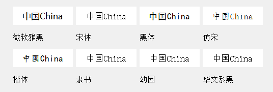
微软雅黑:Microsoft YaHei  宋体:SimSun  黑体:SimHei  仿宋: FangSong  楷体:  KaiTi

隶书:LiSu  幼圆:YouYuan  华文细黑:STXihei  华文楷体:STKaiti  华文宋体:STSong

华文中宋:STZhongsong  华文仿宋:STFangsong  方正舒体:FZShuTi  方正姚体:FZYaoti  华文彩云:STCaiyun

华文琥珀:STHupo  华文隶书:STLiti  华文行楷:STXingkai  华文新魏:STXinwei

font: 15px "Segoe UI";             /* 字体:大小 名称 */  
 
font-family: "Segoe UI";           /* 字体名称 */  

5.2 颜色

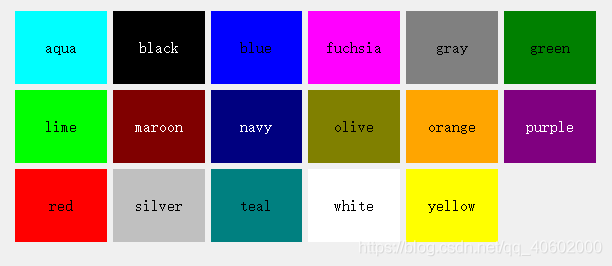
17种标准色:aqua, black, blue, fuchsia, gray, green, lime, maroon, navy,olive, orange, purple, red, silver, teal, white, yellow

color: rgb(255,255,255);   
color: #F5F5F5;               /* 前景(文本)颜色 */  
 
color: qlineargradient();     /* 前景(文本)颜色:线性渐变*/  
 
color: qradialgradient();     /* 前景(文本)颜色:辐射渐变*/  
 
color: qconicalgradient();    /* 前景(文本)颜色:梯形渐变*/

5.3 内边距

padding: 14px 18px 20px 18px;              /*内边距 顺序上右下左 */
 
padding-left: 5px;                 /* 文字左边距 */  
 
padding-right: 10px;               /* 文字右边距 */  
 
padding-top: 3px;                  /* 文字顶边距 */  
 
padding-bottom: 3px;               /* 文字底边距 */

5.4 外边距

margin: 14px 18px 20px 18px; /*外边距 顺序上右下左 */
 
margin-top: 14px;
 
margin-right: 18px;
 
margin-bottom: 20px;
 
margin-left: 18px;

5.5 背景

background-color: #202122;              
background-color: rgb(113,240,255);       /* 背景颜色 */
 
background-color: qlineargradient();    /* 背景颜色:线性渐变*/  
 
background-color: qradialgradient();    /* 背景颜色:辐射渐变*/  
 
background-color: qconicalgradient();   /* 背景颜色:梯形渐变*/  
 
background-image:url(boder.png);        /* 背景图片 */  
 
background-position: ;                 /* 背景图片对齐方式 */  
 
background-repeat: ;                   /* 背景图片平铺方式 */

5.6 边框

border-style: solid;/*边框类型*/
/*===============================*/
dotted - 定义点线边框
dashed - 定义虚线边框
solid - 定义实线边框
double - 定义双边框
groove - 定义 3D 坡口边框。效果取决于 border-color 值
ridge - 定义 3D 脊线边框。效果取决于 border-color 值
inset - 定义 3D inset 边框。效果取决于 border-color 值
outset - 定义 3D outset 边框。效果取决于 border-color 值
none - 定义无边框
hidden - 定义隐藏边框
/*===============================*/

border-width: 2px;                     /*边框宽度*/

border-color: #FDBC03;                 /*边框颜色*/

border: 1px solid #FDBC03;             /* 边框:宽度 类型 颜色*/  
 
border-image:url(boder.png) 4 8 12 16; /* 边界图 切线 */  
 
border-radius: 4px;                    /* 角弧度 */  
 
border-top-left-radius: 4px;           /* 角弧度:左上角*/  
 
border-top-right-radius: 4px;          /* 角弧度:右上角*/  
 
border-bottom-left-radius: 4px;      /* 角弧度:左下角*/  
 
border-bottom-right-radius: 4px;     /* 角弧度:右下角*/

5.7 宽高

width:12px;           /*设置宽度*/
 
height:40px;          /*设置高度*/
 
min-width:65px;       /*最小宽度*/
 
min-height:12px;      /*最小高度*/
 
max-width:12px;       /*最大宽度*/
 
max-height:12px;      /*最大高度*/


6. QSS伪状态与子控件

6.1 伪状态列表

:checked                        /*button部件被选中*/ 
:unchecked                      /*button部件未被选中*/ 
:disabled                       /*部件被禁用*/ 
:enabled                        /*部件被启用*/ 
:focus                          /*部件获得焦点*/ 
:hover                          /*鼠标位于部件上*/ 
:indeterminate                  /*checkbox或radiobutton被部分选中*/ 
:off                            /*部件可以切换,且处于off状态*/ 
:on                             /*部件可以切换,且处于on状态*/ 
:pressed                        /*部件被鼠标按下*/


6.2 子部件列表

::down-arrow        /*combo box或spin box的下拉箭头*/ 
::drop-down         /*combo box的下拉箭头*/ 
 
::indicator              /*checkbox、radio button或可选择group box的指示器*/ 
::item               /*menu、menu bar或status bar的子项目*/ 
::menu-indicator          /*push button的菜单指示器*/ 
::title              /*group box的标题*/ 
 
::down-button         /*spin box的向下按钮*/
::up-arrow           /*spin box的向上箭头*/ 
::up-button          /*spin box的向上按钮*/


7. QSS级联

QT样式表可以设置在应用程序、父组件、子组件上。通过合并组件的祖先(父亲、祖父等)可以获取任意组件的有效样式表,以及设置在应用程序上的任何样式表。

冲突发生时,不论冲突规则的特性如何,组件自己的样式表总是优先于任何继承而来的样式表。同样,父组件的样式表优先于祖父组件的样式表。

这样的结果是,在一个组件上设置样式规则会自动获得比祖先组件的样式表或是应用程序的样式表指定的其他规则更高的优先级。例如,首先在应用程序设置样式表

qApp->setStyleSheet("QPushButton { color: white }");

然后,在QPushButton对象设置一个样式表

myPushButton->setStyleSheet("* { color: blue }");

QPushButton的样式表会强制QPushButton(及其任何子组件)显示蓝色文本,尽管应用程序范围的样式表提供了更具体的规则。

下列写法也会得到相同的结果:

myPushButton->setStyleSheet("color: blue");

但如果QPushButton有子组件,样式表不会对子组件有效果。

样式表级联是一个复杂的主题,更详细的内容请参考CSS2规范。QT目前没有实现。


8. QSS继承

在经典的CSS中,当元素的字体和颜色没有显示设置时,会自动从父组件继承。使用QT样式表时,一个组件不会自动继承父组件设置的字体和颜色。例如,一个QGroupBox包含一个QPushButton:

qApp->setStyleSheet("QGroupBox { color: red; } ");

QPushButton并没有显示设置颜色,因此并不是继承父组件QGroupBox的颜色,而是拥有系统的颜色。如果要设置QGroupBox及其子组件的颜色,如下:

qApp->setStyleSheet("QGroupBox, QGroupBox * { color: red; }");

相比之下,使用QWidget::setFont() 和 QWidget::setPalette()为子组件设置字体和画板。


9. QT官方示例

官方示例链接:http://doc.qt.io/archives/qt-4.8/stylesheet-examples.html

Qt样式表示例

现在我们将看到一些例子来开始使用Qt样式表。

样式表用法

自定义前景和背景颜色

让我们从将黄色设置为应用程序中所有QLinEdits的背景色开始。这可以像这样实现:

qApp->setStyleSheet("QLineEdit { background-color: yellow }");

如果我们希望属性只应用于QLineEdit,它是特定对话框的子(或孙子或孙子),我们宁愿这样做

myDialog->setStyleSheet("QLineEdit { background-color: yellow }");

如果我们希望属性只应用于一个特定的QLineEdit,我们可以使用QObject:setObjectName()给它一个名字,并使用IDl选择器来引用它:

myDialog->setStyleSheet("QLineEdit#nameEdit { background-color: yellow }");

或者,我们可以直接在QLineEdit上设置background-color属性,省略选择器:

nameEdit->setStyleSheet("background-color: yellow");

为了确保良好的对比度,我们还应该为文本指定合适的颜色:

nameEdit->setStyleSheet("color: blue; background-color: yellow");

这可能是一个好主意,改变所选文本的颜色:

nameEdit->setStyleSheet("color: blue;"
                        "background-color: yellow;"
                        "selection-color: yellow;"
                        "selection-background-color: blue;");

使用动态属性自定义

在很多情况下,我们需要呈现具有强制字段的表单。为了向用户表明该字段是强制性的,一个有效的(尽管在美学上是可疑的)解决方案是使用黄色作为这些字段的背景色。事实证明,这是非常容易实现使用Qt样式表。首先,我们将使用以下应用程序范围的样式表:

*[mandatoryField="true"] { background-color: yellow }

这意味着每个强制性字段Qt属性设置为true的小部件将具有黄色背景。

然后,对于每个强制字段小部件,我们只需动态地创建一个强制性字段属性并将其设置为true。例如:

QLineEdit *nameEdit = new QLineEdit(this);
nameEdit->setProperty("mandatoryField", true);

QLineEdit *emailEdit = new QLineEdit(this);
emailEdit->setProperty("mandatoryField", true);

QSpinBox *ageSpinBox = new QSpinBox(this);
ageSpinBox->setProperty("mandatoryField", true);

使用Box模型自定义QPushButton

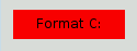
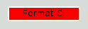
这一次,我们将展示如何创建一个红色的QPushButton。这个QPushButton可能会连接到一个非常具有破坏性的代码片段。

首先,我们很想使用这个样式表:

QPushButton#evilButton { background-color: red }

 然而,结果是一个无聊的,没有边框的扁平按钮:

事情是这样的:

  • >我们提出了一个仅仅使用原生样式无法满足的要求(例如,Windows XP主题引擎不允许我们指定按钮的背景色)。
  • >因此,按钮是使用样式表呈现的。
  • >我们没有为border-width和border-style指定任何值,所以默认情况下我们获得一个样式为none的o像素宽边框。
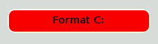
让我们通过指定边框来改善这种情况:

QPushButton#evilButton {
    background-color: red;
    border-style: outset;
    border-width: 2px;
    border-color: beige;
}

事情看起来已经好多了。但是按钮看起来有点挤。让我们使用padding在边框和文本之间指定一些间距。此外,我们将强制执行最小宽度,圆角,并指定一个更大的字体,使按钮看起来更好:

QPushButton#evilButton {
    background-color: red;
    border-style: outset;
    border-width: 2px;
    border-radius: 10px;
    border-color: beige;
    font: bold 14px;
    min-width: 10em;
    padding: 6px;
}

剩下的唯一问题是,当我们按下按钮时,它没有反应。我们可以通过指定一个稍微不同的背景来解决这个问题颜色和使用不同的边框样式。

QPushButton#evilButton {
    background-color: red;
    border-style: outset;
    border-width: 2px;
    border-radius: 10px;
    border-color: beige;
    font: bold 14px;
    min-width: 10em;
    padding: 6px;
}
QPushButton#evilButton:pressed {
    background-color: rgb(224, 0, 0);
    border-style: inset;
}

自定义QPushButton的菜单指示子控件

子控件允许访问小部件的子元素。例如,与菜单关联的QPushButton(使用QPushButton:setMenu())有一个菜单指示器。我们来定制一下红色按钮的菜单指示器:

QPushButton#evilButton::menu-indicator {
    image: url(myindicator.png);
}

默认情况下,菜单指示器位于填充矩形的右下角。我们可以通过指定subcontrol-position和subcontrol-origin来改变这一点,以不同的方式锚定指示器。我们也可以使用top和left来移动指示器几个像素。例如:

QPushButton::menu-indicator {
    image: url(myindicator.png);
    subcontrol-position: right center;
    subcontrol-origin: padding;
    left: -2px;
}

这将myindicator.png定位到QPushButton填充矩形的中右位置(参见subcontrol-origin了解更多信息)。


复杂选择器示例

由于红色似乎是我们最喜欢的颜色,让我们通过设置以下应用程序范围的样式表将QLineEdit中的文本设置为红色:

QLineEdit { color: red }

然而,我们想给一个视觉指示,一个QLineEdit是只读的,使其显示为灰色:

QLineEdit { color: red }
QLineEdit[readOnly="true"] { color: gray }

在某些时候,我们的设计团队要求注册表单(对象名称为registrationDialog)中的所有qlineedit都是棕色的:

QLineEdit { color: red }
QLineEdit[readOnly="true"] { color: gray }
#registrationDialog QLineEdit { color: brown }

在几次Ul设计会议之后,我们决定所有的qdialog都应该是棕色的qlineedit。

QLineEdit { color: red }
QLineEdit[readOnly="true"] { color: gray }
QDialog QLineEdit { color: brown }

测试:如果我们在QDialog中有一个只读的QLineEdit会发生什么?[提示:上面的冲突解决部分解释了在这种情况下会发生什么。]


10. 定制特定的小部件

本节提供了使用样式表定制特定小部件的示例。

10.1 自定义QAbstractScrollArea

任何QAbstractScrollArea (Item)视图的背景。QTextEdit和QTextBrowser)可以使用背景属性进行设置。例如,设置一个与滚动条一起滚动的背景图像。

QTextEdit, QListView {
    background-color: white;
    background-image: url(draft.png);
    background-attachment: scroll;
}

如果背景图像要用视口固定:

QTextEdit, QListView {
    background-color: white;
    background-image: url(draft.png);
    background-attachment: fixed;
}

10.2 自定义QCheckBox

QCheckBox的样式与QRadioButton的样式几乎相同。主要区别在于三状态QCheckBox具有不确定状态。

QCheckBox {
    spacing: 5px;
}

QCheckBox::indicator {
    width: 13px;
    height: 13px;
}

QCheckBox::indicator:unchecked {
    image: url(:/images/checkbox_unchecked.png);
}

QCheckBox::indicator:unchecked:hover {
    image: url(:/images/checkbox_unchecked_hover.png);
}

QCheckBox::indicator:unchecked:pressed {
    image: url(:/images/checkbox_unchecked_pressed.png);
}

QCheckBox::indicator:checked {
    image: url(:/images/checkbox_checked.png);
}

QCheckBox::indicator:checked:hover {
    image: url(:/images/checkbox_checked_hover.png);
}

QCheckBox::indicator:checked:pressed {
    image: url(:/images/checkbox_checked_pressed.png);
}

QCheckBox::indicator:indeterminate:hover {
    image: url(:/images/checkbox_indeterminate_hover.png);
}

QCheckBox::indicator:indeterminate:pressed {
    image: url(:/images/checkbox_indeterminate_pressed.png);
}

10.3 自定义QComboBox

我们将看一个例子,其中QComboBox的下拉按钮与组合框框架“合并”。

QComboBox {
    border: 1px solid gray;
    border-radius: 3px;
    padding: 1px 18px 1px 3px;
    min-width: 6em;
}

QComboBox:editable {
    background: white;
}

QComboBox:!editable, QComboBox::drop-down:editable {
     background: qlineargradient(x1: 0, y1: 0, x2: 0, y2: 1,
                                 stop: 0 #E1E1E1, stop: 0.4 #DDDDDD,
                                 stop: 0.5 #D8D8D8, stop: 1.0 #D3D3D3);
}

/* QComboBox gets the "on" state when the popup is open */
QComboBox:!editable:on, QComboBox::drop-down:editable:on {
    background: qlineargradient(x1: 0, y1: 0, x2: 0, y2: 1,
                                stop: 0 #D3D3D3, stop: 0.4 #D8D8D8,
                                stop: 0.5 #DDDDDD, stop: 1.0 #E1E1E1);
}

QComboBox:on { /* shift the text when the popup opens */
    padding-top: 3px;
    padding-left: 4px;
}

QComboBox::drop-down {
    subcontrol-origin: padding;
    subcontrol-position: top right;
    width: 15px;

    border-left-width: 1px;
    border-left-color: darkgray;
    border-left-style: solid; /* just a single line */
    border-top-right-radius: 3px; /* same radius as the QComboBox */
    border-bottom-right-radius: 3px;
}

QComboBox::down-arrow {
    image: url(/usr/share/icons/crystalsvg/16x16/actions/1downarrow.png);
}

QComboBox::down-arrow:on { /* shift the arrow when popup is open */
    top: 1px;
    left: 1px;
}

QComboBox的弹出窗口是QAbstractltemView,并使用后代选择器进行样式设置:1

QComboBox QAbstractItemView {
    border: 2px solid darkgray;
    selection-background-color: lightgray;
}

10.4 自定义QDockWidget

QDockWidget的标题栏和按钮可以自定义如下:

QDockWidget {
    border: 1px solid lightgray;
    titlebar-close-icon: url(close.png);
    titlebar-normal-icon: url(undock.png);
}

QDockWidget::title {
    text-align: left; /* align the text to the left */
    background: lightgray;
    padding-left: 5px;
}

QDockWidget::close-button, QDockWidget::float-button {
    border: 1px solid transparent;
    background: darkgray;
    padding: 0px;
}

QDockWidget::close-button:hover, QDockWidget::float-button:hover {
    background: gray;
}

QDockWidget::close-button:pressed, QDockWidget::float-button:pressed {
    padding: 1px -1px -1px 1px;
}

如果希望将dock小部件按钮向左移动,可以使用以下样式表:

QDockWidget {
    border: 1px solid lightgray;
    titlebar-close-icon: url(close.png);
    titlebar-normal-icon: url(float.png);
}

QDockWidget::title {
    text-align: left;
    background: lightgray;
    padding-left: 35px;
}

QDockWidget::close-button, QDockWidget::float-button {
    background: darkgray;
    padding: 0px;
    icon-size: 14px; /* maximum icon size */
}

QDockWidget::close-button:hover, QDockWidget::float-button:hover {
    background: gray;
}

QDockWidget::close-button:pressed, QDockWidget::float-button:pressed {
    padding: 1px -1px -1px 1px;
}

QDockWidget::close-button {
    subcontrol-position: top left;
    subcontrol-origin: margin;
    position: absolute;
    top: 0px; left: 0px; bottom: 0px;
    width: 14px;
}

QDockWidget::float-button {
    subcontrol-position: top left;
    subcontrol-origin: margin;
    position: absolute;
    top: 0px; left: 16px; bottom: 0px;
    width: 14px;
}

注意:要自定义QDockWidget的分隔符(调整句柄大小),请使用QMainWindow:separator。

10.5 自定义QFrameQFrame

使用Box模型进行样式化。

QFrame, QLabel, QToolTip {
    border: 2px solid green;
    border-radius: 4px;
    padding: 2px;
    background-image: url(images/welcome.png);
}

10.6 自定义QGroupBox

让我们看一个将QGroupBox的标题移到中心的示例。

QGroupBox {
    background-color: qlineargradient(x1: 0, y1: 0, x2: 0, y2: 1,
                                      stop: 0 #E0E0E0, stop: 1 #FFFFFF);
    border: 2px solid gray;
    border-radius: 5px;
    margin-top: 1ex; /* leave space at the top for the title */
}

QGroupBox::title {
    subcontrol-origin: margin;
    subcontrol-position: top center; /* position at the top center */
    padding: 0 3px;
    background-color: qlineargradient(x1: 0, y1: 0, x2: 0, y2: 1,
                                      stop: 0 #FFOECE, stop: 1 #FFFFFF);
}

对于可检查的QGroupBox,使用(#indicator-subindicator)子控件并将其样式与QCheckBox(即)完全相同。

QGroupBox::indicator {
    width: 13px;
    height: 13px;
}

QGroupBox::indicator:unchecked {
    image: url(:/images/checkbox_unchecked.png);
}

/* proceed with styling just like QCheckBox */

10.7 自定义QHeaderView

QHeaderView自定义如下:

QHeaderView::section {
    background-color: qlineargradient(x1:0, y1:0, x2:0, y2:1,
                                      stop:0 #616161, stop: 0.5 #505050,
                                      stop: 0.6 #434343, stop:1 #656565);
    color: white;
    padding-left: 4px;
    border: 1px solid #6c6c6c;
}

QHeaderView::section:checked
{
    background-color: red;
}

/* style the sort indicator */
QHeaderView::down-arrow {
    image: url(down_arrow.png);
}

QHeaderView::up-arrow {
    image: url(up_arrow.png);
}

10.8 自定义QLineEdit

QLineEdit的框架使用The Box Model进行样式化。要创建圆角的线条编辑,我们可以设置:

QLineEdit {
    border: 2px solid gray;
    border-radius: 10px;
    padding: 0 8px;
    background: yellow;
    selection-background-color: darkgray;
}

具有QLineEdit:: password echo模式的行编辑的密码字符可以通过以下方式设置:

QLineEdit[echoMode="2"] {
    lineedit-password-character: 9679;
}

只读QLineEdit的背景可以修改如下:

QLineEdit:read-only {
    background: lightblue;

10.9 自定义QListView

交替行的背景色可以使用下面的样式表进行自定义:

QListView {
    alternate-background-color: yellow;
}

当您将鼠标悬停在项目上时,为了提供一个特殊的背景,我们可以使用item子控件。例如,

QListView {
    show-decoration-selected: 1; /* make the selection span the entire width of the view */
}

QListView::item:alternate {
    background: #EEEEEE;
}

QListView::item:selected {
    border: 1px solid #6a6ea9;
}

QListView::item:selected:!active {
    background: qlineargradient(x1: 0, y1: 0, x2: 0, y2: 1,
                                stop: 0 #ABAFE5, stop: 1 #8588B2);
}

QListView::item:selected:active {
    background: qlineargradient(x1: 0, y1: 0, x2: 0, y2: 1,
                                stop: 0 #6a6ea9, stop: 1 #888dd9);
}

QListView::item:hover {
    background: qlineargradient(x1: 0, y1: 0, x2: 0, y2: 1,
                                stop: 0 #FAFBFE, stop: 1 #DCDEF1);
}

10.10 自定义QMainWindow

QMainWindow的分隔符的样式如下:

QMainWindow::separator {
    background: yellow;
    width: 10px; /* when vertical */
    height: 10px; /* when horizontal */
}

QMainWindow::separator:hover {
    background: red;
}

10.11 自定义QMenu

QMenu的单个项目使用'item'子控件进行样式设置,如下所示:

QMenu {
    background-color: #ABABAB; /* sets background of the menu */
    border: 1px solid black;
}

QMenu::item {
    /* sets background of menu item. set this to something non-transparent
        if you want menu color and menu item color to be different */
    background-color: transparent;
}

QMenu::item:selected { /* when user selects item using mouse or keyboard */
    background-color: #654321;
}

要进行更高级的自定义,请使用样式表,如下所示。

QMenu {
    background-color: white;
    margin: 2px; /* some spacing around the menu */
}

QMenu::item {
    padding: 2px 25px 2px 20px;
    border: 1px solid transparent; /* reserve space for selection border */
}

QMenu::item:selected {
    border-color: darkblue;
    background: rgba(100, 100, 100, 150);
}

QMenu::icon:checked { /* appearance of a 'checked' icon */
    background: gray;
    border: 1px inset gray;
    position: absolute;
    top: 1px;
    right: 1px;
    bottom: 1px;
    left: 1px;
}

QMenu::separator {
    height: 2px;
    background: lightblue;
    margin-left: 10px;
    margin-right: 5px;
}

QMenu::indicator {
    width: 13px;
    height: 13px;
}

/* non-exclusive indicator = check box style indicator (see QActionGroup::setExclusive) */
QMenu::indicator:non-exclusive:unchecked {
    image: url(:/images/checkbox_unchecked.png);
}

QMenu::indicator:non-exclusive:unchecked:selected {
    image: url(:/images/checkbox_unchecked_hover.png);
}

QMenu::indicator:non-exclusive:checked {
    image: url(:/images/checkbox_checked.png);
}

QMenu::indicator:non-exclusive:checked:selected {
    image: url(:/images/checkbox_checked_hover.png);
}

/* exclusive indicator = radio button style indicator (see QActionGroup::setExclusive) */
QMenu::indicator:exclusive:unchecked {
    image: url(:/images/radiobutton_unchecked.png);
}

QMenu::indicator:exclusive:unchecked:selected {
    image: url(:/images/radiobutton_unchecked_hover.png);
}

QMenu::indicator:exclusive:checked {
    image: url(:/images/radiobutton_checked.png);
}

QMenu::indicator:exclusive:checked:selected {
    image: url(:/images/radiobutton_checked_hover.png);
}

10.12 自定义QMenuBar

菜单栏的样式如下:

QMenuBar {
    background-color: qlineargradient(x1:0, y1:0, x2:0, y2:1,
                                      stop:0 lightgray, stop:1 darkgray);
}

QMenuBar::item {
    spacing: 3px; /* spacing between menu bar items */
    padding: 1px 4px;
    background: transparent;
    border-radius: 4px;
}

QMenuBar::item:selected { /* when selected using mouse or keyboard */
    background: #a8a8a8;
}

QMenuBar::item:pressed {
    background: #888888;
}

10.13 自定义QProgressBar

进度条的边框、块和文本对齐可以使用样式表进行定制。但是,如果一个属性或子控件是定制的,那么所有其他属性或子控件也必须是定制的。

例如,我们将边界更改为灰色,将块更改为天蓝色。

QProgressBar {
    border: 2px solid grey;
    border-radius: 5px;
}

QProgressBar::chunk {
    background-color: #05B8CC;
    width: 20px;
}

这留下了文本对齐,我们通过将文本定位在进度条的中心来定制它。

QProgressBar {
    border: 2px solid grey;
    border-radius: 5px;
    text-align: center;
}

可以包括边距以获得更多可见的块。

在上面的截图中,我们使用了0.5像素的边距。

QProgressBar::chunk {
    background-color: #CD96CD;
    width: 10px;
    margin: 0.5px;
}


10.14 自定义QPushButton

QPushButton的样式如下:

QPushButton {
    border: 2px solid #8f8f91;
    border-radius: 6px;
    background-color: qlineargradient(x1: 0, y1: 0, x2: 0, y2: 1,
                                      stop: 0 #f6f7fa, stop: 1 #dadbde);
    min-width: 80px;
}

QPushButton:pressed {
    background-color: qlineargradient(x1: 0, y1: 0, x2: 0, y2: 1,
                                      stop: 0 #dadbde, stop: 1 #f6f7fa);
}

QPushButton:flat {
    border: none; /* no border for a flat push button */
}

QPushButton:default {
    border-color: navy; /* make the default button prominent */
}

对于带有菜单的QPushButton,请使用菜单指示子控件。

QPushButton:open { /* when the button has its menu open */
    background-color: qlineargradient(x1: 0, y1: 0, x2: 0, y2: 1,
                                      stop: 0 #dadbde, stop: 1 #f6f7fa);
}

QPushButton::menu-indicator {
    image: url(menu_indicator.png);
    subcontrol-origin: padding;
    subcontrol-position: bottom right;
}

QPushButton::menu-indicator:pressed, QPushButton::menu-indicator:open {
    position: relative;
    top: 2px; left: 2px; /* shift the arrow by 2 px */
}

Checkable QPushButton具有:checked伪状态设置。

10.15 自定义QRadioButton

QRadioButton的指示器可以使用:

QRadioButton::indicator {
    width: 13px;
    height: 13px;
}

QRadioButton::indicator::unchecked {
    image: url(:/images/radiobutton_unchecked.png);
}

QRadioButton::indicator:unchecked:hover {
    image: url(:/images/radiobutton_unchecked_hover.png);
}

QRadioButton::indicator:unchecked:pressed {
    image: url(:/images/radiobutton_unchecked_pressed.png);
}

QRadioButton::indicator::checked {
    image: url(:/images/radiobutton_checked.png);
}

QRadioButton::indicator:checked:hover {
    image: url(:/images/radiobutton_checked_hover.png);
}

QRadioButton::indicator:checked:pressed {
    image: url(:/images/radiobutton_checked_pressed.png);
}

10.16 自定义QScrollBar

QScrollBar可以使用它的子控件(如handle、add-line、sub-line等)来设置样式。请注意,如果一个属性或子控件是自定义,所有其他属性或子控件也必须自定义。

上面的滚动条被设计成海蓝宝石和纯灰色边框。

QScrollBar:horizontal {
    border: 2px solid grey;
    background: #32CC99;
    height: 15px;
    margin: 0px 20px 0 20px;
}
QScrollBar::handle:horizontal {
    background: white;
    min-width: 20px;
}
QScrollBar::add-line:horizontal {
    border: 2px solid grey;
    background: #32CC99;
    width: 20px;
    subcontrol-position: right;
    subcontrol-origin: margin;
}

QScrollBar::sub-line:horizontal {
    border: 2px solid grey;
    background: #32CC99;
    width: 20px;
    subcontrol-position: left;
    subcontrol-origin: margin;
}

左箭头和右箭头具有白色背景的纯灰色边框。作为替代,你也可以嵌入箭头的图像。

QScrollBar:left-arrow:horizontal, QScrollBar::right-arrow:horizontal {
    border: 2px solid grey;
    width: 3px;
    height: 3px;
    background: white;
}

QScrollBar::add-page:horizontal, QScrollBar::sub-page:horizontal {
    background: none;
}

如果你想让滚动条的滚动按钮像Mac OS X一样放在一起(而不是边缘),你可以使用下面的样式表:

QScrollBar:horizontal {
    border: 2px solid green;
    background: cyan;
    height: 15px;
    margin: 0px 40px 0 0px;
}

QScrollBar::handle:horizontal {
    background: gray;
    min-width: 20px;
}

QScrollBar::add-line:horizontal {
    background: blue;
    width: 16px;
    subcontrol-position: right;
    subcontrol-origin: margin;
    border: 2px solid black;
}

QScrollBar::sub-line:horizontal {
    background: magenta;
    width: 16px;
    subcontrol-position: top right;
    subcontrol-origin: margin;
    border: 2px solid black;
    position: absolute;
    right: 20px;
}

QScrollBar:left-arrow:horizontal, QScrollBar::right-arrow:horizontal {
    width: 3px;
    height: 3px;
    background: pink;
}

QScrollBar::add-page:horizontal, QScrollBar::sub-page:horizontal {
    background: none;
}

使用上述样式表的滚动条看起来是这样的。

要自定义垂直滚动条,请使用类似于以下的样式表:

 QScrollBar:vertical {
     border: 2px solid grey;
     background: #32CC99;
     width: 15px;
     margin: 22px 0 22px 0;
 }
 QScrollBar::handle:vertical {
     background: white;
     min-height: 20px;
 }
 QScrollBar::add-line:vertical {
     border: 2px solid grey;
     background: #32CC99;
     height: 20px;
     subcontrol-position: bottom;
     subcontrol-origin: margin;
 }

 QScrollBar::sub-line:vertical {
     border: 2px solid grey;
     background: #32CC99;
     height: 20px;
     subcontrol-position: top;
     subcontrol-origin: margin;
 }
 QScrollBar::up-arrow:vertical, QScrollBar::down-arrow:vertical {
     border: 2px solid grey;
     width: 3px;
     height: 3px;
     background: white;
 }

 QScrollBar::add-page:vertical, QScrollBar::sub-page:vertical {
     background: none;
 }

10.17 自定义QSizeGrip

QSizeGrip通常仅通过设置图像来设置样式。

QSizeGrip {
    image: url(:/images/sizegrip.png);
    width: 16px;
    height: 16px;
}

10.18 自定义QSlider

你可以设置水平滑动条的样式,如下所示:

QSlider::groove:horizontal {
    border: 1px solid #999999;
    height: 8px; /* the groove expands to the size of the slider by default. by giving it a height, it has a fixed size */
    background: qlineargradient(x1:0, y1:0, x2:0, y2:1, stop:0 #B1B1B1, stop:1 #c4c4c4);
    margin: 2px 0;
}

QSlider::handle:horizontal {
    background: qlineargradient(x1:0, y1:0, x2:1, y2:1, stop:0 #b4b4b4, stop:1 #8f8f8f);
    border: 1px solid #5c5c5c;
    width: 18px;
    margin: -2px 0; /* handle is placed by default on the contents rect of the groove. Expand outside the groove */
    border-radius: 3px;
}

如果要更改手柄前后滑动块部分的颜色,可以使用添加页面和子页面子控件。例如,对于垂直滑动条:

QSlider::groove:vertical {
    background: red;
    position: absolute; /* absolutely position 4px from the left and right of the widget. setting margins on the widget should work too... */
    left: 4px; right: 4px;
}

QSlider::handle:vertical {
    height: 10px;
    background: green;
    margin: 0 -4px; /* expand outside the groove */
}

QSlider::add-page:vertical {
    background: white;
}

QSlider::sub-page:vertical {
    background: pink;
}

10.19 自定义QSpinBox

QSpinBox可以完全自定义如下(样式表有内联注释):

QSpinBox {
    padding-right: 15px; /* make room for the arrows */
    border-image: url(:/images/frame.png) 4;
    border-width: 3;
}

QSpinBox::up-button {
    subcontrol-origin: border;
    subcontrol-position: top right; /* position at the top right corner */

    width: 16px; /* 16 + 2*1px border-width = 15px padding + 3px parent border */
    border-image: url(:/images/spinup.png) 1;
    border-width: 1px;
}

QSpinBox::up-button:hover {
    border-image: url(:/images/spinup_hover.png) 1;
}

QSpinBox::up-button:pressed {
    border-image: url(:/images/spinup_pressed.png) 1;
}

QSpinBox::up-arrow {
    image: url(:/images/up_arrow.png);
    width: 7px;
    height: 7px;
}

QSpinBox::up-arrow:disabled, QSpinBox::up-arrow:off { /* off state when value is max */
   image: url(:/images/up_arrow_disabled.png);
}

QSpinBox::down-button {
    subcontrol-origin: border;
    subcontrol-position: bottom right; /* position at bottom right corner */

    width: 16px;
    border-image: url(:/images/spindown.png) 1;
    border-width: 1px;
    border-top-width: 0;
}

QSpinBox::down-button:hover {
    border-image: url(:/images/spindown_hover.png) 1;
}

QSpinBox::down-button:pressed {
    border-image: url(:/images/spindown_pressed.png) 1;
}

QSpinBox::down-arrow {
    image: url(:/images/down_arrow.png);
    width: 7px;
    height: 7px;
}

QSpinBox::down-arrow:disabled,
QSpinBox::down-arrow:off { /* off state when value in min */
   image: url(:/images/down_arrow_disabled.png);
}

10.20 自定义QSplitter

QSplitter派生自QFrame,因此可以像QFrame一样样式。手柄或手柄是使用handle子控件定制的。

QSplitter::handle {
    image: url(images/splitter.png);
}

QSplitter::handle:horizontal {
    width: 2px;
}

QSplitter::handle:vertical {
    height: 2px;
}

QSplitter::handle:pressed {
    image: url(images/splitter_pressed.png);
}

10.21 自定义QStatusBar

我们可以为状态栏提供背景,为状态栏内的项目提供边框,如下所示:

QStatusBar {
    background: brown;
}

QStatusBar::item {
    border: 1px solid red;
    border-radius: 3px;
}

注意,添加到QStatusBar的小部件可以使用后代声明(即)进行样式设置。

QStatusBar QLabel {
    border: 3px solid white;
}

10.22 自定义QTabWidget和QTabBar

对于上面的截图,我们需要一个样式表如下:

QTabWidget::pane { /* The tab widget frame */
    border-top: 2px solid #C2C7CB;
}

QTabWidget::tab-bar {
    left: 5px; /* move to the right by 5px */
}

/* Style the tab using the tab sub-control. Note that
    it reads QTabBar _not_ QTabWidget */
QTabBar::tab {
    background: qlineargradient(x1: 0, y1: 0, x2: 0, y2: 1,
                                stop: 0 #E1E1E1, stop: 0.4 #DDDDDD,
                                stop: 0.5 #D8D8D8, stop: 1.0 #D3D3D3);
    border: 2px solid #C4C4C3;
    border-bottom-color: #C2C7CB; /* same as the pane color */
    border-top-left-radius: 4px;
    border-top-right-radius: 4px;
    min-width: 8ex;
    padding: 2px;
}

QTabBar::tab:selected, QTabBar::tab:hover {
    background: qlineargradient(x1: 0, y1: 0, x2: 0, y2: 1,
                                stop: 0 #fafafa, stop: 0.4 #f4f4f4,
                                stop: 0.5 #e7e7e7, stop: 1.0 #fafafa);
}

QTabBar::tab:selected {
    border-color: #9B9B9B;
    border-bottom-color: #C2C7CB; /* same as pane color */
}

QTabBar::tab:!selected {
    margin-top: 2px; /* make non-selected tabs look smaller */
}

我们通常要求标签重叠,如下图所示:

对于上面的选项卡小部件,我们使用负边距。生成的样式表是这样的:

QTabWidget::pane { /* The tab widget frame */
    border-top: 2px solid #C2C7CB;
}

QTabWidget::tab-bar {
    left: 5px; /* move to the right by 5px */
}

/* Style the tab using the tab sub-control. Note that
    it reads QTabBar _not_ QTabWidget */
QTabBar::tab {
    background: qlineargradient(x1: 0, y1: 0, x2: 0, y2: 1,
                                stop: 0 #E1E1E1, stop: 0.4 #DDDDDD,
                                stop: 0.5 #D8D8D8, stop: 1.0 #D3D3D3);
    border: 2px solid #C4C4C3;
    border-bottom-color: #C2C7CB; /* same as the pane color */
    border-top-left-radius: 4px;
    border-top-right-radius: 4px;
    min-width: 8ex;
    padding: 2px;
}

QTabBar::tab:selected, QTabBar::tab:hover {
    background: qlineargradient(x1: 0, y1: 0, x2: 0, y2: 1,
                                stop: 0 #fafafa, stop: 0.4 #f4f4f4,
                                stop: 0.5 #e7e7e7, stop: 1.0 #fafafa);
}

QTabBar::tab:selected {
    border-color: #9B9B9B;
    border-bottom-color: #C2C7CB; /* same as pane color */
}

QTabBar::tab:!selected {
    margin-top: 2px; /* make non-selected tabs look smaller */
}

/* make use of negative margins for overlapping tabs */
QTabBar::tab:selected {
    /* expand/overlap to the left and right by 4px */
    margin-left: -4px;
    margin-right: -4px;
}

QTabBar::tab:first:selected {
    margin-left: 0; /* the first selected tab has nothing to overlap with on the left */
}

QTabBar::tab:last:selected {
    margin-right: 0; /* the last selected tab has nothing to overlap with on the right */
}

QTabBar::tab:only-one {
    margin: 0; /* if there is only one tab, we don't want overlapping margins */
}

为了将标签栏移动到中心(如下所示),我们需要以下样式表:

QTabWidget::pane { /* The tab widget frame */
    border-top: 2px solid #C2C7CB;
    position: absolute;
    top: -0.5em;
}

QTabWidget::tab-bar {
    alignment: center;
}

/* Style the tab using the tab sub-control. Note that
    it reads QTabBar _not_ QTabWidget */
QTabBar::tab {
    background: qlineargradient(x1: 0, y1: 0, x2: 0, y2: 1,
                                stop: 0 #E1E1E1, stop: 0.4 #DDDDDD,
                                stop: 0.5 #D8D8D8, stop: 1.0 #D3D3D3);
    border: 2px solid #C4C4C3;
    border-bottom-color: #C2C7CB; /* same as the pane color */
    border-top-left-radius: 4px;
    border-top-right-radius: 4px;
    min-width: 8ex;
    padding: 2px;
}

QTabBar::tab:selected, QTabBar::tab:hover {
    background: qlineargradient(x1: 0, y1: 0, x2: 0, y2: 1,
                                stop: 0 #fafafa, stop: 0.4 #f4f4f4,
                                stop: 0.5 #e7e7e7, stop: 1.0 #fafafa);
}

QTabBar::tab:selected {
    border-color: #9B9B9B;
    border-bottom-color: #C2C7CB; /* same as pane color */
}

撕裂指示器和滚动按钮可以进一步定制如下:

QTabBar::tear {
    image: url(tear_indicator.png);
}

QTabBar::scroller { /* the width of the scroll buttons */
    width: 20px;
}

QTabBar QToolButton { /* the scroll buttons are tool buttons */
    border-image: url(scrollbutton.png) 2;
    border-width: 2px;
}

QTabBar QToolButton::right-arrow { /* the arrow mark in the tool buttons */
    image: url(rightarrow.png);
}

QTabBar QToolButton::left-arrow {
    image: url(leftarrow.png);
}

自Qt 4.6以来,关闭按钮可以自定义如下:

QTabBar::close-button {
    image: url(close.png)
    subcontrol-position: left;
}
QTabBar::close-button:hover {
    image: url(close-hover.png)
}

10.23 自定义QTableView

假设我们希望我们在QTableView中选择的项目有泡泡糖粉红色褪色到白色作为其背景。

这可以通过select -background-color属性实现,所需的语法是:

QTableView {
    selection-background-color: qlineargradient(x1: 0, y1: 0, x2: 0.5, y2: 0.5,
                                stop: 0 #FF92BB, stop: 1 white);
}

可以使用下面的样式表定制角落小部件

QTableView QTableCornerButton::section {
    background: red;
    border: 2px outset red;
}

10.24 自定义QToolBar

QToolBar的背景和句柄如下所示。

QToolBar {
    background: red;
    spacing: 3px; /* spacing between items in the tool bar */
}

QToolBar::handle {
    image: url(handle.png);
}

10.25 自定义QToolBox

QToolBox的选项卡是使用'tab'子控件定制的。

QToolBox::tab {
    background: qlineargradient(x1: 0, y1: 0, x2: 0, y2: 1,
                                stop: 0 #E1E1E1, stop: 0.4 #DDDDDD,
                                stop: 0.5 #D8D8D8, stop: 1.0 #D3D3D3);
    border-radius: 5px;
    color: darkgray;
}

QToolBox::tab:selected { /* italicize selected tabs */
    font: italic;
    color: white;
}

10.26 自定义QToolButton

qtoolbutton有三种类型。

> QToolButton没有菜单。在这种情况下,QToolButton的样式与QPushButton完全相同。参见自定义QPushButton示例。

> QToolButton有一个菜单,QToolButton:popupMode设置为QToolButton::DelayedPopup或QToolButton::InstantPopup。在这种情况下,QToolButton的样式与带有菜单的QPushButton完全相同。请参阅Customizino QPushButton,了解菜单指示器伪状态的使用示例。

> QToolButton有其QToolButton:popupMode设置为QToolButton::MenuButtonPopup。在这种情况下,我们将其样式设置如下:

QToolButton { /* all types of tool button */
    border: 2px solid #8f8f91;
    border-radius: 6px;
    background-color: qlineargradient(x1: 0, y1: 0, x2: 0, y2: 1,
                                      stop: 0 #f6f7fa, stop: 1 #dadbde);
}

QToolButton[popupMode="1"] { /* only for MenuButtonPopup */
    padding-right: 20px; /* make way for the popup button */
}

QToolButton:pressed {
    background-color: qlineargradient(x1: 0, y1: 0, x2: 0, y2: 1,
                                      stop: 0 #dadbde, stop: 1 #f6f7fa);
}

/* the subcontrols below are used only in the MenuButtonPopup mode */
QToolButton::menu-button {
    border: 2px solid gray;
    border-top-right-radius: 6px;
    border-bottom-right-radius: 6px;
    /* 16px width + 4px for border = 20px allocated above */
    width: 16px;
}

QToolButton::menu-arrow {
    image: url(downarrow.png);
}

QToolButton::menu-arrow:open {
    top: 1px; left: 1px; /* shift it a bit */
}

10.27 自定义QToolTip

QToolTip是完全像QLabel一样定制的。另外,对于支持它的平台,可能会设置透明度属性来调整不透明度。例如,

QToolTip {
    border: 2px solid darkkhaki;
    padding: 5px;
    border-radius: 3px;
    opacity: 200;
}

10.28 自定义QTreeView

交替行的背景色可以使用下面的样式表进行自定义:

QTreeView {
    alternate-background-color: yellow;
}

当您将鼠标悬停在项目上时,为了提供一个特殊的背景,我们可以使用item子控件。例如,

QTreeView {
    show-decoration-selected: 1;
}

QTreeView::item {
     border: 1px solid #d9d9d9;
    border-top-color: transparent;
    border-bottom-color: transparent;
}

QTreeView::item:hover {
    background: qlineargradient(x1: 0, y1: 0, x2: 0, y2: 1, stop: 0 #e7effd, stop: 1 #cbdaf1);
    border: 1px solid #bfcde4;
}

QTreeView::item:selected {
    border: 1px solid #567dbc;
}

QTreeView::item:selected:active{
    background: qlineargradient(x1: 0, y1: 0, x2: 0, y2: 1, stop: 0 #6ea1f1, stop: 1 #567dbc);
}

QTreeView::item:selected:!active {
    background: qlineargradient(x1: 0, y1: 0, x2: 0, y2: 1, stop: 0 #6b9be8, stop: 1 #577fbf);
}

QTreeView的分支使用分支子控件进行样式化。下面的样式表颜色编码绘制分支时的各种状态。

QTreeView::branch {
        background: palette(base);
}

QTreeView::branch:has-siblings:!adjoins-item {
        background: cyan;
}

QTreeView::branch:has-siblings:adjoins-item {
        background: red;
}

QTreeView::branch:!has-children:!has-siblings:adjoins-item {
        background: blue;
}

QTreeView::branch:closed:has-children:has-siblings {
        background: pink;
}

QTreeView::branch:has-children:!has-siblings:closed {
        background: gray;
}

QTreeView::branch:open:has-children:has-siblings {
        background: magenta;
}

QTreeView::branch:open:has-children:!has-siblings {
        background: green;
}

虽然它是彩色的,但可以使用以下图像制作一个更有用的示例:

vline.png branch-more.png branch-end.png branch-closed.png branch-open.png
QTreeView::branch:has-siblings:!adjoins-item {
    border-image: url(vline.png) 0;
}

QTreeView::branch:has-siblings:adjoins-item {
    border-image: url(branch-more.png) 0;
}

QTreeView::branch:!has-children:!has-siblings:adjoins-item {
    border-image: url(branch-end.png) 0;
}

QTreeView::branch:has-children:!has-siblings:closed,
QTreeView::branch:closed:has-children:has-siblings {
        border-image: none;
        image: url(branch-closed.png);
}

QTreeView::branch:open:has-children:!has-siblings,
QTreeView::branch:open:has-children:has-siblings  {
        border-image: none;
        image: url(branch-open.png);
}

生成的树视图是这样的:


posted @ 2022-07-17 08:40  [BORUTO]  阅读(1098)  评论(0编辑  收藏  举报