

vue-awesome-swiper ---移动端h5 swiper 和 tab 栏选项联动效果实现
很久之前做小程序时有个类似每日优鲜里储值卡充值界面里的 卡轮播和价格tab栏联动效果,当时觉得新鲜做出来之后也没当回事。直到今天又遇到了一个类似的功能,所以想着总结经验。
实现效果如下图:
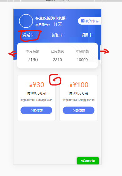
图解:点击tab菜单 三个选项时,下面的轮播会随之滑动,下面的商品列表也会根据上面的tab选项变化。反之,当左右滑动切换swiper时,tab选择会随之选中高亮,下面的商品列表也会跟着变化。
实现思路:tab选项的个数跟swiper 滑块数量一致。可以根据当前选中/滑块获取索引值,展现相应的选中项/滑块。下面要展示的商品列表,因为有下拉加载更多的需求,需要另一个接口完成实现。根据当前选中项的状态值作为参数,去请求相对应得列表。
实现代码如下:
1、首先在项目里 npm install swiper vue-awesome-swiper --save
2、在main.js全局引入
import Vue from 'vue'
import VueAwesomeSwiper from 'vue-awesome-swiper'

// import style
import 'swiper/css/swiper.css'

Vue.use(VueAwesomeSwiper, /* { default options with global component } */)
3、或者在当前页面局部引入

import { Swiper, SwiperSlide } from 'vue-awesome-swiper'
import 'swiper/css/swiper.css'

export default {
  components: {
    Swiper,
    SwiperSlide
  }
}
4、页面上使用如下:
<div class="coupon_bot">
                <ul class="coupon_b_name">
                    <li v-for="(item,index) in cardList"
                        :key="index"
                        :class="{'actived':index == isActiveIndex}"
                        @click="handlerClick('cardChange',index)">
                       {{item.cardTypeName}}
                    </li>
                </ul>
                <swiper class="coupon_swiper swiper-container"  :options="swiperOption" ref="mySwiper">
                    <swiperSlide v-for="(item,index) in cardList" :key="index" class="coupon_s_slider">
                        <div class="conpon_swiper_bg">
                            <ul class="con_swiper_content">
                                <li>
                                    <span class="conpon_s_t">{{item.cardType == 1?'本月余额':'本月剩余'}}</span>
                                    <span class="conpon_s_c" :class="{'conpon_price':item.cardType == 1}">{{item.notGet}}</span>
                                    <i class="conpon_unit conpon_unit_ft" v-show="item.cardType != 1">张</i>
                                </li>
                                <li>
                                    <span class="conpon_s_t">{{item.cardType == 1?'已用额度':'本月已用'}}</span>
                                    <span :class="{'conpon_s_rprice':item.cardType == 1}" >{{item.isGet}}</span>
                                    <i class="conpon_unit"  v-show="item.cardType != 1">张</i>
                                </li>
                                <li>
                                    <span class="conpon_s_t">{{item.cardType == 1?'本月限额':'本月总数'}}</span>
                                    <span  :class="{'conpon_s_rprice':item.cardType == 1}">{{item.ttlGet}}</span>
                                    <i class="conpon_unit"  v-show="item.cardType != 1">张</i>
                                </li>
                            </ul>
                        </div>
                    </swiperSlide>
                </swiper>
            </div>
5、data里初始化swiper
 swiperOption: {
                autoplay: false,
                loop: false,
                spaceBetween : 10,
                observer: true,
                observeParents: true,
                on: {
                        slideChangeTransitionEnd: function(){
                            _this.isActiveIndex = this.realIndex;//切换结束时,告诉我现在是第几个slide
                            _this.type = _this.cardList[_this.isActiveIndex].cardType;
                            _this.cardInfoList = [];
                            _this.pageNo = 1;
                            _this.isScroll = true;
                            _this.loading = true;
                            _this.getListData();
                        },
                }
            },
6、计算属性获取swiperDOM
 computed:{
        swiper(){
            return this.$refs.mySwiper.swiper
        }
    },
7、tab点击事件实现
handlerClick(action,data){
            if(action == 'cardChange'){
                //tab切换
                this.loading = true;
                this.isActiveIndex = data;
                this.swiper.slideTo(this.isActiveIndex); //swiper滑动到相对应的滑块
                document.documentElement.scrollTop = document.body.scrollTop = 0;
            }
}
8、相对应的swiper scss样式如下
<style lang="scss" scoped>
@function rem($px) {
    @return $px / 75 * 1rem;
}
$bg-color: #fff;
$text-color: #587BF3;
$money-color: #FD8040;
$title-color: #999;
.coupon_bot{
            padding-top: rem(20);
            .coupon_b_name{
                display: flex;
                color: $bg-color;
                font-size: rem(32);
                li{
                    flex: 1;
                    justify-content: space-between;
                    text-align: center;
                    padding: rem(10) 0;
                }
                .actived{
                    position: relative;
                }
                .actived::before{
                    content:'';
                    display: inline-block;
                    width: rem(64);
                    height: rem(4);
                    background: $bg-color;
                    border-radius: 2px;
                    position: absolute;
                    bottom: 0;
                    left: 50%;
                    margin-left: -13%;
                }
            }
            .coupon_swiper{
                padding: rem(30);
                .coupon_s_slider{
                    width: rem(690) !important;
                    height: rem(200);
                    box-shadow: 0px rem(20) rem(30) 0px rgba(0, 0, 0, 0.06);
                    background: $bg-color;
                    border-radius: 16px;
                    .conpon_swiper_bg{
                        width: 100%;
                        height: 100%;
                        background: url('../../../static/images/coupon/swiperBg.png') no-repeat top right;
                        background-size: rem(485) rem(220);
                        .con_swiper_content{
                            padding: rem(50) rem(30);
                            display: flex;
                            justify-content: space-between;
                            li {
                                width: 33%;
                                text-align: center;
                                span{
                                    color:#666;
                                    font-weight: 500;
                                    font-size: rem(40);
                                    line-height: rem(48);
                                }
                                .conpon_s_t {
                                    display: block;
                                    color: $title-color;
                                    font-size: rem(28);
                                    line-height: rem(42);
                                    margin-bottom: rem(30);
                                }
                                .conpon_s_c{
                                    text-align: left;
                                    display: inline-block;
                                    color: #333;
                                    font-size: rem(54);
                                }
                                .conpon_price{
                                    font-size: rem(36);
                                }
                                .conpon_s_rprice{
                                    font-size: rem(32);
                                }
                                .conpon_unit{
                                    font-style: normal;
                                    font-size: rem(28);
                                }
                                .conpon_unit_ft{
                                    font-size: rem(36);
                                }
                            }
                        }
                    }
                }
                >>>.swiper-slide-active{
                    height: rem(220);
                }
            }
        }
</style>
以上就实现了联动效果了(代码仅供参考)。


【推荐】国内首个AI IDE,深度理解中文开发场景,立即下载体验Trae
【推荐】编程新体验,更懂你的AI,立即体验豆包MarsCode编程助手
【推荐】抖音旗下AI助手豆包,你的智能百科全书,全免费不限次数
【推荐】轻量又高性能的 SSH 工具 IShell:AI 加持,快人一步
· Linux系列:如何用heaptrack跟踪.NET程序的非托管内存泄露
· 开发者必知的日志记录最佳实践
· SQL Server 2025 AI相关能力初探
· Linux系列:如何用 C#调用 C方法造成内存泄露
· AI与.NET技术实操系列(二):开始使用ML.NET
· 被坑几百块钱后,我竟然真的恢复了删除的微信聊天记录!
· 【自荐】一款简洁、开源的在线白板工具 Drawnix
· 没有Manus邀请码?试试免邀请码的MGX或者开源的OpenManus吧
· 园子的第一款AI主题卫衣上架——"HELLO! HOW CAN I ASSIST YOU TODAY
· 无需6万激活码!GitHub神秘组织3小时极速复刻Manus,手把手教你使用OpenManus搭建本