利用Python进行数据分析_Pandas_绘图和可视化_Matplotlib
1 认识Figure和Subplot
import matplotlib.pyplot as plt
matplotlib的图像都位于Figure对象中
fg = plt.figure()
通过add_subplot创建subplot
ax1 = fg.add_subplot(1,2,1)
ax2 = fg.add_subplot(1,2,2)
设置坐标轴的范围
plt.xlim((-1, 1))
plt.ylim((0, 3))
设置坐标轴的lable
matplotlib.pyplot.xlabel(xlabel, fontdict=None, labelpad=None, **kwargs)
plt.xlabel('横轴:时间', fontproperties = 'SimHei', fontsize = 15, color = 'green')

plt.ylabel('纵轴:振幅', fontproperties = 'SimHei', fontsize = 15)
plt.figure()的作用
如下例子中,plt.subplot()如果不加,则4个图都在同一个figure对象汇总,而加上plt.subplot(),则每个图分别在一个figure对象中
import matplotlib.pyplot as plt
import pandas as pd
from numpy.random import randn

x = np.linspace(-1, 1, 50)

y1 = 2 * x + 1
# plt.figure()
ax1 = plt.subplot(4,2,1)
ax1.plot(x, y1)

y2 = x**2
# plt.figure()
ax2 = plt.subplot(4,2,2)
ax2.plot(x, y2)

y3 = 2*x+1
# plt.figure()
ax3 = plt.subplot(4,2,3)#plt.subplot(3,2,4) :  分成3行2列,共6个绘图区域,在第4个区域绘图。排序为行优先。也可 plt.subplot(324),将逗号省略。
ax3.plot(x, y3)

y4 = x**2
# plt.figure()
ax4 = plt.subplot(4,2,4)
ax4.plot(x, y4)

plt.show()
plt的常用函数
plt.scatter#(数据,点的大小)  绘制单个点

plt.show()# 显示出来

plt.title #(名字,大小)

plt.xlable()

plt.ylable()

plt.tick_params()#设置刻度的大小

plt.axis([0,1100,0,111000]) # 设置坐标轴的取值范围

plt.scatter(x_values, y_values, c=y_values, cmap=plt.cm.Blues,
edgecolor='none', s=40)  # 把颜色设置为一个动态的变量,并使用cmp高数pylot使用哪个颜色的映射

plt.savefig(“squares_plot.png”,bbox_inches = "tight")# 第一个参数指定要以什么样的文件名保存图表,第二个参数指定将图标多余的空白区域裁掉

plt.axes().get_xaxis().set_visible(false)# 使x轴不可见

plt.figure(figsize = (10,6)) #  设置绘图窗口的尺寸
plt的图表函数
plt.plot(x,y , fmt)  :绘制坐标图

plt.boxplot(data, notch, position): 绘制箱形图

plt.bar(left, height, width, bottom) : 绘制条形图

plt.barh(width, bottom, left, height) : 绘制横向条形图

plt.polar(theta, r) : 绘制极坐标图

plt.pie(data, explode) : 绘制饼图

plt.scatter(x, y) :绘制散点图

plt.hist(x, bings, normed) : 绘制直方图
fig,axes = plt.subplots()
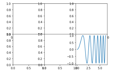
import numpy as np
import matplotlib.pyplot as plt
fig,axes = plt.subplots(2,3)
plt.subplots_adjust(wspace=0,hspace=0)# wspace控制宽度百分比,hspace控制高度的百分比,用作subplot之间的距离
axes[1,2]
import numpy as np
import matplotlib.pyplot as plt
x = np.linspace(0, 2*np.pi, 400)
y = np.sin(x**2)

fig,axes = plt.subplots(2,3)
plt.subplots_adjust(wspace=0,hspace=0)# wspace控制宽度百分比,hspace控制高度的百分比,用作subplot之间的距离
axes[1,2].plot(x,y)
plt.show()
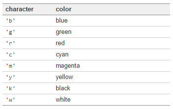
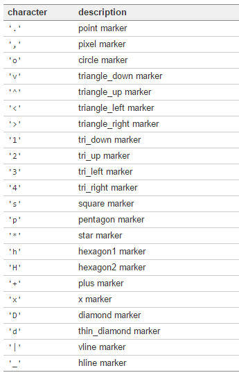
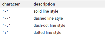
颜色、标记、线型
详见:API文档
axes.plot(x,y,'g--')
Colors
Markers
Line Styles
刻度、标签、图例
plt.xlim() #返回当前的X轴的范围
plt.xlim(0,10)#设置当前的X轴的范围
修改X轴刻度
import numpy as np
import matplotlib.pyplot as plt

plt.figure()
ax = plt.subplot()
ax.plot(randn(1000).cumsum())
# ax.set_xticks([0,250,500,750,1000])
ax.set_xticklabels(['1w','2w','3w','4w','5w','6w','7w'],rotation=30,fontsize='small')

ax.set_title('Test plot!')

plt.show()

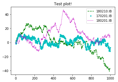
import numpy as np
import matplotlib.pyplot as plt

plt.figure() #创建figure对象

ax = plt.subplot()

# 一张图中 传入多个元素,需要传入label参数
ax.plot(randn(1000).cumsum(),'g--',label='180210.IB',)
ax.plot(randn(1000).cumsum(),'c.',label='170201.IB',)
ax.plot(randn(1000).cumsum(),'m:',label='180201.IB',)

# ax.legend(loc='best') # 添加图例(左上角那玩意)
plt.legend(loc='best') # 添加图例(左上角那玩意)

ax.set_title('Test plot!') #设置图标的标题
plt.savefig('D:\Test plot.svg')
plt.savefig('D:\Test plot.pdf')
plt.savefig('D:\Test plot.jpg')
plt.savefig('D:\Test plot.png',dpi=400,bbox_inches = 'tight') #保存png格式,dpi 分辨率,bbox_inches 最小白边
plt.show()
本文来自博客园,作者:ZhouSpeaks,转载请注明原文链接:https://www.cnblogs.com/zhouwp/p/10254416.html

 浙公网安备 33010602011771号