三十四:布局之混合布局、圣杯布局、双飞翼布局
一:混合布局


<!DOCTYPE html>
<html lang="en">
<head>
    <meta charset="UTF-8">
    <title>Title</title>
    <style>
        body{margin: 0;padding: 0;color: #fff;text-align: center;}
        .header{width: 80%;height: 50px;background: red;
            line-height: 50px; /* 行高与高度一致,实现文字垂直居中 */
            margin: 0 auto; /* 上下为0左右居中 */
        }
        .banner{width: 80%; height: 200px;background: #ed817e; margin: 0 auto}
        .container{width: 80%;height: 400px;margin: 0 auto}
        .container .left{width: 30%;height: 400px; float: left;background: green}
        .container .right{width: 70%;height: 400px; float: right;background: blue}
        .footer{width: 80%;height: 50px;background: orange;margin: 0 auto;line-height: 50px}
    </style>
</head>
<body>
    <div class="header">页面头部</div>
    <div class="banner">页面banner</div>
    <div class="container">
        <div class="left">页面左侧</div>
        <div class="right">页面右侧</div>
    </div>
    <div class="footer">页面底部</div>

</body>
</html>
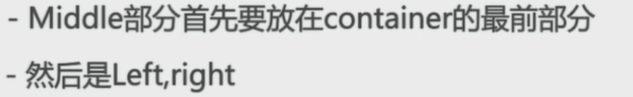
二:圣杯布局
1.三列布局,中间自适应宽度,两边定宽
2.中间栏在浏览器中优先渲染
3.允许任意列的高度最高
4.用最简单的CSS,最少的HACK语句

页面框架

CSS
基础样式

实现圣杯布局


<!DOCTYPE html>
<html lang="en">
<head>
<meta charset="UTF-8">
<title>Title</title>
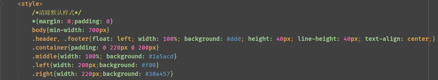
<style>
/*清除默认样式*/
*{margin: 0;padding: 0}
body{min-width: 700px}
.header, .footer{float: left; width: 100%; background: #ddd; height: 40px; line-height: 40px; text-align: center;}
.container{padding: 0 220px 0 200px} /* 上右下左 */
.left, .right, .middle{
position: relative; /* 相对定位 */
float: left; /* 左浮动 */
min-height: 300px;
}
.middle{width: 100%; background: #1a5acd}
.left{width: 200px;background: #f00;
margin-left: -100%; /* 移动到最左侧 */
left: -200px; /* 再左移container设置的左边距:200px */
}
.right{width: 220px;background: #30a457;
margin-left: -220px;
right: -220px; /* 再左移container设置的右边距:220px */
}
</style>
</head>
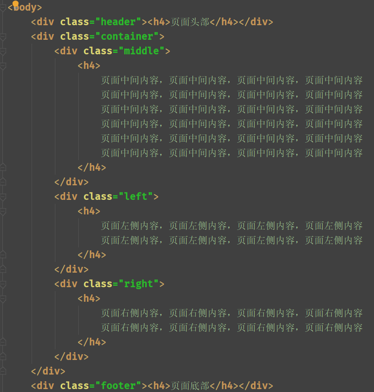
<body>
<div class="header"><h4>页面头部</h4></div>
<div class="container">
<div class="middle">
<h4>
页面中间内容,页面中间内容,页面中间内容,页面中间内容
页面中间内容,页面中间内容,页面中间内容,页面中间内容
页面中间内容,页面中间内容,页面中间内容,页面中间内容
页面中间内容,页面中间内容,页面中间内容,页面中间内容
页面中间内容,页面中间内容,页面中间内容,页面中间内容
页面中间内容,页面中间内容,页面中间内容,页面中间内容
</h4>
</div>
<div class="left">
<h4>
页面左侧内容,页面左侧内容,页面左侧内容,页面左侧内容
页面左侧内容,页面左侧内容,页面左侧内容,页面左侧内容
</h4>
</div>
<div class="right">
<h4>
页面右侧内容,页面右侧内容,页面右侧内容,页面右侧内容
页面右侧内容,页面右侧内容,页面右侧内容,页面右侧内容
</h4>
</div>
</div>
<div class="footer"><h4>页面底部</h4></div>
</body>
</html>
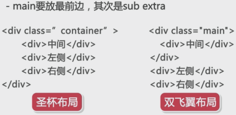
三:双飞翼布局
在圣杯布局的基础上,去掉相对布局,只需要浮动和负边距
页面架构


基础CSS


<!DOCTYPE html>
<html lang="en">
<head>
    <meta charset="UTF-8">
    <title>Title</title>
    <style>
        /*清除默认样式*/
        *{margin: 0;padding: 0}
        body{min-width: 700px}
        .header, .footer{
            width: 100%;
            float: left;
            height: 40px;
            background: #ddd;
            text-align: center;
            line-height: 40px;
        }
        .sub, .main, .extra{
            float: left; /* 左浮动 */
            min-height: 300px;
        }
        .main{width: 100%;}
        .main-inner{margin-left: 200px; margin-right: 220px;background: #30a457; min-height: 300px}
        .sub{width: 200px; background: #f00;margin-left: -100%}
        .extra{width: 220px;background: #1a5acd; margin-left: -220px}
    </style>
</head>
<body>
    <div class="header"><h4>页面头部</h4></div>
    <div class="main">
        <div class="main-inner">
            <h4>main</h4>
            <p>
                页面中间内容,页面中间内容,页面中间内容,页面中间内容
                页面中间内容,页面中间内容,页面中间内容,页面中间内容
                页面中间内容,页面中间内容,页面中间内容,页面中间内容
            </p>
        </div>
    </div>
    <div class="sub">
        <h4>sub</h4>
        <p>
            页面左侧内容,页面左侧内容,页面左侧内容,页面左侧内容
            页面左侧内容,页面左侧内容,页面左侧内容,页面左侧内容
        </p>
    </div>
    <div class="extra">
        <h4>extra</h4>
        <h4>
            页面右侧内容,页面右侧内容,页面右侧内容,页面右侧内容
            页面右侧内容,页面右侧内容,页面右侧内容,页面右侧内容
        </h4>
    </div>
    <div class="footer"><h4>页面底部</h4></div>
</body>
</html>
圣杯布局和双飞翼布局的区别:
圣杯布局的流程方式:
双飞翼布局的流程方式:
讨论群:249728408