鸿蒙NEXT开发案例:字数统计
【引言】
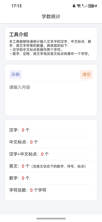
本文将通过一个具体的案例——“字数统计”组件,来探讨如何在鸿蒙NEXT框架下实现这一功能。此组件不仅能够统计用户输入文本中的汉字、中文标点、数字、以及英文字符的数量,还具有良好的用户界面设计,使用户能够直观地了解输入文本的各种统计数据。
【环境准备】
• 操作系统:Windows 10
• 开发工具:DevEco Studio NEXT Beta1 Build Version: 5.0.3.806
• 目标设备:华为Mate60 Pro
• 开发语言:ArkTS
• 框架:ArkUI
• API版本:API 12
【组件概述】
“字数统计”组件基于鸿蒙NEXT框架构建,旨在提供一个简洁而强大的文本统计工具。组件的主要功能包括:
• 文本输入:用户可以在提供的文本区域内输入或粘贴任何文本。
• 实时统计:当用户输入或修改文本时,组件会实时更新并显示文本中汉字、中文标点、数字、英文字符等的具体数量。
• 示例与清空:提供了“示例”按钮,点击后会自动填充预设的文本内容;“清空”按钮则用于清空当前的输入内容。
【技术实现】
1. 状态管理:使用@State装饰器来管理组件的状态,如输入文本、各种字符的数量统计等。通过@Watch装饰器监听输入文本的变化,触发相应的计算逻辑。
2. 文本解析:当检测到输入文本发生变化时,组件会遍历文本中的每一个字符,根据正则表达式判断字符类型,并分别统计汉字、中文标点、数字、英文字符的数量。特别地,对于汉字和中文标点,每个字符被视为两个单位进行统计。
3. 用户界面:组件的UI设计遵循了鸿蒙NEXT的设计规范,使用了Column、Row、Text、TextArea等基础组件来构建布局。通过设置字体颜色、大小、背景色、边距等属性,实现了美观且易于使用的界面。此外,组件还利用了阴影效果和圆角设计来提升视觉体验。
4. 交互设计:为了增强用户体验,组件中加入了“示例”和“清空”按钮,用户可以通过简单的点击操作快速测试组件的功能或清空输入框。同时,组件支持文本输入区域的实时更新,保证了用户操作的即时反馈。
【完整代码】
// 定义一个组件,用于数字和文本统计
@Entry
@Component
struct NumberToChineseConverter {
  // 定义一个状态变量,存储示例数字字符串
  @State private exampleNumber: string = '自从盘古破鸿蒙,开辟从兹清浊辨。\nare you ok?\n1234\n+-*/';
  // 定义文本颜色的状态变量
  @State private textColor: string = "#2e2e2e";
  // 定义阴影边框颜色的状态变量
  @State private shadowColor: string = "#d5d5d5";
  // 定义基础内边距的状态变量
  @State private basePadding: number = 30;
  // 定义汉字数量的状态变量
  @State private chineseCharCount: string = "0";
  // 定义中文标点数量的状态变量
  @State private chinesePunctuationCount: string = "0";
  // 定义汉字加中文标点总数的状态变量
  @State private totalChineseCount: string = "0";
  // 定义英文字符数量的状态变量
  @State private englishCharCount: string = "0";
  // 定义数字数量的状态变量
  @State private digitCount: string = "0";
  // 定义总字符数的状态变量
  @State private charTotalCount: string = "0";
  // 定义监听输入文本变化的状态变量
  @State @Watch('inputChanged') private inputText: string = "";

  // 当输入文本发生变化时调用的方法
  inputChanged() {
    // 初始化计数器
    let chineseChars = 0; // 汉字数量
    let chinesePunctuation = 0; // 中文标点数量
    let englishChars = 0; // 英文字符数量
    let digits = 0; // 数字数量
    let count = 0; // 总字符数
    // 遍历输入文本的每个字符
    for (let i = 0; i < this.inputText.length; i++) {
      let char = this.inputText.charAt(i); // 获取当前字符
      count++; // 计数器加一
      // 如果字符是数字,则数字计数器加一
      if (/\d/.test(char)) {
        digits++;
      }
      // 如果字符是汉字,则汉字计数器加一,同时总字符数加二
      if (/[\u4e00-\u9fa5]/.test(char)) {
        chineseChars++;
        count++; // 汉字和中文标点算两个字符,所以这里多+1
      }
      // 如果字符是中文标点,则中文标点计数器加一,同时总字符数加二
      if (/[\u3001-\u3002\uff01-\uff1a]/.test(char)) {
        chinesePunctuation++;
        count++; // 汉字和中文标点算两个字符,所以这里多+1
      }
      // 如果字符是英文字符或英文标点,则英文字符计数器加一
      if (/[a-zA-Z0-9\s!-/:-@[-`{-~]/.test(char)) {
        englishChars++;
      }
    }
    // 更新状态变量
    this.chineseCharCount = `${chineseChars}`;
    this.chinesePunctuationCount = `${chinesePunctuation}`;
    this.totalChineseCount = `${chineseChars + chinesePunctuation}`;
    this.englishCharCount = `${englishChars}`;
    this.digitCount = `${digits}`;
    this.charTotalCount = `${count}`;
  }

  // 构建UI界面的方法
  build() {
    // 创建一个列布局容器
    Column() {
      // 添加标题
      Text('字数统计')
        .fontColor(this.textColor) // 设置字体颜色
        .fontSize(18) // 设置字体大小
        .width('100%') // 设置宽度为100%
        .height(50) // 设置高度为50
        .textAlign(TextAlign.Center) // 设置文本居中对齐
        .backgroundColor(Color.White) // 设置背景色为白色
        .shadow({ // 设置阴影效果
          radius: 2, // 阴影半径
          color: this.shadowColor, // 阴影颜色
          offsetX: 0, // X轴偏移量
          offsetY: 5 // Y轴偏移量
        });
      // 创建可滚动的容器
      Scroll() {
        // 在可滚动容器内部创建列布局
        Column() {
          // 添加工具介绍
          Column() {
            Text('工具介绍').fontSize(18).fontWeight(600).fontColor(this.textColor);
            Text('本工具能够快速统计输入文本中的汉字、中文标点、数字、英文字符等的数量。具体规则如下:\n•汉字和中文标点各算作两个字符。\n•数字、空格、英文字母及英文标点各算作一个字符。')
              .textAlign(TextAlign.JUSTIFY) // 设置文本两端对齐
              .fontSize(13) // 设置字体大小
              .fontColor(this.textColor) // 设置字体颜色
              .margin({ top: `${this.basePadding / 2}lpx` }); // 设置上边距
          }
          // 设置样式
          .alignItems(HorizontalAlign.Start) // 设置水平对齐方式
          .width('650lpx') // 设置宽度
          .padding(`${this.basePadding}lpx`) // 设置内边距
          .margin({ top: `${this.basePadding}lpx` }) // 设置外边距
          .borderRadius(10) // 设置圆角
          .backgroundColor(Color.White) // 设置背景色
          .shadow({ // 设置阴影效果
            radius: 10, // 阴影半径
            color: this.shadowColor, // 阴影颜色
            offsetX: 0, // X轴偏移量
            offsetY: 0 // Y轴偏移量
          });
          // 添加示例和清空按钮
          Column() {
            Row() {
              Text('示例')
                .fontColor("#5871ce") // 设置字体颜色
                .fontSize(16) // 设置字体大小
                .padding(`${this.basePadding / 2}lpx`) // 设置内边距
                .backgroundColor("#f2f1fd") // 设置背景色
                .borderRadius(5) // 设置圆角
                .clickEffect({ level: ClickEffectLevel.LIGHT, scale: 0.8 }) // 设置点击效果
                .onClick(() => { // 设置点击事件
                  this.inputText = this.exampleNumber; // 将示例文本赋值给输入框
                });
              Blank(); // 添加空白间隔
              Text('清空')
                .fontColor("#e48742") // 设置字体颜色
                .fontSize(16) // 设置字体大小
                .padding(`${this.basePadding / 2}lpx`) // 设置内边距
                .clickEffect({ level: ClickEffectLevel.LIGHT, scale: 0.8 }) // 设置点击效果
                .backgroundColor("#ffefe6") // 设置背景色
                .borderRadius(5) // 设置圆角
                .onClick(() => { // 设置点击事件
                  this.inputText = ""; // 清空输入框
                });
            }
            .height(45) // 设置高度
            .justifyContent(FlexAlign.SpaceBetween) // 设置子项之间间距均匀分布
            .width('100%'); // 设置宽度
            Divider(); // 添加分割线
            // 添加文本输入区域
            TextArea({ text: $$this.inputText, placeholder: `请输入内容` })
              .width(`${650 - this.basePadding * 2}lpx`) // 设置宽度
              .height(100) // 设置高度
              .fontSize(16) // 设置字体大小
              .caretColor(this.textColor) // 设置光标颜色
              .fontColor(this.textColor) // 设置字体颜色
              .margin({ top: `${this.basePadding}lpx` }) // 设置上边距
              .padding(0) // 设置内边距
              .backgroundColor(Color.Transparent) // 设置背景色
              .borderRadius(0) // 设置圆角
              .textAlign(TextAlign.JUSTIFY); // 设置文本两端对齐
          }
          // 设置样式
          .alignItems(HorizontalAlign.Start) // 设置水平对齐方式
          .width('650lpx') // 设置宽度
          .padding(`${this.basePadding}lpx`) // 设置内边距
          .margin({ top: `${this.basePadding}lpx` }) // 设置外边距
          .borderRadius(10) // 设置圆角
          .backgroundColor(Color.White) // 设置背景色
          .shadow({ // 设置阴影效果
            radius: 10, // 阴影半径
            color: this.shadowColor, // 阴影颜色
            offsetX: 0, // X轴偏移量
            offsetY: 0 // Y轴偏移量
          });
          // 添加统计结果展示
          Column() {
            // 汉字数量
            Row() {
              Text() {
                Span(`汉字:`)
                Span(`${this.chineseCharCount} `).fontColor(Color.Red) // 汉字数量以红色显示
                Span('个')
              }
              .fontColor(this.textColor) // 设置字体颜色
              .fontSize(16) // 设置字体大小
              .layoutWeight(1); // 设置布局权重
            }
            .constraintSize({ minHeight: 45 }) // 设置最小高度
            .justifyContent(FlexAlign.SpaceBetween) // 设置子项之间间距均匀分布
            .width('100%'); // 设置宽度
            Divider(); // 添加分割线
            // 中文标点数量
            Row() {
              Text() {
                Span(`中文标点:`)
                Span(`${this.chinesePunctuationCount} `).fontColor(Color.Red) // 中文标点数量以红色显示
                Span('个')
              }
              .fontColor(this.textColor) // 设置字体颜色
              .fontSize(16) // 设置字体大小
              .layoutWeight(1); // 设置布局权重
            }
            .constraintSize({ minHeight: 45 }) // 设置最小高度
            .justifyContent(FlexAlign.SpaceBetween) // 设置子项之间间距均匀分布
            .width('100%'); // 设置宽度
            Divider(); // 添加分割线
            // 汉字加中文标点总数
            Row() {
              Text() {
                Span(`汉字+中文标点:`)
                Span(`${this.totalChineseCount} `).fontColor(Color.Red) // 汉字加中文标点总数以红色显示
                Span('个')
              }
              .fontColor(this.textColor) // 设置字体颜色
              .fontSize(16) // 设置字体大小
              .layoutWeight(1); // 设置布局权重
            }
            .constraintSize({ minHeight: 45 }) // 设置最小高度
            .justifyContent(FlexAlign.SpaceBetween) // 设置子项之间间距均匀分布
            .width('100%'); // 设置宽度
            Divider(); // 添加分割线
            // 英文字符数量
            Row() {
              Text() {
                Span(`英文:`)
                Span(`${this.englishCharCount} `).fontColor(Color.Red) // 英文字符数量以红色显示
                Span('个')
                Span('(含英文状态下的数字、符号、标点)').fontSize(13) // 附加说明
              }
              .fontColor(this.textColor) // 设置字体颜色
              .fontSize(16) // 设置字体大小
              .layoutWeight(1); // 设置布局权重
            }
            .constraintSize({ minHeight: 45 }) // 设置最小高度
            .justifyContent(FlexAlign.SpaceBetween) // 设置子项之间间距均匀分布
            .width('100%'); // 设置宽度
            Divider(); // 添加分割线
            // 数字数量
            Row() {
              Text() {
                Span(`数字:`)
                Span(`${this.digitCount} `).fontColor(Color.Red) // 数字数量以红色显示
                Span('个')
              }
              .fontColor(this.textColor) // 设置字体颜色
              .fontSize(16) // 设置字体大小
              .layoutWeight(1); // 设置布局权重
            }
            .constraintSize({ minHeight: 45 }) // 设置最小高度
            .justifyContent(FlexAlign.SpaceBetween) // 设置子项之间间距均匀分布
            .width('100%'); // 设置宽度
            Divider(); // 添加分割线
            // 总字符数
            Row() {
              Text() {
                Span(`字符总数:`)
                Span(`${this.charTotalCount} `).fontColor(Color.Red) // 总字符数以红色显示
                Span('个字符')
              }
              .fontColor(this.textColor) // 设置字体颜色
              .fontSize(16) // 设置字体大小
              .layoutWeight(1); // 设置布局权重
            }
            .constraintSize({ minHeight: 45 }) // 设置最小高度
            .justifyContent(FlexAlign.SpaceBetween) // 设置子项之间间距均匀分布
            .width('100%'); // 设置宽度
          }
          // 设置样式
          .alignItems(HorizontalAlign.Start) // 设置水平对齐方式
          .width('650lpx') // 设置宽度
          .padding(`${this.basePadding}lpx`) // 设置内边距
          .margin({ top: `${this.basePadding}lpx` }) // 设置外边距
          .borderRadius(10) // 设置圆角
          .backgroundColor(Color.White) // 设置背景色
          .shadow({ // 设置阴影效果
            radius: 10, // 阴影半径
            color: this.shadowColor, // 阴影颜色
            offsetX: 0, // X轴偏移量
            offsetY: 0 // Y轴偏移量
          });
        }
      }
      .scrollBar(BarState.Off) // 关闭滚动条
      .clip(false); // 不裁剪超出部分,这里是允许内部组件阴影可以向父布局外扩散
    }
    .height('100%') // 设置高度为100%
    .width('100%') // 设置宽度为100%
    .backgroundColor("#f4f8fb"); // 设置背景色
  }
}

 浙公网安备 33010602011771号