CSS知识点总结[部分]
css是英文Cascading Style Sheets的缩写,称为层叠样式表,用于对页面进行美化。
存在方式有三种:元素内联、页面嵌入和外部引入,比较三种方式的优缺点。
注释为 /* 注释内容 */
CSS选择器
标签选择器
div{ background-color:red; }
<div > </div>
class选择器
.bd{ background-color:red; }
<div class='bd'> </div>
id选择器
#idselect{ background-color:red; }
<div id='idselect' > </div>
关联选择器(层级选择器)
#idselect p{ background-color:red; }
<div id='idselect' > <p> </p> </div>
组合选择器(逗号分隔)
input,div,p{ background-color:red; }
<div>hello world</div>
<input type="text"/>
<input type="password"/>
<p>hello world</p>
属性选择器
对选择到的标签再通过属性再进行一次筛选
input[type='text']{ width:100px; height:200px; }
<input type="text"/>
<input type="password"/>
CSS常用属性
height - 高度:像素、百分比
width - 宽度:像素、百分比
text-align:ceter - 水平方向居中
line-height - 垂直方向根据标签高度(等于当前所在的位于标签的高度,居中)
color -字体颜色
font-size - 字体大小
font-weight - 字体加粗
font-family:宋体; - 设置字体
border边框
边框线粗细
border-top-width: 15px;
border-right-width: 5px;
border-bottom-width: 15px;
border-left-width: 5px;
边框的样式和颜色
border-style: solid实线,dashed虚线,none无(默认)
border-style: solid;
border-color:red;
也可以写成这样:
border: 1px solid red;
改变边框棱角的样式:
border-radius: 50%;
border-radius: 50px;
dispaly
display: none; - 让标签消失
display: inline; - 转换成行内标签
display: block; - 转换为块级标签
display: inline-block; - 同时具备两种标签的属性
具有inline,默认自己有多少占多少
具有block,可以设置无法设置高度,宽度,padding margin
float
让标签浮动,块级标签也可以堆叠
<div style="height: 50px; width: 200px; background-color: green; float: right"></div>
<div style="height: 50px; width: 500px; background-color: red; float: right"></div>
让标签都向右漂浮,如果窗口 的宽度不够,默认换行

当标签float之后就不收父级标签的约束了,解决此问题,可以在父级标签中添加:
<div style="clear: both;"></div>
内外边距
padding - 内边距
margin - 外边距
Positioning(定位)
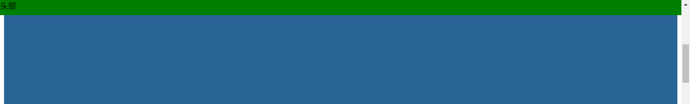
position: fiexd 固定在页面的某个位置
将head导航栏固定到头部,不管滚动条如何滑动,他都会跟着页面走,始终在最顶部


<!DOCTYPE html>
<html lang="en">
<head>
    <meta charset="UTF-8">
    <title>Title</title>
    <style>
        .pg-head {
            height: 30px;
            background-color: green;
            position: fixed;
            top: 0;
            right: 0;
            left: 0;
        }
        .pg-body {
            height: 5000px;
            background-color: #2a6496;
            margin-top: 40px;
        }
    </style>
</head>
<body>
    <div class="pg-head">头部</div>
    <div class="pg-body">内容</div>
</body>
</html>
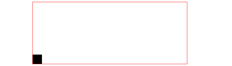
relative(相对的) + absolute(绝对的)
相对于当前父级标签定位到某位置
<!DOCTYPE html>
<html lang="en">
<head>
    <meta charset="UTF-8">
    <title>Title</title>
</head>
<body>
    <div style="height: 200px; width: 500px; border: 1px solid red; margin: 0 auto; position: relative;">
        <div style="height: 30px; width: 30px; background-color: black; position: absolute; bottom: 0"></div>
    </div>
</body>
</html>
用一个实例说明这个的用途:
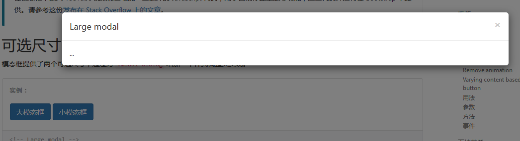
实现像上图所示的效果,上图是点击按钮,出现了层级关系,下层无法被操作,我们在这里实现层级关系,不实现点击按钮出现的功能
<!DOCTYPE html>
<html lang="en">
<head>
    <meta charset="UTF-8">
    <title>title</title>
    <style>
        .i3 {
            z-index:10;
            position:fixed;
            margin-top: -150px;
            margin-left: -100px;
            left: 50%;
            top: 50%;
            height: 300px;
            width: 200px;
            background-color: white;
        }

        .i2 {
            z-index: 9;
            opacity:0.5;
            position: fixed;
            left: 0;
            right: 0;
            top: 0;
            bottom: 0;
            background-color: black;
        }

        .i1 {
            height: 5000px;
            background-color: green;
        }
    </style>
</head>
<body>
    <!--三层层叠-->
    <div class="i3">第三层</div>
    <div class="i2">第二层</div>
    <div class="i1">第一层</div>

</body>
</html>
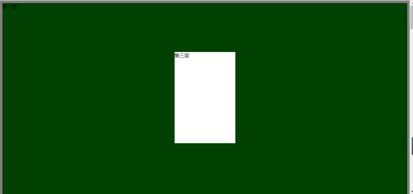
属性 opcity: 0.5; 透明度 数值越小,透明度越高
z-index: 10; 层级顺序,数值越大优先级越高
background 背景
background-color: red; - 纯色背景
background-image:url('image/4.gif'); - 图片背景,默认如果div的像素大于图片的像素,则图片进行x和y轴的重复
使用以下三个属性可以控制图片的重复方式
- background-repeat: repeat-y;
- background-position-x:
- background-position-y:
例子:使一个图标可以的变化
原始图标是这样的:

<!DOCTYPE html>
<html lang="en">
<head>
    <meta charset="UTF-8">
    <title>Title</title>
</head>
<body>
    <div style="height: 100px;"></div>
    <div style="background-image: url(icon_18_118.png);background-repeat:no-repeat;height: 20px;width:20px;border: 1px solid red; background-position-x:0;background-position-y: 10px; "></div>
</body>
</html>
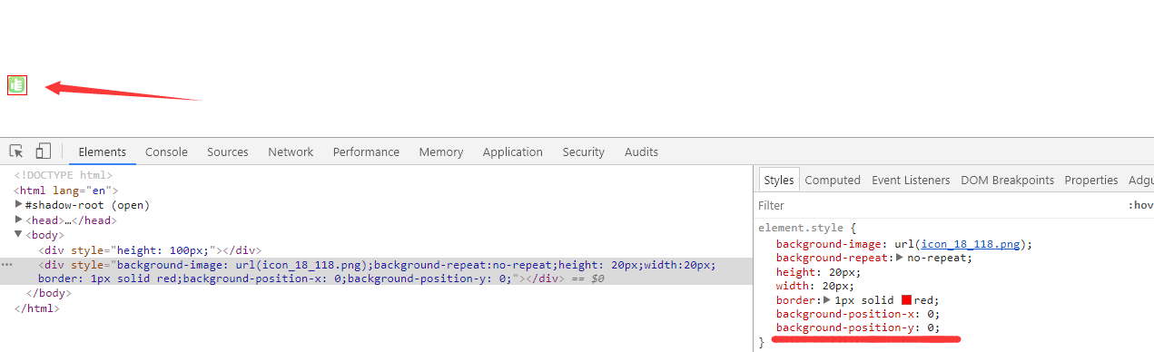
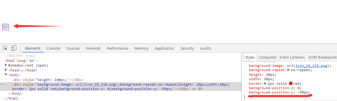
调整background-position-y的值可以使图标切换
overflow
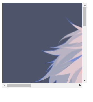
<div style="height:300px; width: 300px;">
    <img src="a.jpeg">
</div>
如果是上面的代码,图片的尺寸大于了div的尺寸,那么div就会被撑开
可以使用overflow属性
overflow: auto; - 如果照片的大小大于div的大小,则自动折叠,形成下拉条(设置滚动条)
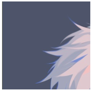
overflow: hidden; - 如果照片的大小大于div的大小,则进行剪切
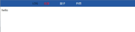
hover
可以实现鼠标移动到指定标签可以进行变化
<!DOCTYPE html>
<html lang="en">
<head>
    <meta charset="UTF-8">
    <title>Title</title>
    <style>
        .pg-head {
            height: 40px;
            position: fixed;
            top: 0;
            left: 0;
            right: 0;
            background: #2459a2;
            line-height: 40px;

        }

        .pg-body {
            margin-top: 50px;
        }

        .comm {
            width: 980px;
            margin: 0 auto;
        }

        .pg-head .pa {
            display: inline-block;
            padding: 0 30px;
            color: white;
        }
        .pg-head .pa:hover {
            display: inline-block;
            padding: 0 30px;
            /*background: red;*/
            color: red;
        }

    </style>

</head>
<body>
    <div class="pg-head">
        <div class="comm">
            <a class="log">LOG</a>
            <a class="pa">全部</a>
            <a class="pa">段子</a>
            <a class="pa">抖音</a>
        </div>
    </div>
    <div class="pg-body">hello</div>
</body>
</html>
更多

