1、浮动
1.1 代码
<!DOCTYPE html>
<html>

<head>
    <meta charset="utf-8">
    <title>浮动</title>
    <style type="text/css">

       .box{
           width: 100px;
           height: 100px;
           background-color: red;
       }

       /*
       当一个元素设置为浮动后,元素会立即脱离文档流,下边的元素会立即向上移动,元素浮动以后会尽量向左上或者右上浮动
          如果浮动元素上方是一个没有浮动的块元素,则浮动元素不会超过块元素

       */

       .box1{
           width: 200px;
           height: 200px;
           background-color: yellow;
           float: right;
       }

       .box2{
           width: 200px;
           height: 200px;
           background-color: green;
       }

    </style>
</head>

<body>
    <div class="box"></div>
    <div class="box1"></div>
    <div class="box2"></div>

</body>

</html>
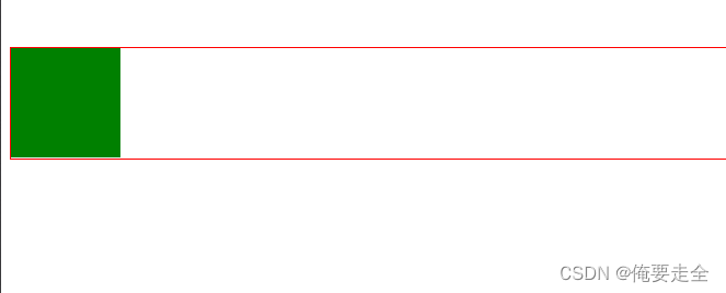
1.2、测试结果

2、简单布局
2.1 代码
<!DOCTYPE html>
<html>

<head>
    <meta charset="utf-8">
    <title>例子</title>
    <style type="text/css">

     /* 清楚默认样式 */
    *{
        margin: 0;
        padding: 0;
    }

           /*设置头部div*/
        .header{
            /* 设置高度 */
            height: 120px;
            /* 设置宽度 */
            width: 1000px;
            /* 设置背景 */
            background-color: grey;
            /* 居中 */
            margin: 0 auto ;
        }

          /*设置content div*/
        .content{
            /* 设置高度 */
            height: 400px;
            /* 设置宽度 */
            width: 1000px;
            /* 设置背景 */
            background-color: green;
            /* 居中 */
            margin: 10px auto ;
        }

        /* 设置content中的内容 */
        .left{
            height: 100%;
            width: 200px;
            background-color: red;
            float: left;
        }

         .center{
            height: 100%;
            width: 580px;
            background-color: blueviolet;
            float: left;
            margin: 0 10px;
        }

          .right{
            height:  100%;
            width: 200px;
            background-color: pink;
            float: left;
        }

            /*设置footer div*/
        .footer{
            /* 设置高度 */
            height: 150px;
            /* 设置宽度 */
            width: 1000px;
            /* 设置背景 */
            background-color: yellow;
            /* 居中 */
            margin: 0 auto ;
        }

    </style>
</head>

<body>
    <!-- 头部 -->
    <div class="header"></div>
    <!-- 内容 -->
    <div class="content">
        <!-- 左侧 -->
        <div class="left"></div>
        <!-- 中间 -->
        <div class="center"></div>
        <!-- 右侧 -->
        <div class="right"></div>
    </div>
    <!-- 底部 -->
    <div class="footer"></div>

</body>

</html>
2.2 测试结果

3、导航条
3.1 代码
<!DOCTYPE html>
<html>

<head>
    <meta charset="utf-8">
    <title>导航条</title>
    <style type="text/css">
       /* 清楚默认样式 */
       *{
           margin: 0;
           padding: 0;
       }
       .nav{
           /* 清楚列表项前字符 */
           list-style: none;
           width: 1000px;
           background-color: blue;
           margin: 10px auto;
           /* 解决高度塌陷 */
           overflow: hidden;
       }
         /* 设置li */
       .nav li{
           /* 设置li向左浮动 */
           float: left;
           /* 设置li宽度 */
           width: 12.5%;
       }
       .nav a{
           /* 将a转换为块元素 */
           display: block;
           /* 设置a的宽度 */
           width: 100%;
           /* 设置文字居中 */
           text-align: center;
           /* 设置高度 */
           padding: 5px 0;
           /* 去除超链接下划线 */
           text-decoration: none;
           /* 设置字体颜色 */
           color: white;
           font-weight: bold;

       }
       /* 设置鼠标移动到这里的效果 */
       .nav a:hover{
           background-color: red;
       }
    </style>
</head>

<body>
    <div>
        <ul  class="nav">
            <li><a href="#">首页</a></li>
            <li><a href="#">新闻</a></li>
            <li><a href="#">联系</a></li>
            <li><a href="#">关于</a></li>
            <li><a href="#">首页</a></li>
            <li><a href="#">新闻</a></li>
            <li><a href="#">联系</a></li>
            <li><a href="#">关于</a></li>
        </ul>


    </div>

</body>

</html>
3.2 测试效果

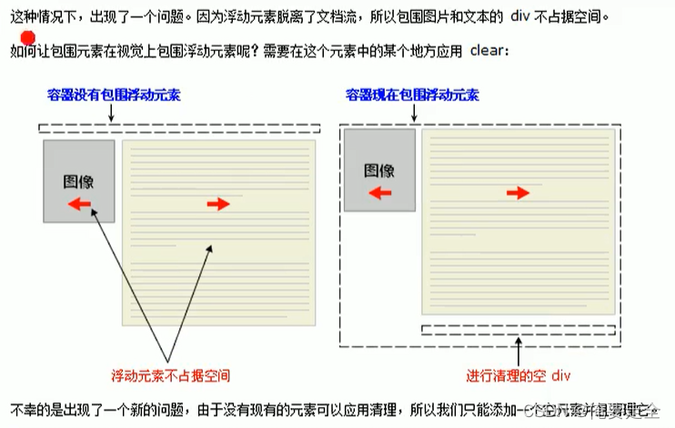
4、塌陷问题clear
4.1 代码
<!DOCTYPE html>
<html>

<head>
    <meta charset="utf-8">
    <title>清除浮动带来的影响</title>
    <style type="text/css">
        .box{
            width: 100px;
            height: 100px;
            background-color: red;
            float: right;
        }

        /*

            由于收到box浮动的影响,.box1整体向上移动100px
            有时我们需要清除浮动带来的影响,可以使用clear
                                    可取值:
                                          none:默认值,不清除浮动
                                          left:清除左侧浮动元素带来的影响
                                          right:清除左侧浮动元素带来的影响
                                          both:清除两侧

                                          清除其它元素浮动对当前元素造成的影响

        */

        .box2{

            border: 1px red solid;
        }

        .box3{
            width: 100px;
            height: 100px;
            background-color: green;
            float: left;
        }

        /* 解决高度塌陷方案:
                      可以直接在高度塌陷的父元素的最后,在添加一个空白的div
                      这个div没有浮动,可以撑开父元素的高度,
                      然后对其进行清除浮动,这样可以通过这个空白的div来撑开父元素的高度
                      基本没有副作用 */

        .box4{
            clear: both;

        }

        /* 通过after伪类,选中box2的后边 */

        /* .clearfix:after{
            /* 添加一个内容 */
            /* content:""; */
            /* 转化为要给块元素 */
            /* display: block; */
            /*清除两侧的浮动*/
            /* clear:both; */
        /* } */

    </style>
</head>

<body>
    <div class="box"></div>
    <hr>

    <div class="box1"></div>

    <hr>
    <br><br>

    <div class="box2 clearfix">
        <div class="box3"></div>
        <div class="box4"></div>
    </div>


</body>

</html>
4.2 测试结果