

Canvas+html+css+position定位
浮动毛病:
-
会让出文档流,会影响后面的元素的布局。
-
如果父元素是width:100%,没办法做到均分宽度和间隙,如果父元素是固定宽度情况,可以通过切蛋糕的方式进行计算。
概述
css中定位样式position属性用于指定一个元素在文档的定位方式。它是解决布局中盒子和盒子面和面的关系。其中top、left、和bottom属性决定了该元素的最终位置。
场景:网页置顶、吸顶、弹出层、消息框、抽屉、弹出登录、公告等…
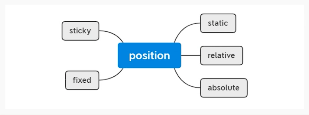
最终情况下:static
注意:static设置的定位,top bottom right left z-index不会影响,也就是说未来如果想要一个定位的元素失效,直接把position设置为 static
改变定位的四个方向
-
top
-
bottom
-
left
-
right
-
上面的四个值:可以是负数,负数就是朝着反方向进行移动
-
z-index:层级默认都是 0
-
如果不指定放在后面的优先级会高于前面的优先级。
-
如果设置了,大的一定在后面。
-
relative
relative:相对定位的元素是在文档中的正确位置偏移给定的值。
-
不影响其他元素布局
-
相对自身进行偏移
-
用来给absolute设置参考点。
<!DOCTYPE html>
<html lang="en">
<head>
<meta charset="UTF-8">
<meta http-equiv="X-UA-Compatible" content="IE=edge">
<meta name="viewport" content="width=device-width, initial-scale=1.0">
<title>Document</title>
<style>
.box1,
.box2,
.box3 {
width: 100px;
height: 100px;
background: red;
}
.box2 {
position: relative;
left: 100px;
top: 100px;
}
</style>
</head>
<body>
<div class="box1">1</div>
<div class="box2">2</div>
<div class="box3">3</div>
</body>
</html>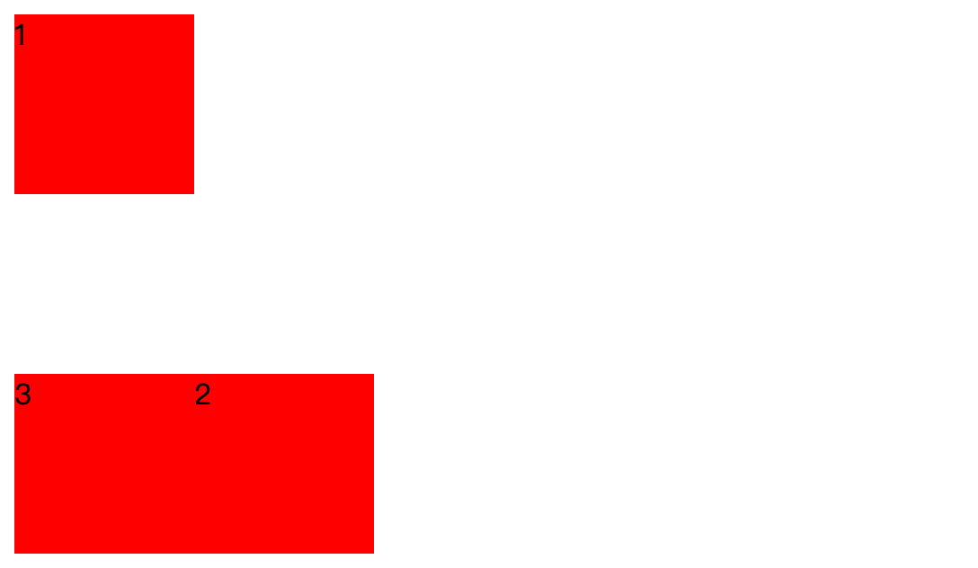
问:和margin有什么区别吗?
会改变文档流,relative永远参考左顶点,margin参考位移之前的点。
Zindex的层级问题
<!DOCTYPE html>
<html lang="en">
<head>
<meta charset="UTF-8">
<meta http-equiv="X-UA-Compatible" content="IE=edge">
<meta name="viewport" content="width=device-width, initial-scale=1.0">
<title>Document</title>
<style>
.box1,
.box2,
.box3 {
width: 100px;
height: 100px;
position: absolute;
left: 100px;
top: 100px;
}
/*破坏了文档流:top:0; left: 0;*/
.box1 {
top: 100px;
left: 100px;
background: yellow;
z-index: 0;
}
.box2 {
top: 110px;
left: 110px;
background: red;
z-index: 0;
}
.box3 {
top: 120px;
left: 120px;
background: blue;
z-index: 0;
}
</style>
</head>
<body>
<div class="box box1">1</div>
<div class="box box2">2</div>
<div class="box box3">3</div>
<script>
var zindex = 100;
var doms = document.getElementsByClassName("box");
for(var i = 0; i < doms.length; i ++) {
doms[i].onclick = function () {
zindex++;
this.style.zIndex = zindex;
}
}
</script>
</body>
</html>-
如果z-index相同,后面的优先级会高于前面的优先级
-
如果z-index越大的,代表在最前面,所以如果要置在前面,z-index一定要比前面的最大的zindex 多1即可!
-
可以负数 -1
-
如果一个定位元素被要给父定位的元素包裹,那么未来的z-index的层级比较,就是拿父z-index和下一个平级的z-index进行比较,越大的就在前面。
<!DOCTYPE html>
<html lang="en">
<head>
<meta charset="UTF-8">
<meta http-equiv="X-UA-Compatible" content="IE=edge">
<meta name="viewport" content="width=device-width, initial-scale=1.0">
<title>Document</title>
<style>
.parentbox {
/*除了static以外的属性都可以*/
position: relative;
/*父和box2去比较z-index*/
z-index: 9;
}
.box1,
.box2 {
width: 100px;
height: 100px;
position: absolute;
}
/*破坏了文档流:top:0; left: 0;*/
.box1 {
top: 100px;
left: 100px;
background: yellow;
z-index: 100; /*不会和box2进行比较z-index了*/
}
.box2 {
top: 110px;
left: 110px;
background: red;
z-index: 10;
}
</style>
</head>
<body>
<div class="parentbox">
<div class="box box1">1</div>
</div>
<div class="box box2">2</div>
</body>
</html>
absolute绝对定位
-
absolute定位的元素脱离了文档流。
-
绝对定位元素不占据空间。
-
面和面的关系
absolute和relative查找过程
<!DOCTYPE html>
<html lang="en">
<head>
<meta charset="UTF-8">
<meta http-equiv="X-UA-Compatible" content="IE=edge">
<meta name="viewport" content="width=device-width, initial-scale=1.0">
<title>Document</title>
<style>
.container {
width: 1480px;
margin: 100 auto;
background: pink;
padding: 30px;
overflow: hidden;
position: relative; /*爷*/
}
.box1 {
width: 600px;
background: palegreen;
height: 300px;
position: relative; /*父级*/
}
.commentbox {
width: 100px;
height: 100px;
color: #fff;
position: absolute;
top: 10px;
left: 10px;
}
</style>
</head>
<body>
<div class="pug-chapterbox">
<div class="container">
<div class="box1">
<div class="commentbox">我是评论</div>
<div class="commentbox">点赞</div>
</div>
</div>
</div>
</div>
</body>
</html>-
就近查找position:等于非static的定位元素:如果找到直接作为参考点。
-
如果没有找到继续网上找,找到就折回。
-
如果上面都没有那么就相对于浏览器。
position:absolute实战开发认识和理解

思考:如果我们要去做上面的,点赞数和评论。如果使用position:absolute去完成,怎么做呢?
-
假设上面的几个盒子,所有的点赞都参考控制的浏览器的左顶点的话。这种计算top和left。left和top都不好计算。
-
left:每个用户的电脑的分辨率都是不一样的,位置自然也就不一样。
-
top:会出现滚动条。当前元素以上的所有元素的top位置先计算出来再去增加位移。
-
-
position:absolute的默认规则:都是从浏览器的左顶点进行计算和位移的。如果是这样做的,我们就会非常麻烦。
-
如果能把每个元素的左顶点,约束到父盒子上,这个问题就会完美解决?怎么做呢?
-
所以这个是不现实的问题,怎么做?
思考:如果我们能把每个盒子的position:absolute的左顶点的位置参考点从浏览器设置到每个盒子上,那么是不是可以解决以上的问题呢?答案是:是的!
做法
-
就是把父元素设置为position:relative
-
然后里面的子元素设置成position:absolute。这个适合子元素的top/left位置就是相对于父元素。就不是浏览器了。这样的话就可以把top/bottom/left/right给固定下来了。
<!DOCTYPE html>
<html lang="en">
<head>
<meta charset="UTF-8">
<meta http-equiv="X-UA-Compatible" content="IE=edge">
<meta name="viewport" content="width=device-width, initial-scale=1.0">
<title>Document</title>
<style>
.container {
width: 1480px;
margin: 100 auto;
background: pink;
padding: 30px;
overflow: hidden;
}
.pug-chapterbox .box1 {
height: 400px;
width: 260px;
padding: 20px;
border: 10px solid #000;
background: url(https://imgjike.ui.cn/data/singles/d1ec245f877f6241f86166477decf18d.png?imageView/1/w/330/h/714);
color: #fff;
border-radius: 10px;
float: left;
margin-right: 20px;
/*把每个子元素的绝对定位的参考点设置到父容器上*/
position: relative;
}
.pug-chapterbox .box1 .commentbox1,
.pug-chapterbox .box1 .commentbox2 {
background : red;
margin-bottom: 20px;
position: absolute;
right: 10px;
display: none;
}
.pug-chapterbox .box1 .commentbox1 {
top: 10px;
}
.pug-chapterbox .box1 .commentbox2 {
top: 10px;
}
.pug-chapterbox .box1:hover .commentbox1,
.pug-chapterbox .box1:hover .commentbox2 {
display: block;
}
</style>
</head>
<body>
<div class="pug-chapterbox">
<div class="container">
<div class="box1">
<div class="commentbox1">我是评论</div>
<div class="commentbox2">点赞</div>
</div>
<div class="box1">
<div class="commentbox1">我是评论</div>
<div class="commentbox2">点赞</div>
</div>
</div>
</div>
</div>
</body>
</html>
sticky粘性定位
粘性定位可以被认为是:相对定位 relative和固定定位 fixed的混合。元素在跨越特定阈值为相对定位,之后为固定定位。
案例如下:
这里先看看再没有sticky定位之前的处理
<!DOCTYPE html>
<html lang="en">
<head>
<meta charset="UTF-8">
<meta http-equiv="X-UA-Compatible" content="IE=edge">
<meta name="viewport" content="width=device-width, initial-scale=1.0">
<title>Document</title>
<style>
.parentbox {
width: 600px;
margin: 0 auto;
}
.titlebox {
height: 100px;
line-height: 100px;
background: #fafafa;
text-align: center;
margin-bottom: 20px;
position: relative;
width: 100%;
top: 0;
left: 0;
}
.titlebox.fixed {
position: fixed;
}
</style>
<script src="https://cdn.bootcdn.net/ajax/libs/jquery/3.6.0/jquery.js"></script>
</head>
<body>
<div class="titlebox">
<h1>vue3.x 语法 ....</h1>
</div>
<div class="parentbox">
<p>2009年,W3C 提出了一种新的方案 Flex 布局,可以简便、完整、响应式地实现各种页面布局。目前,它已经得到了所有浏览器的支持,这意味着,现在就能很安全地使用这项功能。</p>
<p>2009年,W3C 提出了一种新的方案 Flex 布局,可以简便、完整、响应式地实现各种页面布局。目前,它已经得到了所有浏览器的支持,这意味着,现在就能很安全地使用这项功能。</p>
<p>2009年,W3C 提出了一种新的方案 Flex 布局,可以简便、完整、响应式地实现各种页面布局。目前,它已经得到了所有浏览器的支持,这意味着,现在就能很安全地使用这项功能。</p>
<p>2009年,W3C 提出了一种新的方案 Flex 布局,可以简便、完整、响应式地实现各种页面布局。目前,它已经得到了所有浏览器的支持,这意味着,现在就能很安全地使用这项功能。</p>
<p>2009年,W3C 提出了一种新的方案 Flex 布局,可以简便、完整、响应式地实现各种页面布局。目前,它已经得到了所有浏览器的支持,这意味着,现在就能很安全地使用这项功能。</p>
<p>2009年,W3C 提出了一种新的方案 Flex 布局,可以简便、完整、响应式地实现各种页面布局。目前,它已经得到了所有浏览器的支持,这意味着,现在就能很安全地使用这项功能。</p>
<p>2009年,W3C 提出了一种新的方案 Flex 布局,可以简便、完整、响应式地实现各种页面布局。目前,它已经得到了所有浏览器的支持,这意味着,现在就能很安全地使用这项功能。</p>
<p>2009年,W3C 提出了一种新的方案 Flex 布局,可以简便、完整、响应式地实现各种页面布局。目前,它已经得到了所有浏览器的支持,这意味着,现在就能很安全地使用这项功能。</p>
<p>2009年,W3C 提出了一种新的方案 Flex 布局,可以简便、完整、响应式地实现各种页面布局。目前,它已经得到了所有浏览器的支持,这意味着,现在就能很安全地使用这项功能。</p>
<p>2009年,W3C 提出了一种新的方案 Flex 布局,可以简便、完整、响应式地实现各种页面布局。目前,它已经得到了所有浏览器的支持,这意味着,现在就能很安全地使用这项功能。</p>
<p>2009年,W3C 提出了一种新的方案 Flex 布局,可以简便、完整、响应式地实现各种页面布局。目前,它已经得到了所有浏览器的支持,这意味着,现在就能很安全地使用这项功能。</p>
<p>2009年,W3C 提出了一种新的方案 Flex 布局,可以简便、完整、响应式地实现各种页面布局。目前,它已经得到了所有浏览器的支持,这意味着,现在就能很安全地使用这项功能。</p>
<p>2009年,W3C 提出了一种新的方案 Flex 布局,可以简便、完整、响应式地实现各种页面布局。目前,它已经得到了所有浏览器的支持,这意味着,现在就能很安全地使用这项功能。</p>
<p>2009年,W3C 提出了一种新的方案 Flex 布局,可以简便、完整、响应式地实现各种页面布局。目前,它已经得到了所有浏览器的支持,这意味着,现在就能很安全地使用这项功能。</p>
<p>2009年,W3C 提出了一种新的方案 Flex 布局,可以简便、完整、响应式地实现各种页面布局。目前,它已经得到了所有浏览器的支持,这意味着,现在就能很安全地使用这项功能。</p>
<p>2009年,W3C 提出了一种新的方案 Flex 布局,可以简便、完整、响应式地实现各种页面布局。目前,它已经得到了所有浏览器的支持,这意味着,现在就能很安全地使用这项功能。</p>
</div>
<script>
$(function () {
$(window).scroll(function () {
var stop = $(this).scrollTop();
if (stop >= 100) {
$(".titlebox").addClass("fixed");
} else {
$(".titlebox").removeClass("fixed");
}
})
})
</script>
</body>
</html>在这里可以发现一些问题:
-
如果要实现超过对应的高度产生标题置顶的作用需要使用到js
-
会出现闪动问题!
接下来看看我们sticky是如何处理的:
<!DOCTYPE html>
<html lang="en">
<head>
<meta charset="UTF-8">
<meta http-equiv="X-UA-Compatible" content="IE=edge">
<meta name="viewport" content="width=device-width, initial-scale=1.0">
<title>Document</title>
<style>
.parentbox {
width: 600px;
margin: 120px auto 0;
}
.titlebox {
height: 100px;
line-height: 100px;
background: #fafafa;
text-align: center;
margin-bottom: 20px;
/*如果是初始状态就是relative,滚动状态就是fixed*/
position: sticky;
width: 100%;
top: 0;
left: 0;
}
</style>
</head>
<body>
<div class="titlebox">
<h1>vue3.x 语法 ....</h1>
</div>
<div class="parentbox">
<p>2009年,W3C 提出了一种新的方案 Flex 布局,可以简便、完整、响应式地实现各种页面布局。目前,它已经得到了所有浏览器的支持,这意味着,现在就能很安全地使用这项功能。</p>
<p>2009年,W3C 提出了一种新的方案 Flex 布局,可以简便、完整、响应式地实现各种页面布局。目前,它已经得到了所有浏览器的支持,这意味着,现在就能很安全地使用这项功能。</p>
<p>2009年,W3C 提出了一种新的方案 Flex 布局,可以简便、完整、响应式地实现各种页面布局。目前,它已经得到了所有浏览器的支持,这意味着,现在就能很安全地使用这项功能。</p>
<p>2009年,W3C 提出了一种新的方案 Flex 布局,可以简便、完整、响应式地实现各种页面布局。目前,它已经得到了所有浏览器的支持,这意味着,现在就能很安全地使用这项功能。</p>
<p>2009年,W3C 提出了一种新的方案 Flex 布局,可以简便、完整、响应式地实现各种页面布局。目前,它已经得到了所有浏览器的支持,这意味着,现在就能很安全地使用这项功能。</p>
<p>2009年,W3C 提出了一种新的方案 Flex 布局,可以简便、完整、响应式地实现各种页面布局。目前,它已经得到了所有浏览器的支持,这意味着,现在就能很安全地使用这项功能。</p>
<p>2009年,W3C 提出了一种新的方案 Flex 布局,可以简便、完整、响应式地实现各种页面布局。目前,它已经得到了所有浏览器的支持,这意味着,现在就能很安全地使用这项功能。</p>
<p>2009年,W3C 提出了一种新的方案 Flex 布局,可以简便、完整、响应式地实现各种页面布局。目前,它已经得到了所有浏览器的支持,这意味着,现在就能很安全地使用这项功能。</p>
<p>2009年,W3C 提出了一种新的方案 Flex 布局,可以简便、完整、响应式地实现各种页面布局。目前,它已经得到了所有浏览器的支持,这意味着,现在就能很安全地使用这项功能。</p>
<p>2009年,W3C 提出了一种新的方案 Flex 布局,可以简便、完整、响应式地实现各种页面布局。目前,它已经得到了所有浏览器的支持,这意味着,现在就能很安全地使用这项功能。</p>
<p>2009年,W3C 提出了一种新的方案 Flex 布局,可以简便、完整、响应式地实现各种页面布局。目前,它已经得到了所有浏览器的支持,这意味着,现在就能很安全地使用这项功能。</p>
<p>2009年,W3C 提出了一种新的方案 Flex 布局,可以简便、完整、响应式地实现各种页面布局。目前,它已经得到了所有浏览器的支持,这意味着,现在就能很安全地使用这项功能。</p>
<p>2009年,W3C 提出了一种新的方案 Flex 布局,可以简便、完整、响应式地实现各种页面布局。目前,它已经得到了所有浏览器的支持,这意味着,现在就能很安全地使用这项功能。</p>
<p>2009年,W3C 提出了一种新的方案 Flex 布局,可以简便、完整、响应式地实现各种页面布局。目前,它已经得到了所有浏览器的支持,这意味着,现在就能很安全地使用这项功能。</p>
<p>2009年,W3C 提出了一种新的方案 Flex 布局,可以简便、完整、响应式地实现各种页面布局。目前,它已经得到了所有浏览器的支持,这意味着,现在就能很安全地使用这项功能。</p>
<p>2009年,W3C 提出了一种新的方案 Flex 布局,可以简便、完整、响应式地实现各种页面布局。目前,它已经得到了所有浏览器的支持,这意味着,现在就能很安全地使用这项功能。</p>
</div>
</body>
</html>-
这里你会发现你的页面超过100px就会自动转换定位。
-
在初始状态是relative定位,但是在超过那个高度就会转换成fixed定位。
fixed固定定位
固定定位和绝对定位很相似,但是会固定在可视区域中,也就是不会受到定位的影响。
-
认识1:固定定位fixed:固定在可视区域(就是说永远参考的都是浏览器的左顶点),不会受到position定位的影响
-
认识2:固定定位fixed。不会随着滚动条的滚动而位移。absolute会随着滚动条位移。
-
absolute特别适合做那些局部定位这种业务。
应用场景:
-
弹出层、抽屉、置顶、弹窗登录、消息框等组件都可以使用fixed来完成
-
这里为什么不能使用absolute来完成呢?
<!DOCTYPE html>
<html lang="en">
<head>
<meta charset="UTF-8">
<meta http-equiv="X-UA-Compatible" content="IE=edge">
<meta name="viewport" content="width=device-width, initial-scale=1.0">
<title>Document</title>
<style>
.box1 {
width: 500px;
height: 500px;
background: red;
margin: 100px;
position: relative;
}
.box2 {
width: 200px;
height: 200px;
background: rgb(88,28,138,0.5);
margin: 100px;
position: fixed;
top: 0;
left: 0;
}
</style>
</head>
<body>
</body>
<div class="box">
<div class="box2">22222</div>
</div>
</body>
</html>
总结
-
relative 相对定位相对于自己定位,所以特别适合一个布局的微调,比如图标对齐
-
absolute 绝对定位特别适合做:局部布局的定位,一般结合relative。非(static),就近找relative。
-
fixed 固定定位:永远固定在可视区域(你电脑的第一屏),absolute会受到滚动条的滚动影响,而fixed不会,所以特别适合做弹出层,抽屉,置顶,悬浮等。
-
fixed永远都会受到position定位元素的影响,永远都是相对于浏览器的左顶点,所以在开发中用fixed做局部布局就不合适。所以用fixed修饰的盒子永远都是在body中,结束body的上方。
-
-
sticky 粘性定位,特别适合做头部吸顶,文章标题置顶。>top/botttom 马上从 relative - >fixed
实战案例:Notification开发
代码实现:
reset.css
/**
* Eric Meyer's Reset CSS v2.0 (http://meyerweb.com/eric/tools/css/reset/)
* http://cssreset.com
*/
html,
body,
div,
span,
applet,
object,
iframe,
h1,
h2,
h3,
h4,
h5,
h6,
p,
blockquote,
pre,
a,
abbr,
acronym,
address,
big,
cite,
code,
del,
dfn,
em,
img,
ins,
kbd,
q,
s,
samp,
small,
strike,
strong,
sub,
sup,
tt,
var,
b,
u,
i,
center,
dl,
dt,
dd,
ol,
ul,
li,
fieldset,
form,
label,
legend,
table,
caption,
tbody,
tfoot,
thead,
tr,
th,
td,
article,
aside,
canvas,
details,
embed,
figure,
figcaption,
footer,
header,
hgroup,
menu,
nav,
output,
ruby,
section,
summary,
time,
mark,
audio,
video {
margin: 0;
padding: 0;
border: 0;
font-size: 100%;
font: inherit;
font-weight: normal;
vertical-align: baseline;
}
/* HTML5 display-role reset for older browsers */
article,
aside,
details,
figcaption,
figure,
footer,
header,
hgroup,
menu,
nav,
section {
display: block;
}
ol,
ul,
li {
list-style: none;
}
blockquote,
q {
quotes: none;
}
blockquote:before,
blockquote:after,
q:before,
q:after {
content: '';
content: none;
}
table {
border-collapse: collapse;
border-spacing: 0;
}
/* custom */
a {
color: #7e8c8d;
text-decoration: none;
-webkit-backface-visibility: hidden;
}
::-webkit-scrollbar {
width: 5px;
height: 5px;
}
::-webkit-scrollbar-track-piece {
background-color: rgba(0, 0, 0, 0.2);
-webkit-border-radius: 6px;
}
::-webkit-scrollbar-thumb:vertical {
height: 5px;
background-color: rgba(125, 125, 125, 0.7);
-webkit-border-radius: 6px;
}
::-webkit-scrollbar-thumb:horizontal {
width: 5px;
background-color: rgba(125, 125, 125, 0.7);
-webkit-border-radius: 6px;
}
html,
body {
width: 100%;
font-family: "Arial", "Microsoft YaHei", "黑体", "宋体", "微软雅黑", sans-serif;
}
body {
line-height: 1;
-webkit-text-size-adjust: none;
-webkit-tap-highlight-color: rgba(0, 0, 0, 0);
}
html {
overflow-y: scroll;
}
/*清除浮动*/
.clearfix:before,
.clearfix:after {
content: " ";
display: inline-block;
height: 0;
clear: both;
visibility: hidden;
}
.clearfix {
*zoom: 1;
}
/*隐藏*/
.dn {
display: none;
}iconfont.css
@font-face {
font-family: "iconfont";
/* Project id */
src: url('iconfont.ttf?t=1659799450473') format('truetype');
}
.iconfont {
font-family: "iconfont" !important;
font-size: 16px;
font-style: normal;
-webkit-font-smoothing: antialiased;
-moz-osx-font-smoothing: grayscale;
}
.icon-cuowu:before {
content: "\f00b3";
}
.icon-Error:before {
content: "\e78d";
}
.icon-zhengque:before {
content: "\e615";
}模拟实现notification代码:
<!DOCTYPE html>
<html lang="en">
<head>
<meta charset="UTF-8">
<meta http-equiv="X-UA-Compatible" content="IE=edge">
<meta name="viewport" content="width=device-width, initial-scale=1.0">
<title>Document</title>
<link rel="stylesheet" href="./css/reset.css" />
<link rel="stylesheet" href="./font_88e09uepgy4/iconfont.css" />
<link rel="stylesheet" href="https://cdnjs.cloudflare.com/ajax/libs/animate.css/4.1.1/animate.min.css" />
<style>
/*notification通知框*/
.pug-notification {
position: fixed;
background: #fff;
width: 320px;
max-height: 80px;
top: 10px;
left: 10px;
border-radius: 12px;
box-shadow: 0px 0px 12px rgba(0, 0, 0, .12);
padding: 20px;
box-sizing: border-box;
}
.pug-notification-title {
font-size: 16px;
margin-bottom: 15px;
letter-spacing: 0.08em;
}
.pug-notification-content {
letter-spacing: 0.05em;
font-size: 12px;
}
.pug-notification-icon {
font-size: 22px;
color: #67c23a;
float: left;
}
.pug-notification-icon.icon-zhengque {
color: #67c23a;
}
.pug-notification-icon.icon-cuowu {
color: #ff0000;
}
.pug-notification-icon.icon-jinggao {
color: #da9a24;
}
.pug-notification-wrapper {
float: left;
margin-left: 10px;
}
.pug-notification-close {
position: absolute;
top: 20px;
right: 10px;
color: #9999;
}
.pug-notification-close .iconfont {
font-size: 14px;
}
</style>
</head>
<body>
<button class="openbtn">打开通知</button>
<!-- <div class="pug-notification">
<i class="pug-notification-icon iconfont icon-zhengque"></i>
<div class="pug-notification-wrapper">
<h3 class="pug-notification-title">Title</h3>
<div class="pug-notification-content">
<p>This is a reminder</p>
</div>
</div>
<a href="" class="pug-notification-close"><i class="iconfont icon-cuowu"></i></a>
</div> -->
<script src="https://cdn.bootcdn.net/ajax/libs/jquery/3.6.0/jquery.js"></script>
<script>
(function ($)
{
var top = 20;
var index = 0
$.notification = function (options)
{
//$(".pug-notification").remove();
var $pugbox = $(`
<div class="pug-notification animate__animated animate__backInRight">
<i class="pug-notification-icon iconfont icon-${options.icon}}"></i>
<div class="pug-notification-wrapper">
<h3 class="pug-notification-title">${options.title}</h3>
<div class="pug-notification-content">
<p>${options.content}</p>
</div>
</div>
<a href="javascript:void(0);" class="pug-notification-close"><i class="iconfont icon-cuowu"></i></a>
</div>`)
$pugbox.css("top", index * 100 + 20);
index++;
$("body").append($pugbox)
// 关闭事件处理!
$pugbox.find(".pug-notification-close").on("click", function ()
{
$(this).parents(".pug-notification")
.removeClass("animate__animated animate__backInRight")
.addClass("animate__animated animate__backOutRight")
.fadeOut(1000, function ()
{
$(this).remove();
});
})
// 定时关闭
if (options.timeout > 0) {
if ($pugbox.timer) clearTimeout($pugbox.timer);
$pugbox.timer = setTimeout(() =>
{
$pugbox.find(".pug-notification-close").trigger("click")
}, options.timeout);
}
}
// 如果你的组件很多一次更改要改好多,可以尝试这种方便管理!
$.notification.main = function (title, content, icon)
{
var opts = $.extend({}, { // 第一个参数就是做默认值的,可以不填
title,
content,
icon
})
$.notification(opts)
}
$.notification.success = function (title, content, options)
{
$.notification.main(title, content, "zhengque", options)
}
$.notification.success = function ()
{
$.notification({
title,
content,
icon: "zhengque"
})
}
$.notification.error = function ()
{
$.notification({
title,
content,
icon: "error"
})
}
$.notification.timeout = function (title, content, icon, timeout, options)
{
if (!options) options = {}
options.timeout = timeout || 3000;
$.notification.main(title, content, icon || "zhengque", options)
}
})(jQuery)
$(function ()
{
$(".openbtn").on("click", function ()
{
$.notification().success("提示,你的消息已送到!")
})
})
</script>
</body>
</html>
关于弹出层居中的问题
案例如下:
01、fixed实现
<!DOCTYPE html>
<html lang="en">
<head>
<meta charset="UTF-8">
<meta http-equiv="X-UA-Compatible" content="IE=edge">
<meta name="viewport" content="width=device-width, initial-scale=1.0">
<title>Document</title>
<link rel="stylesheet" href="./css/reset.css">
<style>
/* .pug-dialog-overlay {
min-height: 100vh;
display: flex;
justify-content: center;
align-items: center;
} */
/*实现遮罩层*/
.pug-dialog-overlay {
position: fixed;
/*可视区域*/
top: 0;
left: 0;
bottom: 0;
right: 0;
/* width: 100%;
height: 100%; */
background: rgba(0, 0, 0, 0.1);
}
.pug-dialog {
width: 300px;
height: 200px;
background: red;
position: fixed;
/* left: 50%;
top: 50%;
transform: translate(-50%, -50%); */
/* margin-left: -150px;
margin-top: -100px; */
overflow: auto;
}
/*这个就是没有滚动条也可以实现滚动*/
.pug-dialog::-webkit-scrollbar {
width: 0;
}
/*问题1:如果元素的宽度和高度发生了改变,需要更改margin-left/top也要进行调整*/
</style>
</head>
<body>
<div class="pug-dialog-overlay">
<div class="pug-dialog">
fixed
</div>
</div>
<script src="https://cdn.bootcdn.net/ajax/libs/jquery/3.6.0/jquery.js"></script>
<script>
$(function ()
{
$(".pug-dialog-overlay").on("click", function (e)
{
if (e.target.className === "pug-dialog-overlay") {
$(this).remove()
}
})
})
</script>
</body>
</html>02、absolute这个实现会有点诡异(不推荐)
<!DOCTYPE html>
<html lang="en">
<head>
<meta charset="UTF-8">
<meta http-equiv="X-UA-Compatible" content="IE=edge">
<meta name="viewport" content="width=device-width, initial-scale=1.0">
<title>Document</title>
<link rel="stylesheet" href="./css/reset.css">
<style>
.pug-dialog {
width: 300px;
height: 200px;
background: red;
position: absolute;
left: 50%;
top: 50%;
margin-left: -150px;
margin-top: -100px;
}
</style>
</head>
<body>
<div class="pug-dialog-overlay">
<div class="pug-dialog">
absolute
</div>
</div>
</body>
</html>
关于抽屉方向的问题- - height
第一种方法
<!DOCTYPE html>
<html lang="en">
<head>
<meta charset="UTF-8">
<meta http-equiv="X-UA-Compatible" content="IE=edge">
<meta name="viewport" content="width=device-width, initial-scale=1.0">
<title>Document</title>
<style>
html,
body {
height: 100%;
}
.pug-drawbox {
width: 600px;
background: #d45;
height: 100%;
position: fixed;
}
</style>
</head>
<body>
<div class="pug-drawbox">1</div>
</body>
</html>第二种方法
<!DOCTYPE html>
<html lang="en">
<head>
<meta charset="UTF-8">
<meta http-equiv="X-UA-Compatible" content="IE=edge">
<meta name="viewport" content="width=device-width, initial-scale=1.0">
<title>Document</title>
<style>
.pug-drawbox {
width: 600px;
background: #d45;
height: 100%;
position: fixed;
top: 0;
left: 0;
bottom: 0;
/*起到拉伸*/
}
.pug-drawbox2 {
width: 600px;
background: #d45;
height: 100%;
position: fixed;
top: 0;
right: 0;
bottom: 0;
}
.pug-drawbox3 {
height: 300px;
background: #000;
position: fixed;
top: 0;
right: 0;
left: 0;
z-index: 2;
}
</style>
</head>
<body>
<div class="pug-drawbox">1</div>
<div class="pug-drawbox2">2</div>
<div class="pug-drawbox3">3</div>
</body>
</html>
默认情况下:display:inline-block 的元素会破坏文档流。在布局的时候存在间隙。所以一般不使用display:inline-block进行布局。所以:float布局替代。
-
给父盒子增加font-size:0;
-
display:inline-block 自然解决
<!DOCTYPE html>
<html lang="en">
<head>
<meta charset="UTF-8">
<meta http-equiv="X-UA-Compatible" content="IE=edge">
<meta name="viewport" content="width=device-width, initial-scale=1.0">
<title>Document</title>
<style>
.box {
height: 500px;
background: pink;
font-size: 0;/*解决display:inline-block间隙的问题*/
}
.box .box1 {
width: 100px;
height: 100px;
background: #000;
color: #fff;
display: inline-block;
font-size: 14px;
}
</style>
</head>
<body>
<div class="box">
<div class="box1">1</div>
<div class="box1">2</div>
</div>
</body>
</html>存在问题:font-size: 0会影响内部的文字的大小。可能就会全部消失。所以子元素就必须自己覆盖。所以这就是为什么不用display:inline-block的原因。
float布局可以解决上面的所有问题,那为什么不选择浮动呢?
布局技巧的问题
1、在实际开发中,如果不是明确的宽度和高度的设计。那么不要去显示的定义width和height。
2、如果学习flex布局,可以尽量不要使用浮动布局。
3、在开发中一般都是flex、grid和浮动布局一起使用。
