import pandas as pd
import matplotlib.pyplot as plt

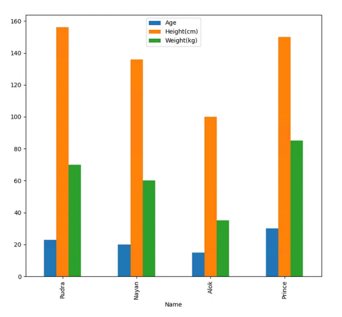
data=[["Rudra",23,156,70],
      ["Nayan",20,136,60],
      ["Alok",15,100,35],
      ["Prince",30,150,85]
     ]

df=pd.DataFrame(data,columns=["Name","Age","Height(cm)","Weight(kg)"])
df.plot(x="Name", y=["Age", "Height(cm)", "Weight(kg)"], kind="bar",figsize=(9,8))
plt.show()

# Import Library

import numpy as np
import matplotlib.pyplot as plt

# Define Data

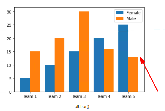
team = ['Team 1','Team 2','Team 3','Team 4','Team 5']
female = [5, 10, 15, 20, 25]
male = [15, 20, 30, 16, 13]

x_axis = np.arange(len(team))

# Multi bar Chart

plt.bar(x_axis -0.2, female, width=0.4, label = 'Female')
plt.bar(x_axis +0.2, male, width=0.4, label = 'Male')

# Xticks

plt.xticks(x_axis, team)

# Add legend

plt.legend()

# Display

plt.show()


