
高斯过程定义
定义:若对于任意时刻ti(i=1,2,...,n),随机过程的任意n维随机变量Xi=X(ti)(i=1,2,...,n)服从高斯分布,则称X(t)为高斯随机过程或正太过程。
高斯过程的特性
- 高斯随机过程完全由它的均值和协方差函数决定。
- 高斯随机过程在不同时刻ti,tk的取值不相关和相互独立等价,即平稳高斯过程在任意两个不同时刻不相关,则也一定是相互独立的。
- 高斯过程的广义平稳性意味着严格平稳性,即广义平稳高斯过程一定是严平稳过程。
- 高斯(变量)随机过程通过线性系统(线性变换)还是高斯的。
- 高斯变量之和仍然是高斯变量。
- 平稳高斯过程与确定时间信号之和也是高斯过程。除非确定信号不随时间变化的,否则将不再是平稳过程。
- 如果高斯过程的积分存在,它也将是高斯分布的随机变量或随机过程。
- 平稳高斯过程导数的一维概率密度也是高斯分布的。
- 平稳高斯过程导数的二维概率密度是高斯分布的,平稳高斯过程与其导数的联合概率密度也是高斯分布的。
- 对于n维高斯分布,则任意k维(k<n)边缘分布仍是高斯分布,k维(k<n)维条件分布仍是高斯分布。
编者按:高斯过程(Gaussian process)是概率论和统计学中的一个重要概念,它同时也被认为是一种机器学习算法,广泛应用于诸多领域。为了帮助入门者更好地理解这一简单易用的方法,近日国外机器学习开发者Alex Bridgland在博客中图文并茂地解释了高斯过程,并授权论智将文章分享给中国读者。
注:本文为系列第一篇,虽用可视化形式弱化了数学推导,但仍假设读者具备一定机器学习基础。
现如今,高斯过程可能称不上是机器学习领域的炒作核心,但它仍然活跃在研究的最前沿。从AlphaGo到AlphaGo Zero,Deepmind在MCTS超参数自动调优上一直表现出对高斯过程优化的信心,而这的确是它的优势领域。当涉及丰富的建模可能性和大量随机参数时,高斯过程十分简单易用。
但是,掌握高斯过程不是一件简单的事,尤其是如果你已经用惯了深度学习常用的那些模型。为了解决这个问题,我特意撰写了这篇文章,并用一种直观地、可视化的方式结合理论向初学者介绍。我已在github上传了我的Jupyter Notebook,建议读者前往下载,并结合函数图像和代码来对整个概念建立清晰认识。
什么是高斯过程?
高斯过程(GP)是一种强大的模型,它可以被用来表示函数的分布情况。当前,机器学习的常见做法是把函数参数化,然后用产生的参数建模来规避分布表示(如线性回归的权重)。但GP不同,它直接对函数建模生成非参数模型。由此产生的一个突出优势就是它不仅能模拟任何黑盒函数,还能模拟不确定性。这种对不确定性的量化是十分重要的,如当我们被允许请求更多数据时,依靠高斯过程,我们能探索最不可能实现高效训练的数据区域。这也是贝叶斯优化背后的主要思想。
如果你给我几张猫和狗的图片,要我对一张新的猫咪照片分类,我可以很有信心地给你一个判断。但是,如果你给我一张鸵鸟照片,强迫我说出它是猫还是狗,我就只能信心全无地预测一下。——Yarin Gal
为了更好地介绍这一概念,我们假定一个没有噪声的高斯回归(其实GP可以扩展到多维和噪声数据):
- 假设有一个隐藏函数:f:ℝ→ℝ,我们要对它建模;
- x=[x1,…,xN]^T,y=[y1,…,yN]^T,其中yi=f(xi);
- 我们要计算函数f在某些未知输入x∗上的值。
用高斯建模函数
GP背后的关键思想是可以使用无限维多变量高斯分布来对函数进行建模。换句话说,输入空间中的每个点都与一个随机变量相关联,而它们的联合分布可以被作为多元高斯分布建模。
这是什么意思呢?让我们从一个简单的例子开始:二维高斯分布。
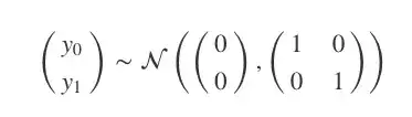
上式可以被可视化为一个3D的钟形曲线,其中概率密度为其高度。如果我们不把它作为一个整体来看,而是从它的分布中抽样,那会怎么样?比如说,我们一次从图中抽取两点,反复进行10次,并把第一个值记录在x=0,第二个值在x=1,然后在两点间绘制线段。
def plot_unit_gaussian_samples(D):
   p = figure(plot_width=800, plot_height=500,
              title='Samples from a unit {}D Gaussian'.format(D))

   xs = np.linspace(0, 1, D)
for color in Category10[10]:
       ys = np.random.multivariate_normal(np.zeros(D), np.eye(D))
       p.line(xs, ys, line_width=1, color=color)
return p

show(plot_unit_gaussian_samples(2))
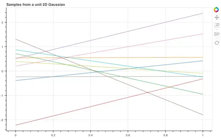
如图所示,这10根线条就是我们刚才抽样的10个线性函数。那如果我们扩展到20维,它们会呈怎样的分布呢?
show(plot_unit_gaussian_samples(20))
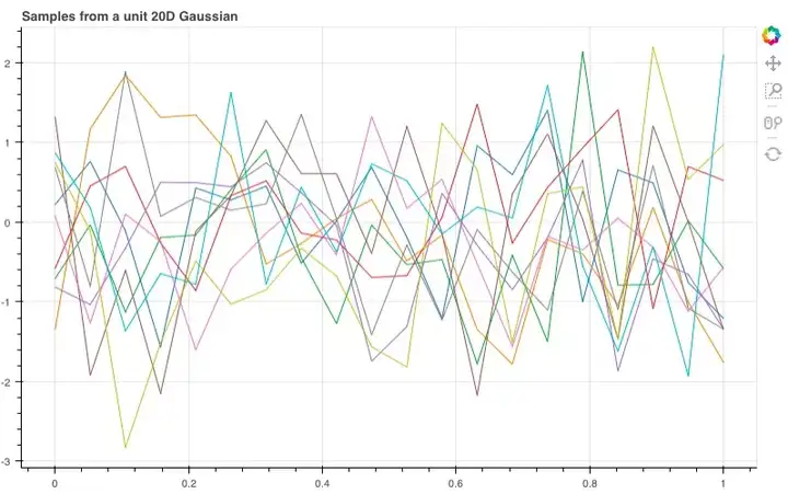
经过调整,我们得到了这样的函数曲线,虽然整体非常杂乱,但它们包含了许多有用的信息,能让我们推敲想从这些样本中获得什么,以及如何改变分布来获得更好的样本。
多元高斯分布有两个重要参数,一个是均值函数,另一个是协方差函数。如果只改变均值,那我们改变的只有曲线的整体趋势(如果均值函数是上升的,例:np.arange(D),曲线就会有一个整体的线性上升趋势),而锯齿状的噪声形状依然存在。鉴于这个特征,我们一般倾向于设GP的均值函数为0(即使不改变均值,GP也能对许多函数建模)。
解决了曲线形态,那么接下来,我们就要为它们增加一些平滑度(smoothness)。例如,如果两个样本非常接近,那我们自然会希望它们的函数值,即y值也非常相近。而把这个放进我们的模型中,就是样本附近的随机变量对应到它们联合分布(高维协方差)上的值应当和样本对应的值十分接近。
现在,这些点的协方差被定义在高斯协方差矩阵中,考虑到我们有的是一个N维的高斯模型:y0,…,yN,那么这就是一个N×N的协方差矩阵Σ,那么矩阵中的(i,j)就是Σij=cov(yi,yj)。换句话说,协方差矩阵Σ是对称的,它包含了模型上所有随机变量的协方差(一对)。
用核函数实现平滑
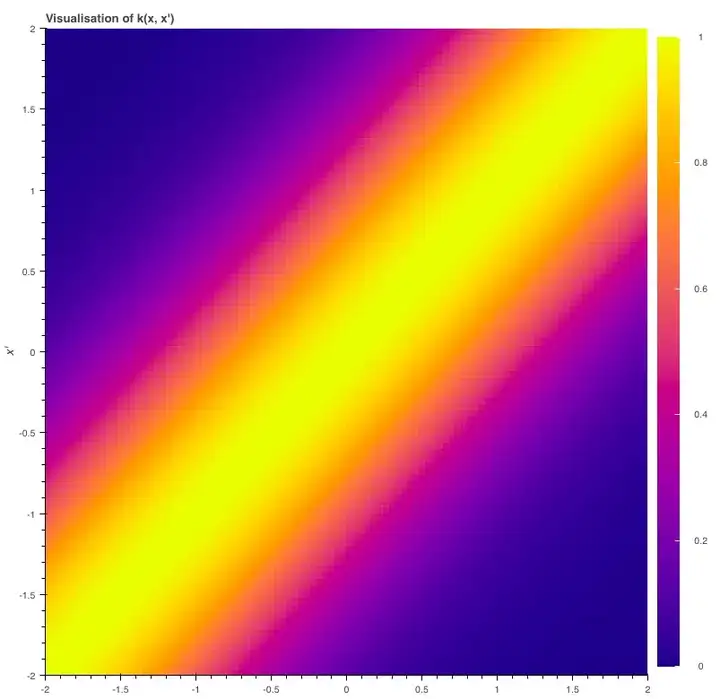
那么我们该如何定义我们的协方差函数呢?这时高斯过程的一个重要概念核函数(kernel)就要登场了。为了实现我们的目的,我们可以设一个平方形式的核函数(最简形式):
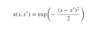
当x=x′时,核函数k(x,x′)等于1;x和x′相差越大,k越趋向于0。
def k(xs, ys, sigma=1, l=1):
"""Sqared Exponential kernel as above but designed to return the whole
   covariance matrix - i.e. the pairwise covariance of the vectors xs & ys.
   Also with two parameters which are discussed at the end."""

# Pairwise difference matrix.
   dx = np.expand_dims(xs, 1) - np.expand_dims(ys, 0)
return (sigma ** 2) * np.exp(-((dx / l) ** 2) / 2)

def m(x):
"""The mean function. As discussed, we can let the mean always be zero."""
return np.zeros_like(x)
我们可以这样绘制核函数的曲线,并观察图像变化:当x=x′时,函数值最大;当两个输入变得越来越不同,曲线逐渐呈平滑下降趋势。
N = 100
x = np.linspace(-2, 2, N)
y = np.linspace(-2, 2, N)
d = k(x, y)

color_mapper = LinearColorMapper(palette="Plasma256", low=0, high=1)

p = figure(plot_width=400, plot_height=400, x_range=(-2, 2), y_range=(-2, 2),
          title='Visualisation of k(x, x\')', x_axis_label='x',
          y_axis_label='x\'', toolbar_location=None)
p.image(image=[d], color_mapper=color_mapper, x=-2, y=-2, dw=4, dh=4)

color_bar = ColorBar(color_mapper=color_mapper, ticker=BasicTicker(),
                    label_standoff=12, border_line_color=None, location=(0,0))

p.add_layout(color_bar, 'right')

show(p)
为了实现平滑度,我们会希望xi和xj的协方差yi和yj就等于核函数k(xi,xj)——xi、xj越接近,协方差越高。
利用上文中的函数,我们可得矩阵(xs,xs)。接下来,让我们从20维高斯分布中抽取另外10个样本,不同的是,这一次我们用了新的协方差矩阵。
p = figure(plot_width=800, plot_height=500)
D = 20
xs = np.linspace(0, 1, D)
for color in Category10[10]:
   ys = np.random.multivariate_normal(m(xs), k(xs, xs))
   p.circle(xs, ys, size=3, color=color)
   p.line(xs, ys, line_width=1, color=color)

show(p)
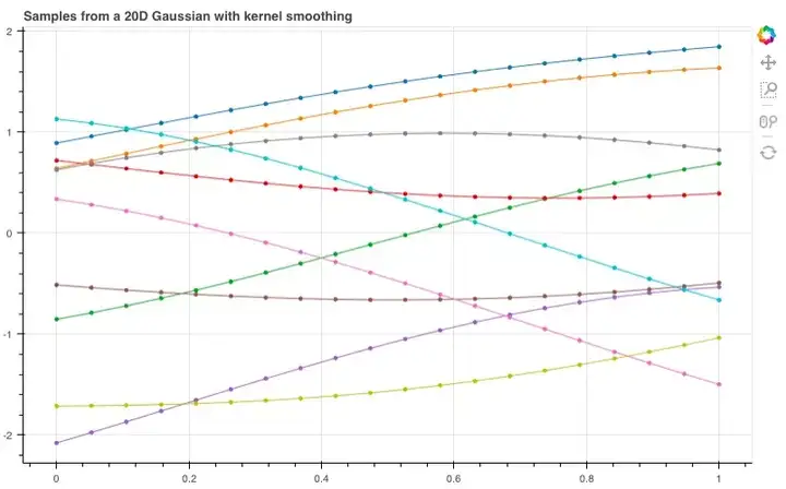
现在,我们似乎获得了一些看起来有点用的函数分布。随着维数增加,我们甚至不再需要连接各个点,因为我们可以为任何可能的输入指定一个点。
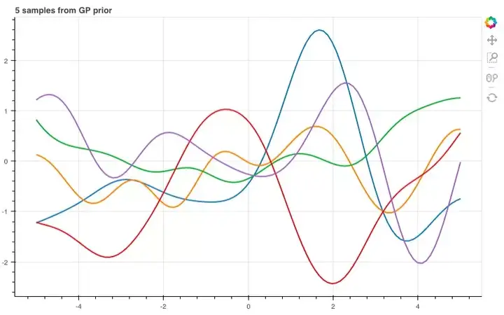
那么,如果进一步提高维数,比如到100维呢?
n = 100
xs = np.linspace(-5, 5, n)
K = k(xs, xs)
mu = m(xs)

p = figure(plot_width=800, plot_height=500)

for color in Category10[5]:
   ys = np.random.multivariate_normal(mu, K)
   p.line(xs, ys, line_width=2, color=color)
show(p)
用先验和观察进行预测
现在我们已经有了一个函数分布,之后就要用训练数据来模拟那个隐藏函数,从而预测y值。
首先,我们需要一些训练数据。
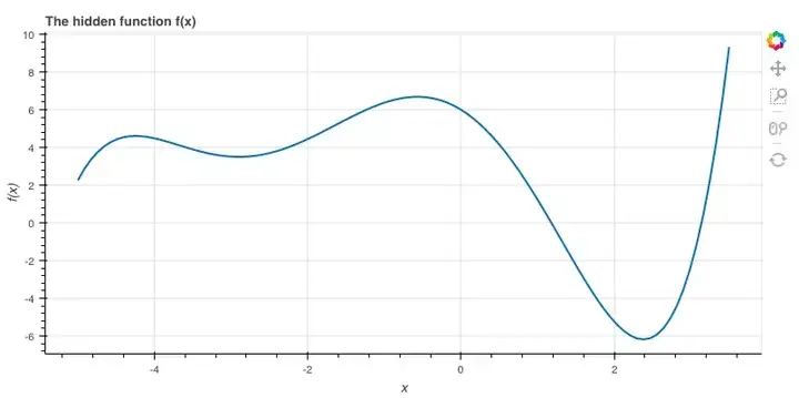
隐藏函数f
为了介绍它,我先用一个5次方程:
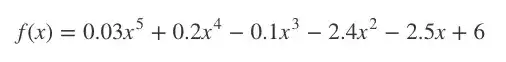
之所以这么选,是因为它的图适合讲解,事实上我们可以随便设。
# coefs[i] is the coefficient of x^i
coefs = [6, -2.5, -2.4, -0.1, 0.2, 0.03]

def f(x):
   total = 0
for exp, coef in enumerate(coefs):
       total += coef * (x ** exp)
return total

xs = np.linspace(-5.0, 3.5, 100)
ys = f(xs)

p = figure(plot_width=800, plot_height=400, x_axis_label='x',
          y_axis_label='f(x)', title='The hidden function f(x)')
p.line(xs, ys, line_width=2)
show(p)
数学计算
现在我们到了GP的核心部分,需要涉及一点点数学计算,但它其实只是我们用来调整观测数据联合分布的一种方法。
我们用多元高斯分布对p(y|x)建模:
K=κ(x,x),均值函数m(x)=0。
这是一个先验分布,表示在观察任何数据前,我们期望在输入x后获得的输出y。
之后,我们导入一些输入为x的训练数据,并输出y=f(x)。接着,我们设有一些新输入x∗,需要计算y∗=f(x∗)。
x_obs = np.array([-4, -1.5, 0, 1.5, 2.5, 2.7])
y_obs = f(x_obs)

x_s = np.linspace(-8, 7, 80)
我们将所有y和y∗的联合分布建模为:
其中,K=κ(x,x), K∗=κ(x,x∗), K∗∗=κ(x∗,x∗),均值函数为0。
现在,模型成了p(y,y∗|x,x∗),而我们需要的是y∗。
调节多元高斯分布
比起反推回去,其实我们可以利用这个标准结果。由于我们已有y和y∗的联合分布,在这个基础上我们想对y的数据做条件处理,那就会得到:
这就是基于先验分布和观察值计算出的关于y∗的后验分布。
注:由于K条件不当,以下代码可能是不准确的,我会在第二篇文章中介绍一种更好的方法。
K = k(x_obs, x_obs)
K_s = k(x_obs, x_s)
K_ss = k(x_s, x_s)

K_sTKinv = np.matmul(K_s.T, np.linalg.pinv(K))

mu_s = m(x_s) + np.matmul(K_sTKinv, y_obs - m(x_obs))
Sigma_s = K_ss - np.matmul(K_sTKinv, K_s)
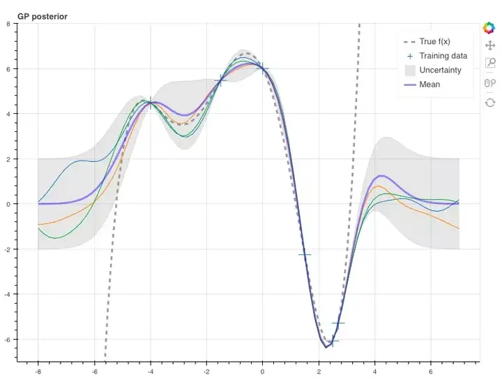
这样,我们就能根据这两个参数从条件分布中抽取样本。在这里,我们设真函数f(x)与它们相对应。由于使用了GP,每个随机变量的方差中会包含不确定性,而矩阵中第i个随机变量的协方差是Σ∗ii,也就是矩阵Σ∗的一个对角元素,所以在这里,我们得到样本的标准差为±2。
p = figure(plot_width=800, plot_height=600, y_range=(-7, 8))

y_true = f(x_s)
p.line(x_s, y_true, line_width=3, color='black', alpha=0.4,
      line_dash='dashed', legend='True f(x)')

p.cross(x_obs, y_obs, size=20, legend='Training data')

stds = np.sqrt(Sigma_s.diagonal())
err_xs = np.concatenate((x_s, np.flip(x_s, 0)))
err_ys = np.concatenate((mu_s + 2 * stds, np.flip(mu_s - 2 * stds, 0)))
p.patch(err_xs, err_ys, alpha=0.2, line_width=0, color='grey',
       legend='Uncertainty')

for color in Category10[3]:
   y_s = np.random.multivariate_normal(mu_s, Sigma_s)
   p.line(x_s, y_s, line_width=1, color=color)

p.line(x_s, mu_s, line_width=3, color='blue', alpha=0.4, legend='Mean')
show(p)
Gaussian processes may not be at the center of current machine learning hype but are still used at the forefront of research – they were recently seen automatically tuning the MCTS hyperparameters for AlphaGo Zero for instance. They manage to be very easy to use while providing rich modeling capacity and uncertainty estimates.
However they can be pretty hard to grasp, especially if you’re used to the type of models we see a lot of in deep learning. So hopefully this guide can fix that! It assumes a fairly minimal ML background and I aimed for a more visual & intuitive introduction without totally abandoning the theory. To get the most out of it I recommend downloading the notebook and experimenting with all the code!
What is a Gaussian Process and why would I use one?
A Gaussian process (GP) is a powerful model that can be used to represent a distribution over functions. Most modern techniques in machine learning tend to avoid this by parameterising functions and then modeling these parameters (e.g. the weights in linear regression). However GPs are nonparametric models that model the function directly. This comes with one hugely important benefit: not only can we model any black-box function, we can also model our uncertainty. Quantifying uncertainty can be extremely valuable - for example if we are allowed to explore (request more data) we can chose to explore the areas we are least certain about to be as efficient as possible. This is the main idea behind Bayesian optimisation. For more information on the importance of uncertainty modeling see this article by Yarin Gal.
If you give me several pictures of cats and dogs – and then you ask me to classify a new cat photo – I should return a prediction with rather high confidence. But if you give me a photo of an ostrich and force my hand to decide if it’s a cat or a dog – I better return a prediction with very low confidence.
Yarin Gal
For this introduction we will consider a simple regression setup without noise (but GPs can be extended to multiple dimensions and noisy data):
- We assume there is some hidden function f:R→R that we want to model.
- We have data x=[x1,…,xN]T,y=[y1,…,yN]T where yi=f(xi).
- We want to predict the value of f at some new, unobserved points x∗.
Modeling Functions using Gaussians
The key idea behind GPs is that a function can be modeled using an infinite dimensional multivariate Gaussian distribution. In other words, every point in the input space is associated with a random variable and the joint distribution of these is modeled as a multivariate Gaussian.
Ok, so what does that mean and what does it actually look like? Well lets start with a simpler case: a unit 2D Gaussian. How can we start to view this as a distribution over functions? Here’s what we have:
Normally this is visualised as a 3D bell curve with the probability density represented as height. But what if, instead of visualising the whole distribution, we just sample from the distribution. Then we will have two values which we can plot on an graph. Let’s do this 10 times, putting the first value at x=0 and the second at x=1 and then drawing a line between them.
def plot_unit_gaussian_samples(D):
    p = figure(plot_width=800, plot_height=500,
               title='Samples from a unit {}D Gaussian'.format(D))

    xs = np.linspace(0, 1, D)
    for color in Category10[10]:
        ys = np.random.multivariate_normal(np.zeros(D), np.eye(D))
        p.line(xs, ys, line_width=1, color=color)
    return p

show(plot_unit_gaussian_samples(2))
Looking at all these lines on a graph, it starts to look like we’ve just sampled 10 linear functions… What if we now use a 20-dimensional Gaussian, joining each of the sampled points in order?
show(plot_unit_gaussian_samples(20))These definitely look like functions of sorts but they look far too noisy to be useful for our purposes. Let’s think a bit more about what we want from these samples and how we might change the distribution to get better looking samples…
The multivariate Gaussian has two parameters, its mean and covariance matrix. If we changed the mean then we would only change the overall trend (i.e. if the mean was ascending integers, e.g. np.arange(D) then the samples would have an overall positive linear trend) but there would still be that jagged noisy shape. For this reason we tend to leave the GP mean as zero - they actually turn out to be powerful enough to model many functions without changing this.
Instead we want some notion of smoothness: i.e. if two input points are close to each other then we expect the value of the function at those points to be similar. In terms of our model: random variables corresponding to nearby points should have similar values when sampled under their joint distribution (i.e. high covariance).
The covariance of these points is defined in the covariance matrix of the Gaussian. Suppose we have an N dimensional Gaussian modeling y0,…,yN, then the covariance matrix Σ is N×N and its (i,j)-th element is Σij=cov(yi,yj). In other words Σ is symmetric and stores the pairwise covariances of all the jointly modeled random variables.
Smoothing with Kernels
So how should we define our covariance function? This is where the vast literature on kernels comes in handy. For our purposes we will choose a squared exponential kernel which (in its simplest form) is defined by:
This function (which we plot in a moment) is 1 when x=x′ and tends to zero as its arguments drift apart.
def k(xs, ys, sigma=1, l=1):
    """Sqared Exponential kernel as above but designed to return the whole
    covariance matrix - i.e. the pairwise covariance of the vectors xs & ys.
    Also with two parameters which are discussed at the end."""

    # Pairwise difference matrix.
    dx = np.expand_dims(xs, 1) - np.expand_dims(ys, 0)
    return (sigma ** 2) * np.exp(-((dx / l) ** 2) / 2)

def m(x):
    """The mean function. As discussed, we can let the mean always be zero."""
    return np.zeros_like(x)
We can plot this kernel to show how it’s maximised when x=x′ and then smoothly falls off as the two inputs start to differ.
N = 100
x = np.linspace(-2, 2, N)
y = np.linspace(-2, 2, N)
d = k(x, y)

color_mapper = LinearColorMapper(palette="Plasma256", low=0, high=1)

p = figure(plot_width=400, plot_height=400, x_range=(-2, 2), y_range=(-2, 2),
           title='Visualisation of k(x, x\')', x_axis_label='x',
           y_axis_label='x\'', toolbar_location=None)
p.image(image=[d], color_mapper=color_mapper, x=-2, y=-2, dw=4, dh=4)

color_bar = ColorBar(color_mapper=color_mapper, ticker=BasicTicker(),
                     label_standoff=12, border_line_color=None, location=(0,0))

p.add_layout(color_bar, 'right')

show(p)
So, to get the sort of smoothness we want we will consider two random variables yi and yjplotted at xi and xj to have covariance cov(yi,yj)=κ(xi,xj) – the closer they are together the higher their covariance.
Using the kernel function from above we can get this matrix with k(xs, xs). Now lets try plotting another 10 samples from the 20D Gaussian, but this time with the new covariance matrix. When we do this we get:
p = figure(plot_width=800, plot_height=500)
D = 20
xs = np.linspace(0, 1, D)
for color in Category10[10]:
    ys = np.random.multivariate_normal(m(xs), k(xs, xs))
    p.circle(xs, ys, size=3, color=color)
    p.line(xs, ys, line_width=1, color=color)

show(p)
Now we have something thats starting to look like a distribution over (useful) functions! And we can see how as the number of dimensions tends to infinity we don’t have to connect points any more because we will have a point for every possible choice of input.
Let’s use more dimensions and see what it looks like across a bigger range of inputs:
n = 100
xs = np.linspace(-5, 5, n)
K = k(xs, xs)
mu = m(xs)

p = figure(plot_width=800, plot_height=500)

for color in Category10[5]:
    ys = np.random.multivariate_normal(mu, K)
    p.line(xs, ys, line_width=2, color=color)
show(p)
Making Predictions using the Prior & Observations
Now that we have a distribution over functions, how can we use training data to model a hidden function so that we can make predictions?
First of all we need some training data! And to get that we are going to create our secret function f.
The Target Function f
For this intro we’ll use a 5th order polynomial:
I chose this because it has a nice wiggly graph but we could have chosen anything.
# coefs[i] is the coefficient of x^i
coefs = [6, -2.5, -2.4, -0.1, 0.2, 0.03]

def f(x):
    total = 0
    for exp, coef in enumerate(coefs):
        total += coef * (x ** exp)
    return total

xs = np.linspace(-5.0, 3.5, 100)
ys = f(xs)

p = figure(plot_width=800, plot_height=400, x_axis_label='x',
           y_axis_label='f(x)', title='The hidden function f(x)')
p.line(xs, ys, line_width=2)
show(p)
Getting into the Maths
Now we get to the heart of GPs. Theres a bit more maths required but it only consists of consolidating what we have so far and using one trick to condition our joint distribution on observed data.
So far we have a way to model p(y|x) using a multivariate normal:
where K=κ(x,x) and m(x)=0.
This is a prior distribution representing the kind out outputs y that we expect to see over some inputs x before we observe any data.
So we have some training data with inputs x, and outputs y=f(x). Now lets say we have some new points x∗ where we want to predict y∗=f(x∗).
x_obs = np.array([-4, -1.5, 0, 1.5, 2.5, 2.7])
y_obs = f(x_obs)

x_s = np.linspace(-8, 7, 80)
Now recalling the definition of a GP, we will model the joint distribution of all of y and y∗as:
where K=κ(x,x), K∗=κ(x,x∗) and K∗∗=κ(x∗,x∗). As before we are going to stick with a zero mean.
However this is modeling p(y,y∗|x,x∗) and we only want a distribution over y∗!
Conditioning Multivariate Gaussians
Rather than deriving it from scratch we can just make use of this standard result. If we have a joint distribution over y and y∗ as above, and we want to condition on the data we have for y then we have the following:
Now we have a posterior distribution over y∗ using a prior distribution and some observations!
NB: The code below would not be used in practice since K can often be poorly conditioned, so its inverse might be inaccurate. A better approach is covered in part II of this guide!
K = k(x_obs, x_obs)
K_s = k(x_obs, x_s)
K_ss = k(x_s, x_s)

K_sTKinv = np.matmul(K_s.T, np.linalg.pinv(K))

mu_s = m(x_s) + np.matmul(K_sTKinv, y_obs - m(x_obs))
Sigma_s = K_ss - np.matmul(K_sTKinv, K_s)
And that’s it! We can now use these two parameters to draw samples from the conditional distribution. Here we plot them against the true function f(x) (the dashed black line). Since we are using a GP we also have uncertainty information in the form of the variance of each random variable. We know the variance of the i-th random variable will be Σ∗ii - in other words the variances are just the diagonal elements of Σ∗. Here we plot the samples with an uncertainty of ±2 standard deviations.
p = figure(plot_width=800, plot_height=600, y_range=(-7, 8))

y_true = f(x_s)
p.line(x_s, y_true, line_width=3, color='black', alpha=0.4,
       line_dash='dashed', legend='True f(x)')

p.cross(x_obs, y_obs, size=20, legend='Training data')

stds = np.sqrt(Sigma_s.diagonal())
err_xs = np.concatenate((x_s, np.flip(x_s, 0)))
err_ys = np.concatenate((mu_s + 2 * stds, np.flip(mu_s - 2 * stds, 0)))
p.patch(err_xs, err_ys, alpha=0.2, line_width=0, color='grey',
        legend='Uncertainty')

for color in Category10[3]:
    y_s = np.random.multivariate_normal(mu_s, Sigma_s)
    p.line(x_s, y_s, line_width=1, color=color)

p.line(x_s, mu_s, line_width=3, color='blue', alpha=0.4, legend='Mean')
show(p)
What Next? - GP Regression and Noisy Data
In practice we need to do a bit more work to get good predictions. You may have noticed that the kernel implementation contained two parameters σ and l. If you try changing those when sampling from the prior then you can see how σ changes the vertical variation and l changes the horizontal scale. So we would need to change these to reflect our prior belief about the hidden function f. For instance if we expect f to have a much bigger range of outputs (for the domain we are interested in) then we would need to scale up σaccordingly (try scaling the return value of f by 100 to see what happens, then setsigma=100). In fact, as with anything that uses kernels, we might change our kernel entirely if we expect a different kind of function (e.g. a periodic function).
Picking the kernel is up to a human expert but choosing the parameters can be done automatically by minimising a loss term. This is the realm of Gaussian process regression.
Finally we should consider how to handle noisy data - i.e. when we can’t get perfect samples of the hidden function f. In this case we need to factor this uncertainty into the model to get better generalisation.
These two topics will be the focus of Introduction to Gaussian Processes - Part II.
Resources
- Machine Learning - A Probabilistic Perspective, Chapter 15 by Kevin P. Murphy
- Introduction to Gaussian processes on YouTube by Nando de Freitas

 浙公网安备 33010602011771号