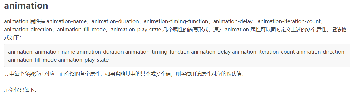
CSS——动画
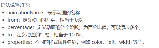
@keyframes 规则
要创建 CSS 动画,您首先需要了解 @keyframes 规则,@keyframes 规则用来定义动画各个阶段的属性值,类似于 flash 动画中的关键帧,语法格式如下:
1 2 3 4 5 6 7 8 9 10 11 12 13 14 15 16 17 18 19 20 21 22 23 | @keyframes animationName { from { properties: value; } percentage { properties: value; } to { properties: value; }}// 或者@keyframes animationName { 0% { properties: value; } percentage { properties: value; } 100% { properties: value; }} |
下面我们来看一个简单的 @keyframes 规则示例:
1 2 3 4 5 6 7 | @keyframes ball { 0% { top: 0px; left: 0px;} 25% { top: 0px; left: 350px;} 50% { top: 200px; left: 350px;} 75% { top: 200px; left: 0px;} 100% { top: 0px; left: 0px;} } |

下面就来详细介绍一下上述属性的使用:
1 2 3 4 5 6 7 8 9 10 11 12 13 14 15 16 17 18 19 20 21 22 23 24 25 | <!DOCTYPE html><html><head> <style> @keyframes ball { 0% { top: 0px; left: 0px;} 25% { top: 0px; left: 350px;} 50% { top: 200px; left: 350px;} 75% { top: 200px; left: 0px;} 100% { top: 0px; left: 0px;} } div { width: 100px; height: 100px; border-radius: 50%; border: 3px solid black; position: relative; animation-name: ball; } </style></head><body> <div></div></body></html> |
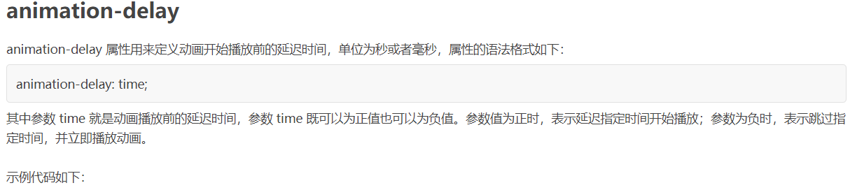
注意:要想让动画成功播放,您还需要定义 animation-duration 属性,否则会因为 animation-duration 属性的默认值为 0,导致动画并不会播放。

1 2 3 4 5 6 7 8 9 10 11 12 13 14 15 16 17 18 19 20 21 22 23 24 25 26 | <!DOCTYPE html><html><head> <style> @keyframes ball { 0% { top: 0px; left: 0px;} 25% { top: 0px; left: 350px;} 50% { top: 200px; left: 350px;} 75% { top: 200px; left: 0px;} 100% { top: 0px; left: 0px;} } div { width: 100px; height: 100px; border-radius: 50%; border: 3px solid black; position: relative; animation-name: ball; animation-duration: 2s; } </style></head><body> <div></div></body></html> |
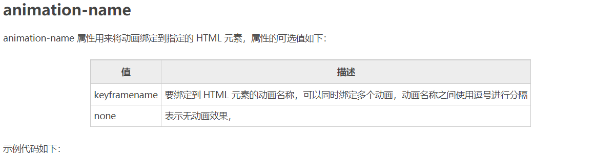
提示:动画若想成功播放,必须要定义 animation-name 和 animation-duration 属性。
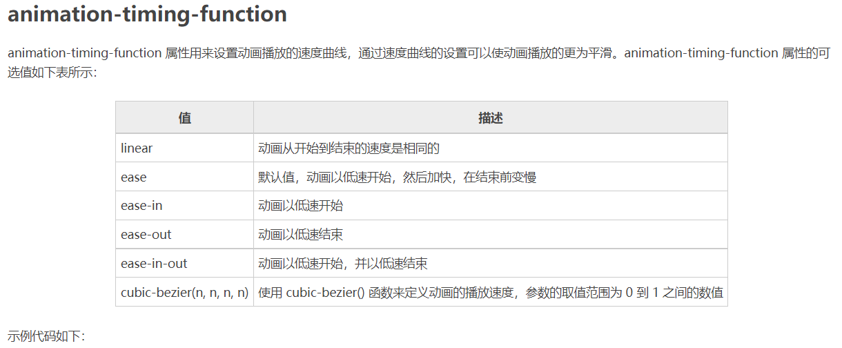
1 2 3 4 5 6 7 8 9 10 11 12 13 14 15 16 17 18 19 20 21 22 23 24 25 26 27 28 29 30 31 32 33 34 35 36 37 38 39 40 41 | <!DOCTYPE html><html><head> <style> @keyframes ball { 0% {left: 0px;} 50% {left: 350px;} 100% {left: 0px;} } div { width: 100px; height: 100px; border-radius: 50%; border: 3px solid black; text-align: center; line-height: 100px; position: relative; animation-name: ball; animation-duration: 2s; } .one { animation-timing-function: ease; } .two { animation-timing-function: ease-in; } .three { animation-timing-function: ease-out; } .four { animation-timing-function: ease-in-out; } </style></head><body> <div class="one">ease</div> <div class="two">ease-in</div> <div class="three">ease-out</div> <div class="four">ease-in-out</div></body></html> |
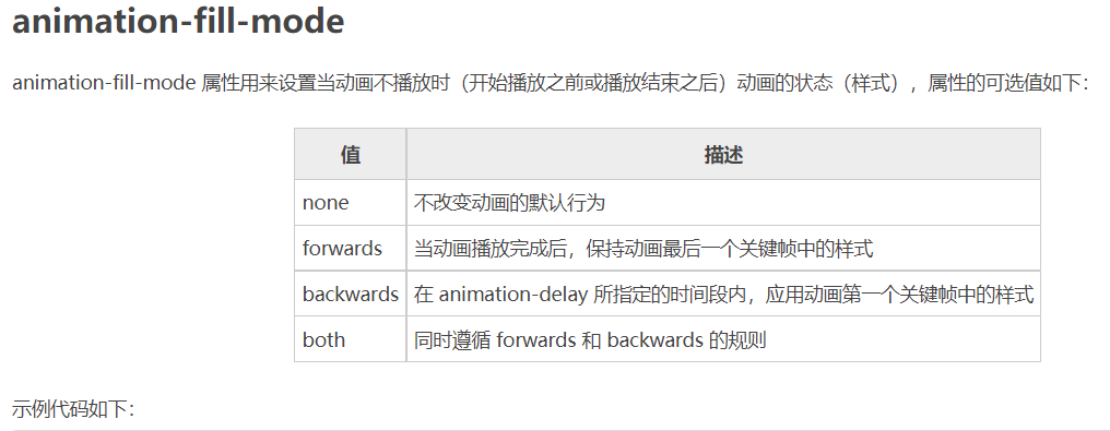
1 2 3 4 5 6 7 8 9 10 11 12 13 14 15 16 17 18 19 20 21 22 23 24 25 26 27 28 29 | <!DOCTYPE html><html><head> <style> @keyframes box { 0% {transform: rotate(0);} 50% {transform: rotate(0.5turn);} 100% {transform: rotate(1turn);} } div { width: 100px; height: 100px; border-radius: 50%; float: left; border: 3px solid black; text-align: center; line-height: 100px; position: relative; animation-name: box; animation-duration: 2s; animation-iteration-count: 1; animation-fill-mode: forwards; } </style></head><body> <div>forwards</div></body></html> |
1 2 3 4 5 6 7 8 9 10 11 12 13 14 15 16 17 18 19 20 21 22 23 24 25 26 27 28 29 30 31 32 33 | <!DOCTYPE html><html><head> <style> @keyframes ball { 0% {left: 0px;} 50% {left: 350px;} 100% {left: 0px;} } div { width: 100px; height: 100px; border-radius: 50%; border: 3px solid black; text-align: center; line-height: 100px; position: relative; animation-name: ball; animation-duration: 2s; } .one { animation-delay: 0.5s; } .two { animation-delay: -0.5s; } </style></head><body> <div class="one">0.5s</div> <div class="two">-0.5s</div></body></html> |
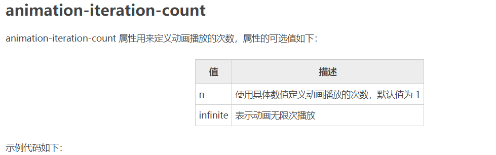
1 2 3 4 5 6 7 8 9 10 11 12 13 14 15 16 17 18 19 20 21 22 23 24 25 26 27 28 29 30 31 32 33 34 | <!DOCTYPE html><html><head> <style> @keyframes box { 0% {transform: rotate(0);} 50% {transform: rotate(0.5turn);} 100% {transform: rotate(1turn);} } div { width: 100px; height: 100px; float: left; border: 3px solid black; text-align: center; line-height: 100px; position: relative; animation-name: box; animation-duration: 2s; } .one { animation-iteration-count: 1; } .two { margin-left: 50px; animation-iteration-count: infinite; } </style></head><body> <div class="one">1</div> <div class="two">infinite</div></body></html> |
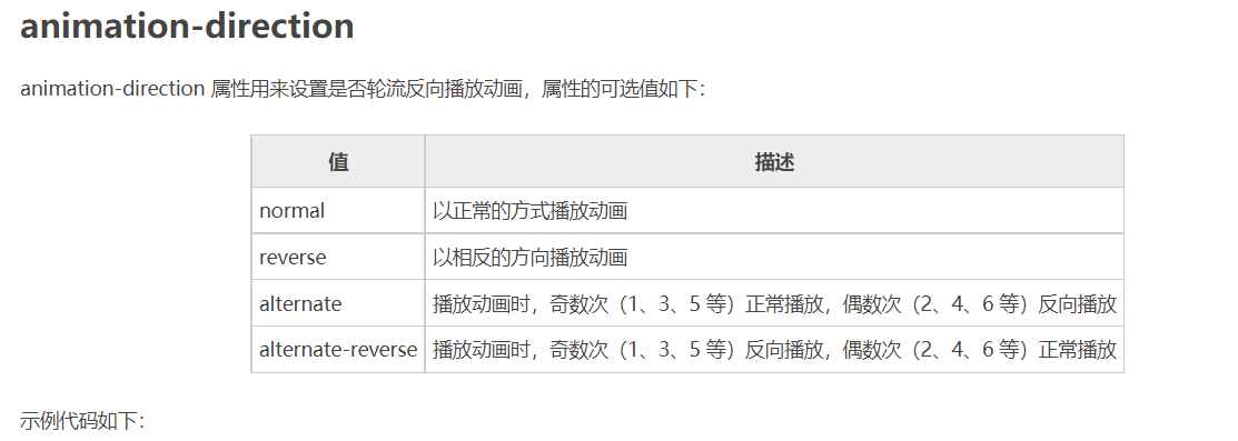
1 2 3 4 5 6 7 8 9 10 11 12 13 14 15 16 17 18 19 20 21 22 23 24 25 26 27 28 29 30 31 32 33 34 35 | <!DOCTYPE html><html><head> <style> @keyframes box { 0% {transform: rotate(0);} 50% {transform: rotate(0.5turn);} 100% {transform: rotate(1turn);} } div { width: 100px; height: 100px; float: left; border: 3px solid black; text-align: center; line-height: 100px; position: relative; animation-name: box; animation-duration: 2s; animation-iteration-count: infinite; } .one { animation-direction: reverse; } .two { margin-left: 50px; animation-direction: alternate; } </style></head><body> <div class="one">reverse</div> <div class="two">alternate</div></body></html> |
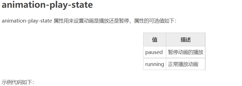
1 2 3 4 5 6 7 8 9 10 11 12 13 14 15 16 17 18 19 20 21 22 23 24 25 26 27 28 29 30 31 32 33 34 35 | <!DOCTYPE html><html><head> <style> @keyframes box { 0% {transform: rotate(0);} 50% {transform: rotate(0.5turn);} 100% {transform: rotate(1turn);} } div { width: 100px; height: 100px; float: left; border: 3px solid black; text-align: center; line-height: 100px; position: relative; animation-name: box; animation-duration: 2s; animation-iteration-count: infinite; } .one { animation-play-state: running; } .two { margin-left: 50px; animation-play-state: paused; } </style></head><body> <div class="one">running</div> <div class="two">paused</div></body></html> |
1 2 3 4 5 6 7 8 9 10 11 12 13 14 15 16 17 18 19 20 21 22 23 24 25 26 | <!DOCTYPE html><html><head> <style> @keyframes box { 0% {transform: rotate(0);} 50% {transform: rotate(0.5turn);} 100% {transform: rotate(1turn);} } div { width: 100px; height: 100px; border-radius: 50%; float: left; border: 3px solid black; text-align: center; line-height: 100px; position: relative; animation: box 2s linear 0s infinite alternate; } </style></head><body> <div>animation</div></body></html> |


【推荐】国内首个AI IDE,深度理解中文开发场景,立即下载体验Trae
【推荐】编程新体验,更懂你的AI,立即体验豆包MarsCode编程助手
【推荐】抖音旗下AI助手豆包,你的智能百科全书,全免费不限次数
【推荐】轻量又高性能的 SSH 工具 IShell:AI 加持,快人一步
· AI与.NET技术实操系列:基于图像分类模型对图像进行分类
· go语言实现终端里的倒计时
· 如何编写易于单元测试的代码
· 10年+ .NET Coder 心语,封装的思维:从隐藏、稳定开始理解其本质意义
· .NET Core 中如何实现缓存的预热?
· 分享一个免费、快速、无限量使用的满血 DeepSeek R1 模型,支持深度思考和联网搜索!
· 基于 Docker 搭建 FRP 内网穿透开源项目(很简单哒)
· ollama系列01:轻松3步本地部署deepseek,普通电脑可用
· 25岁的心里话
· 按钮权限的设计及实现