

Vue Viser柱状图,根据数值显示不同颜色
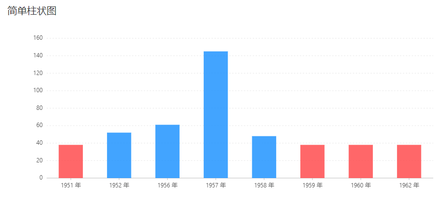
1 2 3 4 5 6 7 8 9 10 11 12 13 14 15 16 17 18 19 20 21 22 23 24 25 26 27 28 29 30 31 32 33 34 35 36 37 38 39 40 41 42 43 44 45 | <template> <div> <v-chart :forceFit="true" :height="height" :data="data" :scale="scale"> <v-tooltip /> <v-axis /> <v-bar position="year*sales" :color="color"/> </v-chart> </div></template><script> const data = [ { year: '1951 年', sales: 38 }, { year: '1952 年', sales: 52 }, { year: '1956 年', sales: 61 }, { year: '1957 年', sales: 145 }, { year: '1958 年', sales: 48 }, { year: '1959 年', sales: 38 }, { year: '1960 年', sales: 38 }, { year: '1962 年', sales: 38 }, ]; const scale = [{ dataKey: 'sales', tickInterval: 20, }]; const color = ['sales', function(val) { if (val <=38 ) { return '#ff4d4f'; } return '#2194ff'; }] export default { data() { return { data, scale, height: 400, }; } };</script> |
效果图如下:
每天学习一点点,你就进步一点点。


【推荐】国内首个AI IDE,深度理解中文开发场景,立即下载体验Trae
【推荐】编程新体验,更懂你的AI,立即体验豆包MarsCode编程助手
【推荐】抖音旗下AI助手豆包,你的智能百科全书,全免费不限次数
【推荐】轻量又高性能的 SSH 工具 IShell:AI 加持,快人一步
· 无需6万激活码!GitHub神秘组织3小时极速复刻Manus,手把手教你使用OpenManus搭建本
· C#/.NET/.NET Core优秀项目和框架2025年2月简报
· 什么是nginx的强缓存和协商缓存
· 一文读懂知识蒸馏
· Manus爆火,是硬核还是营销?