
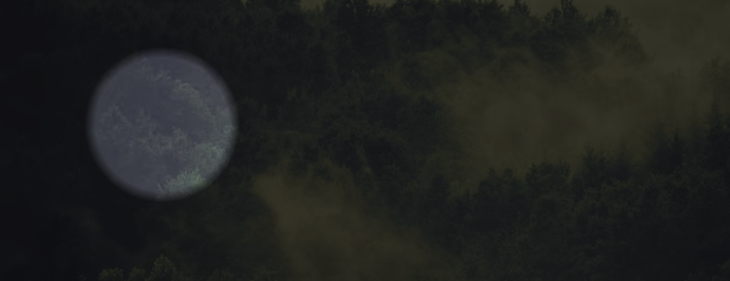
径向渐变实现舞台灯光聚焦效果
<template>
<div>
<div class="radial-circle"></div>
</div>
</template>
<style lang="scss">
$img: 'https://images.unsplash.com/photo-1440688807730-73e4e2169fb8?dpr=1&auto=format&fit=crop&w=1500&h=1001&q=80&cs=tinysrgb&crop=';
html,
body {
width: 100%;
height: 100%;
background-image: url($img);
background-repeat: no-repeat;
background-size: cover;
overflow: hidden;
}
.radial-circle {
position: absolute;
top: -100%;
left: -100%;
right: -100%;
bottom: -100%;
background: radial-gradient(circle at 50% 50%, transparent 0%, transparent 3%, rgba(0, 0, 0, .7) 3.5%, rgba(0, 0, 0, .8) 100%);
animation: move 10s infinite alternate;
}
@keyframes move {
0% {
transform: translateX(-10%);
}
100% {
transform: translateX(10%);
}
}
</style>
转自: https://csscoco.com/inspiration/#/./background/bg-radial-focus.md
