
图片叠加科幻切换 -- css
<template>
<div>
<div class="a"></div>
<div class="b"></div>
</div>
</template>
<style lang="scss">
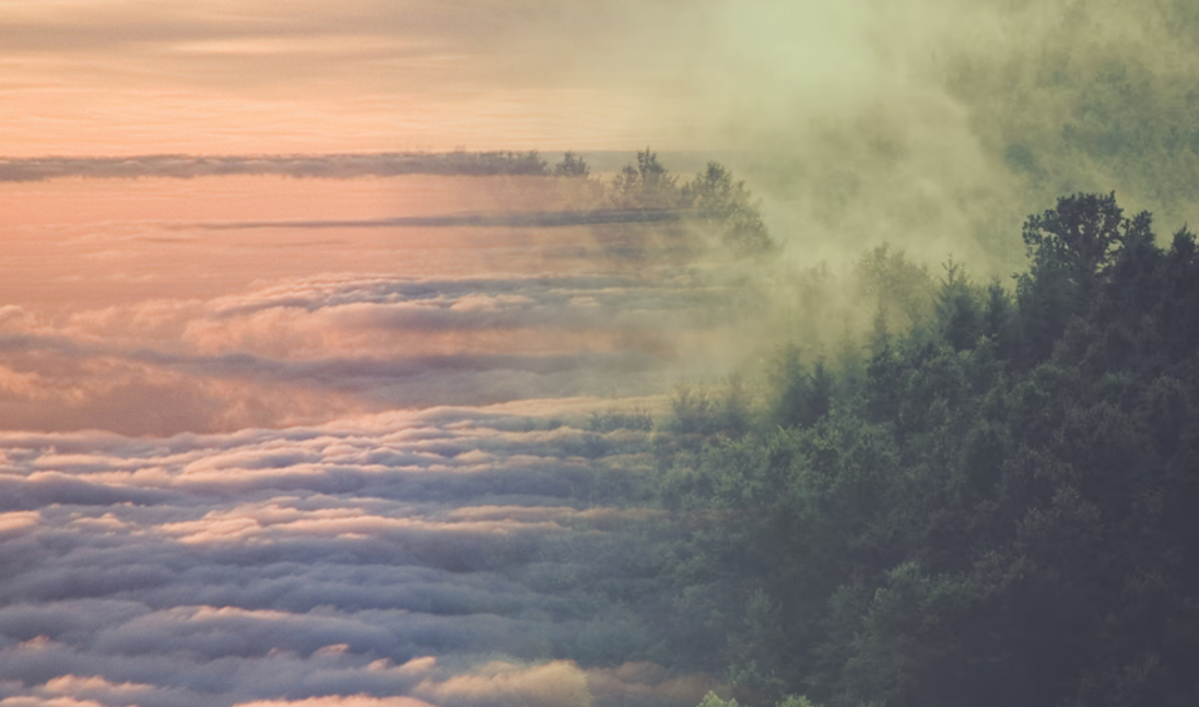
$img2: 'http://up.enterdesk.com/edpic_source/21/00/00/210000f8e772d7fc0758e67ae4b48807.jpg';
$img1: 'https://images.unsplash.com/photo-1440688807730-73e4e2169fb8?dpr=1&auto=format&fit=crop&w=1500&h=1001&q=80&cs=tinysrgb&crop=';
$count: 360;
div {
position: absolute;
top:0;
left: 0;
width: 100vw;
height: 100vh;
}
.a {
background: url($img1);
background-size: 100% auto;
}
.b {
background: url($img2);
background-size: 100% auto;
mask-image: linear-gradient(0, rgba(0, 0, 0, 1) 40%, transparent 60%);
mask-image-position: 50% 50%;
animation: move 10s infinite;
}
@keyframes move {
@for $i from 0 through $count {
#{$i / $count * 100}% {
mask-image: linear-gradient($i / $count * 360deg, rgba(0, 0, 0, 1) 40%, transparent 60%);
}
}
}
</style>
转自: https://csscoco.com/inspiration/#/./background/bg-mask-image.md
