
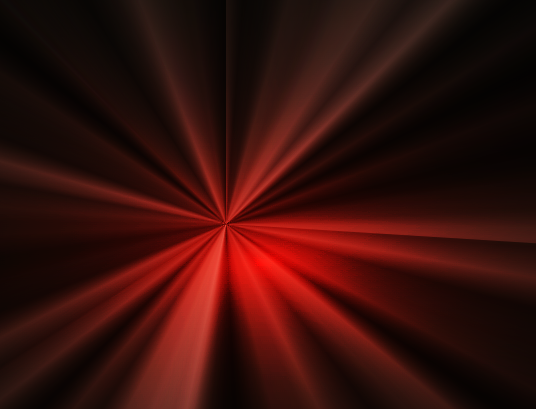
角向渐变配合混合模式实现炫酷光影效果
<template>
<div></div>
</template>
<script>
export default {
}
</script>
<style lang="scss">
@function randomNum($max, $min: 0, $u: 1) {
@return ($min + random($max)) * $u;
}
@function randomConicGradient() {
$n: 16 + random(16);
$list: ();
@for $i from 0 to $n {
$list: $list, rgba(hsl(100, randomNum(250, 5, 10%), randomNum(1, 1, 1%)), randomNum(100, 0, .01));
}
@return conic-gradient($list, nth($list, 1));
}
div {
width: 100vw;
height: 100vh;
margin: 0;
background:
radial-gradient(hsl(9, randomNum(100, 75, 1%), randomNum(100, 75%, 1%)), black);
&:before, &:after {
position: absolute;
top: 50%; left: 50%;
margin: -100vmax;
width: 200vmax;
height: 200vmax;
opacity: .5;
mix-blend-mode: overlay;
animation: rotate randomNum(100, 25, .1s) ease-in-out infinite;
content: '';
}
&:before { background: randomConicGradient(); }
&:after {
background: randomConicGradient();
animation-duration: randomNum(100, 25, .1s);
animation-direction: reverse;
}
}
@keyframes rotate {
to {
transform: rotate(1turn);
}
}
</style>
转自: https://csscoco.com/inspiration/#/./background/bg-conic-gradient-animation.md
