
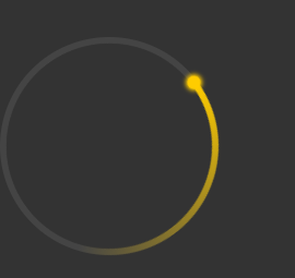
圆环加载进度条
<template>
<div class="g-container">
<div class="g-circle"></div>
</div>
</template>
<script>
export default {
}
</script>
<style lang="scss">
body, html {
width: 100%;
height: 100%;
display: flex;
background: #333;
}
.g-container {
position: relative;
width: 200px;
height: 200px;
margin: auto;
border-radius: 50%;
box-sizing: border-box;
border: 6px solid #444;
}
.g-circle {
position: absolute;
top: -6px;
left: -6px;
bottom: -6px;
right: -6px;
border-radius: 50%;
background: conic-gradient(#fc0 0%, transparent 40%, transparent);
animation: rotate 1s ease-in-out infinite;
transition-origin: 50% 50%;
&::before {
content: "";
position: absolute;
top: 6px;
left: 6px;
bottom: 6px;
right: 6px;
background: #333;
border-radius: 50%;
// z-index: 1;
}
&::after {
content: "";
position: absolute;
width: 12px;
height: 12px;
top: 0;
left: 50%;
transform: translate(-50%, -3px);
border-radius: 50%;
background: #fc0;
box-shadow: 0 0 4px 2px #fc0;
}
}
@keyframes rotate {
100% {
transform: rotate(-360deg);
}
}
</style>
转自: https://csscoco.com/inspiration/#/./background/bg-conic-circle-loading.md
