
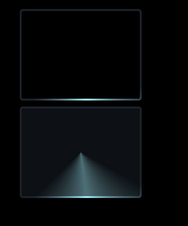
border 流光高光
<template>
<div>
<div class="conic"></div>
<div class="conic conic-demo"></div>
</div>
</template>
<script>
export default {
}
</script>
<style lang="scss">
body {
display: flex;
justify-content: center;
align-items: center;
height: 100vh;
background: #000;
}
*, *::before, *::after {
box-sizing: border-box;
}
@keyframes rotate {
100% {
transform: rotate(1turn);
}
}
.conic {
position: relative;
z-index: 0;
width: 400px;
height: 300px;
margin: 20px;
border-radius: 10px;
overflow: hidden;
padding: 2rem;
&::before {
content: '';
position: absolute;
z-index: -2;
left: -50%;
top: -50%;
width: 200%;
height: 200%;
background-color: #1a232a;
background-repeat: no-repeat;
background-position: 0 0;
background-image: conic-gradient(transparent, rgba(168, 239, 255, 1), transparent 30%);
animation: rotate 4s linear infinite;
}
&::after {
content: '';
position: absolute;
z-index: -1;
left: 6px;
top: 6px;
width: calc(100% - 12px);
height: calc(100% - 12px);
background: #000;
border-radius: 5px;
}
}
.conic-demo::after {
animation: opacityChange 5s infinite linear;
}
@keyframes opacityChange {
50% {
opacity:.5;
}
100% {
opacity: 1;
}
}
</style>
转自: https://csscoco.com/inspiration/#/./background/bg-conic-border-light-effect.md
