
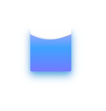
纯css 实现充电动画
<template>
<div class="container">
<div class="header"></div>
<div class="battery">
</div>
<div class="battery-copy">
<div class="g-wave"></div>
<div class="g-wave"></div>
<div class="g-wave"></div>
</div>
</div>
</template>
<script>
export default {
}
</script>
<style lang="scss">
.container {
position: relative;
width: 140px;
margin: auto;
}
.header {
position: absolute;
width: 26px;
height: 10px;
left: 50%;
top: 0;
transform: translate(-50%, -10px);
border-radius: 5px 5px 0 0;
background: rgba(255, 255, 255, .88);
}
.battery-copy {
position: absolute;
top: 0;
left: 0;
height: 220px;
width: 140px;
border-radius: 15px 15px 5px 5px;
overflow: hidden;
}
.battery {
position: relative;
height: 220px;
box-sizing: border-box;
border-radius: 15px 15px 5px 5px;
box-shadow: 0 0 5px 2px rgba(255, 255, 255, 0.22);
background: #fff;
z-index: 1;
&::after {
content: "";
position: absolute;
left: 0;
right: 0;
bottom: 0;
top: 80%;
background: linear-gradient(to bottom, #7abcff 0%, #00BCD4 44%, #2196F3 100%);
border-radius: 0px 0px 5px 5px;
box-shadow: 0 14px 28px rgba(33, 150, 243, 0), 0 10px 10px rgba(9, 188, 215, 0.08);
animation: charging 10s linear infinite;
filter: hue-rotate(90deg);
}
}
.g-wave {
position: absolute;
width: 300px;
height: 300px;
background: rgba(255, 255, 255, .8);
border-radius: 45% 47% 44% 42%;
bottom: 25px;
left: 50%;
transform: translate(-50%, 0);
z-index: 1;
animation: move 10s linear infinite;
}
.g-wave:nth-child(2) {
border-radius: 38% 46% 43% 47%;
transform: translate(-50%, 0) rotate(-135deg);
}
.g-wave:nth-child(3) {
border-radius: 42% 46% 37% 40%;
transform: translate(-50%, 0) rotate(135deg);
}
@keyframes charging {
50% {
box-shadow: 0 14px 28px rgba(0, 150, 136, 0.83), 0px 4px 10px rgba(9, 188, 215, 0.4);
}
95% {
top: 5%;
filter: hue-rotate(0deg);
border-radius: 0 0 5px 5px;
box-shadow: 0 14px 28px rgba(4, 188, 213, .2), 0 10px 10px rgba(9, 188, 215, 0.08);
}
100% {
top: 0%;
filter: hue-rotate(0deg);
border-radius: 15px 15px 5px 5px;
box-shadow: 0 14px 28px rgba(4, 188, 213, 0), 0 10px 10px rgba(9, 188, 215, 0.4);
}
}
@keyframes move {
100% {
transform: translate(-50%, -160px) rotate(720deg);
}
}
</style>
转自: https://csscoco.com/inspiration/#/
