WPF基础篇
第一章 窗体的基本属性
SizeToContent
Icon
WindowStartupLocation
MaxWidth MinWidth
Topmost
<Window x:Class="zhaoxi.MainWindow"
        xmlns="http://schemas.microsoft.com/winfx/2006/xaml/presentation"
        xmlns:x="http://schemas.microsoft.com/winfx/2006/xaml"
        xmlns:d="http://schemas.microsoft.com/expression/blend/2008"
        xmlns:mc="http://schemas.openxmlformats.org/markup-compatibility/2006"
        xmlns:local="clr-namespace:zhaoxi"
        mc:Ignorable="d"
        SizeToContent="Manual"
        WindowStartupLocation="CenterScreen"
        Icon="image/logo.ico"

    Title="MainWindow" Height="450" Width="800" MaxWidth="1200" MinWidth="500">
    <!-- SizeToContent="WidthAndHeight"  默认窗体大小随内容宽高 -->
    <!-- Icon="image/logo.ico" 窗体的图标设置(右键图片属性:生产操作:资源)-->
    <!-- 应用程序的图标:右键项目属性 >> 应用程序 >> win32资源 >> 图标(需要icon文件) -->
    <!--  WindowStartupLocation="CenterScreen" 窗体启动位置-->
    <!--  MaxWidth="1200" MinWidth="500" 最大宽高和最小宽-->
    <Grid>
        <Button Content="点击打开新窗口" Width="100" Height="20" x:Name="btn" Click="btn_Click"></Button>
        <!-- x:Name="btn"
            定义了一个名为 btn 的标识符,它对应于这个 <Button> 元素。
            在代码后面(例如C#代码中),你可以使用 btn 这个名字来直接访问这个按钮,进行诸如改变它的 Content、Width、Height 属性或添加点击事件处理器等操作。
        -->
        <!-- Click="btn_Click" 点击事件-->
    </Grid>
</Window>
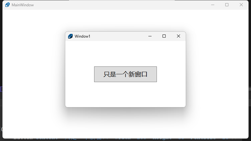
子窗体打开在父窗体正中间
using chapter1;
using System.Text;
using System.Windows;
using System.Windows.Controls;
using System.Windows.Data;
using System.Windows.Documents;
using System.Windows.Input;
using System.Windows.Media;
using System.Windows.Media.Imaging;
using System.Windows.Navigation;
using System.Windows.Shapes;

namespace zhaoxi
{
    /// <summary>
    /// Interaction logic for MainWindow.xaml
    /// </summary>
    public partial class MainWindow : Window
    {
        public MainWindow()
        {
            InitializeComponent();
        }

        /// <summary>
        /// 点击打开子窗体事件
        /// </summary>
        /// <param name="sender"></param>
        /// <param name="e"></param>
        private void btn_Click(object sender, RoutedEventArgs e)
        {
            Window1 window1 = new Window1();
            window1.Owner = this; //窗体的所有者是当前主窗体
            window1.Show();
        }
    }
}
子窗体 Window1
<Window x:Class="chapter1.Window1"
        xmlns="http://schemas.microsoft.com/winfx/2006/xaml/presentation"
        xmlns:x="http://schemas.microsoft.com/winfx/2006/xaml"
        xmlns:d="http://schemas.microsoft.com/expression/blend/2008"
        xmlns:mc="http://schemas.openxmlformats.org/markup-compatibility/2006"
        xmlns:local="clr-namespace:chapter1"
        mc:Ignorable="d"
        WindowStartupLocation="CenterScreen"
        Topmost="True"
        Title="Window1" Height="250" Width="400">

    <Grid>
        <Button Content="只是一个新窗口" Width="200" Height="50" FontSize="20"/>
    </Grid>
</Window>
效果
第二章 布局控件
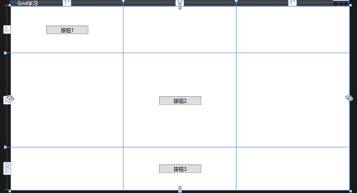
Grid
<Window x:Class="chapter2.MainWindow"
        xmlns="http://schemas.microsoft.com/winfx/2006/xaml/presentation"
        xmlns:x="http://schemas.microsoft.com/winfx/2006/xaml"
        xmlns:d="http://schemas.microsoft.com/expression/blend/2008"
        xmlns:mc="http://schemas.openxmlformats.org/markup-compatibility/2006"
        xmlns:local="clr-namespace:chapter2"
        mc:Ignorable="d"
        Title="Grid学习" Height="450" Width="800">
    <!-- 默认一行一列-->
    <Grid>
        <!--- 行定义 -->
        <Grid.RowDefinitions>
            <!-- 宽高 * 百分比 -->
            <RowDefinition Height="1*"></RowDefinition>
            <RowDefinition Height="2*"></RowDefinition>
            <RowDefinition Height="100"></RowDefinition>
        </Grid.RowDefinitions>

        <!-- 列定义 -->
        <Grid.ColumnDefinitions>
            <ColumnDefinition></ColumnDefinition>
            <ColumnDefinition></ColumnDefinition>
            <ColumnDefinition></ColumnDefinition>
        </Grid.ColumnDefinitions>

        <!---默认是第一个(从0开始)-->
        <Button Grid.Row="0" Content="按钮1" Width="100" Height="20"></Button>
        <Button Grid.Row="1" Grid.Column="1" Content="按钮2" Width="100" Height="20"></Button>
        <!-- 行列合并 -->
        <Button Grid.Row="2" Grid.ColumnSpan="3" Content="按钮3" Width="100" Height="20"></Button>
    </Grid>
</Window>
效果
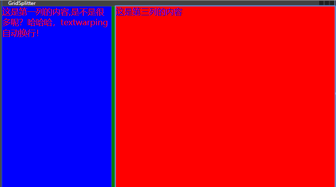
GridSplitter
<Window x:Class="chapter2.MainWindow"
        xmlns="http://schemas.microsoft.com/winfx/2006/xaml/presentation"
        xmlns:x="http://schemas.microsoft.com/winfx/2006/xaml"
        xmlns:d="http://schemas.microsoft.com/expression/blend/2008"
        xmlns:mc="http://schemas.openxmlformats.org/markup-compatibility/2006"
        xmlns:local="clr-namespace:chapter2"
        mc:Ignorable="d"
        Title="GridSplitter" Height="450" Width="800">
    <Grid>
        <!--- 列定义 -->
        <Grid.ColumnDefinitions>
            <!-- 宽高 * 百分比 -->
            <ColumnDefinition Width="1*"></ColumnDefinition>
            <ColumnDefinition Width="auto"></ColumnDefinition>
            <ColumnDefinition Width="2*"></ColumnDefinition>
        </Grid.ColumnDefinitions>

        <TextBlock FontSize="20" Foreground="Red" Background="Blue" TextWrapping="Wrap">这是第一列的内容,是不是很多呢?哈哈哈,textwarping自动换行!</TextBlock>
        <TextBlock Grid.Column="2" FontSize="20" Foreground="blue" Background="red">这是第三列的内容</TextBlock>
        <!-- GridSplitter 分割线,动态调整区域大小。 ShowsPreview 显示预览效果,默认值false-->
        <GridSplitter HorizontalAlignment="Center" ShowsPreview="False" Grid.Column="1" Width="10" Background="green"></GridSplitter>

    </Grid>
</Window>
效果
StackPanel
功能:将子元素按照一个方向(垂直或水平)堆叠排列。
属性:
Orientation: 决定子元素的排列方向,默认为垂直(Vertical)。也可以设置为水平(Horizontal)。
适用场景:适合需要简单线性排列的场景,比如菜单项列表、表单项等。
<StackPanel Orientation="Vertical">
    <Button Content="按钮1"/>
    <Button Content="按钮2"/>
    <Button Content="按钮3"/>
</StackPanel>
WrapPanel
功能:将子元素按指定的方向排列,并在空间不足时自动换行。
属性:
Orientation: 同样可以决定子元素的排列方向,支持垂直(Vertical)和水平(Horizontal)。
适用场景:当您希望UI元素能够根据可用空间自动调整布局时非常有用,例如标签云、工具栏中的图标等。
<WrapPanel Orientation="Horizontal">
    <Button Content="按钮1"/>
    <Button Content="按钮2"/>
    <Button Content="按钮3"/>
    <!-- 更多按钮 -->
</WrapPanel>
DockPanel
功能:允许子元素停靠在其内部的边缘(上、下、左、右)或居中。
属性:
LastChildFill: 默认值为True,表示最后一个子元素是否应该填充剩余的空间。
适用场景:非常适合构建具有边框或包含多个区域的应用程序框架,如带有顶部导航栏、侧边栏和内容区域的主窗口布局。
<DockPanel LastChildFill="True">
    <Button DockPanel.Dock="Top" Content="顶部"/>
    <Button DockPanel.Dock="Left" Content="左侧"/>
    <Button Content="填充其余部分"/>
</DockPanel>
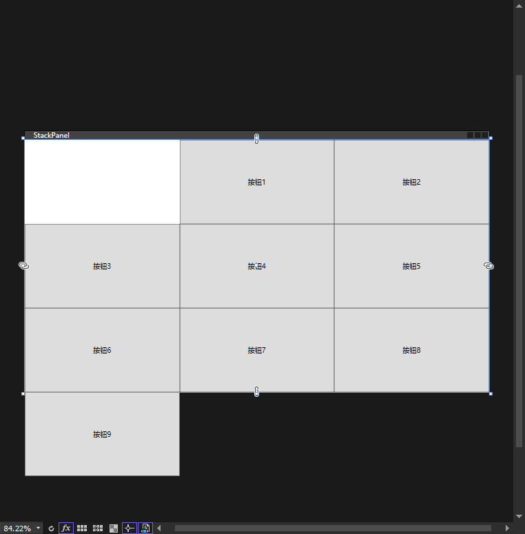
UniformGrid
主要特点
固定单元格大小:在 UniformGrid 中,所有的单元格大小是相等的,这使得它非常适合用于需要均匀分布元素的场景。
自动排列子元素:子元素会按照从左到右、从上到下的顺序依次填入单元格中,不需要显式地指定每个元素的位置。
行列自适应:可以根据添加的子元素数量自动调整行数和列数,或者你可以通过设置属性来手动控制行数和列数。
常用属性
Rows 和 Columns:可以用来指定网格的行数和列数。如果未指定,则根据子元素的数量自动决定。
FirstColumn:确定从哪一列开始填充子元素,允许你跳过网格中的某些列。
<Window x:Class="chapter2.MainWindow"
        xmlns="http://schemas.microsoft.com/winfx/2006/xaml/presentation"
        xmlns:x="http://schemas.microsoft.com/winfx/2006/xaml"
        xmlns:d="http://schemas.microsoft.com/expression/blend/2008"
        xmlns:mc="http://schemas.openxmlformats.org/markup-compatibility/2006"
        xmlns:local="clr-namespace:chapter2"
        mc:Ignorable="d"
        Title="StackPanel" Height="450" Width="800">

    <UniformGrid Rows="3" Columns="3" FirstColumn="1">
        <Button Content="按钮1"/>
        <Button Content="按钮2"/>
        <Button Content="按钮3"/>
        <Button Content="按钮4"/>
        <Button Content="按钮5"/>
        <Button Content="按钮6"/>
        <Button Content="按钮7"/>
        <Button Content="按钮8"/>
        <Button Content="按钮9"/>
    </UniformGrid>
</Window>
效果
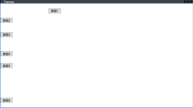
Canvas
是一种布局控件,它允许你通过精确的坐标来定位子元素。这意味着你可以指定每个子元素的 Left、Top、Right 和 Bottom 属性,以确定它们在 Canvas 内的具体位置。这种灵活性使得 Canvas 非常适合创建自定义布局和图形界面。
主要特点
绝对定位:Canvas 使用绝对坐标系统来定位其子元素。你可以通过设置 Canvas.Left 和 Canvas.Top 附加属性(也可以使用 Canvas.Right 和 Canvas.Bottom)来指定子元素的位置。
固定大小:默认情况下,Canvas 不会自动调整其大小以适应其内容。你需要手动设定 Canvas 的宽度和高度,或者让它的大小由外部容器决定。
适合自由布局:由于其基于坐标的定位方式,Canvas 特别适合用于需要精确控制元素位置的场景,比如绘制图表、游戏界面等。
常用属性
Canvas.Left: 设置子元素左边距离 Canvas 左边缘的距离。
Canvas.Top: 设置子元素顶部距离 Canvas 上边缘的距离。
Canvas.Right: 设置子元素右边距离 Canvas 右边缘的距离。
Canvas.Bottom: 设置子元素底部距离 Canvas 下边缘的距离。
Background: 设置 Canvas 背景颜色或图案。
<Window x:Class="chapter2.MainWindow"
        xmlns="http://schemas.microsoft.com/winfx/2006/xaml/presentation"
        xmlns:x="http://schemas.microsoft.com/winfx/2006/xaml"
        xmlns:d="http://schemas.microsoft.com/expression/blend/2008"
        xmlns:mc="http://schemas.openxmlformats.org/markup-compatibility/2006"
        xmlns:local="clr-namespace:chapter2"
        mc:Ignorable="d"
        Title="Canvas" Height="450" Width="800">
    <!-- 画布坐标-->
    <!--Panel.ZIndex="1" 元素顺序-->
    <Canvas>
        <Button Canvas.Top="20" Canvas.Left="200" Content="按钮1" Width="50" Height="20"></Button>
        <Button Canvas.Top="60" Panel.ZIndex="1" Content="按钮2" Width="50" Height="20"></Button>
        <Button Canvas.Top="120" Content="按钮3" Width="50" Height="20"></Button>
        <Button Canvas.Top="200" Content="按钮4" Width="50" Height="20"></Button>
        <Button Canvas.Top="250" Content="按钮5" Width="50" Height="20"></Button>
        <Button Canvas.Bottom="20" Content="按钮6" Width="50" Height="20"></Button>
    </Canvas>
</Window>
效果
第三章 依赖属性和附加属性
1. 依赖属性(Dependency Property)
定义
依赖属性是 WPF 属性系统的核心,用于扩展传统的 .NET 属性。
它允许属性支持数据绑定、动画、样式、资源引用等高级功能。
特点
属性值继承:依赖属性可以从父元素继承值。
默认值支持:可以为依赖属性设置默认值。
属性值优先级:依赖属性的值可以通过多种方式设置(如本地值、样式、模板等),并且有明确的优先级规则。
数据绑定支持:依赖属性可以直接绑定到其他属性或数据源。
资源引用:依赖属性可以引用静态资源或动态资源。
使用场景
用于自定义控件或扩展现有控件的属性。
需要支持数据绑定、动画、样式等功能的属性。
<Window x:Class="chapter3.MainWindow"
        xmlns="http://schemas.microsoft.com/winfx/2006/xaml/presentation"
        xmlns:x="http://schemas.microsoft.com/winfx/2006/xaml"
        xmlns:d="http://schemas.microsoft.com/expression/blend/2008"
        xmlns:mc="http://schemas.openxmlformats.org/markup-compatibility/2006"
        xmlns:local="clr-namespace:chapter3"
        mc:Ignorable="d"
        Title="附加属性" Height="450" Width="800">
    <Grid>
        <local:MyCustomControl Text="依赖属性" MyCustom="111" Height="50" Width="200" TextAlignment="Center" ></local:MyCustomControl>
    </Grid>
</Window>
MyCustomControl.cs
using System;
using System.Collections.Generic;
using System.Linq;
using System.Text;
using System.Threading.Tasks;
using System.Windows;
using System.Windows.Controls;

namespace chapter3
{
    /// <summary>
    /// 依赖属性
    /// 三步骤:定义、注册、包装
    /// </summary>
    public class MyCustomControl : TextBox
    {
        // 注册依赖属性 快捷键  propdp
        public static readonly DependencyProperty MyCustomProperty = DependencyProperty.Register(
            "MyCustom", //属性名
            typeof(string), //数据类型
            typeof(MyCustomControl),//类型,改属性属于哪一个类型
            //OnMyCustomPropertyChanged 属性改变回调函数,coerceValueCallback 强制回调函数
            new PropertyMetadata("默认值", OnMyCustomPropertyChanged,coerceValueCallback),
            new ValidateValueCallback(ValidationData));//验证函数


        // 属性CLR包装器
        public string MyCustom
        {
            get { return (string)GetValue(MyCustomProperty); }
            set { SetValue(MyCustomProperty, value); }
        }

        /// <summary>
        /// 属性改变回调函数
        /// </summary>
        /// <param name="d"></param>
        /// <param name="e"></param>
        private static void OnMyCustomPropertyChanged(DependencyObject d, DependencyPropertyChangedEventArgs e)
        {
            // 处理属性变化
            MessageBox.Show($"{MyCustomProperty}发生了变化!");
        }

        /// <summary>
        /// 强制回调函数
        /// </summary>
        /// <param name="d"></param>
        /// <param name="baseValue"></param>
        /// <returns></returns>
        /// <exception cref="NotImplementedException"></exception>
        private static object coerceValueCallback(DependencyObject d, object baseValue)
        {
            string data = (string)baseValue;
            if (data == null)
            {
                MessageBox.Show($"强制回调222!{data}");
                return "222";
            }
            MessageBox.Show($"强制回调333!{data}");
            return "333";

        }

        /// <summary>
        /// 验证函数
        /// </summary>
        /// <param name="value"></param>
        /// <returns>true|false 验证不通过会报错</returns>
        /// <exception cref="NotImplementedException"></exception>
        private static bool ValidationData(object value)
        {
            string data = (string)value;
            if (data != null)
            {
                MessageBox.Show($"验证true{data}");
                return true;
            }
            MessageBox.Show($"验证false{data}");
            return false;
        }
    }
}
执行顺序:验证>>赋值>>强制回调>>属性改变回调 (验证函数值没改变一次调用一次)
2. 附加属性(Attached Property)
定义
附加属性是一种特殊的依赖属性,它允许一个对象为另一个对象定义属性。
附加属性通常用于布局控件(如 Grid、Canvas)或行为(如 ToolTipService)。
特点
属性附加到其他对象:附加属性可以“附加”到任何对象上,即使该对象本身没有定义该属性。
灵活性高:附加属性可以扩展现有控件的功能,而无需修改控件本身。
常用于布局:例如,Grid.Row 和 Grid.Column 是附加属性,用于定义子元素在 Grid 中的位置。
使用场景
用于布局控件(如 Grid、Canvas)。
用于扩展现有控件的功能(如 ToolTipService.ToolTip)。
public class MyAttachedProperties
{
    // 定义附加属性
    public static readonly DependencyProperty IsEnabledProperty =
        DependencyProperty.RegisterAttached(
            "IsEnabled",
            typeof(bool),
            typeof(MyAttachedProperties),
            new PropertyMetadata(false));

    // Get 方法
    public static bool GetIsEnabled(DependencyObject obj)
    {
        return (bool)obj.GetValue(IsEnabledProperty);
    }

    // Set 方法
    public static void SetIsEnabled(DependencyObject obj, bool value)
    {
        obj.SetValue(IsEnabledProperty, value);
    }
}
在 XAML 中使用附加属性:
<Button local:MyAttachedProperties.IsEnabled="True" Content="Click Me" />
3. 依赖属性与附加属性的区别
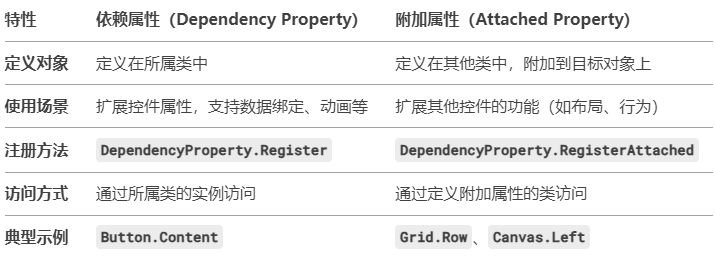
总结
-
依赖属性:用于扩展控件属性,支持数据绑定、动画、样式等功能。
-
附加属性:用于为其他对象定义属性,常用于布局控件或扩展功能。
第四章 事件
事件是用户交互和应用程序逻辑的重要组成部分。WPF 的事件系统基于 .NET 的事件模型,但提供了更强大的功能,如 路由事件(Routed Events) 和 附加事件(Attached Events)。
1 路由事件(Routed Events)
定义:路由事件是一种特殊的事件,它可以在元素树中向上(冒泡)或向下(隧道)传播。
传播方式:
冒泡事件(Bubbling):从事件源元素向上传播到根元素。
隧道事件(Tunneling):从根元素向下传播到事件源元素,一般以Prerview开头。
直接事件(Direct):仅在事件源元素上触发,不传播。
典型示例:
Button.Click 是一个冒泡事件。
PreviewMouseDown 是一个隧道事件。
2. 附加事件(Attached Events)
定义:附加事件是一种特殊的路由事件,它可以在没有定义该事件的类上使用。
典型示例:
Mouse.MouseDown 是一个附加事件,可以在任何元素上使用。
3.事件处理程序
定义:事件处理程序是响应事件的代码逻辑。
注册方式:
在 XAML 中直接绑定:
<Button Click="Button_Click" Content="Click Me" />
在代码中动态注册:
button.Click += Button_Click;
4.WPF 事件的类型
输入事件
鼠标事件:MouseDown、MouseUp、MouseMove、MouseEnter、MouseLeave 等。
键盘事件:KeyDown、KeyUp、TextInput 等。
触摸事件:TouchDown、TouchMove、TouchUp 等。
5.生命周期事件
控件加载和卸载:
Loaded、Unloaded。
控件初始化:
Initialized。
5.布局和渲染事件
布局事件:LayoutUpdated。
渲染事件:Render。
6.数据绑定事件
数据更改事件:DataContextChanged、SourceUpdated、TargetUpdated。
7. 事件处理
事件处理程序可以通过 e.Handled = true 标记事件为已处理,阻止事件继续传播(冒泡和隧道事件)。
8.事件源
通过 e.Source 获取事件的原始触发元素。
通过 e.OriginalSource 获取事件的原始源(通常是具体的子元素)。