The Year is 2012 and This is The Year in Responsive Design
From everyone at ZURB, we want to wish you Happy Holidays and an even happier New Year. On this Christmas Eve, we're taking a look back at the year in responsive design.

This year, we've further dug our heels into responsive design, committing ourselves to becoming the best at it with Foundation, our front-end framework. We weren't the only ones. Other than being the year of the apocalypse-that-never-happened, 2012 was also a big year for responsive design. Here's some of the best the year had to offer.
Responsive Images
When it comes to responsive images, we still have a lot of work to do. But we've started to make progress. We're probably a year or more out from a permanent solution, but we're getting there.
A List Apart got the ball rolling at the start of this year, publishing an excellent article on how responsive images almost work and what we need to do.
Read "Responsive Images: How they Almost Worked"
Apple's new iPad mini added a bit of a vexing viewport problem as well. But it's a problem that's been simmering for sometime. Our friend and advisor Luke Wroblewski and co-writers Peter-Paul Koch, Stephanie Rieger and Lyza Danger Gardner delve deep into this issue.
More and More Companies Turn to Responsive Design
More than a few sites went responsive this year. Here's a few of the big names. Click on the images to go to the sites.
Starbucks
The coffee purveyor's site now comes in tall, grande and venti (or phone, tablet and desktop). Starbucks realized that more and more people were visiting the site on their phones or tablets. At the same time, they knew their site wasn't ideal for those devices. So they decided to do something about it.
Disney
Even Mickey knows responsive is the web of Tomorrowland. As the designers put it:
It should no longer be considered a special feature, it's how any self-respecting website should behave in 2012.
We'd add it's how any site should behave going forward into the New Year.
Microsoft
When Microsoft redesigned its site, Forbes declared that it would introduce mainstream business to responsive design. Microsoft going responsive was huge, showing that even big companies know where the future is headed.
Adobe
The software juggernaut knew that they needed to make their content accessible across multiple devices. And despite the challenges they saw in responsive design, they couldn't deny that it was the solution they needed to meet the needs of their mobile users.
ReadWrite
More than a few tech blogs redesigned their sites to work on any device. One of our favorite redesigns was ReadWrite. We liked it so much that we did an extensive breakdown of the site, highlighting what worked and what could be improved.
Delving Deep Into Responsive Design
We weren't the only ones delving deep into responsive design, asking questions and trying to figure out how to make it better. There's been quite a debate going on and here's some of the best we've seen.
Design Shack questioned if all of us were doing it right. For instance, a simple copy and paste of a media query is not going to be your answer in setting up to fit into your responsive page.
Read "Responsive Design: Why You're Doing It Wrong"
Do we even need Photoshop anymore? This article got us thinking on whether responsive design is making Photoshop obsolete. So is it time to throw it out?
Read "Has Responsive Design Killed Photoshop for Web Designers?"
There's an ongoing battle on whether it's better to have a mobile-only site or a responsive one. Even Google got into the debate, looking at the pros and cons on either side.
Read "Mobile Websites vs Responsive Design"
Page load times can still be a bit of a pain in the butt. Performance is important, so what can we do? This article tells us.
Read "Responsive Responsive Design"
Mobile web strategist Brad Frost has created an incredible hub that's a virtual one-stop shop of patterns, resources and news.
Check Out "This is Responsive"
Our friends at Team Treehouse debuted a responsive design course, solidifying it as an important subject for designers and engineers to learn.
Check Out Team Treehouse's Responsive Design Classes
A Few New Tools
Our responsive toolboxes got a few new tools this year, including some that we at ZURB created.
Responsive Email Templates
When we took our own email campaigns to the responsive level, we were flooded with requests from others to help them do the same. So we put together these templates to help others out.
Get Responsive Email Templates
Responsive Sketchsheets
Sketching is a key component of our process. We realized we needed a way to work through how sites will scale down (or up, for us mobile-firsters) before we even get to coding. That's why we came up with these responsive sketchsheets.
Responsive Tables
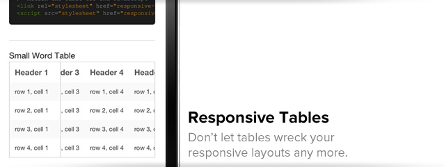
Responsive tables can be a ... well, you know what we're thinking. We decided to do something about it and created these tables to help you out.
Foundation 3.0
And, of course, we released Foundation 3.0, which is the most freakishly advanced responsive front-end framework out there. As we head into the New Year, we're working furiously to release the next great iteration of Foundation.
Other Tools
We weren't the only ones putting out new tools. A sketchbook for responsive design was released this year. There's also a bookmarklet to help you test out your responsive designs within the browser. You can even test your pixel perfection across any device.
We made significant headway this year when it comes to responsive design. 2013 is already shaping up to be the year we take it to the next level, and we plan to be a part of it.
ZURB Marketing Intern Andrew Olsen, Marketer Forrest Kobayashi and Design Lead/Partner Jonathan Smiley contributed to this article.
posted on 2013-01-15 12:32 restService 阅读(152) 评论(0) 编辑 收藏 举报


