
【前端基础】1 - 12 平面变换
§1-12 平面变换
本文示例源码源自 @黑马程序员(bilibili.com),视频地址:
1-12.1 平面变换简介
平面变换由属性 transform 控制,负责控制元素在 2D 层面上的变换,如平移、旋转、倾斜、缩放等。
这些功能一般使用函数实现,也就是说, transform 的值接受代表上述变换的函数。且一个元素可以被同时施加多种不同变换,在不同的值之间使用空格间隔即可。
1-12.2 平移变换
平移变换是基于一个平面变换的,该平面具有一个水平方向轴(x)和垂直方向轴(y),分别指向右和下。
平移变换由以下函数实现:
| 函数 | 说明 |
|---|---|
translate(val) |
元素沿 x 轴的方向平移 |
translate(xVal, yVal) |
元素沿指定方向平移 |
translateX(val) |
元素沿 x 轴方向平移 |
translateY(val) |
元素沿 y 轴方向平移 |
函数值可以写百分比,指示元素会沿指定方向,以自己在该方向上的尺寸的百分比平行移动。
示例:利用平移居中显示一张图片。
<img src="./images/pic.jpg" alt="pic" class="pic">
.pic {
    position: absolute;
    left: center;
    top: center;
    transform: translate(-50%, -50%);
}
1-12.3 旋转变换
旋转变换由函数 rotate(angle) 实现,其中 angle 必须是一个带单位的值。正值表元素向顺时针方向旋转,负值表元素向逆时针方向旋转。
支持的单位有 deg(角度)、rad(弧度)、turn(周)、grad(梯度)。
旋转需要确定旋转中心,元素的旋转中心由属性 transform-origin(变换原点)控制。该属性接受两个值:
transform-origin: horizontalOrigin verticalOrigin;
两个值分别设置水平方向和竖直方向上的原点位置,可接受关键字,如 top, bottom, center。
示例:使用 CSS 实现时钟。
<!-- 表盘 -->
<div class="clock">
    <!-- 刻度线 -->
    <div class="line"></div>
    <div class="line"></div>
    <div class="line"></div>
    <div class="line"></div>
    <div class="line"></div>
    <div class="line"></div>
    <!-- 遮罩 -->
    <div class="mask"></div>
    <!-- 指针 -->
    <div class="hand hour"></div>
    <div class="hand minute"></div>
    <div class="hand second"></div>
    <!-- 螺丝 -->
    <div class="screw"></div>
</div>
.clock {
    margin: 20px auto;
    width: 250px;
    height: 250px;
    border: 8px solid black;
    border-radius: 50%;
    position: relative;
}

.line {
    position: absolute;
    width: 4px;
    height: 250px;
    background-color: #999;
    left: 50%;
    transform: translate(-50%);
}

.clock .line:nth-of-type(1),
.clock .line:nth-of-type(4) {
    width: 5px;
}

.clock .line:nth-of-type(2) {
    transform: translate(-50%) rotate(30deg);
}

.clock .line:nth-of-type(3) {
    transform: translate(-50%) rotate(60deg);
}

.clock .line:nth-of-type(4) {
    transform: translate(-50%) rotate(90deg);
}

.clock .line:nth-of-type(5) {
    transform: translate(-50%) rotate(120deg);
}

.clock .line:nth-of-type(6) {
    transform: translate(-50%) rotate(150deg);
}

.mask {
    position: absolute;
    left: 50%;
    top: 50%;
    transform: translate(-50%, -50%);
    width: 200px;
    height: 200px;
    background-color: #fff;
    border-radius: 50%;
}

.hand {
    position: absolute;
    left: 50%;
    bottom: 50%;
}

.hour {
    width: 6px;
    height: 50px;
    background-color: #333333;
    margin-left: -3px;
    transform: rotate(15deg);
    transform-origin: center bottom;
}

.minute {
    width: 5px;
    height: 65px;
    background-color: #333333;
    margin-left: -3px;
    transform: rotate(0.5turn);
    transform-origin: center bottom;
}

.second {
    width: 4px;
    height: 80px;
    background-color: red;
    margin-left: -2px;
    transform: rotate(220deg);
    transform-origin: center bottom;
}

.screw {
    position: absolute;
    left: 50%;
    top: 50%;
    transform: translate(-50%, -50%);
    width: 18px;
    height: 18px;
    border-radius: 50%;
    background-color: #333;
}
1-12.4 多重变换
前面提到,transform 可以使用复合属性值将多种变换同时应用到一个元素上,这也是实现多重变换的唯一方法。一旦将复合属性拆分成一个个独立的 transform 声明,将只有一个声明生效。
使用多重变换时,后一种变换是基于前一种变换。也就是说,当前一种变换更改了元素的朝向,后一种变换会基于变换后的朝向进行。
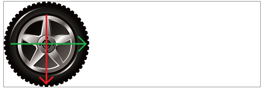
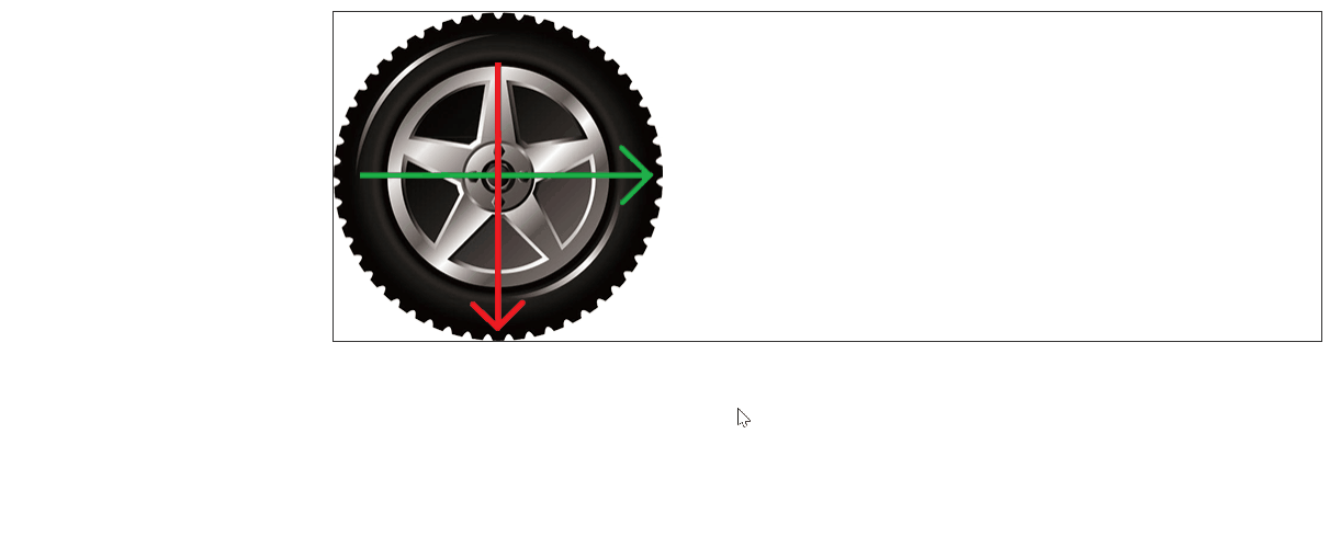
示例:同时涉及平移和旋转的多重变换示例。
<div class="motion">
    <img src="./../../resources/images/tyre.png" alt="轮胎">
</div>
基础 CSS 样式:
.motion {
    margin: 10px auto;
    width: 900px;
    height: 300px;
    border: 1px solid #333333;
}

.motion img {
    width: 300px;
    height: 300px;
    transition: all 1s;
}
先平移后旋转:
.motion:hover img {
    transform: translate(600px) rotate(1turn);
}
先旋转后平移:
.motion:hover img {
    transform: rotate(1turn) translate(600px);
}
使用复合属性值实现多重变换时应当注意前者对后者朝向变化的影响。
1-12.5 缩放变换
缩放变换通过以下函数实现:
| 函数 | 说明 |
|---|---|
scale(scale) |
等比例地按照指定缩放比例缩放元素 |
scaleX(scale) |
等比例地在指定方向上按照指定缩放比例缩放元素 |
scaleY(scale) |
等比例地在指定方向上按照指定缩放比例缩放元素 |
一般而言,使用 scale(scale) 即可实现等比例变换。
示例:鼠标悬停时图片放大且添加遮罩
<div class="pic">
    <img src="./../../resources/images/product.jpeg" alt="产品">
    <div class="mask"></div>
</div>
.pic {
    position: relative;
    margin: 10px auto;
    width: 400px;
    height: 300px;
    overflow: hidden;
}

.pic img {
    width: inherit;
    height: inherit;
    transition: all .5s;
}

.mask {
    position: absolute;
    top: 0;

    width: inherit;
    height: inherit;
    background: #000;
    opacity: 0;
    transition: all .5s;
}

.pic:hover img {
    transform: scale(1.1);
}

.pic:hover .mask {
    opacity: 0.15;
}
1-12.6 倾斜变换
倾斜变换通过 skew(angle) 实现,参数定义倾斜角度,正值表示元素往左倾斜,负值表示元素往右倾斜。
示例:倾斜变换演示
<div class="block"></div>
.block {
    margin: 20px auto;
    width: 300px;
    height: 500px;
    background-color: pink;
    border-radius: 5px;
    transition: all .5s;
}

.block:hover {
    transform: skew(-15deg);
}
1-12.7 渐变
CSS 也支持渐变,是属性 background-image 的函数值。渐变分为两种,线性渐变和径向渐变。
1-12.7.1 线性渐变
线性渐变由函数 linear-gradient() 实现。
/* 语法 */
background-image: linear-gradient(
	angle,				/* 可选,默认从上到下 */
	color1 proportion,	/* 颜色所占比例可选,默认为均分,常用百分比 */
	color2 proportion,	/* 可自由添加多种颜色 */
	...
);
其中,angle 指定了渐变色的过渡方向。可用 to + 方位名词(如 to right,从左到右)修改,或使用角度(如 45deg)。
可以在每个颜色后使用空格分隔,并指定颜色所占比例,一般常用百分比,也可用像素。
提示:可在第三方网站上查找合适的渐变色配色方案。如 Grabient。
示例:给新闻头图添加渐变背景提高文字辨识度。
<div class="news">
    <a href="#" target="_self">
        <img src="../../resources/images/huawei.jpg" alt="6G">
        <div class="mask"></div>

        <div class="heading">
            <p class="category">成功故事</p>
            <h4 class="title">打造海拔最高、充电更快的318川藏超充绿廊</h4>
            <p class="intro">华为全液超冷充,让有路的地方就有充电</p>
        </div>
    </a>
</div>
* {
    margin: 0;
    padding: 0;
    box-sizing: border-box;
}

.news {
    position: relative;
    width: 446px;
    height: 315px;
    margin: 20px auto;
    overflow: hidden;
}

.news img {
    width: 100%;
    height: 100%;
    transition: all .5s;
}

.news:hover img {
    transform: scale(110%);
}

.mask {
    position: absolute;
    top: 0;
    left: 0;
    width: 100%;
    height: 100%;
    background-image: linear-gradient(
        transparent 60%,
        rgba(0, 0, 0, 0.5)
    );
    transition: all .5s;
}

.news:hover .mask {
    background-image: linear-gradient(
        transparent 20%,
        rgba(0, 0, 0, 0.7)
    );
}

.heading {
    position: absolute;
    left: 0;
    bottom: 0;
    padding: 30px;
    width: 100%;
    color: white;
}

.category {
    font-size: 0.91em;
    line-height: 1.8em;
}

.title {
    font-size: 1.2em;
    line-height: 1.4em;
}

.intro {
    font-size: 0.875em;
    line-height: 1.8em;
    opacity: 0.7;
}
实现效果:

1-12.7.2 径向渐变
径向渐变由函数 radial-gradient 实现。
background-image: radial-gradient(
	radius at start_position,
	color1 proportion,
	color2 proportion,
	...
);
其中,radius 指定渐变半径,at 后的 start_position 指定圆心位置(如 center center 以元素水平和垂直剧中的位置开始渐变)。圆心位置也可以是一组像素单位取值。
半径可以有两个,表示一个椭圆。
示例:鼠标悬停时的按钮高光。
<button>了解更多</button>
* {
    margin: 0;
    padding: 0;
    box-sizing: border-box;
}

.box {
    width: 200px;
    height: 200px;
    margin: 20px auto;
    border: 1px solid black;
    border-radius: 50%;
    background-image: radial-gradient(
            75px at center center,
            red,
            pink
    );
}

button {
    display: block;
    margin: 20px auto;
    width: 100px;
    height: 60px;
    border: 1px solid black;
    border-radius: 5px;
    background-color: #ffffff;
    transition: all 0.5s;
    cursor: pointer;
    font-size: 1em;
    color: black;
}

button:hover {
    background-color: black;
    color: white;
    background-image: radial-gradient(
        50px 30px at center center,
        rgba(255, 255, 255, 0.8),
        transparent
    );
}

 浙公网安备 33010602011771号