科学计算和可视化(1)
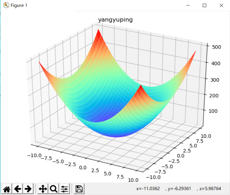
一、三维图像的绘画
 1 from matplotlib import pyplot as plot #用来绘制图形
 2 import matplotlib.pyplot as plt
 3
 4 import numpy as np  #用来处理数据
 5
 6 from mpl_toolkits.mplot3d import Axes3D  #用来给出三维坐标系。
 7 figure = plot.figure()
 8
 9 #画出三维坐标系:
10
11 axes = Axes3D(figure)
12
13
14 X = np.arange(-10, 10, 0.25)
15
16 Y = np.arange(-10, 10, 0.25)
17 plt.title("yangyuping")            #其中,loc表示位置的;
18
19 X, Y = np.meshgrid(X, Y)
20
21 Z = 3*(X)**2 + 2*(Y)**2 + 5
22
23 #绘制曲面,采用彩虹色着色:
24
25 axes.plot_surface(X, Y, Z,cmap='rainbow')
26
27
28 #图形可视化:
29
30 plot.show()
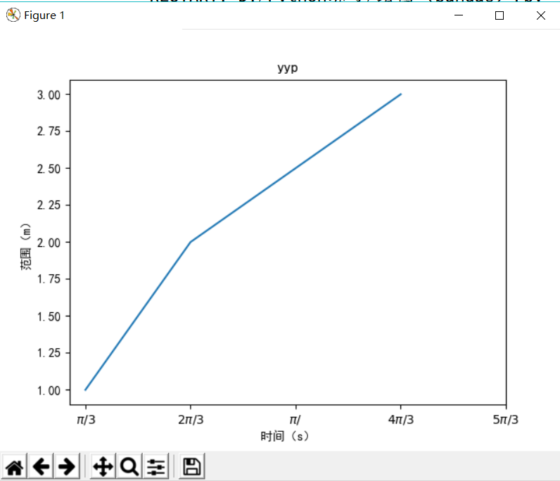
二、折线图的绘制
 1 import matplotlib.pyplot as plt
 2 import matplotlib
 3 matplotlib.rcParams['font.family']='SimHei'
 4 matplotlib.rcParams['font.sans-serif']=['SimHei']
 5 plt.plot([1,2,4],[1,2,3])
 6 plt.title('yyp')     #坐标系标题
 7 plt.xlabel('时间(s)')
 8 plt.ylabel('范围(m)')
 9 plt.xticks([1,2,3,4,5],[r'$\pi/3$',r'$2\pi/3$',r'$\pi/$',r'$4\pi/3$',r'$5\pi/3$',])
10 plt.show()
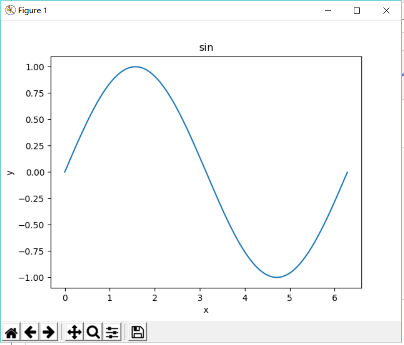
三、sin函数绘制
 1 import numpy as np
 2
 3 import pylab as pl
 4
 5      #绘制线条的库
 6 t = np.arange(0.0, 2.0*np.pi, 0.01)    #sin x//t相当于x
 7 s=pl.sin(t)           #t相当于y
 8 pl.plot(t,s)
 9 pl.xlabel('x')
10 pl.ylabel('y')
11 pl.title('sin')
12 pl.show()
四、散点图的绘制
(1)
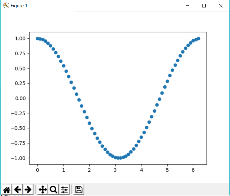
1 import numpy as np
2 import pylab as pl     #绘制线条的库
3 a=np.arange(0,2.0*np.pi,0.1)   #arange函数用于创建等差数组
4 b=np.cos(a)
5 pl.scatter(a,b)   #散点控制的类
6 pl.show()
(2)
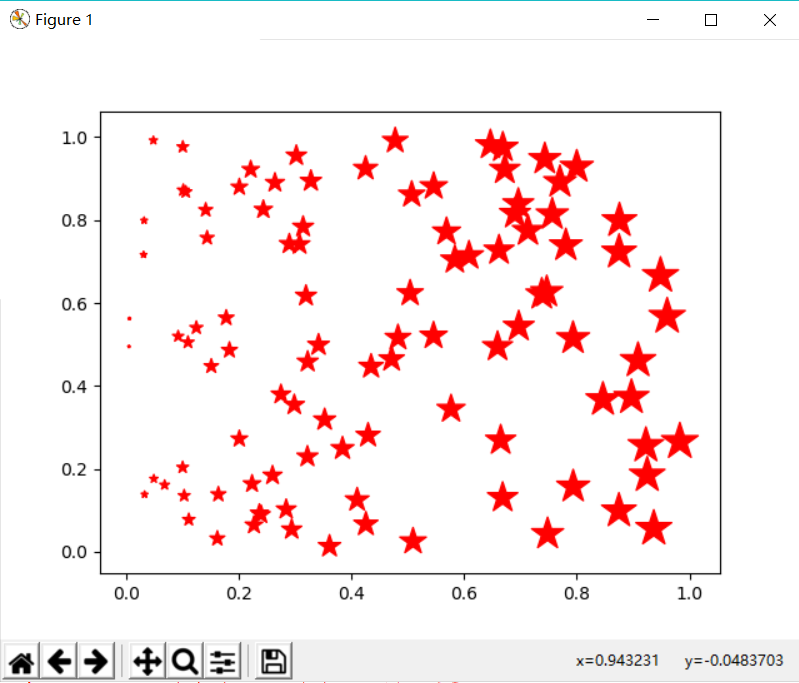
1 import matplotlib.pylab as pl
2 import numpy as np
3 x = np.random.random(100)
4 y = np.random.random(100)
5 pl.scatter(x,y,s=x*500,c=u'r',marker=u'*')   #s指大小,c指颜色,marker指符号形状,scatter散点控制的类
6 pl.show()
六、饼图的绘制
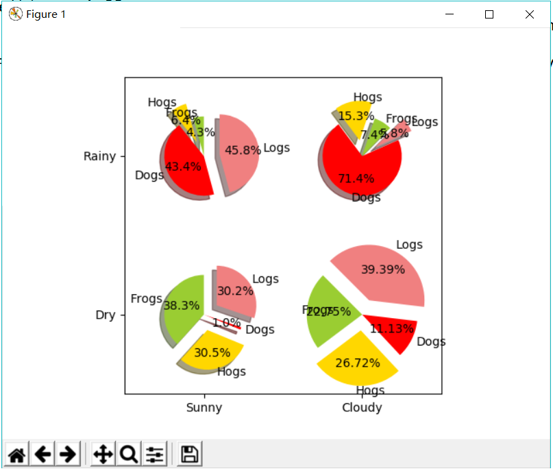
 1 import numpy as np
 2 import matplotlib.pyplot as plt
 3 #The slices will be ordered and plotted counter-clockwise.
 4 labels = 'Frogs', 'Hogs', 'Dogs', 'Logs'
 5 colors = ['yellowgreen', 'gold', '#FF0000', 'lightcoral']
 6 explode = (0, 0.1, 0, 0.1)              # 使饼状图中第2片和第4片裂开
 7 fig = plt.figure()
 8 ax = fig.gca()
 9
10 ax.pie(np.random.random(4), explode=explode, labels=labels, colors=colors,
11          autopct='%1.1f%%',shadow=True, startangle=90,
12          radius=0.25, center=(0, 0), frame=True)   # autopct设置饼内百分比的格式
13 ax.pie(np.random.random(4), explode=explode, labels=labels, colors=colors,
14         autopct='%1.1f%%', shadow=True, startangle=45,
15         radius=0.25, center=(1, 1), frame=True)
16 ax.pie(np.random.random(4), explode=explode, labels=labels, colors=colors,
17          autopct='%1.1f%%', shadow=True, startangle=90,radius=0.25, center=(0, 1), frame=True)
18
19 ax.pie(np.random.random(4), explode=explode, labels=labels, colors=colors,
20         autopct='%1.2f%%', shadow=False, startangle=135,
21         radius=0.35,center=(1, 0), frame=True)
22
23 ax.set_xticks([0, 1])                    # 设置坐标轴刻度
24 ax.set_yticks([0, 1])
25 ax.set_xticklabels(["Sunny", "Cloudy"])  # 设置坐标轴刻度上的标签
26
27 ax.set_yticklabels(["Dry", "Rainy"])
28 ax.set_xlim((-0.5, 1.5))                 # 设置坐标轴跨度
29 ax.set_ylim((-0.5, 1.5))
30 ax.set_aspect('equal')                   # 设置纵横比相等
31
32 plt.show()
七、绘制带有中文标签和图例的图
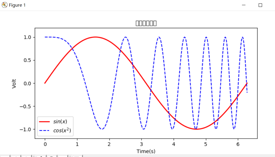
 1 import numpy as np
 2 import matplotlib.pyplot as plt
 3 x = np.linspace(0,2*np.pi,500)
 4 y = np.sin(x)
 5 z = np.cos(x*x)
 6 plt.figure(figsize=(8,4))
 7 #标签前后加$将使用内嵌的LaTex引擎将其显示为公式
 8 plt.plot(x,y,label='$sin(x)$',color='red',linewidth=2)#红色,2个像素宽
 9 plt.plot(x,z,'b--',label='$cos(x^2)$')#蓝色,虚线
10 plt.xlabel('Time(s)')
11 plt.ylabel('Volt')
12 plt.title('Sin and Cos figure using pyplot')
13 plt.ylim(-1.2,1.2)
14 plt.legend()
15 plt.show()  #显示图示
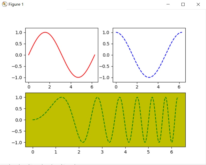
八、使用pyplot绘制,多个图形单独显示
 1 import numpy as np
 2
 3 import matplotlib.pyplot as plt
 4
 5 x= np.linspace(0, 2*np.pi, 500)            # 创建自变量数组
 6
 7 y1 = np.sin(x) # 创建函数值数组
 8 y2 = np.cos(x)
 9
10 y2 = np.cos(x)
11 y3 = np.sin(x*x)
12
13 plt.figure(1)                              # 创建图形
14
15 ax1 = plt.subplot(2,2,1)                   # 第一行第一列图形
16
17 ax2 = plt.subplot(2,2,2)                   # 第一行第二列图形
18
19 ax3 = plt.subplot(212, facecolor='y')      # 第二行
20 plt.sca(ax1)                               # 选择ax1
21
22 plt.plot(x,y1,color='red')                 # 绘制红色曲线
23 plt.ylim(-1.2,1.2)                         # 限制y坐标轴范围
24
25 plt.sca(ax2)                               # 选择ax2
26
27 plt.plot(x,y2,'b--')                       # 绘制蓝色曲线
28 plt.ylim(-1.2,1.2)
29
30 plt.sca(ax3)                               # 选择ax3
31 plt.plot(x,y3,'g--')
32 plt.ylim(-1.2,1.2)
33
34 plt.show()