微信小程序(自定义底部篇)
要点:###
- 需要把 custom-tab-bar 文件放在pages同级
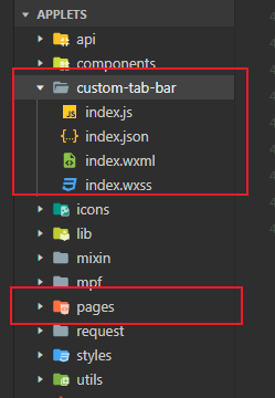
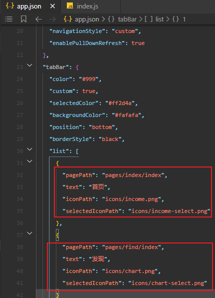
- 在app.json中配置底部导航栏代码(没配置不能点击)
- 开始放代码:
在app.json中配置
"usingComponents": {
    "custom-tab-bar": "./custom-tab-bar/index"
  },
wxml:
<view class="tab-bar">
  <view wx:for="{{list}}" wx:key="index" class="tab-bar-item {{item.bulge?'bulge':''}}" data-path="{{item.pagePath}}" data-index="{{index}}" bindtap="switchTab">
    <view  wx:if="item.bulge" class="tab-bar-bulge tab-bar-view"></view>
    <image class="image" src="{{selected === index ? item.selectedIconPath : item.iconPath}}"></image>
    <view  wx:if="{{item.text}}" style="color: {{selected === index ? selectedColor : color}}" class="tab-bar-view">{{item.text}}</view>
  </view>
</view>
wxss:
.tab-bar {
  position: fixed;
  bottom: 0;
  left: 0;
  right: 0;
  height: 48px;
  background: #FFF;
  display: flex;
  line-height: 1.2;
  padding-bottom: env(safe-area-inset-bottom);
  /* border-top: 1px solid #e6e6e6; */
}

.tab-bar-item {
  flex: 1;
  text-align: center;
  display: flex;
  justify-content: center;
  align-items: center;
  flex-direction: column;
}
.tab-bar-item .image {
  width: 27px;
  height: 27px;
}
.bulge {
  background-color: #FFF;
  display: flex;
  align-items: center;
  justify-content: center;
}
.bulge .image{
  width: 90rpx;
  height: 90rpx;
}

.tab-bar-item .tab-bar-view {
  font-size: 10px;
  margin-top: 5rpx;
}
js:
onShow: function () {
    if (typeof this.getTabBar === 'function' && this.getTabBar()) {
      this.getTabBar().setData({
        //selected 代表顺序
        selected: 0
      })
    }
  },