Kaggle_Data Visulazation of line charts
step0 setup
set up pyhton libraries
import pandas as pd
pd.plotting.register_matplotlib_converters()
import matplotlib.pyplot as plt
%matplotlib inline
import seaborn as sns
print("Setup Complete")
set up code checking
# Set up code checking
import os
if not os.path.exists("../input/museum_visitors.csv"):
    os.symlink("../input/data-for-datavis/museum_visitors.csv", "../input/museum_visitors.csv")
from learntools.core import binder
binder.bind(globals())
from learntools.data_viz_to_coder.ex2 import *
print("Setup Complete")
step1 load the data
# Path of the file to read
spotify_filepath = "../input/spotify.csv"

# Read the file into a variable spotify_data
spotify_data = pd.read_csv(spotify_filepath, index_col="Date", parse_dates=True)
# Path of the file to read
museum_filepath = "../input/museum_visitors.csv"

# Fill in the line below to read the file into a variable museum_data
museum_data = pd.read_csv(museum_filepath, index_col="Date", parse_dates=True)

# Run the line below with no changes to check that you've loaded the data correctly
step_1.check()
step2 review the data
# Path of the file to readmuseum_filepath = "../input/museum_visitors.csv"
# Fill in the line below to read the file into a variable museum_datamuseum_data = pd.read_csv(museum_filepath, index_col="Date", parse_dates=True)
# Run the line below with no changes to check that you've loaded the data correctlystep_1.check()
打印最后5行数据
# Print the last five rows of the data
museum_data.tail()
# Your code here
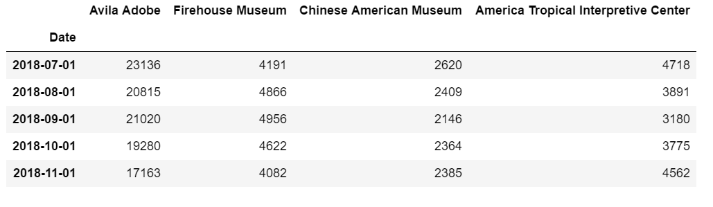
根据表格填空
# Fill in the line below: How many visitors did the Chinese American Museum
# receive in July 2018?
ca_museum_jul18 = 2620

# Fill in the line below: In October 2018, how many more visitors did Avila
# Adobe receive than the Firehouse Museum?
avila_oct18 = 19280-4622

# Check your answers
step_2.check()
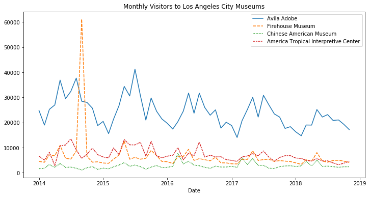
step3 convince the museum board
figsize(x,y)函数,x和y分别为宽和长
绘制直方图
# Line chart showing the number of visitors to each museum over time
plt.figure(figsize=(12,6))
sns.lineplot(data=museum_data)
plt.title("Monthly Visitors to Los Angeles City Museums")
得到图片如下
函数sns.lineplot(data=xxx) for example, xxx=financial_data就表示数据集,xxx是可替代的
所以拿到一个新的数据集,如何绘制直方图,如下:
//set the width and height
sns.lineplot(data=financial_data)

//add title
plt.title("Daily Global Streams of Popular Songs in 2017-2018")

//Line chart showing daily global streams of 'Shape of You'
sns.lineplot(data=spotify_data['Shape of you'],label='Shape of you')

//Line chart showing daily global streams of 'Despacito'
sns.lineplot(data=spotify_data['Despacito'], label='Despacito')

//Add label for horizontal axis
plt.title('Date')


 浙公网安备 33010602011771号