最近公司需要写自己的微信小程序,正好可以利用这个机会接触一下微信小程序,今天自己写了一个模仿今日头条的导航,算是对几个小的知识点的整合吧。
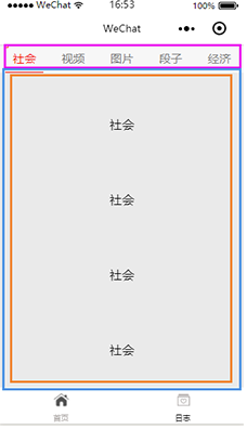
完成之后的效果图就是这样的,在首页页面里,点击上面的菜单栏,下面的内容会根据上面而变化,在下面的内容部分,因为内容多少不确定,设置成了可以滚动的。因此,为了实现上面的效果,我们需要用到view组件、swiper组件和scroll-view组件。
view组件
在小程序开发文档中,将view称为视图容器,通过设置view的fle-direction,可以实现容器内部的排列样式,当flex-direction:row时,容器内部元素横向排列,当flex-direction:column时,容器内部元素纵向排列。除了文档上给出的属性外,还有两个相关属性,
justify-content 主轴的对齐方式(如果flex-direction为row则主轴就是水平方向),可选属性 (‘flex-start’, ‘flex-end’, ‘center’, ‘space-between’, ‘space-around’);
align-items 侧轴对齐方式如果flex-direction为row则侧轴就是垂直方向),可选属性 (‘flex-start’, ‘flex-end’, ‘center’)。下面是实现导航栏部分的代码:
index.wxml
<view class="top-tab">
<view class="top-tab-item {{currentTopItem==idx ? 'active' : ''}}" wx:for="{{topTabItems}}" wx:for-index="idx" data-idx="{{idx}}" bindtap="switchTab">
{{item}}
</view>
index.wxss
.top-tab{
width:100%;
height:36px;
border-top:1px solid #ddccdc;
color:#7b7b7b;
font-size:15px;
background-color:
#f7f7f7;
display: flex;
flex-direction:row;
justify-content: space-around;
align-items: center;
position:fixed;
top:0;
}
.top-tab .top-tab-item{
width:50px;
height:35px;
line-height: 35px;
text-align: center;
}
.top-tab-item.active {
border-bottom:2px solid red;
color: red;
}
index.js
data: {
topTabItems: ["社会", "视频", "图片", "段子", "经济"],
currentTopItem: "0",
},
switchTab: function (e) {
this.setData({
currentTopItem: e.currentTarget.dataset.idx
});
},
在上面的代码中,首先我们构件了一个存放导航条目的容器.top-tab,并进行相关设置display: flex; flex-direction:row; justify-content: space-around; align-items: center; 保证了容器内部的元素纵向排列,内部容器的实现使用了循环,并添加了点击事件,使得在点击的时候可以快速判断出是哪个条目,为下面的内容做准备。
scroll-view组件
在小程序开发文档中,将scroll-view称为可滚动视图区域,通过一对标签scroll-view包裹起来的内容是可以在设置的方向上滚动的,在文档中,列举了很多相关的属性,但我们这里只是举例,便只做出了最简单的滚动样式,具体详细的属性用法可以参看文档。
index.wxml
<scroll-view class="scrollView" scroll-y="true">
<view class="swiperText">{{item}}</view>
<view class="swiperText">{{item}}</view>
<view class="swiperText">{{item}}</view>
<view class="swiperText">{{item}}</view>
<view class="swiperText">{{item}}</view>
<view class="swiperText">{{item}}</view>
<view class="swiperText">{{item}}</view>
<view class="swiperText">{{item}}</view>
<view class="swiperText">{{item}}</view>
</scroll-view>
index.wxss
.swiperText{
width:100%;
height:100px;
line-height: 100px;
text-align: center;
}
.scrollView{
height: 100%;
background-color:
#eaeaea;
}
::-webkit-scrollbar{
width:0;
height:0;
}
在这段代码中,通过设置滚动容器.scrollView的scroll-y="true";使得容器在y中方向上可以滚动,另外通过最后的那两行样式,将滚动条隐藏了。
swiper组件
在小程序开发文档中,将swiper称为视图滑块容器,内容也是可以滑动的,关于swiper,在开发文档中也列出来很多的属性,我们这边只是简单的说一下我们待会儿需要用的几个属性,首先是current,当前所在滑块的index,也就是控制当前显示的滑块的;duration,滑动动画的时长,这个自己按需设置就好了;bindchange,current 改变时会触发 change 事件,event.detail = {current: current, source: source},当我们改变current的时候,会触发的相关事件。先来看一下我们的实现代码。
index.wxml
<view class="top-tab">
<view class="top-tab-item {{currentTopItem==idx ? 'active' : ''}}" wx:for="{{topTabItems}}" wx:for-index="idx" data-idx="{{idx}}" bindtap="switchTab" >
{{item}}
</view>
</view>
<swiper class="swiper" current="{{currentTopItem}}" bindchange="bindChange" duration="300" style="height:{{swiperHeight}}px" >
<block wx:for="{{topTabItems}}" >
<swiper-item>
<scroll-view class="scrollView" scroll-y="true">
<view class="swiperText">{{item}}</view>
<view class="swiperText">{{item}}</view>
<view class="swiperText">{{item}}</view>
<view class="swiperText">{{item}}</view>
<view class="swiperText">{{item}}</view>
<view class="swiperText">{{item}}</view>
<view class="swiperText">{{item}}</view>
<view class="swiperText">{{item}}</view>
<view class="swiperText">{{item}}</view>
</scroll-view>
</swiper-item>
</block>
</swiper>
index.wxss
.swiper{
display: block;
width: 100%;
overflow: hidden;
margin: 0;
border: 0;
margin-top: 37px;
background-color:
#eaeaea;
}
index.js
data: {
topTabItems: ["社会", "视频", "图片", "段子", "经济"],
currentTopItem: "0",
swiperHeight: "0"
},
onReady: function () {
var that = this;
wx.getSystemInfo({
success: function (res) {
that.setData({
swiperHeight: (res.windowHeight - 37)
});
}
})
},
switchTab: function (e) {
this.setData({
currentTopItem: e.currentTarget.dataset.idx
});
},
bindChange: function (e) {
var that = this;
that.setData({
currentTopItem: e.detail.current
});
}
首先,我们通过构建了一个容器.swiper,滑块部分就是每一个scroll-view了,我们默认将current设置为0,也就是默认显示第一个滑块部分了,因为容器的可活动范围=界面可操作范围 - 顶部导航部分,因此在高度上面上面做了一个设置,至于scroll-view的大小,默认是同滑块容器也就是.swiper相同的,我们知道上面导航部分的菜单和下面滑块是一一对应的,因此,我们只需要current同上面的index关联就可以了,也就是前面导航部分说的点击事件了。


