潭州学院html学习(day08)
一.浮动
浮动是css布局里面用的最多的属性
浮动:使元素脱离文档流,按照指定方向(左右)发生移动,遇到父边界或者相邻的浮动元素停了下来。
文档流: 是文档中可显示对象在排列时所占用的位置/空间(在页面中占位置)。
脱离文档流: 在页面中不占位置 ,CSS 中通过 float 属性实现元素的浮动
排列规则:
1. 第一个浮动元素遇到父级边缘的时候停止浮动。
2. 其它元素在横向遇见相邻浮动元素的时候停止
3. 当父元素宽度不够时在下一排排列。但是,在换行的过程中有元素高度比换行前相邻元素的高的时候,元素就会被“卡”住。
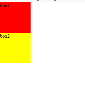
现有两个div,他们的属性如下:
 1 <!DOCTYPE html>
 2 <html lang="en">
 3 <head>
 4     <meta charset="UTF-8">
 5     <title>浮动概括</title>
 6     <style>
 7         *{margin: 0;padding: 0;}
 8         ul,ol{list-style: none;}
 9         a{text-decoration: none;color: inherit;}
10         .box1{
11             background-color: red;
12             width:100px;
13             height:100px;
14         }
15         .box2{
16             background-color: yellow;
17             width:100px;
18             height:100px;
19
20         }
21         .box3{
22             background-color: blue;
23             width:100px;
24             height:100px;
25
26
27         }
28     </style>
29 </head>
30 <body>
31 <div class="box1">box1</div>
32 <div class="box2">box2</div>
33
34 </body>
35 </html>
效果:
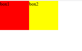
给他们的div增加浮动属性,如:float:left,效果如下,
 .box1{
            background-color: red;
            width:100px;
            height:100px;
            float: left;
        }
        .box2{
            background-color: yellow;
            width:100px;
            height:100px;
            float: left;
        }
这就达到了浮动的效果。此时,两个元素并排了,并且两个元素都能够设置宽度、高度了
浮动的元素脱离
  .box1{
            background-color: red;
            width:100px;
            height:100px;
            float: left;
        }
        .box2{
            background-color: yellow;
            width:200px;
            height:200px;
        }
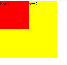
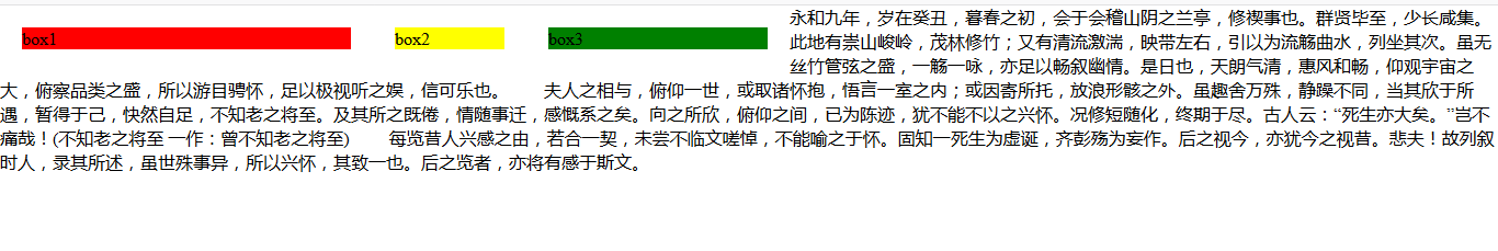
红色的盒子box1有属性float:left,黄色的盒子没有属性float,box1脱离文档流,所以box2就是标准文档流中的第一个盒子,所以box1就附着在上面。
浮动的元素互相贴靠
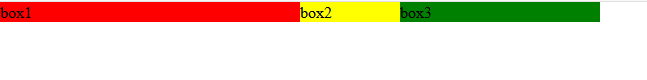
我们给三个div均设置了float: left;属性之后,然后设置宽高。当改变浏览器窗口大小时,可以看到div的贴靠效果:
  .box1{
            background-color: red;
            width:300px;
            height:100px;
            float: left;
        }
        .box2{
            background-color: yellow;
            width:100px;
            height:100px;
            float: left;
        }
        .box3{
            background: green;
            width:200px;
            height: 100px;
            float:left;
        }
宽高特性:
a、无论什么类型的元素,只要浮动就支持设置宽高,但是当未设置宽高时由内容撑开
b、支持margin,但不支持 margin:auto;
c、可以解决垂直外边距合并问题
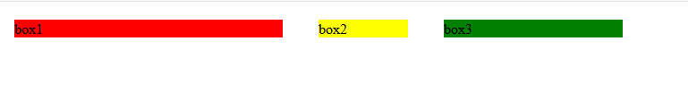
给上面的例子去掉高度height,我们发现的效果如下:
.box1{
            background-color: red;
            width:300px;
            float: left;
        }
        .box2{
            background-color: yellow;
            width:100px;
            float: left;
        }
        .box3{
            background: green;
            width:200px;
            float:left;
        }
给他们加相应的margin:20px
  .box1{
            background-color: red;
            width:300px;
            float: left;
            margin: 20px;
        }
        .box2{
            background-color: yellow;
            width:100px;
            float: left;
            margin: 20px;
        }
        .box3{
            background: green;
            width:200px;
            float:left;
            margin: 20px;
        }
层级特性:
a、浮动元素之后未浮动元素会在浮动元素的下方显示,但是浮动元素之前的未浮动元素不会被影响,因为浮动元素只能对后面的元素产生影响。
b、文字不会出现在浮动的元素的下方而是围绕浮动元素显示
<!DOCTYPE html>
<html lang="en">
<head>
    <meta charset="UTF-8">
    <title>浮动概括</title>
    <style>
        *{margin: 0;padding: 0;}
        ul,ol{list-style: none;}
        a{text-decoration: none;color: inherit;}
        .box1{
            background-color: red;
            width:300px;
            float: left;
            margin: 20px;
        }
        .box2{
            background-color: yellow;
            width:100px;
            float: left;
            margin: 20px;
        }
        .box3{
            background: green;
            width:200px;
            float:left;
            margin: 20px;
        }
    </style>
</head>
<body>
<div class="box1">box1</div>
<div class="box2">box2</div>
<div class="box3">box3</div>
<p>永和九年,岁在癸丑,暮春之初,会于会稽山阴之兰亭,修禊事也。群贤毕至,少长咸集。此地有崇山峻岭,茂林修竹;又有清流激湍,映带左右,引以为流觞曲水,列坐其次。虽无丝竹管弦之盛,一觞一咏,亦足以畅叙幽情。是日也,天朗气清,惠风和畅,仰观宇宙之大,俯察品类之盛,所以游目骋怀,足以极视听之娱,信可乐也。

      夫人之相与,俯仰一世,或取诸怀抱,悟言一室之内;或因寄所托,放浪形骸之外。虽趣舍万殊,静躁不同,当其欣于所遇,暂得于己,快然自足,不知老之将至。及其所之既倦,情随事迁,感慨系之矣。向之所欣,俯仰之间,已为陈迹,犹不能不以之兴怀。况修短随化,终期于尽。古人云:“死生亦大矣。”岂不痛哉!(不知老之将至 一作:曾不知老之将至)

      每览昔人兴感之由,若合一契,未尝不临文嗟悼,不能喻之于怀。固知一死生为虚诞,齐彭殇为妄作。后之视今,亦犹今之视昔。悲夫!故列叙时人,录其所述,虽世殊事异,所以兴怀,其致一也。后之览者,亦将有感于斯文。</p>
</body>
</html>
效果:
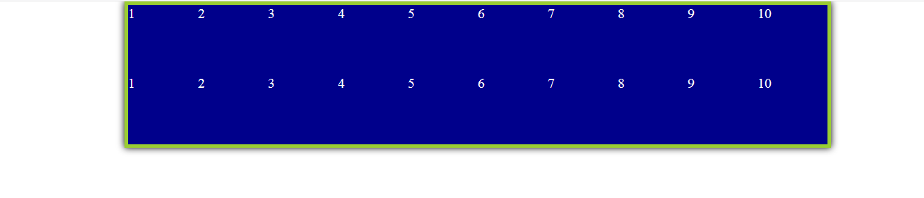
二.清除浮动
 1 <!DOCTYPE html>
 2 <html lang="en">
 3 <head>
 4     <meta charset="UTF-8">
 5     <title>浮动概括</title>
 6     <style>
 7         *{margin: 0;padding: 0;}
 8         ul,ol{list-style: none;}
 9         a{text-decoration: none;color: inherit;}
10         .clearfix:after{
11             content: '';
12             display: block;
13             clear: both;
14         }
15         .container{
16             width: 1000px;
17             /* height: 300px; */
18             margin: auto;
19             box-shadow: 0 0 10px 0 #000;
20             border: 5px solid yellowgreen;}
21         ul li{
22             float: left;
23             /* float: right; */
24             width: 100px;
25             height: 100px;
26             background: darkblue;
27             font-size: 20px;
28             color: #fff;
29             /* margin: 10px; */
30         }
31     </style>
32 </head>
33 <body>
34 <div class="container">
35     <!-- <div class="box1"></div> -->
36     <ul class="clearfix">
37         <li>1</li>
38         <li>2</li>
39         <li>3</li>
40         <li>4</li>
41         <li>5</li>
42         <li>6</li>
43         <li>7</li>
44         <li>8</li>
45         <li>9</li>
46         <li>10</li>
47     </ul>
48
49     <ul class="clearfix">
50         <li>1</li>
51         <li>2</li>
52         <li>3</li>
53         <li>4</li>
54         <li>5</li>
55         <li>6</li>
56         <li>7</li>
57         <li>8</li>
58         <li>9</li>
59         <li>10</li>
60     </ul>
61
62 </div>
63 </body>
64 </html>
三.定位
定位:定位属性(position)允许元素相对于其自身所在的位置、父级定位元素、浏览器窗口(取决于属性值)进行移动。
理解定位(static是默认的)
<!DOCTYPE html>
<html lang="en">
<head>
    <meta charset="UTF-8">
    <title>定位</title>
    <style>
        *{margin: 0;padding: 0;}
        ul,ol{list-style: none;}
        a{text-decoration: none;color: inherit;}
        .c1{
            width: 100px;
            height: 100px;
            background-color: brown;

            left:20px;
            top:20px;
        }

        .c2{
            width: 100px;
            height: 100px;
            background-color: blue;
        }

        .c3{
            width: 100px;
            height: 100px;
            background-color: black;
        }
    </style>
</head>
<body>
<div class="c1"></div>
<div class="c2"></div>
<div class="c3"></div>
</body>
</html>
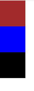
初始图
偏移量:元素添加定位属性与属性值后,只会出现在默认的位置,如果想要移动它,还需要添加与定位配合使用的偏移量属性。
left:元素左边与参照物左边的距离
right:元素右边与参照物右边的距离
top:元素上边与参照物上边的距离
bottom:元素下边与参照物下边的距离
值:
固定数值:div{ position:relative; left:100px; top:100px; }
百分比:div{ position:absolute; right:50%; bottom:50%; } 相对于父级盒子宽高
PS:一般同轴向(X、Y)的偏移量属性通常只会出现一个。
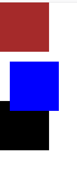
1. 相对定位:相对于最初应该出现的位置定位,不脱离文档流。
特点:元素框最初位置仍然保留,不脱离文档流(阻碍布局,因此,一般不用其定位,但不给偏移量不影响元素)
 .c1{
            width: 100px;
            height: 100px;
            background-color: brown;

        }

        .c2{
            width: 100px;
            height: 100px;
            background-color: blue;
            position: relative;/*相对定位,占位置,相对于自己原来的位置来定位*/
            left:20px;
            top:20px;
        }

        .c3{
            width: 100px;
            height: 100px;
            background-color: black;
        }
2. 绝对定位:相对于最近的父级定位元素定位,如没有定位父级元素,则相对body定位(注意:在使用bottom的时候是相对于可视化窗口进行定位)。使用偏移量后会相对定位父级移动,脱离文档流。
特点:
1. 使元素脱离文档流
2. 所有类型元素使用绝对定位就支持宽高
3. 支持margin,但是margin:auto失效
 .c1{
            width: 100px;
            height: 100px;
            background-color: brown;

        }

        .c2{
            width: 100px;
            height: 100px;
            background-color: blue;
            position: absolute;/*绝对定位,不占位置,无父级定位则相对于body来定位*/
            left:20px;
            top:20px;
        }

        .c3{
            width: 100px;
            height: 100px;
            background-color: black;
        }
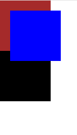
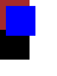
3. 固定定位:相对于可视化窗口(浏览器中我们能看见的区域)定位,脱离文档流。
注意:元素设置定位(除了相对定位)之后块级元素宽度不再默认为父级的百分百。
 .c1{
            width: 100px;
            height: 100px;
            background-color: brown;

        }

        .c2{
            width: 100px;
            height: 100px;
            background-color: blue;
            position: fixed;/*固定定位,不占位置,永远相对于浏览器来定位,不管窗口上下拉动,都不会消失(如广告位)*/
            left:20px;
            top:20px;
        }

        .c3{
            width: 100px;
            height: 100px;
            background-color: black;
        }
四.Z-index解析
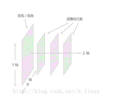
设置元素堆叠顺序
基本支持所以主流浏览器
该元素可拥有负的属性值
Z-index只能在定位元素上奏效(position:absolute)
Z-index的值是设置一个定位元素沿Z轴的位置,其值越大,离用户越进,所以若两个定位元素,Z-index值越大的将会覆盖值越小的定位元素
.c1{
width: 100px;
height: 100px;
background-color: black;
position: absolute;
left:20px;
top:20px;
}
.c2{
width: 50px;
height: 50px;
background-color:blue;
position: absolute;
}
效果是:蓝色定位元素在黑色定位元素上面
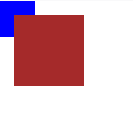
 .c1{
            width: 100px;
            height: 100px;
            background-color: brown;
            z-index: 1;
            position: absolute;
            left:20px;
            top:20px;
        }

        .c2{
            width: 50px;
            height: 50px;
            background-color: blue;
            position: absolute;
            z-index: 0;

        }
加Z-index,使得黑色定位元素在蓝色上面